OPPO ColorOS 11 Full Detailed Review (Android 11) By HowToMen
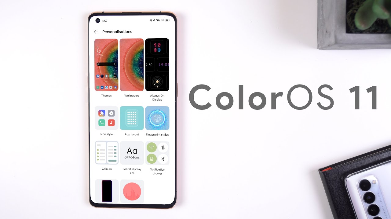
How's it going guys Oppo just announced that they're updating, color OS to android, 11, and they're, now jumping from color OS 8 straight to 11. By naming their system color OS 11 they're trying to follow the same stock android version number, so you can easily tell what version of android your aqua phone is running, pretty smart and being that apple is among the first OEMs to upgrade to android 11. I'm sure you're curious to see what new exclusive changes this software has Oppo even collaborated with Google to make the interface more efficient and convenient. You have all the native android 11 changes, such as improvements to the notifications, an enhanced power menu with better control for your smart home devices, nearby, sharing privacy add-ons, including the auto reset permissions, only this time, option etc. and there's even a new integration with Google Lens that allows you to activate Google Translate when using the three finger screenshot or opening the smart sidebar, but just like every other color OS update, Oppo has included a few new features and design tweaks of their own first off customization for the UI has been stepped up immensely for those of you who have been watching for a while. You'll know that I love customizing, my phones to the extreme and colors 11 is one of the best interfaces that allow me to make the software a lot more personal for stars.
The launcher has added a few more options to the personalization menu that pops up. When you do a two finger pinch on the home screen. So now you can change the icon pack, home screen layout transitions and more without needing to jump into the launcher settings and the great thing about this is when you make any changes, such as choosing a different layout or icon pack, you can see the changes live on your home screen if we open to the settings and jump into the personalization menu. This is where the jackpot is, because within this screen, you can personalize anything. You want some of the new changes that came about from the colors 11 updates include some new color scheme options and 10 static, color options within the color menu.
The color schemes are pretty cool since they apply different colors for every menu control or icon. I personally love the Miranda color scheme. The always on display is also extremely customizable like before you can add an analog or digital clock, but now you can even customize the colors of the clocks, add custom text and even create an animated pattern that looks extremely beautiful. You just tap on the box with a plus in the middle, then on the black panel. You drag your finger on the screen to generate a set of mesmerizing patterns.
Furthermore, you can even add different colors to it. Another awesome new feature is that you can create custom wallpapers, based on the photo that you took on your phone. Just go into the personalization menu tap on wallpaper local, album, select a photo and then tap on the light bulb icon to generate a unique background using a special algorithm. Colors 11 will reorganize and analyze the colors to generate a set of exclusive wallpapers, and they have different styles, based on your photo reference. The wallpapers that it generates are extremely gorgeous and perfect for any home screen.
Setup and Apple didn't stop there with their custom creations within the personalization menu. You can tap on ringtone maker and create your own custom ringtone. You just select the musical tone that you like to use and then with the pad you can change the rhythm of it. By dragging the circle around, you can make the sound thrilling and exciting, or you can also slow down the tempo and get something more relaxing. Once you're satisfied with the final tune, you can hit generate to save it and set it as your ringtone.
It's an extremely creative app that I haven't seen on any other phone, and I love how straightforward it is. Dark mode has been in color OS since version 7, but color OS 11 has evolved it even further. If you hop into the settings, display and brightness switch to the dark theme and then go into dark mode settings here, you'll see a few new options. There are three color schemes that allow you to change the contrast of the background. So if you want a more gentle or lighter dark mode, then you can choose medium or gentle.
If you go back to the previous screen and enable auto switch, you'll also be able to schedule the dark theme based on your sunrise and set times in your area upper relax. An app introducing colors 11 helps you stay relaxed through, sounds and interactions with the screen. The new 2.0 version now has a completely new design, and it has a new feature for the listen mode called sound mix which basically lets you combine. A selection of sounds to create a true-to-life white noise mix, for example. If I want to listen to urban traffic with a fountain running in the background and some pencil writing, I can mix all those sounds together to create that environment.
I can even change the levels of each sound individually plus with Oppo relax 2.0. You can listen to the sounds of cities, since the colors team went to actual global cities like Beijing, Tokyo, Bangkok, etc. , and they record the environment there to turn the sounds into pleasant soundscapes. I use this feature all the time when I'm doing some homework, or I'm studying, and it's pretty cool how every city has a unique sound. If you're a gamer you'll be happy to hear that you can get focused even more by enabling a new feature called immersive mode.
When enabling this feature, your calls will be blocked. The navigation and back gestures and game assistant won't work and any other operations that could disrupt your gameplay will be blocked. Once you're done gaming, you can leave immersive mode by just swiping on the left corner of the screen and hitting exit. Those were most of the main upfront changes, but there is also a lot of under the hood changes. For example, since more and more phones have a higher refresh rate, it's not uncommon to see the software lag and stutter, since the high frame count is very power intensive.
That's why color OS 11 introduced UI first 2.0 for those technical users out there. This technology combines a lag, reducing engine with quantum animation. So with the new feature ram utilization is boosted by 45. The response rate is improved by 32 and the frame rate stability is 17 stabler. On top of that, launching apps has also been sped up by 23.63, thanks to a new feature called AI app preloading, which basically learns how you use your phone, and it preloads your most used apps and finally, the touch response. Speed has been improved thanks to a new super touch feature.
So what does this all translate to in the real world? Well, when I began to navigate the UI scroll through apps or swipe through animations and transitions, everything felt a bit more fluid. I was astonished at how well the screen responded to my touches and how there was never any lag when I did some very power intensive tasks such as screen recording or gaming, so I loved the optimizations that were done to the software. It's awe-inspiring the accomplishments that were made with colors 11. Finally, with battery life being a huge importance for a lot of users, colors 11 now tries to prolong the battery life with a new feature called battery guard. It essentially learns the user's charging habits and responds by halting charging at 80 at night before resuming to a full charge by the time the user gets up.
That way, the health of the battery will be in excellent condition for a more extended period, anyways also most of the new features found within the color OS 11 update by OPPO. If you want to know when your upper phone will receive the update, this is the timeline for most apple phones, so you can get an idea of when you should receive it. There are so many smaller changes that I didn't cover in this video, but if you'd like to learn more about colors 11 in greater detail, I'll leave a link to the global launch event where Oppo went over every feature found within this update in greater detail, either way, that's it for this video. I hope you guys enjoyed it. If you did, please drop a huge thumbs up and get subscribed while you're at it.
Also don't forget to follow me on Twitter and Instagram Ottoman to stay up to date with my content, and I'll catch, you guys in the next one you.
Source : HowToMen


![iPad Pro 9.7" — Unboxing and Review [4K]](https://img.youtube.com/vi/eeZym6LgE3M/maxresdefault.jpg )

