OnePlus 8T: Unboxing & Review By DetroitBORG
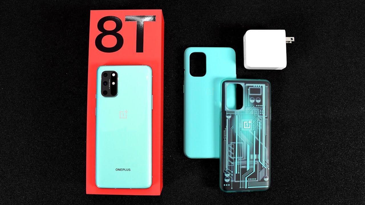
Hey guys mike here the Detroiter with a look at the brand new OnePlus 8t. So this is the direct successor to the OnePlus 8, which is OnePlus mid-range phone at 749. This sits below the larger eight pro which is carried over from last year, but does bring some pro features to the mid-range phone, but first, let's get to the unboxing and, as always, OnePlus was kind enough to send this along in the reviewer kit. So this isn't what you'll get when you buy your OnePlus 8t, but it's always fun to unbox these. So the first thing we'll see here when we open up the butterfly box, is the reviewer guide. So the reviewer guide gives us some geeky details and some nice illustrations to highlight the major new features of this phone, but below that we'll find the retail box on the left side, along with two optional case accessories getting to the retail box.
This is pretty familiar territory for one plus. We have a pull tab to pull off the plastic wrapping the box and once we lift open the lid. The first thing we'll see here is lots of paperwork, so it includes a quick start guide. The tsar value a letter from the CEO as well as this really cool set of stickers. Now, if you want to read that later, just go ahead and pause the screen moving on from there, we have the phone itself, but first, let's get to the new charging accessories, this phone debuts with OnePlus new warp, 65 chargers.
This is a 65 watt, USB charger, the first from OnePlus and can recharge the 4500 William hour battery in this phone from zero to 100 in only 39 minutes, so that basically eliminates the need to charge your phone overnight, because this is an USB charger. This can also be used with other devices up to 45 watts of charging, and the 8t itself supports up to 27 watts of charging on standard USB-C chargers. So this charger is less proprietary than before. So it's a little less wasteful, so unwrapping the 8t you can see. I have the aquamarine color.
I really like this color, but it's also available in lunar silver. So, like the previous design, this has an aluminum frame with glass on the back and front. Although we don't have wireless charging, the glass on the back is treated with a color that sort of scatters light. So, although it's a glossy back panel, it doesn't show fingerprints as easily, so the layout of the phone is pretty familiar for one plus. On the right side, we have our power button just below the three position alert slider.
These buttons are a little lower this time, which makes them a bit easier to use. That also goes for the volume rocker on the left side on the bottom edge. We have the same layout. We have an USB connector with a speaker on one side and the NATO sim tray on the other side, and if you pull that NATO sim tray, you can see the gasket surrounding the tray which reduces water intrusion. Although this phone does not have an IP rating and doesn't claim to be water resistant, one of the bigger design changes from the 8 besides, the new camera system is a flat screen design, so we no longer have that curved edge.
Personally, I'm a fan of moving away from the wrapped screens just because it often led to unintentional presses of the screen, but we still have virtually the same thin bezels all around the phone which are fairly uniform, although the chin is slightly thicker than the forehead. So one of the big new features of this phone is the upgraded display. So although we have similar specs, a 6.55-inch screen with a resolution of 1080 by 2400, that's good for 402 PPI, but this new display has a max refresh rate of 120 hertz up from 90 on the OnePlus 8, and that brings it in line with the OnePlus 8 pro. So that means we get an exceptionally smooth interface. It's definitely very noticeable, especially with an to edge screen like this, so combine that with the new oxygen OS 11, the low latency of the OS and the extreme refresh rate makes for a very smooth operating phone.
This is also an e3 panel, which means it's much more energy efficient, but also reduces the amount of blue light. It emits, while still preserving full DC ip3 color gamut support. So basically, this means the display is extremely bright, vivid and color accurate. In fact, OnePlus says this: has a NCD rating of 0.55 or just noticeable color difference, which is one way to express the technical capability of the display. Also returning is the in-screen optical fingerprint reader, which is also joined by face unlock.
We get a pretty decent set of stereo speakers with the earpiece and the bottom speaker working together. That earpiece does sound excellent for call quality internally speaking, although they're a little thin sounding, they have a nice wide soundscape, so they're, pretty immersive specs are mostly carried over from the OnePlus 8. Let's start with the storage configuration we get 12 gigs of ram and 256 gigs of storage, which is pretty generous. Now this is fast UFS, 3.1 storage, which is an upgrade from the 3.0 storage of the OnePlus 8. Also carried over, is the snapdragon 865 7 nanometer chips, along with the arena 650 GPU.
This also has the x55 modem for 5g support in terms of synthetic benchmarking, it's very similar to the OnePlus 8, although it seemed to be scoring lower in my initial test to keep all of this cool they've upgraded the cooling system with a large vapor chamber with graphite and thermally conductive silicone grease. So this ensures optimal performance during gaming and other high demand tasks. One spec that was upgraded is the battery it's up to 4 500 William hours from 4 300. Moving on to the camera. They have repositioned the module to the corner to allow for better antenna designs.
So, although most of the hardware is carried over, we do get a new quad camera design. So that includes an ultra-wide angle, lens at the top left, followed below that by the main camera and below. That is the macro lens on the right side at the bottom is the monochrome lens and above that is the LED flash and above that is the flicker sensor. So the main camera has the same sensor: the Sony mix 586, which is 48 megapixels with an aperture of f 1.7. That also includes optical and electronic image stabilization.
The ultrawide is also carried over with the mix 481. This is 16 megapixels with an f 2.2 aperture, but it gains an even wider angle, lens up to 123 degrees from 116. The new macro camera is 5 megapixels up from 2, and they've added a new monochrome lens, which is only 2 megapixels, so, unfortunately, we're still missing the total photo camera that's available on the 8 pro camera performance is predictably excellent in daylight conditions, with sharp detail, vibrant colors and the right mix of contrast and highlights, but even in extreme conditions with the sun right in the camera. The computational magic of this camera can generate some beautiful images that can bring up some of the shadows that would otherwise be blown out. Performance of the ultra-wide camera is fairly consistent with the main camera, at least in daylight conditions, although it's not quite as sharp as a lot of ultra wide, there is some barrel distortion at the edges of the photo, and there is some processing there to help sharpen it up.
But you can see it doesn't look quite as sharp as the rest of the image in terms of low light performance. Of course, we have a nights cape mode which solves a lot of the problems of low light photography and these small cameras. So it's able to bring up the contrast, bring down the highlights and even out the color. So it's not over saturated. The overall effect looks very good with very little noise, although it does tend to look over sharpened.
Unfortunately, even though the ultra-wide camera is available in nights cape mode, the overall effect is not consistent with the main wide-angle camera, so in many more extreme shots, there's a lot less detail and the color is way more saturated video also looks great on this phone. You can record 4k up to 60 frames per second, and you do have a cine mode if you want color. Vibrancy is definitely a highlight of this camera, but one of the other impressive features of this camera is stabilization. So handheld stabilization on this phone almost looks like you're using a gimbals, so it's really easy to get smooth shots out of this phone, even if you're walking around all right. So let's go and take a walkthrough of this new oxygen, OS 11, android, 11 bass, interface, which is completely redesigned and, I think, looks really sharp.
So first, let's take a look at the lock screen here. So, of course, we have a fingerprint reader to quickly unlock, or we can use face, unlock and see just how responsive that is. The first thing that's noticeable right away. Is that high 120 hertz refresh rate, it's extremely smooth, it's a big difference between 90 hertz and these 90 hertz isn't as noticeable, but this bit makes a bigger impact. So we can swipe right to get to our Google search swipe down to get to our shelf.
This is where your widgets live. We can also swipe up to get to all of our apps and search the apps as well swipe from the top to get to our quick setting toggles and our notifications. Of course, we have gestures here, but you can go back to the standard navigation bar if you prefer, but with gestures. Of course, we can go back by swiping, left or right from the edge swipe up to go back home. We all swipe up and hold to get to all of our recent apps, and we have this little app bar down here.
You can see just how incredibly smooth this interface is tap and hold to get to additional options such as split screen mode in terms of the quick setting toggles up top. Of course, we do have a vision, comfort mode which reduces the blue light, but more importantly, we have our dark mode, so enable dark mode manually or tap and hold to adjust the automated mode. So you can turn this on automatically with the sunset and sunrise, so the dark mode works across the interface within apps and within the UI. Of course, there's always lots of options here so tap and hold to get to your wallpapers and there's lots of colorful options to pick from. We also have our home settings, so we can change the launcher layout.
So we do have an app drawer here, so you can see the app drawer, and you can disable search history if you want, but you can turn this off and just merge all the apps onto your home screen so again tap and hold to get to your home settings launcher layout and home screen. Only click save, and it moves everything over to your home screen. You can also change the swipe down gesture, so right now, swiping down brings up the shelf, but if you're like me and prefer to just bring up your notifications, you can also enable that here, so you can select notifications and quick settings and that turns off the shelf, or you can just disable that gesture if you prefer under settings, there's a few key things to point out here. So if we go to buttons and gestures, this is where you can turn on or turn off the navigation bar or, if you're like me, and prefer the gestures, you can also hide the bottom bar if you find that redundant under display settings. This is where you can turn off the 120hz refresh rate.
So you can dial it back to 60 hertz, not 90 hertz, so that will give you a conventional refresh rate which should save some battery life. One of the first things I did change was the screen calibration. It was set to vivid by default, but I prefer advanced AMOLED wide gamut. To me, this looks quite a bit more vibrant. We also have some nice customization options for the status bar, including the icon manager.
So if you want to turn off some of these icons, you can do so right here. So in the end, at 7 49, this is really the sweet spot for one plus, although it's not a bargain by any means, it still has a lot of high-end flagship features for this price. A lot of phones that have this technology cost a thousand dollars or more especially with that 120 hertz display. But it's also missing some features that I don't think most people consider to be premium, such as wireless charging. That's pretty ubiquitous! Now a lot of people have wireless chargers even built into their cars.
So I'm not sure why they're reluctant to add that feature, but it would be nice to check that off the list. Alrighty guys hope you enjoyed this look at the OnePlus 8t. If you did, please give this video a like, and I'll see you again in my next video.
Source : DetroitBORG
