MIUI 12.5 24Hrs Later... By Mitchell Millennial
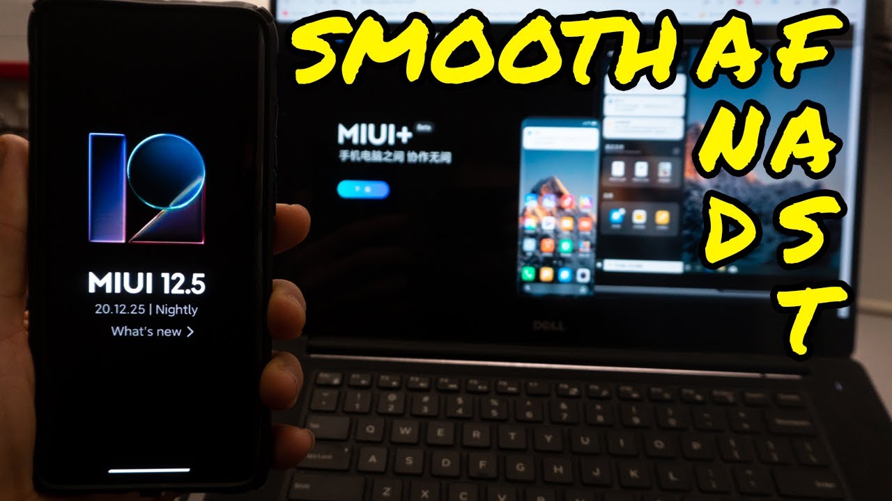
Hey guys it's Mitchell, and today I want to talk about my first 24 hours with Xiaomi mini 12.5. This is based on Xiaomi EU. It's a new beta that recently came out, and, let's just start with talking about some new features now the first one is the approximate location. Now mini 12.5 will come with better location, privacy, apparently- and it's supposed to let you know when applications are using your current location um. This is to better kind of hide your exact location, as opposed to sharing your exact location with apps. Now.
The next thing I want to talk about is new launcher animations, because this one is going to be pretty apparent. Now, mini 12.5 has a bunch of new animations, and if you look at it, the apps seem to be opening and closing out of their specific icons for take twitter, for instance, it looks like the Twitter app is coming out of the icon and, if you guys are on Twitter go ahead, give me a follow link in the description down below next thing I want to talk about. Is the new power menu? This isn't that big of a deal, but we have this new power, menu, power off restart, etc. Little things, but it looks nice next up on this list, is a revamp to how the volume looks and more granular controls in volume. Now here we have full volume controls, something that Xiaomi changed recently.
Is that when you adjust the volume it automatically adjusts it for media playback, not for ringtone, which is nice, and that should have come up for most you guys in mini 12. We have they do not disturb toggle one of the more interesting things that we'll get into in a second is how a lot of the theming a lot of the sounds are more nature or animal-esque, which I think is kind of weird. Next, up on this list, is we have easily converted photos to PDFs within the Xiaomi app directly. This is something I doubt many of you are going to use. Another overall kind of change has been a cleaner, more user, friendly interface, and I don't have any notifications up right now, but they have changed a little about how notifications are displayed and how you can go into notifications to make them closer to stock.
On android 11. We still have the new, updated, very apple-esque control center, and we can flip it around left or right side depending upon which side you want to swipe from. Personally, I have it on the right side, because it's easier for me to reach with my right hand, if I'm holding the device. In my right hand, another thing I want to talk about is a new layout to multitasking. Now this is one that you have to change, but this now makes it look significantly more like iOS and more like stock android I'll show you guys how you can change this setting right here, long press on your home screen settings more and, as you can see, we have the classic home screen with app tour like stock uh, google, the minus one screen for Google recover and there's my tablet.
Uh search bar provided by google. Obviously, lock home screen layout home screen, uh grid size icons, you can change the size. You can change the style which is kind of like changing the theme, but now, instead of just changing the theme, they have it in a much more kind of minimalistic way. I personally like classic with how this looks. I think it's just a little cleaner, a little flatter, but you can go ahead.
Change the icon size and this has been completely redone. I, like the big icons, uh arrange items in recent. Now you can choose again vertically or horizontally, makes it much more like stock android vertically, in my opinion, is maybe a little better, but just to show you guys show suggestions blur app preview, that's all stuff that we've had before to show you guys a little more about the smoothness and cleanness of this. Let's go ahead open up some more apps now, along with all of this Xiaomi, is saying that this new version of mini is going to be more energy, efficient and better for battery life. Now, whether that's because Xiaomi is um pushing away or clearing a lot of the apps running in background, I don't know, I've only been using this for 24 hours and so far.
The way this runs and operates is pretty smooth, and it's something that is certainly smoother than what we had before. It definitely makes my device kind of feel faster, especially if you guys pin any of these apps open or, if any of you guys use the mini, optimizations, and I'll show you guys that right here, special features, mini lab AI preloading on or off, I haven't noticed much of a difference on it normally on stock Xiaomi EU it doesn't allow you to disable it, but overall, a lot of the features. A lot of the enhancements in this update for mini have been about making it lighter on the system, making it faster for the system to go ahead and process stuff and making it a better experience for the overall user, and here you guys can see the start or the creation PDF now, apparently, Xiaomi is also going to be rolling out a super resolution mode. This is something that I haven't seen so far in the camera yet, but the camera seems to be fundamentally uh, unchanged uh. It is worth noting that with Xiaomi EU we can go ahead, and we can have the night mode with the ultrawide camera, which is something I don't think Xiaomi has implemented yet on their regular version of mini.
Now Xiaomi has also talked about updating a lot of its existing applications that come with mini and giving less bloatware and allowing you to disable a lot of these system apps. But if you're someone like me more likely than not, you will disable the stock Xiaomi applications, and you will use the Google ones it's nice not needing to go into a specific, ADB application to uninstall or to stop using the calendar, and on top of that, one thing that I wanted to show you that that notification just made me think of is all of these new notification sounds and wallpapers. First, let's go into these sounds now notifications. We've got all of these new features. All of these new Savannah sounds hyena.
Sounds African. Bush sounds uh just way over the top. In my opinion, we've got uh, Australia, ones, Tasmanian devil ones, we'll go with Tasmanian devil for the rest of the day, but they're just a couple of things that have popped up that ultimately um make like that overall, just kind of make the device feel more natural. If that sounds any, if that sounds weird um, no, like notification sounds that just kind of pop up at will. Our like natural sounds which in many ways are very nice but in other ways a little odd.
I guess you could say this is one of the settings. I wanted to show you guys before adjust media sound in multiple apps, multiple audio sources and uh speaker control, and this basically allows you to choose a variety of kind of ways that the sound and the notifications work on your device and for me having these extra tweaks. Furthermore, I guess you could say is nice, but it's not really that big of a deal now. One thing that Xiaomi talked about a lot that I mentioned before was battery and power. Now I have been using the device for 54 minutes, and we have used up 14 battery now it's worth noting that eight percent of that battery usage comes from uh podcasts and six percent comes from the phone being idle.
So, although this is a beta, build we're not seeing much in the way of, I guess battery up like battery efficiency right now and now that we have these here now is a great time to show you guys some new stuff in the notifications. So this is you just long press on this to open this up before you could kind of double tap and overall. This is just a little cleaner of a way of dealing with the notifications. If that makes any sense- and I hope you guys have enjoyed this walkthrough of mini 12.5 on the Xiaomi mi 10 oopses running Xiaomi, EU going to have more videos coming for you guys this week going to have a preview of the sound Pete's. True air 2, headphones peace.
Source : Mitchell Millennial
