Xiaomi Mibro Air Smartwatch: Quality Design, Poor Software By Tech4All
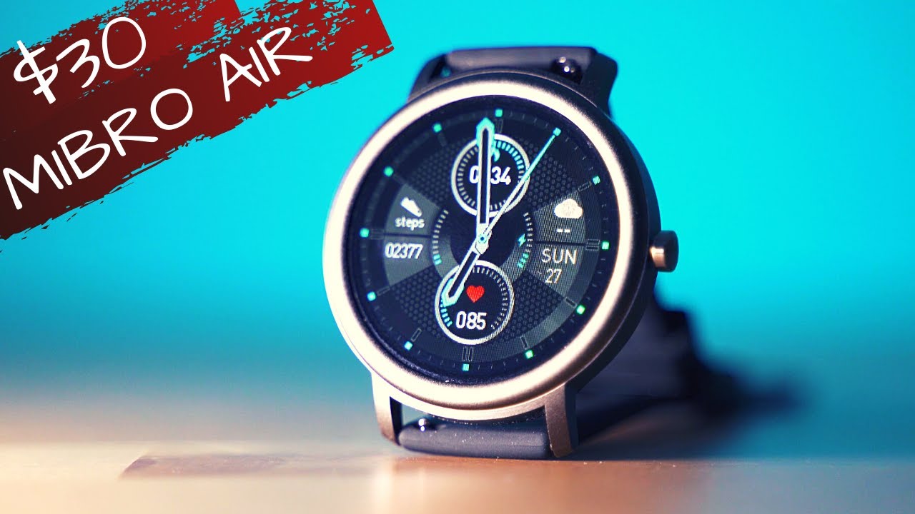
Thirty dollars for a smartwatch associated with Xiaomi, it's possible, of course, but at what cost the mi bro air might be. The exact answer to this question: let's inspect hey welcome to the tech for all channel. This is where we inspect cool tech. It's your host, Michael and so lovely, to see you around now. This review is gonna start in a very positive fashion, because I know how much you appreciate products below 50, even below 40 dollars, especially when it comes to something related to Xiaomi. We've had some attempts last year halo offering a lot of features at a rather small price, and their idea seems to have inspired a lot of other watchmakers now Mira have designed something that seems to be impossible to match in terms of quality, with amazing screen to body ratio and fantastic sleek design.
You actually may know the company staying behind me bro, especially if you can remember the metro drone from a couple of years ago now they've entered another niche and now for around 30 dollars. There are a lot of features packed inside the mi bro air for way less money than what you have to pay for me. Watch, for instance, not to mention the way more expensive, Huawei watch, gt, amazing, GTR and so on sure we can mention Garmin, Fitbit or Samsung, where the price is, of course, a lot higher. I'm saying all that, because we need to be realistic about the expectations. If price and design are top, there might be certain drawbacks in other areas.
So, let's move on to the unboxing part. I've had this device in my site for weeks, and I'm pretty happy that finally have the chance to thoroughly try it and test it in terms of packaging. The whole experience reminds me of the band, 5 or halo series: unboxing, not bad, but definitely not something to remember quite vanilla setup here, just the watch surrounded by foam layer for protection, the charging, cable and the instructions. What does surprise is the build quality and the size, while most other smartwatches are rather thick due to the need of fitting all the hardware and sensors inside this one is pretty slim, and I have to admit it looks beautiful? The case is mostly metal, so that's another quite positive side before digging onto the menus. Let's take a quick look at the specs if you're not familiar with such as you recommend checking them, because I will relay most of these data to use cases or explain them through examples.
So the display 1.29 inches TFT, 200 million power battery, giving up to 10 days, Dumas per charge, Bluetooth, 5, heart rate sensor, proximity sensor and accelerometer ip68, waterproof weight of only 23 grams without the strap well on paper that all sounds very promising, but TFT is perhaps the worst choice for a display these days having both LCD and all led technologies being superior. There is no oxygen saturation sensor. There is not much data about the ip68 rating given, but the lack of swimming sports mode inside makes me think you should better keep it away from water. So in terms of hardware, its rather basic setup, you may see the sensors on the back side. The strap feels good.
If you don't like it, you can still replace it for any 22 mm alternative that you prefer and okay hardware info check time for software. This is where things become a little different. Let's begin with taking a look at the navigation. If you've had a smartwatch before this is going to feel different or if you have used another watch, then it's a matter of time getting used to it. So the button on the side is a home button.
My expectation was that it will open the app list, but now in order to get to the apps swipe left, and now you need to scroll until you get to the one you're looking for there are not too many but cover the essentials for a basic feature: watch health, summary sleep, data, heart rate, data, clock, weather, forecast, counter and stopwatch, etc. , because the operating system is quite basic, there are no apps that you can further add scrolling feels rather good, but the interface is not super smooth and responsive. It's better than the Huawei watch gt and a little worse than the watch, but thanks to the qualities of the AMOLED screens on the last two mentioned devices, their displays feel overall, better and the watch navigation experience is much nicer. If you swipe right, there are the main tiles configurable, but not too many options. You can reach the quick toggles.
If you swipe down and check the notifications, if you swipe up as for emoji support, take a look at this. I can sense a bit of disappointment with this whole navigation system. The idea is good, but if the weather is cold and if you're in a hurry, the app navigation is not too optimal. Let's explore the smartphone app as well. It's called mi profit looks like the iOS rating is way higher than the rating on play store.
I've used primarily the android app version, and it felt grayish most of the time. The icon of the app is truly reminding about Xiaomi, looks like the typical for mini icon packs, but everything that we can associate with miss ecosystem ends. Here. It's just not good enough. This is the main screen with the summary of everything that you might be looking for.
The part that surprised me the most was the lack of heart rate data after the first few days of usage, which made me find out that actually continuous hr tracking is not enabled by default. You can turn it on. However, it severely reduces the battery life with my usual kind of wearing the device 24 7, with notifications on together with hr tracking occasional sports and sleep tracking. It lasted around 4 days. Bluetooth's connection was stable though, but the workout modes were quite a fiasco.
Simple example start a workout from the app and there will be nothing shown on the watch. My greatest frustration was the fact that a few activities have started from the watch were not properly synchronized with the app. So not only the micro air sports limited amount of workouts, namely 12, but you might also doubt about the sync reliability. I feel that micro have some more work to do on the firmware level. So, if you ask me about the list with improvements, I could say a lot.
First, rather poor battery life for 2021, not enough workouts, inaccurate, hr, tracking the displays too pale and angles of visibility are limited issues with data sync and a disappointing smartphone app. It's the fact that there's even a limit for the notifications. You can receive search from only certain apps on your phone. So if we hadn't checked the hardware first, I was about to say that the micro air is quite a disappointment, but if we can live with these software woos at least temporarily, because I hope to see a lot of improvements in the coming weeks. The fact is that it is one of the most elegant nicely designed and well-built smartwatches from the past months and if you prioritize design, shape and materials over functionality and software.
The mi pro air is the one and check the video description about information, how to get it at the best possible price. Otherwise, I'd strongly recommend checking some many reviews on the channel and get to know more about the wonderful world of wearable devices. I very much hope that the last few minutes have helped you to decide whether the mi pro air is the right fit for you, or at least to get to know how it compares to smartwatches from these days. If the video accomplished this mission, please let me know by hitting the like button. Subscribing to the channel would be great and comes for free and is much appreciated, and that's all of it for today, I'm Michael would love to see you soon.
Maybe in our next tech inspection, take care and have a lovely day. You.
Source : Tech4All
