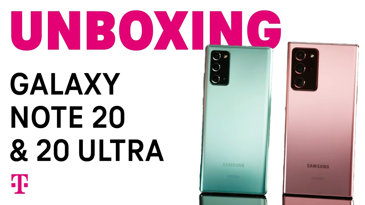
Tweak these 20 features and settings on your NEW Note 20 Ultra By Tech Guy Charlie
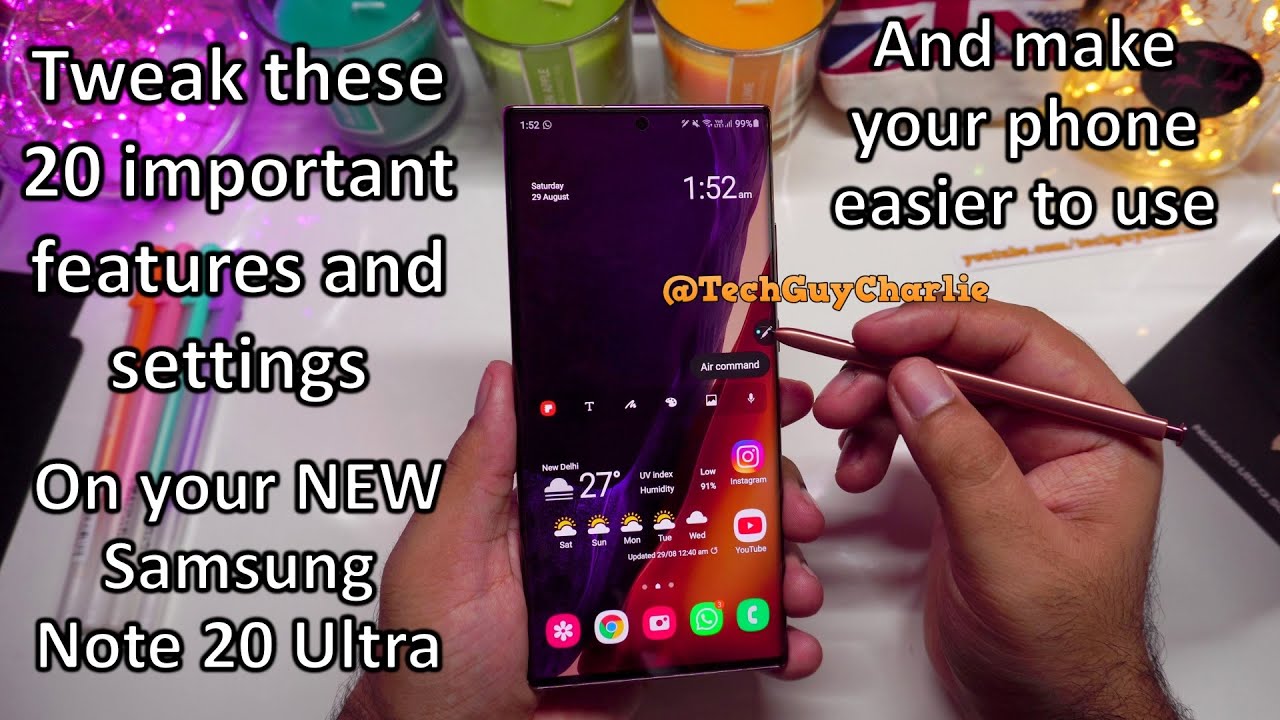
Hey everybody how's it going welcome back to a new video today, I'm going to walk you through 20 features and settings that you should tweak and turn on in order to get a better experience out of your brand new Samsung Galaxy note 20 or the note 20 ultra now before we begin, if you, like my content, make sure to subscribe to me on my YouTube channel and then make sure to follow me on my social media account I'll put all the links in the video description. Also in the video description, you will find the time code of this video, so in case you want to skip to any particular part in this video. You can do that by checking the video description out alright. So, let's begin so after finishing off with the initial setup, this is how the home screen should look like on your brand new Samsung Galaxy note 20 and the note 20 ultra. So the first thing we want to do is enable a feature which allows us to drop the notification panel by swiping down on the home screen. So right now, if I swipe down on the home screen, it opens up the app drawer.
The app drawer also opens up if you swipe up. What you want to do here is pinch in on the home screen and then go home, screen settings and turn this feature on which says swipe down for notification panel. So once you enable this feature, if you swipe down like this, that will drop the notification panel, so you see how convenient that is. You really don't have to take your hand off and do this to drop the notification panel just swipe down, and that will reveal the drop-down notification panel. If you want to open up the app drawer just swipe up and that will open up the app drawer.
The next tweak we want to make to the phone is that we want the brightness control on top of the notification panel. So right now, if you want to change the brightness, you actually have to drop the notification panel twice, and then you get the brightness control slider. We want this to be visible with a single swipe so to enable that drop down the notification panel and then tap on these three dots then select quick panel layout and then enable this feature which says, show brightness on top, and that is it now. The brightness slider will appear with a single swipe. So now you can change the brightness without having to drop the notification panel twice.
Another thing I have noticed is that we don't have the battery percentage in the status bar. So if you want the battery percentage to be always there drop the notification panel and then tap on these three dots and then select status bar from over here turn on this feature, which says, show battery percentage and now the phone will always show you the battery percentage in the status bar and that battery percentage will always be there, no matter what you're doing so, even if I'm inside a particular app that battery percentage will always be there, so that is kind of nice. That will let you keep a track on the level of charge in the battery. Now, if we go back to the status bar setting, so let's go back here, there's another setting here, which says, show notification icon. This is set to three most recent notification, so that means you'll get only three icons, no matter how many notifications you've got now.
This is more of a personal choice, but I like to select all notifications so that the phone shows me more than three icons in the status bar and that will kind of. Let me know that there are more than three notifications on the phone. The next thing you should do is turn on dark mode. Dark mode will change the white theme of the phone to black, and that is more preferable, because black puts less strain on the eyes, so drop the notification panel, and over here you will see dark mode, just turn it on, and the theme changes from blinding white to black and- and this is more comfortable on the eyes- and this also changes the theme inside the settings menu, and this does affect a lot of apps. So, for example, let's go back to Instagram.
You will see the theme of Instagram. Also changes from white to black, so yeah, like I said, black theme is more comfortable on the eyes and because this is an OLED screen, pixels generate their own light, so this phone does not have a separate backlight. So that means when the screen is displaying black, there is no power being consumed. So with this dark theme, you also save a bit of battery power and when you turn on dark mode, you'll also notice that the wallpaper has become a little dim if you don't like the wallpaper becoming them, go to wallpapers and then turn this feature off, which says apply, dark mode to wallpaper and that will turn off the wallpaper dimming feature. But I like to keep this turned on.
Another feature that I like to switch off is Samsung daily, so on the home screen. Whenever you swipe to the leftmost tile, you get this thing called Samsung daily, so this will give you your latest news and entertainment. Honestly, I feel it's a waste of resources and I like to conserve my battery power, so I will disable this so the way you disable this tile on the home screen is by swiping in like this and then, if you move on to over here, you can switch off this additional tile called Samsung daily. So now, when you swipe to the left, there is nothing there. So now the annoying Samsung daily tile has now disappeared, and I'll make this my home screen and add another home screen tile over here.
So the middle screen is the home screen and I have a free home screen onto my left and onto my right so that I can add more stuff over here. The next thing I like to change is the way the apps are sorted in the app drawer. So this is how the apps are sorted. You can see these are not sorted. Alphabetically I like to sort the apps alphabetically so that they are easy to track.
So I will press these three dots and then select sort, and I will select the second option which says alphabetical order, so this will sort all the apps alphabetically so that they are easier to find. Now speaking of app icons, I feel that we can fit more icons here on the home screen, as well as on the app drawer. So right now we have five icons vertically and four icons horizontally. We can change that so pinch in on the home screen and tap on home screen settings so to change. The number of icons on the home screen grid select the home screen grid, and I'm going to change this to five into six.
That means we will have six icons vertically and five icons horizontally. So that way you can add more icons to your home screen and let's go back again to home, screen settings, and we are going to go to app screen grid and by default it is set to four into five. That means four icons horizontally and five icons vertically. I'm going to change it to five into six. That means 6 icons vertically and 5 icons horizontally.
So now it looks much better. All the icons now fit on one single page in the app drawer. The next thing we are going to do is add some useful widgets to the home screen. Now, if you have noticed, I have removed the weather widget, which was already there. I've also removed the Google search widget because we are not going to use that gonna, add a better weather, widget and the widgets that I'm going to add are pre-installed on the phone, so I have not downloaded any extra widgets from the play store all right, so I'm going to pinch in like this and go to widgets and first thing I want to do is add a calendar widget, because it's always nice to have a calendar on the home screen and from over here I'm going to add the monthly widget, and we are going to place it here on the leftmost tile.
Now there are a few settings that you can tweak. You can tweak the background transparency if you want a white background. You can also have that, but I kind of like to have this thing completely transparent and that actually looks pretty nice, and I'm going to readjust this make it a little small. So now we have a calendar on our left most tile and again, I'm going to go back widgets and, let's add a weather widget. So let's look at weather, and I'm going to add this one three into three long, press and I'm going to select my city and again, I'm going to leave it transparent, because that looks nice and the next thing we want to do is resize this so that it fits properly.
Now this also looks nice, but if you want a smaller weather widget, you can always make it a little smaller. I think I'm going to leave it at this another useful widget that I like to have on the home screen as Samsung notes, widget so pinch in, go to widgets and select Samsung notes, and we are going to add this to the home screen. So this will quickly allow you to take notes just tap on the t button, and it takes you directly to the Samsung notes. The next thing I want to do is add a clock widget over here, and I think I'm going to add this digital clock, widget, so long press and I think I'm going to resize it like this, so that we have the time, and also we have the date over here and if you haven't noticed, I've also rearranged these icons. So I have my favorite icons.
I use YouTube a lot. I use camera WhatsApp and the phone dialer. So when I'm holding the phone like this, it becomes very easy to launch these apps and the way you add app icons to the home screen is go to the app drawer, long press, and that's it that's how you add app icons to the home screen now it may seem a little trivial that I'm showing you how to add the app icons from the app drawer onto the home screen, but you have to keep in mind. Most of my viewers are coming from Apple iPhone, or they have never used a Samsung phone before. So that's why it kind of becomes important to show these basic steps.
Another widget that I like to add on the home screen is the digital well-being, widget so pinch in, go to widgets and locate digital well-being and just drag and drop this anywhere on your home screen. So this one shows you how many times you have unlocked the phone and your screen on time and if you tap on this widget, it will take you to the digital well-being, app, which kind of lets you keep a track on how you are using your phone. It may sound crazy, but it looks like Samsung has not included a music player with the Galaxy Note 20. So, let's install a music player, go to the play, store and locate Samsung music. You can install pretty much any music player app.
You want from the play store, but I like to use Samsung music. So we will download and install this. So this app will let you play all the mp3s on your phone, and you should also add the Samsung music player with it. So we will go back to widgets and locate Samsung music and just place it anywhere. You like on the home screen.
So this will let you control the tracks directly from the home screen. So that's kind of awesome. The next thing I like to change on the Galaxy Note 20 is the keyboard. Now this is more of a personal choice. Some people do prefer using the built-in Samsung keyboard on their galaxy phones, but I like to use Microsoft swift key now.
The best part is because swift key is now owned by Microsoft. I think, starting from the galaxy s20 series Samsung has been including swift key on their phones. So if you press this keyboard icon, you will be able to see Microsoft. Swift key is pre-installed on the phone and this is the swift key keyboard. It supports that swipe gesture.
I do like swift key, because you do get a lot of customization options on this keyboard, so I'm going to change the theme. There are plenty of themes available so check this theme out. This one is called carbon dark red, and it looks kind of nice, and the next thing I want to do is make the keyboard a little smaller, because I think it's a little too big for my taste, so yeah that looks nice. So now I have swift key keyboard. The next few tweaks that I'm going to show you are in the display settings, so we will drop the notification panel, go to the settings and then go to display settings.
So the first thing I want to do is turn on video enhancer. So if you scroll all the way down, you will see the video enhancer option here. Just turn this on now the video enhancer will enhance the image quality of the videos that you play back on your phone so that you get brighter and vivid colors. The next thing you should do in the display settings is turn on bold fonts, so scroll down, tap on font, size and style and turn on bold fonts and as soon as you turn that on you'll see the fonts are a little more legible. So the actual font size has not changed.
The text has become a little more thick. Samsung's phones have this feature that whenever you get a notification on your phone, the edges of the screen light up like this, so this is called edge lighting. So we want to change that to something more interesting and fun. So what we'll do is drop the notification panel we will go to settings then go to display scroll down and tap on edge screen. Then we will go to edge lighting and select lighting style and from over here you can see there are a bunch of edge lighting effects.
My personal favorite is the glitter effect. Now we will go to advanced and change the width from narrow to wide and duration from short to long, so that the edge lighting effect is there for a longer period of time. So that looks really, really cool. Now you will need to select apps from choose apps, for which you want the edge lighting to work. So I have already selected the edge lighting to work with text messages and WhatsApp, and I think I'll also select this for Instagram.
So now, whenever I get a message, the edges of the screen light up and that's a really, really cool effect. If you press and hold the power button on your Galaxy Note, 20 or the note 20 series, it will open up Bixby personal assistant. Now, if you use Bixby personal assistant, then it is completely fine. But if you don't, you might want to change the long press behavior of this key to open up the power off menu rather than opening up Bixby, so drop the notification menu and tap on this power button and select site key setting. If you select the second option, if you long press the power button now it shows you the power off menu and I think that's the way it should be, because I think it is easier to power the phone off by long pressing this button, rather than dropping the drop-down notification panel and then powering your phone off from over.
Here. Interestingly enough, Samsung has included two web browsers with the Galaxy Note 20. You have Samsung internet, and then you have the Google Chrome web browser again. This is more of a personal choice, but I do prefer using Google Chrome over Samsung internet. So what I'm going to do is uninstall the Samsung internet web browser and use Google Chrome instead of the Samsung internet web browser.
So that's if it's gone, and I'm going to go to the Google folder and copy this down over here. So now I'll be using Google Chrome as my default web browser. A lot of people also ask me: how do you change the lock screen clock? So let me show you how to do that, because I think it's always nice to customize it. So we will go to settings and then scroll down to lock, screen and then tap on clock style select, lock screen, because we are not changing the always on display clock right now and from over here you can pick pretty much any style clock you want, and this will appear on your lock screen. You can also pick a different color from over here.
I'm going to pick this rainbow style color. I think this one looks nice and press on done, and that is pretty much it now. You will see a more colorful clock on the lock screen. Another crucial change I like to make on the Galaxy Note 20 is that I want to disable this menu, which pops up every time I remove the s pen. So sometimes I want to use the s pen when I'm browsing the internet, because now you can navigate across your phone using the s pen.
So if I want to open up recent, I can just do this and that opens up recent, or I can go back by doing this gesture, but every time I remove the s pen, the air command menu pops up and that is kind of annoying, because then I have to tap once to make it go away. You can also open up the air command menu by pressing the pen icon over here, or you can also hover the s pen on the screen and then press the button, and that also opens up the air command menu. So there is really no need of opening up this menu whenever you remove the s pen, so we will go to settings and scroll down here and under removal. We will change this setting to do nothing so after changing that setting whenever you remove the s pen on your Galaxy Note that annoying menu won't pop up, and if you want to open up that menu, you can just tap this and that will open up the air command menu. The final change I want to make on my new Galaxy Note: 20 ultra is: I want to disable some vibrations so whenever I tap something so if I tap these navigation icons, the phone kind of vibrates, if I am typing something the phone again vibrates- and I kind of don't like that- but this is more of a personal choice.
So in case you like the vibration feedback from your phone, you can leave this feature turned on, but I don't like them and if you don't like them, let me show you how to switch those vibrations off so drop. The notification panel go to settings, go to sounds and vibrations scroll down and go to system sounds and vibration control and from over here you can turn off additional vibrations. If you don't like it. So now the phone no longer vibrates when I'm navigating across the android system now to switch off vibrations in the swift key keyboard. You'll have to go to swift key settings and switch it off from over there.
So swift key settings sounds and vibration and I will switch off the vibrations from over here. So now, when I type something on the keyboard, the phone will not vibrate alright, so that pretty much wraps it up for this video. I hope you guys are enjoying your new Galaxy Note 20. This is an awesome phone and I hope this video has helped you out in customizing. Your Galaxy Note 20.
Alright, so thank you for watching. Do stay tuned for more videos. On the Galaxy Note 20, and I will see you guys next time.
Source : Tech Guy Charlie
