Samsung Galaxy Note 10.1 Tablet: Unboxing & Review By DetroitBORG
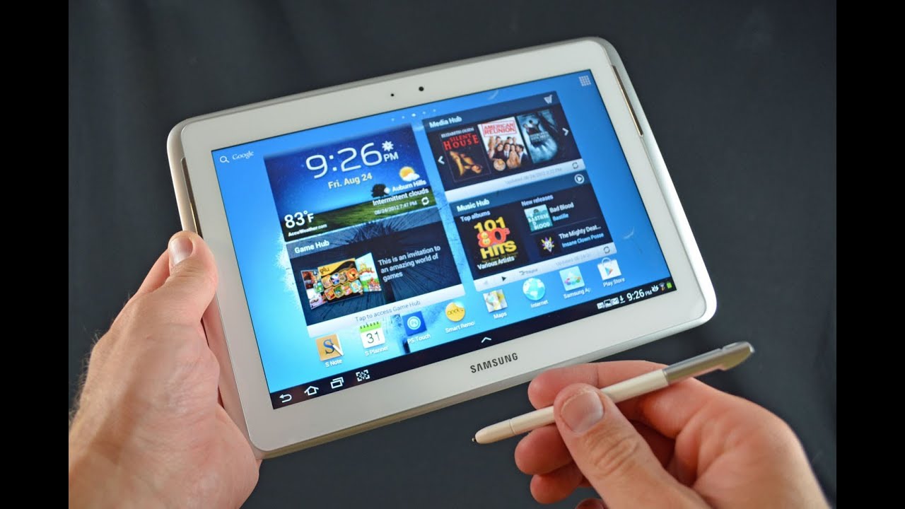
Hey guys my Curie Detroit Borg, with a look at the Galaxy Note 10.1 inch, which is essentially a tendon, stabbed with an integrated stylus. So let's go ahead and take a look around the hardware software and see what I think about this latest and greatest Samsung tablet. Now the Galaxy Note 10.1 is available in two colors white or deep gray white. As we have here, 16, gigs or 32 gig capacity, 16 gigs is $4.99.32 gigs is 549. So for $50 more you get twice as much storage, but you do have a micro SD card slot in here, so you can upgrade storage up to 32 gigs on the back. We have some of our specs, so we have a display which is good for 1080 by 800, which is a pixel density of 149 PPI, not very impressive, with things like the new iPad or the Asus Transformer Pad Infinity, which have much higher resolution displays with pixel densities in the 200 to near 300.
Up here we have a 5 megapixel autofocus in camera, which is only good for 720p video, not 1080p. I. Don't understand why that is. The sensor should be good enough for it, and certainly the specs can keep up. We do have a 1.9 megapixel front-facing camera, as well as a 7,000 William battery, which is good for about 9 to 10 hours of normal use and of course we have the s-pen or open, as some people like to call it, which is a Wacom technology base, stylus, which is integrated into the chassis of the tablet, which is pretty interesting. So we'll take a look at how that works.
Now, let's go ahead and crack this open and see what we get in the box. So here is our tablet with this little tab here to lift, so we're going to flip that over you can see it's covered in many pieces of plastics. So let's set that aside and take a look at the inside interesting here is that we have some indicators here which tell us how to align this in the box. I guess that's trivial, but interesting. Nonetheless, now inside we have our power adapter.
So here we have our US power adapter, as well as our wall wart here down we have our literature, and we have our USB to proprietary dock connector. So this is Samsung's proprietary dock, and so this is how you charge or sync data to it. Now here we have our literature. Let's take a quick look to see what in here, so we have a Galaxy Note users guy, which probably tells us a little about the ports and buttons. We also have Samsung media hub, which we can talk about later.
We also have the Galaxy Note accessories. You can buy quite a few accessories from Samsung directly, and you have your warranty guide now. They've also included a baggie which contains some replacement stylus points, as well as a tool for removing them from the pen itself. Now quickly take a look at the power adapter. Here again we have Samsung branding with this very shiny black glossy plastic.
We also have our power adapter here, which snaps into place, so you can either add an extension cable or you can step on a different international wall adapter. Now, let's go ahead and take a look at the tablet itself before we take off all the wrapping, so some highlighted features, including the s-pen as well as Adobe Photoshop Touch, which is software, which highlights the use case for that stylus. We also have a Smart Remote. This does have an IR blaster, so you can use this as a universal remote. A lot of Samsung tablets have been doing this.
We also have that 1.4 gigahertz quad-core processor, as well as Android, our Wi-Fi up to n, as well as that Photoshop logo. On the back, we have more wrapping, which tells us about the S Pen, which is right here, we'll take a look at that once we get the wrapping off. So let's go ahead and peel all this off I'm going to peel off the front, and now we have lots of different pieces of plastic all over this thing. So we got one here. We got one on the top one on the side, one on the bottom.
So let me get back to you so, with the tablet free of all of its plastic, we can take a close look around. So one of the neat things here about that white finish is that it kind of has a pearl to it. So if you look off access, you can see how it sort of reflects the light and has a texture to it. It kind of looks purple very nice detail. It's not just flat white plastic.
Furthermore, it has a nice high quality, look to it down. Here we have our stylus, which, if you look closely here, has a nice little cutout here for your fingernail to pull it out and integrate nicely into the edge of the tablet. So you can see it pulls out. You have your S Pen here, along with a bun which is used for screen, grabs, and I'll. Show you how to use that once we boot it up.
Let's pop that back in, we have our dock connector here for charging and syncing, as well as a microphone port, not much on the side until you get to the top. So, on the top, we have our power button next to the volume rocker I. Definitely don't really like sort of sale, because at some point you're going to want to press the volume button and hit the sleep/wake button to show off your display, which is not great. So we have our micro SD card slot here. I already have a SD card plugged in there it's spring-loaded kind of hard to get.
Unless you have a long figure now we also have our infrared blaster here for using this as a universal remote. We also have a headphone jack. Here we have our five megapixel autofocus scene, camera again only capable of recording video at 720p. We also have an LED flash and that's all there is to it until we get to the front. So on the front, we have a 1.9 megapixel front-facing camera, as well as an ambient light sensor on the side. We have our speakers.
These are dual speakers for stereo sound, so they sound pretty good, and they fire at the user as opposed to away from the device, as most tablets seem to be doing now. Overall, the design aesthetic is very similar to the popular galaxy s3, especially the white version we have here. So we have that same sort of glossy back panel plastic as well with that nice curved texture to it. We have that gray plastic bezel now on the galaxy s3 come as a metal grain to it, while the note just has it flat glossy finish so overall, very similar. So if you want a tablet to match your phone you're, definitely in luck.
Not only does the hardware match, but so does the software. So, let's move on to the software and boot this up for the first time we're going to hold the power button and let it run alright. The first thing we need to do is set it up for the first time, so we're going to choose English the United States we're going to select our Wi-Fi network and login. Now we can also log in to or create a Samsung Account. So let's go to sign-in, because I already have one of those.
Now, with our Samsung Account, we can restore from a previous backup or auto backup, our current installation, so we're going to skip all that and go to next, and now we're going to sign in to our Google account. So logging into my Google account well I'll make Lee transfer all my information from my Google account, including my contacts, calendar information, bookmarks and everything associated with Google. Next up we're going to agree to allow Google location all right so log in to my Google account means it knows my name, so we're going to click Next. Next up we have two gigs of Dropbox space free for two years I already have in the council. Let me sign in to that now want me to turn on Dropbox to save my photos taken with this device.
So let's go ahead and do that alright. So let's go ahead and take a look at the stock user interface. So here on the lock screen, we have our time as well as our tracking status right now, I have a plugged in because the battery's kind of low, but on the front you can see, we have that whoops. We have that nature Touch ID theme, so just like the galaxy s3, you have this sort of watery theme to it with the sound effects and water effects. You can unlock the device just by swiping across a lock screen, or you can launch several apps here.
The ones they've included s-memo the internet, browser movies and gallery. So if you want to launch any of this life to do swipe up on them, takes you right to the app now on the home screen. Let's get back to the home screen here we have five pre-installed home screens, which you can scrub through. If you tap and hold the scrubber up here, or you can just swipe through them, you can modify this by pinching in and out, so you can add additional home screens, I think it's up to seven home screens, or you can remove them just by tapping and holding them and moving them up to delete, and you can also move them around now before we get to our home screen. Flushes.
Take a look at some of our controls here. So we have our back home recent apps and screen capture button along with our quick apps here, so these are apps that will actually work over whatever you're doing, so it kinda is a multitasking element, so this only works with the app set Samsung has included. That includes the alarm, app calculator, email, music, player, s, note s planner and task manager, and you can edit what appears in this menu. So let's go done, and so, if you want to launch the memo app, for example, you can move this around and continue to do. Other things like launch a web browser.
The home button will take you to the home screen or, if you tap and hold it, it will give you the task manager. So that's our task manager here, so you can quit specific apps. If you want again, this is actually part of those quick apps which launch over everything else, so that doesn't interrupt what you're doing. We also have our recent apps button, which you can scroll through again. This is very familiar territory here and if you tap and hold it, you get right to your app store.
So you can get to more apps and the screen capture button here, of course, we'll grab a screen grab of your device and save it to your gallery. Now in the upper right corner, we have our apps' tray, which includes apps and widgets, with lots and lots of pages of different apps and of course you can drag and drop any of these to the home screen. Some of them are already there, and you have a standard array of Samsung Apps as well as Google Apps in some third-party apps. So some third-party apps include Barnes & Noble Nook Netflix. We also have Dropbox and others, so Barnes & Noble has partnered with Samsung to bring Irina to their tablets.
So we a have navigation, free navigation from Android. This does have GPS, so this will work, but of course, you'll need a cellular connection for that to really work effectively. We have Netflix, and we have standard array of Google apps, including play books play music places, Google Talk play movies. We also have Google Plus, Gmail net sort of thing, and we have Android F, including game hub, I'm, sorry, Samsung apps, including game hub music, hub music player media hub Alistair, Play chat on, which is that cross-platform chat app, which you can install on other devices like iOS, and we have also a video editor. Furthermore, we have a text book app YouTube, and we have a screen saver app.
So there's lots and lots of apps to pick from now on the main home screen. We have several apps already, so we have email, camera, Polaris, Office, Dropbox, chat on Nook Netflix, our settings bun, as well as s note, which is a hallmark feature here, because it uses that stylus s planner, which is kind of a calendar app that resembles the iOS calendar, including that geomorphic leather design. We have that peeler remote app. Furthermore, we have that Photoshop Touch app internet. This is the standard Android browser, but of course you can use Chrome, Samsung Apps and the Google Play, Store and, of course, maps.
We also have some widgets here, so we have s suggest which is an app discovery tool. We have the Nook widget, which is fills the whole screen, and you have room to grow. Furthermore, we also have a big widget up here or several widgets on the home screen, including a weather clock it widget, as well as our Media Hub, widget, Music, Hub, widget and game hub now in the lower right corner. Furthermore, we have our notifications, along with our clock and other information here. So if we tap that brings up our notification tray as well as some toggles for controlling major functions such as Wi-Fi GPS, brightness controls, power, saving mode notifications, Bluetooth draw I'been mode, Google Sync.
You can also toggle your brightness here, so you can turn it auto. You can slide it all the way to the left, dude bring it all the way down. Furthermore, you can also jump right to your settings and, of course, we also have our notifications here, which will take us right to them. So, for example, if you want to get to our email, just tap email takes us right to the app now what you may also notice. Next, to that clock is a technology brought over from the galaxy s3, which is smart stay, so this camera in the upper part of the device will actually be able to detect the presence of your eyes.
So it's actually watching you at all times to determine if you're using the tablet. If not, it will automatically allow the tablet to go to sleep so that kind of overrides the automatic sleep function of the screen, so it won't turn off if you're reading something as long as it can see your eyes. But of course you need adequate lighting in order for that to work now, the note does not include s voice like the galaxy s3, but you do have Google Voice Search, so you can go up to Google and search by voice or by text. We also have Google Voice actions such as listen to Coldplay. Now, taking a look at our settings, there's quite a few things to look at here, so this does have haptic feedback.
So if you go to sound, you can adjust the vibration intensity. You can also change the sound effects. So if you don't want that annoying blooping sound that from that nature, whiz UX, you can turn off now under display, including the ability to toggle on smart stay. You can turn that on and off by default, it's off. You can also lock your screen rotation change, font style and font size.
Furthermore, you can also change your quick launch function here. So right now you have the screen gab screen capture button, but you can change that to the applications, button search, button, camera button or none, so I'm, going to leave it on screen capture, actually I'm going to just show you if you change it to application mode, you can see the button changes same with the camera mode or search mode, and it's go-to camera, so you can just see the differences there. Also, under settings is motion which is toggled off by default. You can turn it on, and you can toggle all of them on or off individually, so tilt to Zoom is an interesting function. So let's show you how that works tilt to zoom.
So basically, all you have to do is hold two fingers on the screen and tilt it up or down, and you can recalibrate just by letting go and tilting up, so that works pretty nice. You also have a pan to move an icon which helps you to manage icons on your home screen. So let's try that out. So you have a little Android guy here. You just have to tilt left or right to reposition.
Where you want your icon, you also have pan to browse an image. So if you zoom in zoom up on that image, hold your finger over one portion of the image you can move it around. So it's kind of a neat gimmick, not sure how useful is, but it's nice to have that option. Now. You also have your pen settings here.
One of the things you can toggle on is the hovering pen icon. So when you detach your pen here, you can see you automatically get this panel here which allows you to change your settings or launch specific apps that actually use this pen, but I'm just going to ignore that for now and take a look at what that pointer. Icon is so basically, when you hover the pen over the screen, you'll get a little pointer icon, which is kind of hard to see right now we just kind of acts like a mouse, and you can hold it, maybe an inch above the screen before it disappears. So it works pretty good. You don't actually have to be touching the screen over for that pointer to appear, so you can see it right there.
Now moving on to the pen, you can see that the design of the pen is pretty basic. It's just a plastic pen feels pretty rigid. It does feel a little small for me, but we do have a button here for a screen capture mode. You also have that capacitive touch tip at the bottom, which you can remove using that tool to change out these tips because they do wear out. Apparently so, let's go ahead and start using this, and we're going to start with s nope, and you can use the pen for the entire UI, so you can use it to scroll around select items that sort of thing.
So let's go ahead and start now. The first thing I want to do is select my mode up here, so I'm going to do text to handwriting to text. You can also do formula match, which is interesting, and we can do shape, match, and we're going to test all of those out. So let's go to handwriting to text, and we're going to start writing this to see how it works. So the great thing about this software is that when you rest your palm on the tablet, it does recognize the palm.
As you know, it's something that you do not want touching or activating things in the lower tray. So if I put my palm down, you can see, it won't activate a bunch of things. So we can start writing. So you can see you took a moment to translate that, but you can see hello from Detroit and you can do things like shapes as well. So let's go to shapes, and so let's just draw a few squares here, nice little window here we got a circle rectangle, we can even add to it, and you can see it's very smart software, so you can do diagrams.
So, for example, we can draw a car, let's see how this works, and you get the idea to kind of draw a straight line, so you can also erase what you just did. You can tap the eraser, and you can erase it like this now. One of the things in this app is that if you tap and hold on to some of them, such as the eraser app, you get some controls here. So you can change the size of the eraser, and you can select clear all to erase it all now. We can also take a look at our formula match, so we can start typing or start writing formulas, and it will automatically match it.
Give you some suggestions up here, and they really want that. So, let's do that see if it fixes it nope there we go. We got it now, so we're going to say insert now. You can also use handwriting with the keyboard. So, for example, if we go to internet just tap on to the web search, you can go to the function down here, tap and hold it and bring up text writing.
So here we have instead of a keyboard. We have a handwriting pad, so we can start entering text. Let's do apple and, let's say I, don't want it, that's not correct! You can cross it out or if you make a mistake, you can try and write over it and, let's see, if we can do this right, there you go, so it works pretty nicely. It's actually a very useful, very smart software. Now the pen is also pressure sensitive and if we tap and hold the brush utility up here or pen settings up here, we can change whether we want a brush, a pen and that sort of thing and you can change the thickness of the brushstroke one I.
Can also change the color, but this allows us to demonstrate how that brush or that pen sensitivity works. So, for example, if we press harder, we get a thicker mark. If we light lighten up, it gets thinner, so it works pretty well now. Another major feature here is multi-screen, which is sort of a multitasking solution, unique to the Galaxy Tab 10.1, so it's kind of introduced with this platform, but unfortunately only works with certain apps that Samsung has modified. So if you tap the multiscreen function, you can see.
These are the only apps that will work. You can't download, Chrome and expect it to work in this way it's only Samsung apps. So that includes s. Note the internet, browser video player, Polaris, Office, Gallery and email. So, for example, we can bring up Internet here you get a tutorial on how to use it, but so far we have our browser, and we have notes, so we can interact with both at the same time.
So, for example, if we bring up this website here, and I want to get this photo over here, I can't just drag and drop it. I have to cut I, have to copy it to the clipboard and then paste it. So it's not that sort of interface. So it's not quite like a full desktop interface which allows that sort functionality. So, for example, if we just want to copy this item just happen, hold it we're going to say copy image.
So now it's copied to the clipboard. So what I want to do is go up to my clipboard here. Select it, and now it's inserted so here I can scale it and do what I want in this project. Now another multitasking feature carried over from the galaxy s3 is the ability to play video while doing other things. So, for example, we have our video player here, and we can play it, and we can press this picture and pictures here, and this will minimize it and allow you to move it around and do launch our browser and continued to watch our video moves it around.
If you don't want to, and we can tap on it to jump right to it now. You also have DLNA support built-in to the onboard players that includes the music player and video player. So you tap this icon here. It will determine if you have DLNA equipped devices in the area, find them, and you can tap on them and play video or music to them. So it's kind of like airplay for familiar with that on iOS.
Now, unfortunately, both the picture and picture viewer and DLNA support is only available with the Samsung app it's not Universal. So, for example, you can't use Netflix with that picture and picture viewer or that multitasking mode, and you can't output DLNA to other devices. You've seen this technique. This is really only proprietary. It's built into Samsung, apps, so you're kind of limited in that way, so that's kind of unfortunate I would be better if it was a system-wide.
Samsung has also made some changes to the stock keyboard. So, for example, if you pinch on it, let's try that again there you go pinch in you can change it. You can either do the full layout. You can do the floating keyboard like you have here, or you can do the split keyboard, which is my favorite keyboard. This allows you to thumb type while holding it in landscape or portrait mode.
Now the camera app is pretty familiar territory. You can toggle between video and photo mode and with full of mode. We have tap to focus, so we can change our exposure. You can also see the flash fired. You can change the flash settings back here.
Furthermore, you can turn it off on or auto. Furthermore, you can also change, what's displayed in your menu over here. So if you tap and hold them, you get several options here, so you can select what you want, and you can move them around. So you have tons of options, I'm not going to go through all of them. You have your metering mode.
You have your resolution, you have your outdoor visibility, your guidelines, white balance, scene mode, focus mode, even have effects over here, so you can get the standard, Ray effects and clean sepia negative black and white. Furthermore, you have your exposure levels which can adjust manually, and you have your settings which gives you further control, so you can do single shot. Furthermore, you can change the resolution. White balance, ISO metering, basically everything that's displayed in this icon view in terms of camera quality, the performance is pretty mediocre. Again this is only 120p, so you do get some artifacts.
It's not 1080p, it's not too bad. So if you have a well-lit scene, that's easily lit, it looks pretty good, but shadows tend to be underexposed. Brights tend to be overexposed, so it does a kind of poor job. Balancing both, so you'll have a very high quality lens in here. So yeah.
It's its a mediocre experience in general, definitely not the best performer in the market. Now next up is the front-facing camera, which is what I'm recording with right now this is a 1.9 megapixel sensor records video up to 720p, which is better than some other ones, that's record only in VGA quality, so you get higher quality video out of that front-facing camera, which is good for vlogging, for example, or for apps. That can take advantage of that HD video now in terms of benchmark performance. This is one of the best tablets on the market. This actually bests the Seuss Transformer Pad Infinity.
So using the Egypt tests on the GL benchmark test, the off-screen pro performance gives us 125 frames per second, while on the sou strands, former pad that same test gives us about 96 frames per second, so 125 versus 96 is a sizable gain now in terms of real-world performance, the tablet is kind of choppy a little sluggish. It gets worse over time. Initially, it's very smooth, very quick, but over time it tends to degrade and that could be cured with Android 4.1 or improvements to Touch ID. But overall performance isn't as good as the benchmark would lead you to believe, definitely not as smooth as the assist transformer pad and 50 or the iPad, for example. This is more obvious with things that use multitasking.
So, for example, if we go to the internet browser and my email open here so, for example, I want to scroll through here you can see it takes a minute to catch up, and if I want to go to my web browser, you can see there's a delay there. So, for example, I want to go over here, open an email and go over here to zoom in it's a little slow. Now, overall I have some mixed feelings about the Galaxy Note 10.1 I, really like the design I think it's very attractive. I, really like the speakers. Here they work very effectively.
So when you hold the tablet, you can see that the speakers aren't blocked, and they sound excellent. So the gray Lao nice stereo sound better than most tablets, which have a single speaker which fire away from the user I think that's a huge design problem and I think Samsung has done a nice job, fixing it in a tractive. Wait I also really like the white design with the white back panel. Even though this is all plastic, it feels pretty high-quality to me and the buttons work very nicely. They feel very comfortable.
Camera is also pretty good for a tail, but not the best, but they get the job done and certainly the front-facing camera is one of the best. But for me the problems start with this screen. Now the screen looks great, a very vivid, very colorful, with deep contrast with nice off excess viewing, but at 1280 by 800 it's on the low end of tablets price at this price at $4.99 you get a Retina Display iPad or you get. These suits Transformer Pad Infinity, which gives you much better resolution, which is great for text and great for photo viewing. So this tablet comes to make up for those problems with other features, and one of them obviously, is the S Pen.
Now the S Pen works, pretty good. Handwriting recognition is great. It's great for photo editing, precise control over things like that, and it's great for navigation. So, for example, if you pretty prefer to use a stylus versus your finger, this is definitely a very clever and elegant solution for users who want that, but in the end you can still use a stylus on any other tablet. You don't need the Galaxy Note for that to work, so the other benefit here is system-wide integration of pen recognition for handwriting.
So you can bring up the keyboard, and you can use the pen to write on it too. You know instead of typing text, you can write it out. So that might be a nice feature for me. I don't use it. I really don't need to use it, but it's kind of nice to have the other feature here is side by side windowing, but unfortunately that's limited to only certain number of Samsung amps.
So none of those apps I really want to use I'm going to use Chrome I want to use my own email, client I want to use my Twitter client and I can't use them side by side, and really they don't work as expected. So you can't drag and drop things from one window to another, and they're kind of slow to switch between them. So it's not an elegant solution, and it's a future that doesn't work that well. Another feature, obviously, is the pure mode app which allows you to use this as a remote for your home entertainment system, which also works pretty well, so some users may find that pretty useful, and you have other features like smart state technology gesturing. They also have haptic feedback Bluetooth, you don't have NFC and you don't have s voice like you get in some phones.
We also have the standard array of hardware, including Bluetooth, four-point-oh. We have an accelerometer, a gyroscope, a compass. Furthermore, we have a vibration motor for haptic feedback and notifications, and this also supports MHL through the USB port. So you can output HD video from the USB port using an adapter. Now, overall, my favorite Android tablet is still going to be the sous' transformer pen infinity with a higher resolution display.
It is stock Android, so it works very smoothly. It's a very smooth performing tablet doesn't have some issues with Touch ID, but of course there are fewer features here. You get a lot more stuff crammed into this software than you do with the SUSE Transformer Pad Infinity, which is pretty much stock Android. So if you just want the pure experience with a higher resolution display, this, for me, is the best Android tablet. So that's going to do for me guys in this video.
So thanks for watching, and I'll see you again in the next one.
Source : DetroitBORG
