iPad Pro (M1, 2021) One Month Later Review on iPadOS 15! By GregsGadgets
This video is sponsored by Squarespace one of the things I was waiting for when I purchased my one terabyte 16 gigabyte versions of the m1 iPad Pro was the next version of iPadOS 15 to see if this monster of a tablet, which may very well be stronger than the laptop you're watching this video on would finally get the software updates. I was waiting for to make me say goodbye to my MacBook Pro forever. So did it hey? What's going on everyone Greg here now before we get into this iPad Pro iPadOS 15 review? I just wanted to give a disclaimer up front that, obviously this is the first beta of iPadOS running on this m1 iPad. Pro so obviously features I talk about in today's video could be changed before the release date of iPadOS 15 and some of the missing features I talk about well, they could also very well be changed or added by the time this launches, but for now, while I do expect some minor changes to come to iPadOS before the final release, I don't expect the overall vision of those changes to be drastic in scope. I also won't be talking about any of the bugs on iPadOS 15. Believe me, there are plenty in this first beta because that's also not a fair representation of the software, given that this is literally the first developer beta and bugs are 100 expected at such an early state.
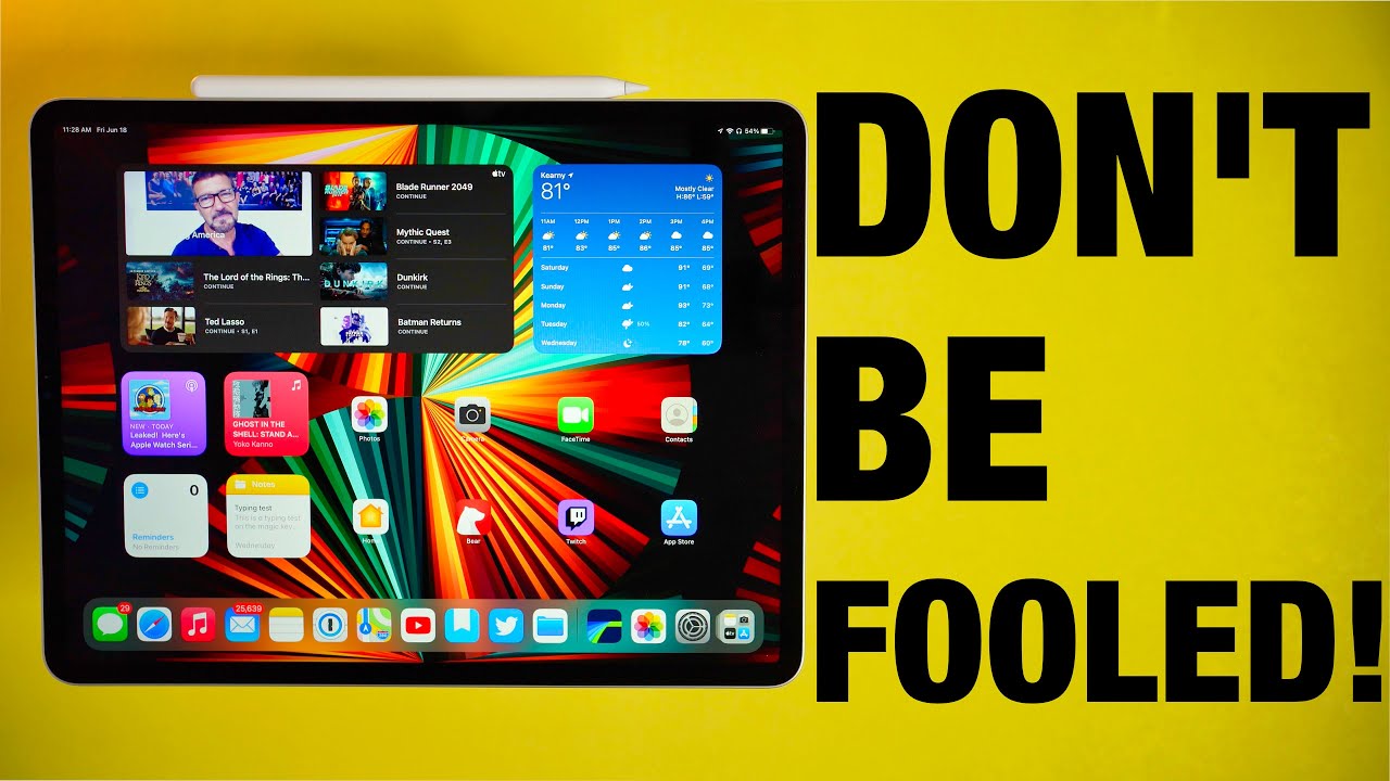
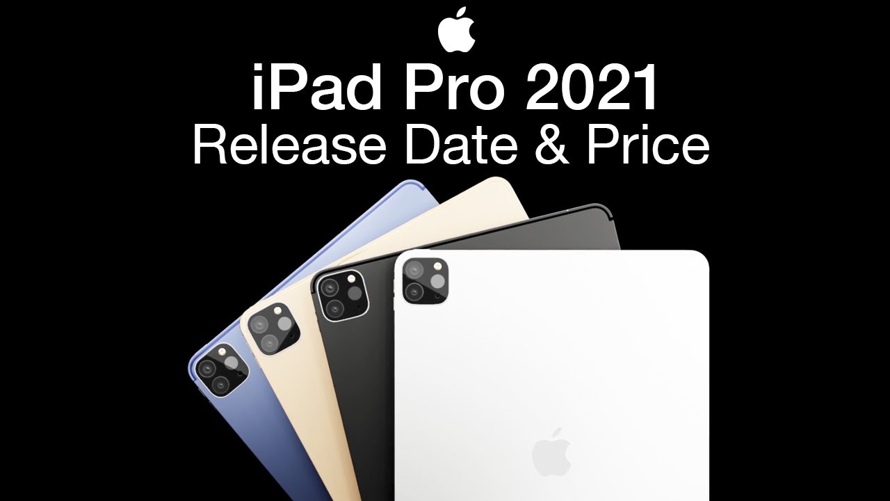
With that being said, let's get into this video. So before we talk about software, I actually want to quickly it'll, probably take a while actually go over the hardware on this iPad Pro, because I really haven't done that yet in any video. So the design here on the 12.9 inch version that I'm reviewing is pretty much the same as last year's 2020 and 2018 model. It still has that same great redesign, reduced bezel, smart connector on the back and Apple Pencil magnetic charging goodness. There are, however, three external changes that I want to talk about.
First, the iPad Pro is just a tiny bit thicker now than the previous two versions and weighs 0.1 pounds heavier over the past couple of weeks. I have been using this iPad Pro. I honestly don't really notice either of these changes. Unless I go back and compare it directly against the older iPad Pro, and then I can visually see the changes in thickness and I can feel the slight weight difference in my hands, that is to say, overall, these are pretty big non-issues for me, in fact, some of you might view this as a design upgrade considering that this slight change in thickness actually makes the iPad Pro a little more resistant to bending and in a Jerry rig everything bent test video. It took significantly more force to bend the iPad and the iPad actually survived the bend test.
I mean it technically survived uh kind of left with permanent scarring for the rest of its life, but hey the other. One was completely destroyed and this one survived. So I guess that's a positive change. Another change is the new thunderbolt 4 port, giving you the same high-speed port connections that you would find on the latest m1 max. This connection is physically the same as the USB-C port, so your old USB-C power, brick and cables, can still charge and transfer data on this iPad Pro.
But if you buy a thunderbolt cable, you can significantly increase. Not only your data transfer speeds, but you can also hook up to external thunderbolt displays complete with 6k resolution as well as thunderbolt, docks or adapters that give the iPad Pro a port selection that would make the recent 24-inch iMac blush. Thunderbolt might sound like a small edition, but it's actually one of the standout features to me, and it greatly increases the versatility of this iPad Pro for hooking it up to even more connections. There's also the display apple's new mini, led technology is here, and its gorgeous mini led is a display technology that allows apple to use smaller, LED lights, behind the display, ten thousand of them to be accurate, to get more controlled backlighting through controlled dimming zones, which this iPad Pro has over 2500 of them for reference. The last version of the iPad Pro had 72 led backlights.
The advantage of this display technology means more control. It's one of the reasons why OLED displays look, so good is because every pixel on an OLED display can be turned on or off individually and, while mini led, doesn't give us that precise control over each individual pixel. It greatly expands the control over regular lcds. This means that on the 12.9-inch iPad Pro, you get increased black levels, meaning the display looks black instead of being washed out like it will on lcds. Those displays can't turn off individual backlighting zones, and they need to keep on the entire backlight, even if only a tiny portion of the screen is black.
So this increased contrast ratio now goes from a million to one giving you almost the same amount of contrast as an OLED panel. The big advantage to mini LED display technology over OLED is the peak brightness levels with this iPad Pro able to get up to 16 000 nits of peak brightness when watching HDR video. This creates a stunning display on HDR content, and it's quite noticeable when putting an older iPad directly next to it and watching the same content combine that with buttery smooth 120 hertz pro motion display, and this could arguably be the best apple display on the market right now there might be a small issue you heard about with mini LED displays, and that is what is called blooming. Blooming is the illumination of pixels, which creates this kind of halo effect, particularly when looking at a dark screen with white UI elements or text. Now, can I see the blooming? Yes, I can see the blooming, especially when again purposely looking for it on a dark background with white text or when holding the iPad Pro at an angle.
You can really see it. Then, however, in normal use case, it's not really distracting to me, and it's not something. I see all that often unless I go looking for it overall, the blooming in those certain areas basically looks how the entire LCD panel looked on older iPad pros. So I would much prefer the mini LED display technology with all the benefits that come with it, and only see that you know light bleed from time to time, rather than it just always being a feature on LCD panels. And if you were looking for similar technology on a PC monitor, you would be looking at three thousand dollars just to get.
This mini LED display technology, so that 1099 price point doesn't look too bad in comparison. There's also a change to the iPad Pro's front camera this year, and it now gets a much wider field of view. This is to take advantage of a new feature which apple calls center stage and center stage is a really cool feature. It basically takes this ultra-wide view. Then it kind of crops in on a human face and then, as you move about you know the scene, the camera will follow you now.
The camera actually isn't physically moving. It's just using that super wide ultra angle view and then, because it has all of that data, it can kind of crop and artificially follow your face. And then, if someone else enters the scene uh, it will actually focus on them or focus on both people in the same scene, and it's kind of just like this dynamic cool feature that when you have your, you know, iPad Pro set up, and you're talking to someone uh. If you move away from it for a little or you kind of move out of you know the traditional field of view that the old iPad Pro used to have well now, this one can actually follow along with you. It's not anything like super crazy, but it's just a nice little touch, and I really like this feature.
I actually really want to see center stage come to the mac. I think that would be great and those are basically most of the new changes. Other than that, though, it's the same iPad Pro you know with the same great sounding speakers same microphones. I think the same cameras, I don't know, I'm not an iPad photographer, the LIDAR scanner and the same accessories too. But this time you can actually get a white magic keyboard, which looks absolutely amazing, and I feel like I'm using my iPad even more with this magic keyboard combo, because I love the look so much, and it has the same Apple Pencil, which I still think is the best stylus experience that I have ever used on any computer to date.
Now we got a lot to cover in this next section, but before we talk about the m1 chip and how far you can push it with iPadOS 15, we need to talk about how to design a beautiful custom website the easy way with our sponsor for this video Squarespace. Listen. If you need to build a website, there's only one service. I know of that's going to be able to take you from a website concept in your head to a beautiful website. In literally just a few hours, that's squarespace makes it as easy as possible to get your website blog portfolio, restaurant, small business or really anything.
You want up and running with literally zero experience or any experience in coding languages, with hundreds of beautiful customizable templates that are as easy to edit as clicking typing and dragging that's all. You need to do to start making your personal website built just for you, and it's how I made the website for my podcast gadget cast Squarespace even offers a full-fledged ecommerce platform complete with online payments through stripe, PayPal and, yes, even Apple Pay. So you can start accepting payments from major credit card companies with just a few clicks and manage store inventory through Squarespace's, easy to use tools. Best of all, you can try it for yourself, absolutely free by going to squarespace. com and when you decide to launch your website, be sure to go to squarespace.
com Greg's gadgets to save 10 off your first purchase or just click the link in the description to get started on your own website. So listen. If you need to build a website, skip the hassle and check out Squarespace, and thank you so much to Squarespace for sponsoring this video. Alright, I think most of the reviews you watched by now have equally praised the hardware of the iPad Pro like. I did hardware wise.
This iPad Pro feels near perfect and the m1 chip inside it means thanks to apple's marketing genius you're, now getting the same performance as the latest m1 max, and the configurations for this iPad Pro are literally the same as those macs with up to 2, terabytes of storage and up to 16 gigabytes of memory. The one terabyte version I have also has that same 16 gigabytes of memory and if you're, asking if that 16 gigabytes of memory is worth it or if it makes a difference. Well, that's an interesting story. So, right now, even in iPad, OS 15 apps are limited to a hard limit of 5 gigabytes of memory per app. That means that if you're using an app that would take up more memory like photoshop suffusion affinity photo or procreate, there will be no performance difference between the 8 gigabyte and 16 gigabytes iPad Pro.
However, I don't know how you use your iPad Pro, but I am constantly switching between apps and different slide overviews all the time and what I can say about this 16 gigabyte iPad Pro. It may not be able to take full power of all this extra memory on a single per-app basis, but it means that in the couple of weeks that I've been using this iPad Pro, I have had apps stay in memory for literally like an entire week, and I have never had that happen on any iPad like I could go back and forth between the first app I opened to the 15th app I opened, and the first app would still be in memory, meaning I didn't have to wait for a loading screen. When I went to go relaunch it, I could instantly jump back into whatever I was doing, and I felt downright spoiled. With this experience, like I had a luxury iPad that was just custom-made for the best iPad experience possible out there with zero speed, bumps or potholes on the iPad highway. The m1 chip was also speedy and fast.
Every interaction with this iPad Pro is effortlessly, smooth and apps load fast. I can edit photos with multiple layers, and it exported video just as fast as my m1 MacBook Air, oh just as fast, I meant to say, even faster, exporting a 10 minute 4k clip with similar export settings in 4 minutes and 38 seconds, while the MacBook Air took 6 minutes and 19 seconds for the same clip wow. This is sounding like a great device Greg as fast as a m1 mac and with superior hardware. Sign me up. Well, don't be fooled.
This is the iPadOS 15 review and if you noticed, we haven't talked too much about the software itself, and I was just hoping for so, so much more. Don't get me wrong if you love the previous way you interacted with iPadOS you'll love this newer version of iPadOS, which to be fair, does make some much-needed improvements in multiple areas and even has some nifty new features that I have fallen in love with, like apple's new quick note feature, which is one of the coolest new features in iPadOS, where you take your Apple Pencil swipe up from the bottom right, and this floating notes window appears where you can instantly start jotting down notes. On top of that, when you are taking a quick note in safari, you can add the link to the web page and anytime. You go back to that web page in safari. Well, now you get a pop-up for your notes in the bottom right of your screen.
You can also get these quick notes by selecting text and pressing the new quick note feature and when you add a quick note this way the note remembers exactly where you highlighted this text, and you can quickly tap this in the notes window to jump between different highlighted sections. The iPad Pro like, if you're a student, and you're looking you know between an iPad and a mac. This feature alone, I think, just makes this like the ultimate digital notebook now other additions, like widgets, are less impressive to me and I feel like it's playing catch up with iOS 14. , there's nothing new and revolutionary about these features, but at least they're. Finally, here helping you make better use of your bigger iPad Pro home screen and the app library is even more at home on iPadOS, where the bigger screen gives you a full view of every folder for your apps and lets you declutter your home screen with only necessary pages for your most used apps, combined with powerful, spotlight search.
This makes me feel like how I kind of use my Mac in a lot of ways using spotlight to either open up apps or get information or by using the launchpad feature on Mac. So this is kind of like a one-to-one scenario where the mac and the iPad feel kind of similar. Now other useful small changes just really improve the overall experience in ways that used to be so frustrating like by finally adding a progress bar in the files' app. That alone was enough to almost have me ready to switch to the iPad full time. Well, almost listen.
Multitasking remains almost identical to previous iterations. Now, to be fair, there are some much-needed changes. First, there's now a three button prompt at the top of every app, which makes multitasking much more discoverable than the slide over gestures we were using before it invites new users to tap on the top of this area and play around with multitasking in a way that I think we're going to see a lot more basic iPad users start to try out this multitasking feature for the first time. It also makes accessing any app easier with multitasking, because they're not limited to the apps in your dock with slide over gestures. Now, when you do tap the top button, you get a complete view of your home screen, and you can select any compatible multitasking app to enter into a slide over or split view mode.
Now, while there is an additional new window, you can access by pressing onto a section in the slide overview, to bring up a temporary middle window. I still don't think these multitasking ideas go far enough aside from just surfacing the multitasking and making it easier to enter. It doesn't address the problem of giving us more control over the placement of our apps and how many we can have open on the screen at one time, especially on this bigger 12.9-inch iPad Pro. Why not? Let me have three apps open side by side or how about a windowing system that can be flexible and let me open any app in the same user interface as the quick notes feature letting me reposition or resize this window dynamically, rather than being stuck with what I think is a very static slide overview and even if apple kept. This version of multitasking apple should acknowledge that it only makes sense on the smaller screen sizes of the iPad Pro, because, while this iPad can connect to a 27-inch 5k display with its thunderbolt port, the experience is less than ideal, with a screen resolution that doesn't adapt to the aspect ratio of the larger display and while connected in this mode, I would love to see an extended desktop mode.
That does more than mirror the display of your iPad, and I would love to let it have apps that you could run in full-blown windows like you could get right on your Mac. I get why that isn't the case on the iPad itself, but on an external 27-inch display apple could and should do more, there's also the lack of apple pro apps. Listen I'll, be the first to say that the iPad Pro has a very diverse, very large selection of apps that are number one basically cheaper than anything you could find on an equivalent program. For the mac I mean suffusion. A popular video editor is 30 on the iPad, whereas Final Cut Pro is 300 on the mac.
There's also apps with feature parity on the iPad Pro photo editing apps, like affinity photo on the iPad, basically give me all the tools that I could find or use on. The desktop version of affinity photo, and it's also 30 cheaper than the mac version, and while I don't use Photoshop adobe does have an iPad version of some of their apps like photoshop and illustrator, and other amazing apps like procreate. It really is kind of like the ultimate drawing app if you have an apple, pencil, and you're using it. For you know, drawing or editing photos again. This iPad Pro remains a fantastic device.
However, as someone who edits video primarily on my computer, the iPad Pro still isn't there for me not for a lack of power, but for a lack of software. While suffusion is a great app. It's not the app that I use, which is Final Cut Pro and after 10 years of iPad and the iPad now sharing the same exact m1 chip as the 24 inch iMac. That's behind me, where I edit my videos, it's time for apple, to eat their own ROG food and give us pro apps of Final Cut Pro optimized for touch on the iPad Pro. It would go a long way in making this a device that I could use to totally replace my MacBook Pro with, and that goes for other apple pro apps too, like logic and while swift playgrounds is finally going to be letting iPad Pro users write and submit code to the app store for the first time and that's a big step.
It's also not enough for professional developers, who I see all the time in my comments, and they use Xcode to write all of their applications for apple's products. This is something that can only be done right now on a Mac, and even though I'm not a developer, I empathize with developers who want this app to come to the iPad as badly as I want Final Cut Pro on my iPad Pro. It speaks volumes when the coolest feature I saw at WWDC was what apple calls universal control, which lets you control your iPad Pro from the same mouse and keyboard that is connected to your Mac, and it will even let you drag a file from the iPad all the way over to your Mac, and while I'm looking forward to utilizing that feature for my iPad Pro, it's still the iPad Pro as being a secondary device. Listen, I made an entire video talking about why I would not want the iPad Pro to ever run macOS, I don't think macOS on the iPad. Pro is the right answer, but I also don't think this version of iPadOS 15 is the right answer either.
It might be fine for basic iPad users or iPad Air users and honestly, let's, let's be totally honest. This is like 10 to 5 of power users who use the iPad Pro who are really complaining here, but I do think that apple needs to make some concessions to this market they're a very influential market for those users as clich? as it sounds, they need something more pro and what I mean by that is an iPad Pro that, even if it doesn't use the same interface as macOS or does things differently than macOS, it should still be a device that could and should be a complete replacement for macOS. If I choose to do so, for some users, the iPad Pro can already do that, and if my complaints about multitasking or software didn't resonate with you, I still recommend this iPad Pro because it's still great at what it does, and it's some of the best hardware that apple sells right now, and I still think it's one of the most creative and versatile products that apple sells right now. It can be a tablet. It can be a drawing canvas, a camera and a complete full-blown laptop alternative.
Despite my gripes 80 to 90 percent of you, I believe can use this iPad Pro as their main computer, and I know some of you already are, and you're loving it. If you have an iPad Pro or an iPad, that's older than 2018. Now is a good time to upgrade. If you have a 2018 or newer iPad, I still think you can wait, especially if you want it to upgrade to the 11-inch version it doesn't have the mini LED display. So it's not nearly as big of an upgrade for me.
I love the iPad Pro. I will continue to use it as a third device that fits in between my iPhone and my Mac, but as of right now, it's not a device that I could personally use to completely replace my Mac, and I'm hoping one day that it can alright everyone. But those are my long thoughts on the 2021 iPad Pro and iPadOS 15. Please let me know in the comments below do you agree with me or do you disagree with me? What do you like, and what do you dislike about the new iPad Pro, and could you use it as your main computer, or are you like me, and you're going to use it as a third device? As always, if you like this video, please show your support by giving me a like, if you want to see more from the channel, well make sure you're subscribed if you want to help the channel out in any way check out some links in the description. If you want to follow me on Twitter, you can find all the social media links there as well and as always, thank you so much for watching I mean if you got to this point of the review.
I mean this is a long video. So thank you so much for watching bonus. Thank you for the people who made it and, as always, uh take care, and I will see you all in the next video I said: take care already, but take care again have a great day, bye.
Source : GregsGadgets



![Samsung Galaxy A7 (2018) Unboxing [4K]](https://img.youtube.com/vi/c3UOlxgMjFY/maxresdefault.jpg )
