🤖 how to have an aesthetic (android) phone | SIMPLE, EASY & storage budget ver. 🤖 By yla joan
Hello, welcome 🥰 In this video i'm going to be sharing my tips on how to make your (android) phone aesthetic ✨ Quick disclaimer though: aesthetic is defined as appreciation of beauty, so it's basically different for each person. Hence I'll try to include several aesthetics in the end of this video. But the tips I'll be sharing are mostly based on MY idea of what is beautiful or pleasing to look at. Also this has been requested by a couple of you guys that came from my other phone videos. A number of people had questions about my display, like what font or theme I used. So i'm going to be answering those in this video.
I also got a lot of compliments on my phone so first of all, thank you very much 💜 But mostly I read a bunch of comments saying how seeing my video made them feel confident about their androids, which made me want to make more phone related content 👾 But these comments also came along with their stories about being JUDGED for having one. Which made me really sad and mad 😡 In reality your phone doesn't have to be pretty or to be of a certain brand. What's important is that it serves its purpose of being a phone. Which is to carry out certain tasks more efficiently for us, like communicating, researching, and the like. But with that being said, if you have the extra time and effort to spare, and you're one of the people who asked for these, or if you're just bored... here are my tips and how to make your phone cuter 😙 First step would be to pick out a sleek phone case.
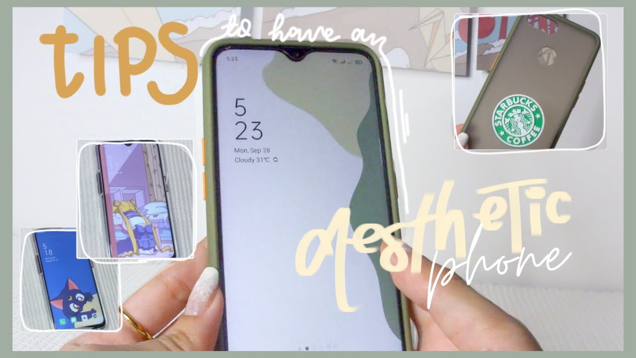
As much as possible we want a case that looks lavish or high quality. Emphasis on 'looks' because of course it doesn't have to be literally expensive. You can get really cheap ones in Shopee. And in buying make sure to check out the reviews, especially photos to see how the products look like in person. Because sometimes it just ain't it sis.. (pls laugh) 🥺 Let's say I'm choosing this green bumper case with this Starbucks popsocket.
I personally like bumper cases the most because they make my phone look a bit bigger and they offer more protection than the regular jelly or hard case. Plus this one has that lavish look I mentioned earlier that we were looking for. And despite that, I got it off Shopee for only 70 pesos. Next up would be to choose a wallpaper. You can either start by picking a lockscreen wallpaper then for a home screen wallpaper to match it, or vice versa.
I do both, whichever I find first, but for the sake of this video I'm going to start with the lockscreen. And I'm pretty sure you already know where to look for really aesthetic photos 🙄 And that would be in Pinterest (dUh) Simply search 'aesthetic wallpaper/ lock screen' for a general selection of photos. But if you already have a specific type of aesthetic you're looking for, like soft, 90s, pastel, k-pop, or whatever~ Go ahead and type that in! M tip would be to pick out a photo that would not disrupt your time widget. The placement varies from phone to phone, but since mine is located here, I always make sure to select a lock screen that would have a clean upper left corner. Or if it's a pattern one like this I would only go for it if it doesn't overpower the widget to the point where I can't decipher what time or date it is.
I'm choosing this photo of Changkyun (I. M) from Monsta X 🥰 since the shirt he's wearing is green, which makes it cohesive with my case and it's very very important that you try to find a photo that is high quality and not pixelated. Now I know a lot of people with androids like downloading themes or fonts but personally I like just having the default settings on. You may then think, "What's the point of getting an android then if you're not going to personalize (customize) it?" Well I just like the minimalist and classy look But if you're someone who likes to personalize your phone, my tip is to not go way too overboard with it I made this mistake in middle school and i ended up with a super laggy and cluttered phone.... But then again it was what was trendy back then so... And speaking of trends I'm not really going to apply the widget thingy that's gotten popular lately because of the new IOS update, and the reason being: I've had this phone for about two+ years now, and it only has 64gb, so i don't want to waste my storage in that.
So I guess that's another tip: don't force yourself to hop on trends or download apps especially when it could compromise the performance of your phone. So let me just look for a wallpaper again, but this time for my home screen. I think I'm keeping this green theme because of my case. And green's my favorite color as of the moment so 💚 I think I'm going with this one since I like how it's not too plain, but at the same time there's nothing much going on in it that can otherwise make it look cluttered and I also just love the color combinations. Next I've always liked keeping my app widgets or icons the way that they are because I find that it's easier to spot the apps that I need when they're like this as compared to when they're like... this.
But recently Oppo has made a new system update, and apparently we can now edit our icons. And this is just how I customized mine. Nothing much, just a decent size that's not too small, and not too big either. As for how I arrange my apps, I already explained this in my 'What's on my phone' video and nothing much has changed since then, but basically I like to keep my first page blank, with only the time widget for a clean space. The second page contains all the essential and pre-installed apps.
The third has my most used and social media applications. While the last one just has a few games which I rarely ever use. I know some people like to color code, as well as put all their apps in one page organized in different folders, or both. Which are also very cute ✨ But again in the end it all boils down to personal preference. Anyway this is our final look! This has actually been my current setup for weeks now andI just set it to default for this video.
But let me show you guys other setup ideas that I came up with, following the same tips that I mentioned :) And that is all for this video ✨ I know it was a bit basic but I do hope you still got a thing or two from it, or perhaps it just entertained you somehow. Thank you very much for watching and I will see you on my next one, bye 😘.
Source : yla joan
