Google Pixel 3 XL Review! By Tim Schofield
Everyone Tim Schofield here it's time to do my full review on the new Google Pixel 3xl the latest flagship from Google. Also, this is the first video I'm shooting on my new DSLR camera. Hopefully you enjoy it. Hopefully you see an improvement in video quality. It still is a learning process. For me.
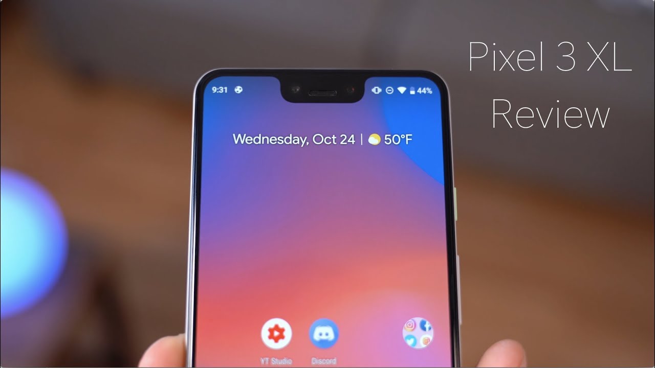
So cut me a little slack drop a comment. Let me know what you think anyways. We have a lot to talk about with the pixel 3xl, including the notch overall design that camera on the back as well just going with that single lens. So, let's get in the full review. The pixel 3 XL and here is a look at the pixel 3xl I'd like to start with design flipping it over on the back very similar.
Look to the previous pixel models with the fingerprint scanner right there on the back a little softer touch feel and, of course it is a glass back, because there is wireless charging now a little of a two-tone as well, which shows more on the plaque model. This is, of course, the white model, with the mint green button, and overall I am a fan of that green button. That Google has decided to go with, however, I'm, not a big fan of the button itself, the volume rockers are great, they feel sturdy premium. However, this button, just kind of has a little too much give when you press it on the top and bottom of it you'll see it just kind of rocks a little too much. You really have to press it in the center for it to really just go all the way in you'll see here, just pressing it on the bottom doesn't really actually press that specific button, which can be a little frustrating at times and just give it a less premium feel in my opinion, now the pixel 3xl does not have a headphone jack.
However, the box does include a dongle, so you just be seated 3.5 millimeter headphone jack. If you'd like to use those, it also includes some headphones, which are fair, they're, nothing, crazy, special. The only thing that really does make them special is the middle button. You can press and hold to activate the Google Assistant, so you can go ahead and ask you questions. It will read you notifications, but overall, sound quality is just fair.
Also, it can get a little uncomfortable with those hooks in your ears. I find that that fingerprint scanner is in a perfect size for me and my hand size also, it does have the gestures where you can pull down that notification tray as opposed to going all the way up to swipe down in the notification. So it makes it easier with the larger screen. Google did decide to go with a single camera more on that in a little. Also, of course, the glass back for wireless charging and when it comes to wireless charging on the pixel 3 at the event in New York that Google hosted, which I was actually at they announced it has 10 watt capable charging for Wired quick, fast wireless charging, which is great, that's awesome.
They included that. However, it is found out that using that and utilizing that 10 watt wireless fast charge is only capable on their pixel stand, which I do have right here. The pixel stand is I, believe $80, and you can only use 10 wide charging with this stand, which is ridiculous to me. The fact that you can't take advantage of the capability, as this has with any other wireless chargers, a little ridiculous that is, as of this video I, have occurred. Google responds to this.
If there's a specific reason other than just hey, you have to buy our wireless charging stand. If you want to utilize this fast charging, I'm, not a hundred percent sure, regardless I hope they push out an update to make it. So it can utilize that fast charging on other compatible wireless chargers. We will see follow my Twitter I'll. Keep you guys updated if that's the case, but at the moment 10 watt wireless charging only available on this pixel stand down at the bottom is a bit of a chin, and that is because there is a front firing, stereo speaker down at the bottom, which I'm a big fan of I'm, okay, with sacrificing some bezel space for front firing speakers.
These speakers are great. They sound awesome. The sound comes at you when playing a game watching a video well done, Google and then, of course, two up at the top. Here is the other front firing speaker just built into that earpiece. Also, you will notice up at the top to the left and right of that earpiece.
There are two cameras, so a dual camera system on the front more on that in just a little and when it comes down to it that notch is a little deeper than other notches on other phones and for me the biggest problem I have with it is the space that it takes up on the display itself. You see that status bar is just so thick up at the top and just feels like it wastes a lot of that space that could be utilized. You'll also see in the upper right hand, corner there, there's a dot next to the Wi-Fi hotspot icon, so I do have hotspot on I have a Wi-Fi on, but I also do not disturb mode on, and you will see there. It hides those specific icons with that dot, and it does the same. If you have notifications on the left side, it just puts a dot there.
Saying hey, you have more notifications, so maybe they could have added a second row of notification, something like that just to utilize that more space because of the for notch and the same thing happens on the left side. When you have notifications you'll see, it only shows two notification icons, which is way too little. In my opinion, it seems like they could have utilized this real estate. Maybe add a couple rows of icons instead of just two in a dot. It even looks like that dot takes up more space where you could just put a third icon and maybe just a smaller dot.
Next to it, the pixel 3xl has a six point: three inch 1440p OLED display, and I'm a big fan of it. It's definitely an improvement over the two XL's display when you're outside it gets bright enough. Colors look great they've really popped, with, of course, that OLED technology and with OLED the blacks are completely black, which helps because there is a very useful always-on display, showing you date/time, weather notifications and battery percentage, and with this great display, it's awesome to consume content, whether you're watching a video, whether you're playing a game. But of course this is where the notch comes into play. If you're watching a video in full-screen, the notch will jut into that video, of course, the same with any other phone with an ATS.
However, since this notch is just a little deeper, it just cuts into that video or game that you're playing just a little more, which can be annoying at times with the pixel. You only have a couple options for storage, 64, gig and 128, which is a bit unfortunate because there is no expandable storage, no micro, SD card slot, and that just seems a little low at this point in the game only offering up to 128 gigs, especially without that expandable storage. The pixel 3 XL has a 3,430 million power battery, which sets it apart from the pixel 3. As you can expect better battery life on this device and overall I'm a little underwhelmed with the battery life, that seems to be just about the same that I was getting on the pixel to excel, of course, over time with battery optimizations. It should get better you'll see here at 4%, left I had 5 hours 48 screens on time, which is very good.
Don't get me wrong. Battery life is very good and then, if I swipe over with 35% left three and three and a half hours screen on time so overall for me, as long as I can get over 4 hours, 45 minutes screen I tell me gets me through the day just about so yes, this phone does get me through the day, but was expecting maybe a day and a half, maybe like a day in a couple of hours when I wake up at 4:00 forget to charge it. Of course, it does that fast charging, which is a plus now also if I, do, want to go ahead and jump into settings real, quick scroll down. We can go ahead and go into battery, which is where, of course, it does have adaptive battery so over time it learns your patterns, usage patterns and should improve battery, so I, don't know if I use this phone for six months, if it's going to actually improve that battery over time, pixel 3xl has the Qualcomm Snapdragon 845 processor, coupled with four gigabytes of RAM and in terms of performance when loading up apps things are very snappy. Things are very quick.
The UI overall is very snappy. If I wanted to open up and swap between a couple apps, it jumps between them really fast. If I wanted to do some higher-end gaming, we can so if I wanted to go ahead and run through one of these games. Now I do want to talk about gaming in general, because, of course, some games developers have optimized it for this display with the notch. So you'll see here, it's actually a little difficult to play.
This game I find that I just have to use that notch corner in the bottom left to actually go left and right. So it just kind of depends on the game, but some games can be a little annoying to have that notch they're, just kind of in the way you'll see here. This is asphalt 9 in case you were wondering and then, for example, you have other games that haven't been optimized for the nuts. This is Altos, Odyssey and you'll see you do not see the notch at all. It just cuts out the entire screen.
This is maybe a choice by the developer. This may not be optimized for it yet, but overall you will see you just kind of have an option of whether you want the notch to show in the game and it can be a little intrusive or you can just cut it out, and you just have a bigger bezel here. Anyways I want to go back to s fault.9 I did close out of the other game that I had opened and talked about that 4 gigabytes of RAM 4 gigabytes of RAM should be more than enough to successfully run the OS have a bunch of apps in the background. I'm going to go ahead and hit resume real. Quick and what I found so far while using this phone is that Ram management has been pretty poor, I'm, not sure if this is luckily something that can be fixed with this future software upgrade.
So this is Android related, but it just seems like sometimes not all time when I'm doing some multitasking. So let's say I wanted to go into the Play Store go through a lot of times when I try and go back into apps over after just a little amount of time. I find that it rehash to reload that app in just a short time. It's not a crazy long time that you have to wait, but it's longer than I've experienced on other devices. Also, I found that it will kill some apps that should it be killed in the background when I'm quickly swiping through so let's go ahead and maybe load up the calculator go ahead and tap on that.
If we load up the camera, maybe snap a quick picture here and there go back home and then what? If we wanted to go back into that game, you swipe up pause, and then we can go back into asphalt right here, and you'll see here. Look at that prime example of it reloading the entire game and I just think it's a RAM management issue. It's a software issue that should not be closed out I. Do this exact same test in other videos where I just go into the Play Store camera calculator do a bunch of things and come back to the game, and it's just fine. So it's definitely not four gigs of RAM.
It's actually the software causing the issue, which has been a little annoying. In my opinion, on the pixel, you do have a 12 point, two megapixel camera with optical image, stabilization and then on the front of the device. You have a dual camera system. Both are 8 megapixels except one of the lenses, is an ultra-wide lens. So you can get a lot more into your shot, specifically when you're taking those selfies opening up that camera app.
Here we have a bunch of different modes down at the bottom, just rent, a normal camera. You have a portrait mode panorama, of course, going over to video and more I do want to talk about video settings. First, audio recording, isn't that great Google has addressed it. They said that they're going to fix it. We will see if I jump into more settings and want to go into actual settings.
The back camera only shoots in 4k 30, which I think other flagships at the moment are all at 4k 60. So a little of a bummer. If you shoot video, keep that in mind, you only have 30 frames a second as an option. The camera app also features Google Lens built-in. So if it wanted to, you wanted to go ahead and maybe tap on an object, there's a couch right there.
It brings up similar looking couches, maybe if you're at a store, you say: oh I, like this style, let's load this up or something more specific, maybe a coke can or something like that. It will actually recognize it and bring it on up now, of course, with this camera it does not have a telephoto lens, so it just uses digital zoom. They have a bunch of AI features to take a bunch of pictures group them together to make zoomed in pictures look well and, as you can see by this picture, I'm showing it does look good, but I found that it's not as good as other flagships with telephoto lenses. Having that optical zoom with the telephoto lens just makes it a little better. So I kind of just wish Google would have added a second lens.
They just decided to go with their AI capabilities now. I just want to show off some pictures that I did take with the pixel 3 XL and I find that this is definitely one of the best, if not the best camera out there right now, HDR mode is just incredible. Their software processing with images is insane, and it only continues to get better the amount of detail on these shots, especially when there's just a lot of exposed areas going on there HDR mode. Just does such a good job. At balancing that color and balancing that brightness in low-light scenarios, it does a good job as well.
I would say this might be the only area that it could improve upon and Google has an answer for that, and it is called Nate's site now night, sights a feature coming to the camera later this year. It has not released just yet, however, I do have access to it via a modded, app you'll see camera p3, now I load it up, and here it is. This is just the standard Google app with the nitrite enabled. So if I go into more, it's actually right there in night mode and if I go ahead and snap a picture right here, you have to hold it still. This went really fast.
However, when you are in the dark, it will actually take a lot longer than it did. It just knows that there's a lot of light right now, so moving into a very dark room right now you will see in the regular camera mode. It says it's dark, try, night mode, so it gives you that option to say: hey, look it's too dark in here. Unfortunately, you cannot tap on that to jump into night mode. You actually have to tap on more and switch to that night mode and look at what this viewfinder looks like.
Don't worry your screens not messed up, let's go ahead and actually snap a regular picture first, so let me go ahead and just hit press there. We go, so it took a picture there now I'm going to into night mode, and we're going to take that exact same picture now, when you take a picture with night mode, you really have to hold it still. That's kind of a key as you'll see that status bar right in the middle. Pretty much takes a long exposure shot and there we go so now that that is complete. Let's take a look at these two different pictures, so here's the one without night mode.
Look at that can't really see anything at all. You really don't know. What's on the desk swiping over to that night, shot the night sight mode insane. Obviously, it's really difficult to read text. Things are very grainy, but you can definitely tell what things are.
You can see the floor a desk wall over here. You can't really see anything in that shot, so this just seems like magic almost again, this isn't out. Yet. However, here is some testing with the night sight. This is just the standard camera app now, if I swipe over this is with night sight, and this isn't a very dark room.
This is actually looking brighter than it was in real life. However, it makes it even brighter, and you do have a lot more colors popping some more texture as well as opposed to it being very dull and not as colorful now another example. If I swipe overlook at this look at this picture, can you tell me what that is? No, you have no idea, because this was an almost completely dark room. You can see. You do have a little of color right there, a little of objects right there, and I swipe over again.
Look at that same picture, regular low-light, camera, just the normal camera. This is nitrite insane. Obviously it's going to be grainy, but look at how much you can see in comparison to just using that standard lens incredible, and it works on the front-facing camera as well. This is the standard one. This is with the flash on and then here is with night sight.
So you'll see here a big comparison difference just a huge difference. It really amazes me how incredible night sight works again, not out yet, hopefully they release it soon, but in this case with the front-facing camera I, actually like the flash picture better than that night side picture, that obviously looks a little really grainy. This looks a little more natural in terms of colors and, of course, looking at the front-facing camera now I'm. Personally, not a big selfie person. You guys might man have gotten that from my other videos as well.
However, the is nice having an ultra wide-angle lens on that front-facing camera. Look at how much more can get into that shot. They have software that makes it, so the sides don't look distorted the shots, look perfect, so kind of I'm, okay with selfies. If they're in groups I'm not a big self solo, selfie kind of guy, you can zoom in even more if you'd like to that's digital zoom, but of course having that ultra wide-angle lens is a nice addition. And, of course, since this is a pixel device from Google, you will get updates.
First, it does run Android 9pi, which is the latest operating system. At the moment, I do have a video kind of really over viewing Android 9pi I can link to that down below, but in general it has a lot of great features. However, I want to talk about the gesture navigation, where you swipe up pause, and it brings you some suggested apps. If you actually swipe up and continue, it will bring you into that app drawer. Overall, the gestures feel a little clunky at the moment.
I know some people really dislike them, I, don't necessarily dislike them, I'm, just not the biggest fan of them. You can quickly swap between apps with that swipe over gesture. Obviously, there's a full screen app, so, let's close out of that close out of these full screen apps. So, let's say if I want to quickly swap I, just quick swipe right on this pill down at the bottom and of course it brings up a back arrow if you can actually go back now. Overall, you'll see when you're in an app this whole bar is blocked out anyways, it's not even using this space down at the bottom, so gestures don't necessarily seem necessary.
In my opinion, it seems like this whole bar is blocked out already. One I just have a recent apps button. There I don't need a swipe up to go home, gesture or a'm. Sorry, a press to go home and swipe up to go to the recent apps gesture overall I wish they just would get rid of this pill and not have a button at all and really go with a full gesture system similar to that on, yes, Apple's latest devices, I think they do gesture as well. Some other features I've enjoyed quickly about Android 9 pi is actually the jump into grayscale, which can automatically turn on at night.
I find it's much. You just find things less interesting when they're in grayscale. It's its astonishing, how much color matters to the human eye, just finding that it's easier to wind down in wind down mode on this phone, so a nice addition also within settings of course, there's digital wellbeing, which is in beta, but it works for the well. If you want to take a look at how much you're using your phone, what apps you've been using? How many notifications you're getting you do? Have that option also a feature I love on the pixel is the squeeze for the Google Assistant. I use it all the time.
I wish all Android phones had that or and even the iPhone had it to activate a voice assistant. Just a really nice addition. I hope they continue to use the squeeze function on future phones. There's also the flip to Shh with three H's, which is in beta still it works. Well, you just flip it upside down, puts you and do not disturb mode, maybe you're at dinner.
You have that option. So that's just about everything. I want to cover for now on the pixel 3 XL a lot more to come so be sure to click that subscribe. Button overall I have enjoyed using the pixel three XL just a couple of things about it. I have been frustrated with such as that RAM management I talked about in the video, of course, that notch can be a little annoying with all that wasted screen real estate.
However, there are very good things about this phone. The camera battery life is good, gets me through the full day those front firing. Speakers are incredible. If you consume a lot of media, it is a great experience. Having that sound go right at you in stereo sound now.
Luckily, some of these issues I'm having can be fixed with a software update, so hopefully Google gets their act together, pushes out an update and, of course, another Pro. You get updates first, when there are newer versions of Android out. So that's just about it. Everything I want to cover on the Google Pixel 3xl I really hope you enjoyed this video definitely drop comment. Let me know you think about the phone itself.
Also. Let me know if you liked the differences and the video shots all that good stuff, so look forward to hearing from you guys and as always. Thank you very much for watching.
Source : Tim Schofield
