Google Pixel 3 XL Review - When Love Meets Notch! By Pocketnow
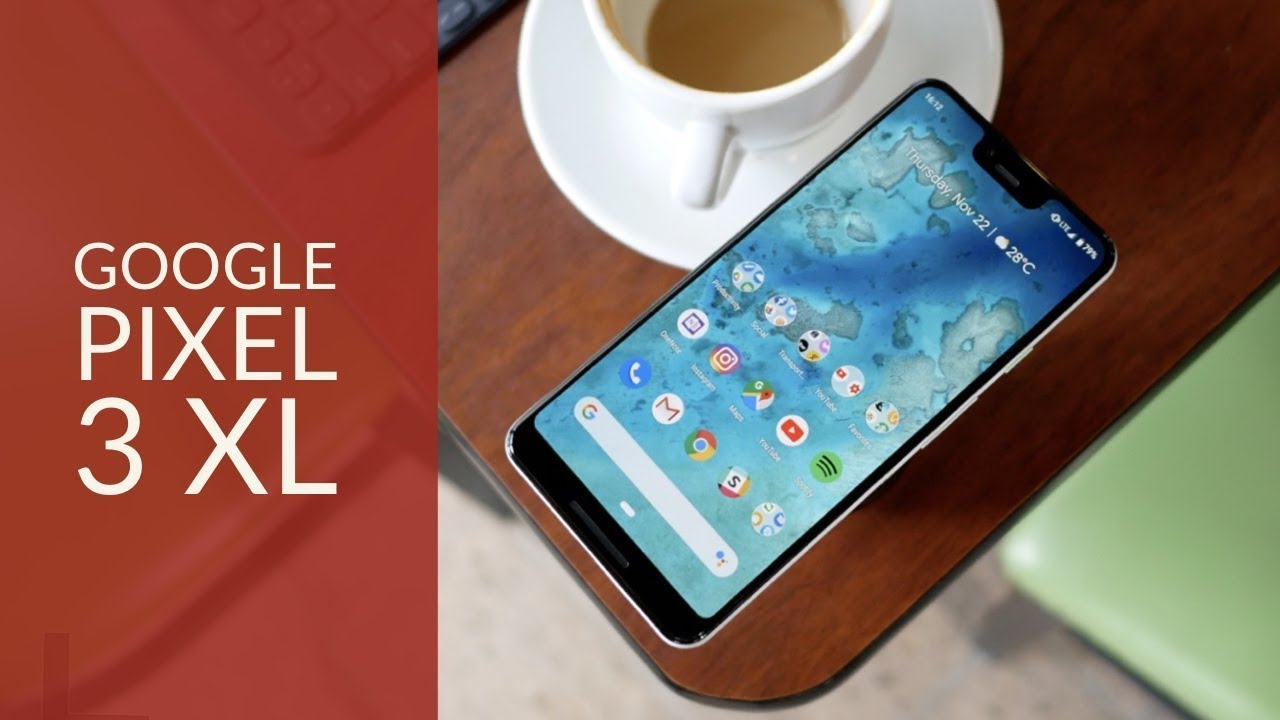
What's your best example of a love and hate relationship. I know for some of you. It could be with a spouse or significant other for others. It's a job or a co-worker, or even a season of the year. For me, it's with a phone, a device that I love so much that I have a really hard time forgiving for some odd design choices as they get in the way of making it great I'm, hiding out with pocket. Now, when it's time for a review of the Google Pixel 3 excel.
Just to give you an idea of how much of a pixel user I am my first ever Android phone was a nexus 1 and then almost every nexus after that, which means that I naturally drifted to the first pixel, even if I found it hideous, which means that the Google Pixel to excel follow later once the screen issues were addressed, so I'm not new to the idea that Google doesn't really focus on building pretty phones, they're, a software company and building a useful product that disappears into the experiences more important. The problem is when that particular premise isn't meant and design gets in the way of execution, but first let me be fair and begin this video by telling you what's great about this phone. One of my favorite things is simply this phone at a glance. You guys have no idea how much I love this. Clearly white color option permits back, it looks elegant, it looks sleek, it looks.
Different I mean what other manufacturers, using this color with so much intent and with the tiny black details and the ports, along with the green power button, just adding to its visuals I'm. Also, a huge fan of this frosted finish along with the smooth accent at the top. Surely the glass means added heft, but the finish makes it hard to notice fingerprints or smudges I have a feeling this will age better than last year's coat of paint over aluminum, but keep the borders protected, as my unit already showed me that it will chip and scrape on a drop another benefit of this glass is that wireless charging is now in tow. You know I've never really cared much about it, but that was before I use this phone with the pixel stand. I've always said that I'll start caring about Wireless charges whenever it doesn't limit.
My use of the phone and the pixels stand actually augments it. The phone becomes a sort of Google home, and you also have the advantage that this charger is faster than average and so many dollars. It's not cheap, I'm sure your pixel will charge with other cheap based pads, but all this added functionality only works with a pixel stand and okay, fine I, admit, I've, never spent this long talking about a wireless charger, but then there's the camera. It's simply a memorable for Google to stick to its guns and only provide one primary shooter and making multiple cameras on competitors look awful in the process. We have a 12 point: two megapixel shooter at F, 1.8, aperture, 1.4 microns and a 28 millimeter equivalent at the front. The approach is different, with two 8 megapixel shooters, one of F 1.8 aperture and 28 millimeters and equivalent, and the other of F 2.2 aperture in a wider 19. Millimeter equivalent, when it comes to photos, a pixel is a pixel.
It is just one of the best cameras of the Year class-leading dynamic range on backlit photos thanks to its HDR+ made possible by computational photography. Some photos are simply surreal, even too good to expect from a regular camera which can be good for those looking for great Instagram pics and not so good for purists and then there's portrait mode which once again, is class leading but more on the side of too good, too aggressive if compared to a real camera. But then again, let me just say this: the pixel doesn't have to abide to trying to replace a camera. I feel that the pixel is unique. This added versatility should be just considered the pixel experience, I mean even selfie.
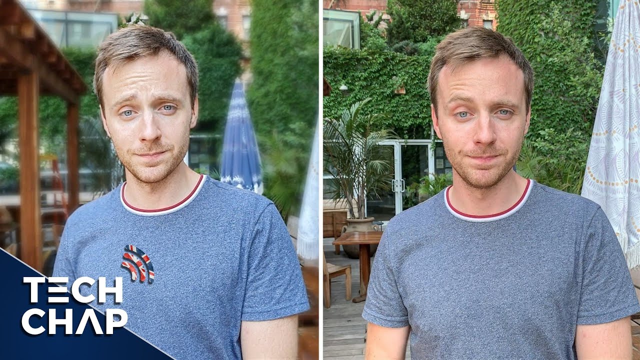
Photos don't have the benefit of a regular and wide angle lens, both capable of the same portrait mode. That's really hard to beat in skin tone and detail. You know what else works in the selfie camera that doesn't work on any other phone sites. I've been testing it for a couple of weeks now, and I'll call it perfect. It's not at the level of Huawei's night mode, because you need to hold the phone really study if you want to avoid grain still, it's a welcomed addition to half, and it's awesome that you don't have to really worry about either using the primary shooter or the selfie.
One. Video recording on pixels is also fantastic, great dynamic range detail, and this is also one of the best cameras when it comes to stabilization I. Just wish it supported 4k at 60, but the hardware is capable, so maybe we get a software update later, who knows and then selfie video has not just the advantage of great civilization, but every vlogger will tell you that a wide lens is a must, and here it is in its full glory, though sadly, it's lacking on the same stabilization of the primary, even if it's not really that bad and really notice. Just how crucial software is to all this awesome experience, as I mentioned earlier, Google is primarily a software company, and it has spent the last 3 generations showing us that the phone is merely a terminal, a window if you may, and quite the up to date, window as the fastest way to get the latest version of Android first is with a pixel. It's also the only official way to enjoy these augments and wallpapers.
With this one telling me the sun's position in real time, along with cloud information, you've got this awesome always-on this flag, which doesn't seem as a separate experience from the rest of the UI switch the phone on and the animation hints to a connection with the lock screen in the way the clock animates into place and by the way, if you love this Google sans font as much as I. Do it's also something that only has a home in the pixel, at least without hacking, and then there's the pixel launcher, which is hands-down. My favorite on Android I love the interactive date that eventually becomes a calendar appointment I'm. A huge fan of the density of icons on the grid I also liked the quick access to Google search from the bottom, along with the Google feed from the left, heck I, even liked that the phone knows and suggests which of the people you contact most then offers it in the app launcher. And finally, there are the perks of owning a pixel like free Google, photo storage and my favorite, which is Project Phi I, can't stress enough how much of a lifesaver the surface is for me and how seamless it is on a pixel.
This is a definite must-have for those of you that travel a lot or simply, if you only want to pay as you go now standing in between of the things, I, love and I. Don't like so much about this phone is the spec sheet. You guys know that I've praised the Qualcomm Snapdragon 845 all year for its performance and power efficiency, and it's here, and I also praise the inclusion of ip68 water and dust resistance where I'm mixed is in the rest of the list, like sticking to four gigs of RAM and a starting non-expandable storage, option of 64 gigs like if this were 2016 and then the regular size battery at 30 for 30 William hours. So fine. Now that I've explained to everything that I love about this phone.
Let me tell you why I have a hard time being nice to it. Let's go back to that initial premise of the phone disappearing into the experience see for that to be possible. You need a great display and this one is not had you noticed that when you walk into a room, you can immediately tell if one of the paintings is slanted. We humans are instinctive about noticing, composition, problems. We know when something doesn't make sense.
So Q in this display we got a total of eight corners here, eight, none of which is even symmetrical, so you've got sharper corners at the bottom around their corners at the top, and then you've got this huge, not CH, and then speakers that aren't symmetrical a pair of cameras that look like if ET is staring at you and then there's a huge chin at the bottom like seriously. This is a design aberration, I, honestly, even stick to black backgrounds, all the time just to avoid how cringe worthy it is, and then there's the problem that this display is not too bright. So even going for darker backgrounds becomes annoying and direct sunlight. Sure the color tuning is great. Saturation is great speakers for content consumption they're also great, because they're dual firing, but then it's just so weird for video to not be centered when you watch it in full screen.
We are another thing that I don't understand like if you've noticed all my previous reviews. You'll know that this is the first time that I've ever complained about a notch on a phone, and that's because there's just too much going on this display for this device to disappear into the experience, even eighteen by nine video shows weird cuts and curves that you can't hide and sure I know. You'll tell me now that you can hide the notch and developer options, but then why included in the first place? This is just what does it make sense and to continue with issues in the experience? Let's talk about battery life, I'm, not sure, what's going on here, but the small original pixel was great. The pixel to Excel was epic, but then the pixel 3 Excel is not this device crawls by end of day, with 20% of a charge if I'm lucky a recent update two days ago, has improved it slightly. But the problem is it's becoming consistent, sometimes it's great.
Sometimes it's not at first I thought that it was due to some connectivity issues that I had, but no. This is sadly not a battery champ. So now we've got a weird display match with variant anxiety, not a good way for content to become king over the phone. Last but not least, there's the pixel pill for navigation, which is no longer optional and don't get me wrong. I do love gesture navigation, but I.
Don't like this one swipe up to reveal multitasking then there's another weird one for the after our swipe left, and it only switches between one application and not the full list. It sadly just feels incomplete, like if they were trying to fit too many features into just two buttons. To conclude, yes, I know I listed at least 6 pros, and only 3 cons and I do agree that some of these pros are essential. Like the camera. The pros in total are cool, and they should be good enough for me to balance things out and say that this phone is worth it right.
Well, sadly, for a guy like me, they all have to be because there are benefits to using a pixel that I just can't live without I. Just I really hate that I have to put up with the weird user experience to retain these benefits. So, yes, I've gone to developer settings and I hit the notch, but that really just defeats the purpose of choosing the pixel 3xl over the pixel 3 sure battery life issues could probably be fixed with a software update later, but that's really theoretical 2018 is just really not the year for any company to come up with weird designs and charge. $900 don't get me wrong, I love what it can do, I love the benefits you have an owning one and if you're already invested like I, am then sure go for it. I know, in my particular case, I'll be using this phone as my daily driver regardless, but for everybody else that values attention to detail and design for the price.
I feel this is not the phone it's a great phone, but it's sadly not the greatest out there. Folks, let us know in the comments, if you agree with our impressions of the Google Pixel 3 Excel and while you're at it make sure you follow us on social media subscribe to both of our channels, English and Spanish, for more videos like this one. If follow me on Twitter hi managers quarterly that aren't Instagram at home, any data. Please give this video a thumbs up. If you like what you saw, I'm Haman, even I, thanks so much for watching, we'll see you on the next one.
Source : Pocketnow
