Meizu M2 Note Unboxing and First Impressions By Brue Computing
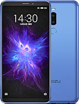
Hi I'm James and in this video I am taking a look at the Miku em to note smartphone, and this is basically a budget smartphone which costs in the UK around about 140 pounds, and what makes it interesting is that, actually you get some interesting specification for that. So, despite the low cost, this has a 5.5 inch, 1080p screen and 16 gigs of storage and an eight core MediaTek processor will system-on-a-chip. So, despite being a very low cost phone, this is cheaper than the new Moto G you're, getting quite a large phone and with some interesting specifications, so I'll probably be taking a look at this a bit over the next few weeks, but I just thought: I'd take a look inside the box and see how things compared with a couple other phones. So, first, when we open it up, we have the phone itself. Nice little plastic tab there to help us remove it from the packaging neatly wrapped in sort of matte, finish plastic. We also have a little SIM card removal tool, our Quick Start Guide various different languages.
Another quick start guides because apparently need to view phone warranty and then, if we lift this up, we have headphones in a nice little plastic case here, then we have our USB power, adapter kind of aping, the apple style of just being a small plug, and then our USB. This is a micro USB lead, so yeah normal sort of selections. It's nice I mean compared to the Moto G that I bought. You don't even get a power adapter with that, so it's nice that they include the basics in there with it. It's certainly and nicely presented in packaging as well better than you might expect, given the low cost of the phone.
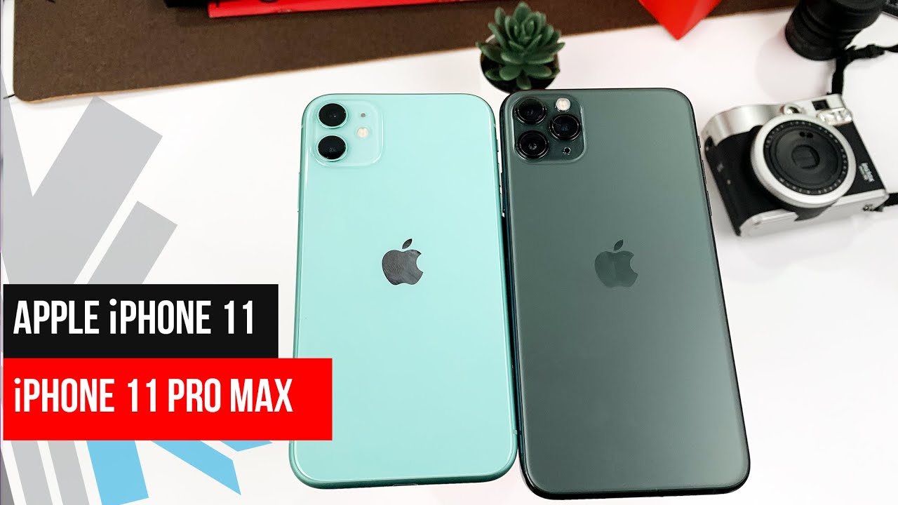
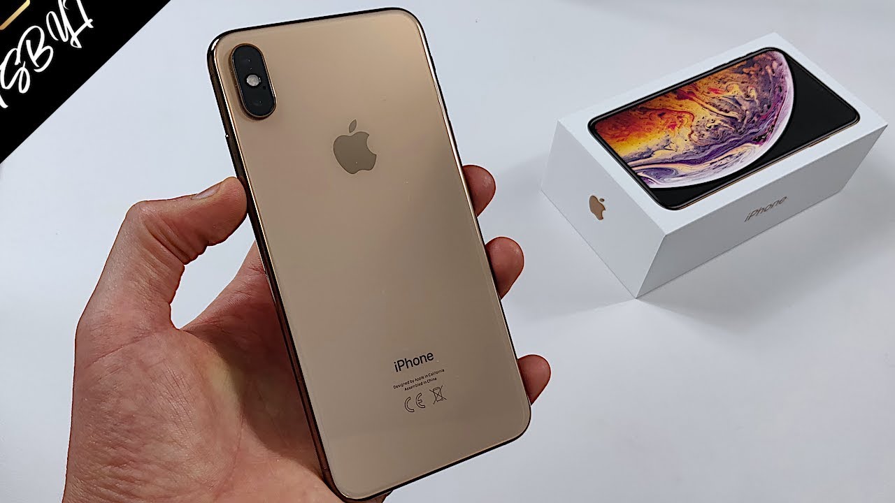
Now looking at some one of the sort of competitors, you might consider against this. You have here the ASUS before 2, so the before 2 same size screens. It's actually you can't really see here, but I would say the before 2 a little thicker, and it's more, it's thinner at the edges with the before 2 they're, both rounded, but the m2 note is the thinner at the back, whereas the lasers tapers more to the sides and then, if we compare a much higher cost phone here, we have the apple, iPhone, 6 and 6 plus sorry, and we can see with this the iPhone 6 same size screen again, but because of the sort of larger button here for the home button and a bit more bezel at the top. It's taller phone, but it's also, in fact, if we compare side-by-side, there's only a very slightly more thickness to the note where the m2 note so actually quite impressive, just from a physical aspect as well, and we're going to unwrap things now. So if we take off that plastic from the back and from the front is an easy tab here, so it has quite a sort: I mean that the're talking you know black rectangle, but you do get an impression of sort of iPhone style, and they've tried to eat that some degree and the back on some models looks quite like the iPhone 5c only bigger this one, because they've gone with gray, not so much, but you can see.
Obviously, if this iPhone was black kitty, a bit more similarity between them, but they've gone for a sort of similar style with it's actually plastic on this, but the sort of metal style surround, and black bezels just compare size wise as well. We have a nexus 5, so you can see. This is quite a big phone being a 5.5 inch phone, so switching it on now and the power button is midway. On the left hand, side volume rockers above it, we also have the SIM card tray over here and with that SIM card tray. This is actually a dual sim and micros card phone.
So what we have is the SIM tray comes out here, so your sim goes in the tray and also the micros card goes in here. So if you're using the tray as such, then I believe if we see the Quick Start Guide. So what we have is the sim sits here in the first part of the tray and then your other all your SD card, and then your other sim goes in here. So you can't use the micro SD and two sims. At the same time, you have an either/or option.
If you do choose to use a micro SD card, then you can actually have up to an additional 128 gigs of storage in this giving you a huge amount of storage capacity for a phone and particularly when you think you can pick up a micros card quite cheaply now and as opposed to spending. You know several hundred pounds on the storage option if you're going for it on an iPhone. If we place that back in, and we are going to power up the phone I've not charged it yet, but hopefully it ships with some charge. So there we have. The Miku logo, nice being the first time the phone has been switched on, will take a little longer to boot and run through into the initial setup options.
Now we have our choices of language default. There is English United States, even though it was not showing it at the start. We are going to say we do not want to connect to wireless for the moment, so we will skip through these initial stages, and that brings us to the start screen, and they've. Obviously customized Android somewhat here, so you have a look more akin, I suppose to what you may expect from an iPhone. So you've got your front page and sort of very flat style, icons, customized and not the standard, Android icons, and actually it looks in quite a reasonable screen.
There is its nice and sharp, certainly, and I'll have to see with usage what the viewing angles are like, but some good initial impressions from this phone, so I'll be looking forward to using it in the coming weeks and reporting more back on it, thanks for watching and be sure to hit subscribe. If you want to see more in the future about it,.
Source : Brue Computing
