Google Pixel 2 XL Revisited: Android 9 Pie Review! By Tim Schofield
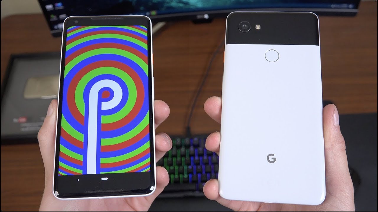
Everyone Tim Schofield here time to take down the plaque because I am retiring from YouTube, completely kidding no I'm, not I'm, actually moving shooting this in a very empty room. The last video I will be shooting in this apartment. I'm still staying in Chicago, however I am upgrading, I will be getting a two-bedroom apartment, so I will have a completely separate office space to shoot videos from here on out. So with the final video in this apartment, I would like to revisit the Google Pixel to excel now that it has the Android 9pi update. So this will be kind of a two in one video where I'll talk about my experience with the pixel to excel and also my opinion and review of android 9 pi. So, first, I'd like to talk about durability of my pixel 2x- oh yes, this is the black-and-white penguin edition with North button on the side and overall, it's held up well.
I do need to make a note that I did have to get a replacement of my previous model, because the headphone jack was broken in the USB type-c slot, but the Google support was very good and handled it well, and I got a replacement device and overall this one has held up very well since I've gotten the replacement still always blown away at the difference of those front-facing speakers. It definitely just makes it for a better multimedia experience and even if you are listening to music setting it down on a table or even watching a video having the sound come towards, you are definitely a big difference, since this is a pixel I do get updates right away. I am an Android 9 PI and the first thing that's really different is the gesture system behind it. You still do have a button down at the bottom. However, a swipe up gesture gets you to your recent apps, which have changed, and I think for the better overall I have kind of preferred the left and right swiping and just the overall full screen of it.
You can also select text and select images by pressing and holding, so you'll, see here, I selected, a full image that I can share from Instagram just from the overview screen, which is nice, I can swipe up as well to get to a app drawer and speaking of my drawer, you see suggested apps up at the top, along with a couple slices right here. So you'll see here have a calendar event right there that you can go to, or you can go straight to a Spotify, playlist called motivation mix. So it gives you some suggested options based on the time place of where you're at. If the options available a back button will appear- and if you press it, you will go back. However, I kind of wish they just made that adjuster I wish that you could just swipe left on this pill to go back.
If you do swipe to the right real quick, you can swap between your two latest apps, which is very handy when multitasking and also, if you kind of press and hold down here, a gray bar appears where you can quickly swap around between your most recent apps in that overview screen. So overall, for me, getting used to the gestures was not difficult. Definitely something that was easy to get used to I think they could just refine them a little to make it better. But overall I find that my navigation has not slowed down whatsoever of the UI throughout the video, of course, make sure to know the overall design changes. This.
The overall look has changed when going through your quick settings, even the Settings app in general they've, just kind of overhauled the theme and speaking of themes, there's a closer step to get to a night mode. If you go to display advanced, you can scroll down and go to device theme where it's automatic based on the wallpaper, or you can just select light or dark, and if you select dark, you'll see those quick settings. Widgets do get changed and, of course, your app drawer gets changed as well, which is a good step towards getting a full dark theme. But if you do actually go into your Settings app that isn't theme dark. It's not an overall system, UI theme, but it is nice.
They are going in the direction where you can customize it and choose a light or dark theme. Performance-Wise. My pixel 2 XL has felt very quick, very snappy. Even after the update, everything seems to be running fluid and smooth with all my apps going all the music downloaded all that good stuff. Now something that I thought I was going to like a lot more, not saying I, don't like it something I thought I was going to like a lot more was the rotation lock, so you'll see you could turn auto rotate on or off, and if you turn it off, you have the option to actually have an icon pop up right here.
Where, if you tap it, it will rotate your display. So it will not Auto rotate your display until you tap on that icon and I find the only time. I really want this to be. The case is at night, when I'm laying in bed, so I wish you could put a timer on it. I think that would be a nice addition, because, overall, when I'm during the day rotating most of the time, it is obvious that I needed to rotate, and it doesn't accidentally rotate in one orientation for me personally just from day-to-day usage.
But it is a nice feature. I just wish it could kind of automatically turn on and off late at night when in bed laying on your side, when you really want things portrait mode in that landscape, a completely underrated feature of the pixel devices is the now playing feature and I wish that came to all Android devices. I always miss it. When I stopped using my pixel having it recognized in the background, what song is playing and give you the artist and what song it is, is a really handy feature and I, find it very useful, personally volume and do not disturb, got a little more complicated. When you use the volume rockers, it actually will switch your media volume by default.
Not your ringer volume, you could switch between mute ring and vibrates just by tapping that icon and then, of course, you can quickly jump into settings to go into all of your settings. If you'd like to change your call volume and all that good stuff, now speaking of do not disturb that got, an update is while we can really customize your do not disturb sound of vibration. Specific notifications, if you want them, no sounds no visuals, you can customize it just a lot of different things that you can customize within, do not disturb, which can be overwhelming for some people, I think it's nice to have the option to really customize do not disturb, and then you can also schedule it for a specific amount of time. Ask every time- or of course you can have it turn on automatically, and it is in beta, but digital well-being is coming to Android 9pi you'll see beta up at the top just giving you a lot of different information, wind down being one that I really like it's an option where you can schedule it, it turns things grayscale. You can also have done not disturb turn on.
You can customize that, but if I switch to am up at the top you'll see, my entire phone is now in grayscale completely the background. All the icons just makes it easier on your eyes and less strain and makes it easier to wind down and essentially go to sleep now, there's also a dashboard which gives you a lot of different information. This one is screen time at the moment going by different days of the week. Lets you know each individual app how much screen time you've used on a per-app basis. You can also change it between notifications received you'll, see here.
I received 182 notifications for messages 248 from Gmail, swapping 344 messages or times open, which is really cool. The amount of times you've actually opened up a specific app and how long you've used them. You can set timers for apps if you want to actually limit the amount of time that you want to use for this app. If you want to set a personal limit, maybe for your kids, so overall a lot of options within digital well-being to actually just make you more mindful of how much you're using your phone and specific ads' battery life from the pixel to Excel has been very good, actually very similar to how it has always been. It gets me through a full day.
That's the best battery life on any phone. However, it will consistently get me through a full day and there is a new adaptive battery option, which will kind of learn your behaviors limit, apps that you don't actually use all the time and I find that over time, I haven't seen a big difference in battery life one way or another, but battery life has always been consistently good on my pixel to excel. So that has been fine for me, there's also a really cool feature called adaptive brightness, which I have been a big fan of it, seems to be working just fine. It forces you to want to change your brightness slider, at least for about a week, and then I find that after that amount of time it starts to learn where how bright you actually want it in specific lighting scenario. So there's a lot of bright light going on right now, so it knows I'm going to want it a bit brighter, but if I were to turn it down all the way it might say.
Okay, maybe he wants it more dim in these bright light scenarios, so we'll start to dim it on its own, very nice and learns really well. Finally, the last thing I'd like to cover is the notifications and for some reason they decide to stop your notifications after for right here, and I really wish, they would change that to just fill up the entire top bar, maybe a little further, which of course does go well for phones with matches to stop after four, but this phone does not have a notch, so I don't necessarily need this notification. Icons in the upper left-hand corner to stop, so you'll see here that dot shows up when letting you know that there are further app notifications. So, overall, that's about everything. I want to cover on the pixel to excel.
In android 9 pi I have been enjoying the update overall they've added some necessary improvements, and I'm pretty excited about all that is to come and, of course, the pixel 3, which I should be doing coverage on soon enough, so be sure you click that subscribe button, so you're notified here's that Android P just Easter Egg screen that shows up pretty Trippe from Google, but it is there, but overall, that would be my full video revisited pixel to excel in android 9 pie review two on one, for you guys hope you enjoyed it. Click that thumbs up if you did be sure to subscribe and as always guys. Thank you very much for watching.
Source : Tim Schofield
