Unboxing: Meizu Pro 7 - Dual Screen Smartphone (Red Edition) By OSReviews
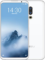
He'll hear OS reviews you're watching our unboxing and first impressions. Look at the read edition of the Mizzou Pro 7. This is a phone that was released actually a few months ago, so it's not completely new to the market, but one of the benefits is the price has come down, and you can now find this around 290 dollars online, which makes a pretty good deal for a highly unique and innovative smartphone. Mizzou is also one of the better Chinese brands, in my opinion, as far as creating original devices, and they use fly me OS, the pro 7 and the pro 7 plus are unique phones because they actually have a secondary display on the back as a quick refresher, it's a 2-inch AMOLED panel that can be used to display notification. So when the phone is turned over, you can still interact with it to play. Songs, look at weather updates things like that, which is actually pretty cool conceptually.
This phone also has dual camera, so it can capture bouquet, looking images that has 12 megapixel sensors and a 16 megapixel camera for selfies on the front has 4 gigs of built-in RAM and the processor is either the Hello P 25 or the Hello X 30, and that's either an outscore or a Dec Accord chipset, depending on the version that you pick up so peeling back. This plastic wrap again a very interesting looking box. It reminds me of a book- and it just says the pro 7 maze and on the top it says maze design, and we can hopefully open it up by peeling off this loop on the front and that should allow us the slide open. The compartment like this again made out of plastic and inside we have another box. So there's an inner compartment and setting this off to the side.
We have the phone sandwiched in between this little box inside, which is a very unusual way of presenting the phones but again unique again. We said we have the Mizzou design logo. Furthermore, we have a sim ejector tool. You can pull out the phone which, in this red color, is extremely vibrant and colorful, so we have another few compartments inside here. There's actually the case, so there's a free included case, which is a nice little bonus.
It's made out of an acrylic plastic, and it has that cutout for that 2 inch display on the back there's also a USB type-c charging cable, it supports quick charge, and we have the various documentation guides. It looks like printed in Chinese as well as in English, for inserting our sin things like that, and we also have the charger, but there are no headphones. Furthermore, it looks like included with the pro 7 coming back to the phone now in a very vibrant shade of red. If we peel back this protector on the back again, we have that 2 inch touchscreen, which is an AMOLED panel, that dual camera setup with dual tone: LED flash. This is an unibody phone as you'd expect from a flagship product, and it feels extremely well-made.
We have just embedded antenna, let bands on the top and the bottom, and we also have the USB type-c. There is a standard headphone port which is nice to see Mesa. They actually started off about 10 years ago, making mp3 players and mp4 players, so they aren't also known for making quality audio devices. Hopefully the sound quality of this will also hold up. There's also a speaker.
It's a very slim device. The site also has a volume rocker a dedicated power key on the top there's just a microphone and on the other side, there's nothing at all. On the front. We have access to a fingerprint scanner, a front-facing 16 megapixel camera and a 5.2 inch full 1080p AMOLED display. So it's going to be sufficient, I think for most folks, as far as having a large enough screen size for interacting, but it's also not quite as large as a phablet, which makes holding it a bit more challenging.
So it fits well in the hand. Here's the LG g5, which has a 5.3 inch display, and you can see that the maze is considerably smaller, just because it doesn't have quite as large of a chin, because LG had to use a modular 10 for the design back then, but you get the idea. The size is pretty similar in terms of the overall footprint, it's not quite as elongated as some of newer crop of phones with 18 by 9 or 2 by one aspect ratios, maybe having a slightly larger screen to body ratio, but this one still is overall I think pretty attractive. Looking it's a classic looking design. Alright! So let's set up our region and the font size is quite large.
It seems like on the fly me OS. We have relatively small bezels on the left and the right just larger on the top in the bottom again, more of a slightly older size, more classic design than what we see today, but nonetheless it still looks pretty attractive. Let's try adding our fingerprints onto the scanner on the front, and it seems to be quite sensitive, there's haptic feedback, so the phone physically vibrates whenever you on it, we have a prompt for the secondary display, which we can activate simply by flipping over the phone has an accelerometer of course, or I can also double tap to activate the screen again, a very nice looking panel in terms of contrast, because it's AMOLED and there's also that amazing oh go on the bottom overall, it looks like a pretty elegant and distinctive design from the rear, definitely very different. Looking from any stock experience, all the icons are very flat. Looking and there's no consolidated app tray.
So all of our apps are scattered on unlimited pages, which we can populate with more programs and widgets, as we download more so a little again reminiscent of iOS in that sense, and we can drag down to have notification shade and I believe you can also access this menu just by using the gesture swiping up in the bezels to the top. So that's a motion that we also see now in the iPhone 10, along with and the original HP and Palm Pre. So it's nice to see that also come into an Android device. We also have again pretty custom. Looking the software for most of the apps I've been redesigned by maze to feel more cohesive, including the gallery.
Along with you know, music player, video player, things like that utility tools, and you'll notice that there aren't any additional kind of capacitive keys down below on the chin. That's because the fingerprint scanner can also physically press down like a real key or a button that you can use to. You know long haul to activate things at Google. Now I can tap once to go back home. So there's a lot of elegance in terms of how everything that's done just using this one button.
Otherwise, we do have a handful of additional utilities like a sound recorder built in, and you do still have the standard of Google Apps, including Chrome, Maps YouTube, and access to the Play Store for downloading more content. So that's more or less our hands-on. First impressions and unboxing. Look at the very distinctive eye, catching unique, maze pro 7, the red color here- really pops, it's definitely a distinctive phone. If you're tired of seeing the same old Android devices, then this might be a fun to consider now, especially since the price has come down a little, and we still have a set of premium features that should satisfy most users, so we'll have to do more testing to find out.
But for now it looks like a pretty promising device and stay tuned for our full review coming out soon. Thanks for watching this unboxing first impressions, look at the red edition of the maze pro.
Source : OSReviews





![Samsung Note 10 Lite Camera Review [FILIPINO] - Is it as GOOD as the Flagship Phone?](https://img.youtube.com/vi/aYNtqUPh_Lw/maxresdefault.jpg )
