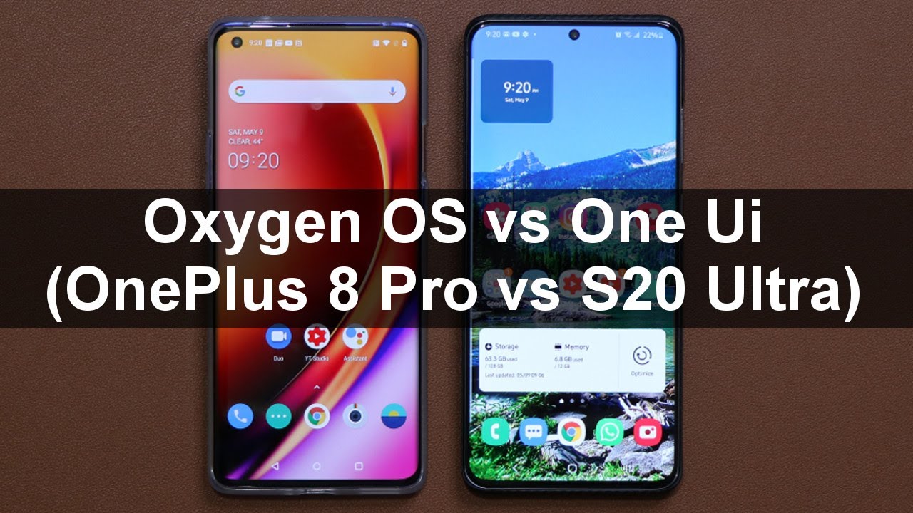
OnePlus 8 Pro vs Galaxy S20 Ultra - Oxygen OS vs Samsung One Ui By sakitech
This video, what we do is we are going to be comparing Samsung's 1ui to OnePlus as oxygen OS. We are gonna, be doing a deep dive, we're gonna look at the smoothness of these softwares we're gonna. Look at the customization capabilities. We are gonna, be looking at the edge functionalities overall, speed, fingerprint sensor, speed, other software features and, of course we are going to be talking about software updates. So let's dive in and get started now. The very first thing I do want to talk about.
Is the fingerprint sensor, let's see which one of these fingerprints actually work faster. Now both phones have a built-in fingerprint under the display, so I'm going to turn off the screens all right. Let me turn this off as well, and then what I'm going to do is I'm going to tap on this one double tap to wake it up: I'm going to click on the fingerprint and there we go. That was pretty fast now, I'm gonna. Do this one? Also alright, again there we go! That was also instantaneous, so both of these fingerprint speeds are quite satisfactory, and I haven't noticed, which one is faster.
Both of them felt extremely fast, but I do want to let you know the Samsung Galaxy S 20 altar has an ultrasonic fingerprint sensor, but the OnePlus 8 Pro has a cheaper optical fingerprint sensor. So the hardware on this one is a little better. The next thing we look at is the overall smoothness of these smartphones. Now let me go to the settings. Real quick, I'm going to show you something so if I go into display here and then, if I go to display over here, if I go to Advanced over here and over here, I have to go to motion smoothness, and here we go to refresh rate.
So both phones right now are running at 120 Hertz refresh rate. As far as scrolling is concerned, switching between apps is concern. It is extremely nice and smooth. So let me show you how that looks like it's hard to catch it on the actual screen, but both of these phones are extremely smooth. Take a look at how it goes up and down no lag, no starter, none of that.
Okay, neither one of these phones have any lag or any starter there super-smooth. So let me launch the application. Okay. There we go very nice and fast, and I'll. Let you know one thing we do have slightly more cool animations, take a look at how it comes up nice and slow, and you can bring it back now.
These animations can be turned off, and you can have it just like this one. Actually, this one has it too. When it comes up, it comes to come up nice and slow, but when it goes down it, just boom goes right. Now, with this one, it's a little more animation, centric and overall day-to-day operations again they're super smooth. They both do an amazing job of being responsive.
Now, one thing where r1 plus pulls ahead here is: if I go into the display again go back to the motion. Smoothness knows this 120 Hertz for now is only available under full high-definition plus, but with the one plus a pro when you go for the 120 Hertz, you also go back here, and you can do HD+ as well. Okay, so that's great, but it is going to be a battery hog. This is gonna, kill your battery faster than if you had it on full high-definition plus I like to keep it all at full, high-definition, plus any way for longer battery life. The next thing I'm going to talk about, has to do with software now.
First, let me quickly talk about the edges of these smartphones. They do have some functionality built in around the edges of the smartphone, so the first one is: if I go here to the settings and if I go to display, I can scroll down, and I can go to the edge screen. Now, with this one I can go to the settings. Okay, I can go to customization and I can swipe over, and I can tap on horizon light. Now that has to do with the edges of the screen.
The equivalent we have over here is edge lighting. Now, when we get a notification, what happens? Are we had a nice notification around the edges of the screen? It's like a light you can see here. We have four colors. We can go for blue. So when I got a text message and the phone is turned off, that's exactly what you're going to see.
That's a little preview you'll go for red okay, you can go for gold and purple. So that's that on this one with this one, you can go into lightning style, lighting style, and you have all these effects. You have more than the 1 plus 8 Pro. These are built-in features, so you're getting more customization options for the actual edge panel. So take a look at all these various options.
You get the lighting effects, little pop-up light, look at the spotlight, ok and with every single one of these guys you can go inside, and you can change the color of the actual edge lighting to whatever you have on this site. Of course, we only have 4 options, but we cannot customize them too much, and on top of that, this is a feature that belongs to Samsung, which was taken by one plus just be aware of these things. Alright, so let's go and talk about more customization features and how they compare. Now one thing I like on the OnePlus that the s20 doesn't have is: if I go to the settings again, if I go into customization, I can go to fingerprint animation, and we actually have four animations. We have the option for none.
We have this option. Furthermore, we have this option: the ripple option, cosmos and energy. Ok, so you can pick these different animations for your fingerprint. So let me just accept this: when I lock the screen, ok and if I want to log in, that's the animation you have to see are on the display with this phone we don't have that all we have is a single animation just like that. Alright, so I wish Samsung brings that option to the table as well.
Now, let's continue so here again if I go into customization I have the ability to pick a clock style for my always-on display. So when I turn off the screen and I just single tap on the screen, that's the always-on display I can customize that with four different clocks. Okay, three different clocks I got this one and this one. So now, if I tap on Clark style, I can turn off the phone. I can tap once and I got that one.
Alright. Now with this phone we have the same option. We have the always-on display, but it's much more complex. For example, you can have it always own or having tapped the show which I have right here, but then you can go in here, two o'clock style, and you have the option to pick from all these different various clock. Styles.
Look at that! Not only that you can go to color and change the color of each clock style as you please, all right. Look at all these options, there's so many even a calendar option. If you want you got this. You've got these animations right here. You can add a GIF image inside here.
Furthermore, you got this clock right here: okay, now, when I click on done and again, if I turn off the screen. Now, if I tap it once tap the show, it's going to show that right there all right. So when it comes to always on display customization again, the one UI is far ahead than the oxygen OS, and then we have other things over here that I kind of like on the one plus we have system customization options. I can pick an accent. Color I can tap on this accent.
Color and I can choose from these various colors, so it changes the colors of these things and also change the colors of these targets on the top okay. So if I pick this one and if I say okay, now, if I pull down, that's the new toggle color, now we don't have the direct option to do that over here. But what I can do with this form is again. I can pinch the screen, go to my themes and actually download thousands of different themes for my phone. Just to give one example: let's go over here to top themes, let's go for free and let's pick something that kind of looks cool.
Let's go for this one right here, normally two dollars today, it's free okay, it is done. I'm going to apply that real, quick and let's see what happens with the phone again. This is not something you can do over here. You can change the accent colors and the icon packs, but here you can change the entire theme of the actual phone. Now that's what my phone looks like what I pull this down? Everything is gonna, look different when I go to my settings.
Everything is gonna, look different when I go to my phone, it's gonna. Look much different! Cannot do that with this, you only get one phone and that's what it looks like, but look at that alright, so another customization win for the one UI all right. So, lets quick, look at the night mode, dark mode on both of these phones. If I go to my settings, if I go into my display, here's my dark mode and then, if I go to the settings and again going to customization I, have the tone option that allows me to switch between dark light, and then we have a colorful option that combines half of light and half of dark. With this one we only have light and dark.
So when I go from like the dark, that's what we get! It's nice and cool I like the transition animation that takes a dark mode when I go out and launch system applications they're all now in the dark mode which a lot of people like they think it's cool. So all these system applications are gonna, be black and white I'm, not black and white, dark mode same with this one. If I launch it all right, if I tap on this one now it's going to turn on to dark. When I go out into system applications, you'll see we have the dark mode applied as well, which is fantastic, nice and easy on the eyes and, like I said, we also have a third option here, which I don't think a lot of people are going to use, but it's an option. That's extra on this phone.
So that's the colorful option, half dark, half light, it's a mixture, so if I tap on it and if I select it, this is gonna, be all white, but you'll see black on the top. When I pull this down, we got some blackness going on over here. So that's some good stuff as well. Let's go back to a regular stuff, let's also quickly look at the notifications panel. So that's what it looks like right here.
That's what we have right here over here. We have a blackness brightness, slider I can pull this down and access all the settings with this one. They do come downwards, so it's easier to control with one hand you can pull it down. Just like this and control with one hand with this one. You don't have the one-handed design all right, but still that's what they look like almost similar.
That's what you expect from Android now. One thing we have here is we have a power button, a software power button that we don't have over here. But that's again, not a big deal just want to give you guys some details now. One thing I want to talk about has to be the home screen. It is much more easy to manage home screens and applications on the home screen on the Samsung device on the one UI, for example, if I want to transfer five applications to the next screen, okay from one screen to the other, I have to grab each one of them all right, just like this, and do it one by one, so I'm going to have to grab this.
Do everything one by one, and it just takes a lot of time with this one I can press and hold on any one of these tap on select items select all the applications. I want to move all right and then just move them over and dump them onto the screen. On top of that, if I select, press and hold I can tap on select items and I can select, maybe three items and just uninstall them in a batch, remove them from home or just dump them in a folder, as you can see, then give it a folder name and a folder color. If I so desire with this one, you don't get to change the colors of the folders, and you have to move everything around, and you would be. You cannot do batch operations here.
You can actually perform the batch operation now. Won't plus also has something that I like that. I wish Samsung has had it too, but again. Samsung then has other things that the wall plus is not gonna. Add, for example, Samsung has some modules you can download.
So when I go to my lock screen, I can make modifications like this tap here. I got all these shortcuts. Okay, so that's the kind of stuff you can do with this one or, as you can see, I can swipe from the corner of the screen nice little accessories, as you can see, okay to control the brightness and whatnot. So we have things like this here. This doesn't have it, but it does have some built-in tools that I like so when I go to my settings and if I go over to my buttons and gestures, we have things like if I go into my quick gestures, for example, take a look at this.
It says: draw all to launch the calculator so over here I can pick any application and one that the screen is turned off. What I can do is I can draw the oh, and it's gonna, ask me to login when I do it's gonna quickly pick a calculator? That's not bad! So let me go back to the settings. You can do the same thing for V s m and EE. You can assign apps and options and settings to this menu. So you can draw these things at the lock screen to launch these applications, and we have things like three finger screenshots.
If I go like this, it takes a screenshot. Now with this one. We also have a bunch of things if I go into advanced features, alright, and if I go into motions and gestures, you also have things like palms swipe to capture, so I can go like this and that's going to take a screenshot alright, so they both have their little things here and there. But then we have things like linked to windows that we don't have over here, which basically allows you to project this phone onto your Windows PC. Exactly as you see here, so whatever you do on your phone, you can do it through the Windows PC, but this phone does not have that option.
Now. One more very important thing has to do with hiding apps. Now people look for ways to hide applications and files. All the time with the one UI you have something known as the secure folder, so I'm going to type that in right now, I renamed it to secret files. I can log into my secret files and I can hide photos, files, music videos, even separate Facebook accounts if I want I can hide.
Samsung notes and I can even have a camera application that acts independently of the public camera application, so when I take a photo on the outside camera. Ok, this is just all public, but when I go to my secret files and take a photo from that camera, it stays hidden automatically. With this phone, we don't have such an advanced option. We have something very simple: we go to the settings, go all the way down, good, we go into utilities and what we have is something known as the app Locker option, so that locks an application. So let me just put the password.
Ok, so I can add an application. I can say Calendar. So, basically, now that calendar application is locked. So if I try to access it if it tells me to put in a password to access the application. Well, this one I can still access the calendar application.
Alright, this is just a public version, but then I can go to my secret files or my secure, folder and I can have a separate calendar right here. I can add files if I want to image videos. All your documents, my files I, can applications if I want much more advanced when it comes to the actual widgets. Both phones have a bunch of stock widgets that are very useful and nice. So, as you can see, we have it right here now.
This one is compartmentalized in these 6x6 grids. Okay, so you can just swipe through with this one you swipe up and down. You can see all you our various widgets, but again both of them have enough, and these can be downloaded from the Play Store. If you want to go crazy now, one more thing I'll talk about is the fact that you can convert this phone into an actual desktop like environment. So, basically, if I go to my settings, let me just search for decks, so we have a built-in functionality known as Samsung decks.
So if you connect this phone with a simple cable to any monitor, you will see a desktop like interface that you can use to get some work done. It's highly productive. This phone doesn't have it yet might get in the future, but haven't seen it so far, and then finally, I want to talk about software updates. This is where a1 plus is ahead. It gets more consistent software updates, so basically everybody that owns a1 plus gets the same.
Software update around the same time around the world. That's one of the benefits of the one plus well, the Samsung phones. What happens? Is its much more fragmented, because Samsung is in many more countries. They work with many more carriers, so anytime there's an update. It has to go through certain levels to get to your phone, so somebody in Germany might get the update one month before you or you might have to wait three months to get an update in the United States or maybe in India.
Alright. So you will get your updates, as you can see, I have a May 8 of date already enabled, but sometimes it takes more time with the OnePlus. The updates are more consistent and universal. Everyone plus owner, gets an update at the same time, kind of like an iPhone and also when I go to the software update portion of the phones. Let's go to software update, let's go to system now.
What you can do here is you can get the information on what was the last update say if I temple were here, I get an update, lock, showing me what actually did get updated, and over here I can tap on last update, and again you get some nice information, so I like that they not keep it nice and clean. So you can see exactly what has been updated. However, I have noticed that OnePlus keeps them a little more specific and Samsung. Sometimes unless it's a major update does keep it a little more generic okay. So those were the things I want to talk about.
Overall, the smoothness and the speed is the same on these smartphones, and I'm. Not talking about launching applications. I mean this might launch application 0.001 seconds faster, or this might do an another application 0.5 seconds faster. That's not what I'm talking about they're all smooth, they're, fast, they're, snappy, they're lag free when it comes to customization. Samsung is more deep and rich when it comes to suffered capabilities such as Samsung, decks, secure, folder or even something like the edge screen.
Samsung is ahead with these tiny little cool features that you can add to the edge of your screen, or you can add a theme to your screen. Now. OnePlus still has it, but it seems more vanilla compared to the Samsung fingerprint sensors on both phones are fast, but this one is more advanced because it's ultrasonic and then, finally again, the software updates on the OnePlus is in fact better alright. So that was an in-depth comparison of one UI versus oxygen OS. If you do have any questions, comments or concerns, let me know down below also, let me know which one you guys actually prefer: the wine UI or the oxygen drop those comments down below and for now guys have a fantastic day all right.
Source : sakitech
![*NEW* iPad Pro 2021 UNBOXING [Silver, 128 GB, 11-inch]](https://img.youtube.com/vi/22UQd4r2n0s/maxresdefault.jpg )


