One Ui Samsung Galaxy Watch Update | Amazing Battery Life By EBPMAN Tech Reviews
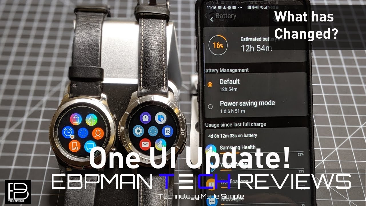
Hey guys MVP men here, and today we're going to talk about the one UI update to the Samsung Galaxy line of watches Samsung recently released this release. That upgrades the experience on the watch, so I'm going to talk about, what's changed and, more importantly, how it's changed the battery life, and it's a big game changer. So you going to want to watch this video now in this video we're going to take a look at two watches, one that has the update and one that doesn't so here. What I have is a gear s3 classic compared to the Galaxy watch with the 1 UI update I purposely kept one upgraded so that you can see what the differences are. So, let's get right to it now. The 1 UI update is really designed to improve the overall look and aesthetics of the watch line and really brings it in line with what you see on the phones, but it also improves the battery life drastically.
So, first, let's take a look at some UI changes so that you can see what you can expect, and then we'll talk about the battery life. So you can see how great it is. So, first, let's take a look at some of the toggles that have changed, so I'm going to go ahead and swipe down, and you'll notice that I have toggles. This is the update, and this is the non updated version. So here you'll notice that all the toggles aren't there, the same ones are there, but the look has changed and for the most part, this one UI update changes.
The graphical look, so you have more animations, you have richer graphics, but it also has changed the functionality so as I swipe down you'll notice, I can't swipe to the left or to the right the icons, the toggles that I hear here are limited to the ones on the screen and if I wanted to change them, I would have to edit, and then I would have to add or remove something, because I only have these toggles. Now on this side, with the update, the toggles are no more like the phone. So not only do I have one page of toggles, but I can swipe, and I have more. So all the toggles are accessible. I can still reorder and modify them, but I have more access to all my toggles.
So this is an example of some graphical changes or functionality changes that you're going to find with this new software now. Another area that has changed is your notification, so your notification is going to be more vibrant, there's going to be more graphics to them and as I go back, and I toggle back you'll notice that they look at the same, but the color is better and the size of the graphics are a little larger and so you'll be able to open up the actual details of that think notification. You can see here what the actual Gmail notification looks like, so you see that it's a little bolder a little richer and graphics, and I'd say that it's really taking advantage of the screen that you have with these watches, because they have a really beautiful high-res screen. Now the graphic changes also have touched. Other parts of the watch, so I'm going to turn right once, and I'm going to turn right once on this one, and you can see what the graphics look like, so you notice that the graphics have been updated.
So this is I would say more cartoon like in nature, and this one is a little cleaner in design and every single thing has changed. So if I were to go into the let's go into the app for the alarm, clock and I were to go into the alarm clock here as well. You'll notice how the colors the functionality is the same, but the features the way you access. It has changed so you'll notice. Again.
This is a four o'clock in the morning alarm, and you can see how the add button looks at all the toggles, so you're seeing a graphical change in many of the applications now. This is another example of some of the changes that you'll see so here on this side we have what the fitness components are, and here you see on the new UI, what the fitness components look like, so I have actually four here added. I have three, but you can add up to four, so you can get up to four of them just like this, but the graphics exchange has anything else changed. Well, let me answer that, so they say they claim that they have improved the watch's ability to auto, detect workouts I haven't seen much of an improvement, so I work out every day. I do either a CrossFit I do hit training.
I do kettle bell also do some running, and what I found is that they really haven't improved it Auto, detecting that I'm doing a push-up that I'm doing a sit-up or that I'm doing kind of like an active workout. But what I've seen is that the graphics have improved right. So that's been cleaned up. So, if you're looking for improvement in auto-detection, in my experience it's not there now. Here's another example of how the apps have been updated.
So here you'll see the barometer on both of these, and you can tell it'll bring that up again. That kind of the bars have become heavier. The text itself is a bit bolder, it's easier to read in my opinion, so there again taking advantage of that screen, but not much has changed, so I've. Seen so far. A lot of these chain just have to do with the UI changes, but should you be excited about the UI yeah I am I think it looks good, but this is what really got me excited with this update, and I'd like to hear if this is your same experience, so take a look at this screen here.
So this is how much battery life I'm getting after the upgrade four days. Eight hours in 12 minutes I've had my watch on right and I, literally only take it off if I'm going to take a shower, but I sleep with my watch. I work out with my watch I get over a hundred text messages a day. I get calendar reminders, I use all those Fitness features, I use it when I work out, as I mentioned, but I'm getting four days, 12 minutes and 33 seconds so far on battery life and check out what I have remaining 16% is left, and I still have 12 hours more to go. So that means I could get five days on this.
If you think about the Apple Watch, some people could barely get a day. You're going to get five days after this update. So I think that this is really the area that this update excels and if you haven't gotten the upgrade yet make sure you check, because if you want like smashing battery life, then you don't want to get this update so guys. That concludes our review of the 1 UI update. Now, while the UI is great I like that, they are making it more like the phones themselves.
For me, the battery life is where this crushes it so make sure you continue to check. If you don't have the upgrade- and let me know what you think about your battery life because again I'm getting five days of battery life, see you in the next one.
Source : EBPMAN Tech Reviews
