New iPad Pro review: can it replace your laptop? By The Verge
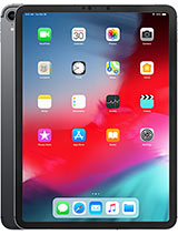
- I don't even know where to start with this thing. (techno music) This is the new iPad Pro, and this one is actually the most iPad Pro you can get. This is the 12.9 inch version with one terabyte of storage, and LTE, with the optional $199 keyboard cover, and $129 of Apple Pencil on top. This is $2200 of iPad Pro. It is big, and bad, and mean looking. It has an 8-core A12X processor that is just lightning fast.
It has this new Apple Pencil that clips on magnetically, and charges wirelessly. And it has a USB-C port, that can theoretically let it connect to basically anything. It's more expensive than my laptop. With a processor that benchmarks faster than Apples own Core i7 Macbook Pros. This iPad Pro is a beast.
If a muscle car could turn into a tablet, it would turn into this, and I should love this, I should love it, it should keep me up at night, it should make my heart flutter every time I see it. It should be my computer, my number one go to computer. But it's not, and I'm gonna tell you why. So it's no secret that Apple's lead in tablets is just silly. No other company has a tablet that offers the same power, app selection, ease of use, and battery life as the iPad Pro.
Last year when Dieter reviewed the 10.5 inch iPad Pro, he said it was basically like Apple showing off. And this new iPad Pro is definitely Apple showing off again, especially when it comes to hardware. There are two sizes, 11 inches, and 12.9. The 11 inch model fits a larger screen in the same sized body as the old 10.5 inch model, and the 12.9 shrinks the body down to fit the screen. The 12.9 is basically the same size as a sheet of paper now. Although, I'm gonna tell you, it feels a lot bigger than that.
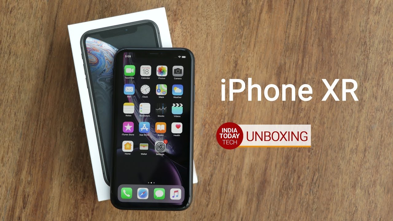
Apple likes to say that both models have edge to edge displays, but I mean, come on. Nothing about this bezel is edge to edge. But it is an extremely nice LCD screen that's 264 points per inch on both sizes. And it has Apples fancy new rounded corner technology that the company calls Liquid Retina. That's a little confusing because the iPhone XR also has a Liquid Retina LCD.
But the iPad display is way better than the XR screen. With a faster 120 hertz promotion variable refresh rate, better viewing angles, brightness, and wider color support. So I asked Apple, and they told me that Liquid Retina really just means rounded corners, that's it. The new iPad Pro is also the first really really new Apple hardware design language in a long time. Instead of rounded corners, and soft shapes, it's all hard corners, and flat sides with big exposed antenna lines in the back, and a huge camera bump.
It kind of looks like the Macbook Pro but it's also kind of brutal looking. Almost like a reference design. Most people I showed it to thought it looked kinda cool, especially in this space gray finish. But it's taking a while to grow on me. You'll also notice that there's no home button.
Just like the iPhone X the new iPad Pro has Face ID. It's the same TrueDepth camera system with a 7 megapixel camera, infrared projector, and IR sensor. But it works in any orientation, landscape, upside down, whatever. If your palm is covering the camera while you're holding the iPad, it'll tell you. And if you have it at the bottom, it'll tell you to look down to unlock, which is pretty neat.
You can also double tap the space bar if you have the keyboard cover on to unlock. Which is really fast, and kinda reminiscent of Windows Hello. The lack of a home button means that you now navigate the iPad Pro using the same gestures as the iPhone X. So you can tap to wake, swipe up to go home, swipe up a little bit more to go to open the app launcher, swipe up just a little bit to open the dock, and swipe between apps along the bottom here. Now this will even preserve your app layout, so if you've got two apps on one screen, they'll be right there when you come back.
And of course you can pop over certain apps to get something done quickly if you need to. These new gestures are all pretty intuitive to pick up, especially if you've been using an iPhone X. But there's a lot going on when you swipe up, and getting the dock, and not the app switcher is a lot harder than you would think. You have to take a minute to really dial it in. Apart from screen size, both size of the iPad Pro are identical internally.
With the new 8-core A12X processor, four speakers, the smart connector for keyboards on the back instead of the bottom, a 12 megapixel camera with smart HDR, no more headphone jack, (takes a breathe) and a new USB-C port on the bottom to replace the lightning connector. I'd normally keep going here but that USB-C port is really what you all came to see, right? So let's just start plugging stuff in, and see what happens. Whoop, whoop, whoop, whoop, whoop, whoop, whoop. (laughing) So here's the deal, with one huge exception, most everything you'd want to plug into a USB-C port works if you have an app that supports it. We tried a bunch of hubs, an HDMI adaptor, a keyboard, a camera, a microphone, even a VGA adaptor, and silly USB accessories like this fan.
The USB-C ecosystem is not super well developed, but the stupid accessories are definitely out in force. The iPad Pro will charge a phone, it'll charge a Nintendo Switch. We tried some pro DJ gear, but that didn't work because there's no app support for it. And neither did this cheap HP printer, but honestly what were you expecting. But the main thing I want to plug into an iPad simply doesn't work, external storage.
You can plug as many flash drives, or hard drives as you want into this USB-C port, and nothing will happen. They won't show up in your apps, they won't show up in Apple's files app, nothing. If you plug a camera into the iPad, or an SD card from your camera into a card reader, iOS 12 will automatically pop open a camera import screen, and let you import photos into your Camera Roll, that's it, you can't even import photos directly into an app like Lightroom CC. Apple has to be in the middle. Now, I asked Apple about this, because I use Lightroom CC all of the time, and I don't wanna clutter up my Camera Roll, and iCloud storage with huge RAW files.
And Apples big solution is that Adobe wrote a series shortcut that imports photos into Lightroom, and then automatically deletes them from the Camera Roll. Which is basically a hack to be honest. A neat hack that works, sure, but a hack, and this is essentially the story of the iPad Pro, and it's why I can't just use it the way I want to. Either you have to completely understand the limitations of iOS so well that you can make use of these little hacks all over the place to get things done, or you just deal with it, and accept the fact that you have to go back to a real computer from time to time because it's just easier. And it's the same all over iOS 12 on the iPad.
For the most part iOS 12 is super fast, and fun to use, but there are roadblocks everywhere. This new iPad Pro is faster than my actual laptop, but the mobile version of Safari just isn't a desktop class browser, so it kicks you out to apps all the time. I don't wanna use Apple Mail, I don't. But I can't set Outlook, or Gmail to be the default, so I kinda end up in Apple Mail all the time. And I hate to tell you this, but since Apple refuses to support Googles VP9 video codec, there is literally no way to watch YouTube in 4k on this $2000 tablet.
You just can't do it. In the browser, or in the app. These kinds of little stumbles just happen when you use an iPad all day, and until now we've been really forgiving of iPads because we knew Apple was taking its time building up the iPad into a real computer. They were supposed to get there, but you know what? I'm tired of waiting. It's obvious that Apple has a massive processor performance lead, and I desperately wanna push this A12X to the limit, and use the iPad Pro as my main computer.
But over, and over again I can't. And I don't think it's just me being stuck in some old way of thinking, or needing to spend more time discovering a new workflow, or understanding series shortcuts better. This is just basic stuff like plugging in a flash drive, or quickly changing the name of a file before emailing it off. I don't want to adapt to my computer. I want my computer to adapt to me.
Apples keyboard cover has the same keys as before, they feel exactly the same. But the whole thing has been redesigned, and it's better, and worse than the old one. On the plus side there's no more weird hump in the middle, or origami folding. This is just much simpler, and cleaner. But if you open it, and just wanna use it as a tablet, you're gonna have to feel these keys on the back which is just not very Apple like, and while the Google Pixel Slate, and the Surface Pro offer near infinite adjustments, you really just get the two with the iPad Pro.
You got that one, and you got that one. That's about it. I would bet 3rd parties like Logitech offer much nicer keyboards in the future, just like they did with the older iPad Pro, so I would take a minute, and see what they do. The Apple Pencil has also been redesigned, but I'll be honest I am just not that much of an artist. So I gave the iPad Pro to Verge design director William Joel, and also to Dami Lee a Verge tech reporter who also happens to be a published cartoonist, to see what they thought of the new Pencil, and what it's like to use the iPad Pro as professional creatives everyday.
- The 2nd generation Apple Pencil is a huge improvement over the old, no matter which way you look at it. The Apple Pencil was already pretty great specs wise in terms of pressure sensitivity, and palm rejection, so there wasn't much to improve upon there. But the new magnetic charging method just makes so much more sense. It's what the original Pencil should of had instead of this horrible charging situation that required you to take off the cap, so you can lose it immediately, and plug it into the lightning port so you can accidentally snap your Pencil in half. Apple's added a new feature where you can tap the Pencil to the screen, and it'll wake it up, and immediately launch the Notes app, which is pretty useful but you can't really program it to open any other app like this.
There's also a new gesture control feature on the Pencil where you can double tap the sides to switch to an eraser, or the last tool that you used. In the upcoming Photoshop for iPad, which launches next year. Apple says you can customize a gesture to other tools like Zoom, but I can't really see myself using this feature, it's hard to get it exactly right, and it's not as natural as just having a button on the side. It's also kind of unfortunate that the new Pencil, despite being $30 more expensive than the last $99 Pencil doesn't work with any other iPad besides the new iPad Pro, and alternatively you can't use your old Apple Pencil with the new iPad Pro. Which is kind of a bummer considering Microsoft's newest Surface Pro 6 is compatible with it's Surface Pen's 3, and up.
I know some artists who've always felt that the Apple Pencil is too thin to hold comfortably compared to the thicker Wacom pens, or the Surface Pens. That hasn't changed with the new Pencil as it's basically the same size, and feels about the same as before. There are silicone grips you can buy for the 1st generation Apple Pencil but the new magnetic charging process in the 2nd pencil means you would have to take it off every time you want to charge it. But still I'd take this new magnetic charging process over the old one any day. - The first thing that I noticed using the new iPad Pro is how crazy fast the refresh rate is.
I have a iPad mini from early 2018, and it is nowhere, like, as beautiful to just like swipe, and I could do this for hours. So we wanted to kinda push it, and test it a little bit, and see like, well if it's rated at like a Macbook Pro, can it work like one? So we were using Adobe Rush editing 4k footage, and surprisingly it handled working with 4k footage just fine, or at least it did for me. We had no problem making a sequence that is roughly 10 minutes long, and then we exported it, and timed it, and it about as long as it would take on my iMac. Which is kind of crazy. So while this is as powerful, or maybe even more powerful than my Macbook Pro, what it lacks are the apps, and that's really important to me.
I like to work within Adobe's Creative Cloud, and the apps that it has on here like Rush, and like the beta Photoshop are nowhere near as strong, or powerful as they would be on my Macbook. And for $2200 having like the baby versions of them isn't really what I want. The good news is that this is definitely powerful enough to use apps like that, and hopefully down the line maybe we'll get a Cinema 4D, or something. But until then, we're just gonna have to wait. - Look if you're the sort of person who might spend over $2000 on a maxed out iPad Pro, you probably know exactly why you need one, what you're gonna use it for, and whether it's worth it to you, that's great, and you're gonna find the switch to USB-C super convenient, the new Pencil to be much nicer, and the A12X to be a significant performance boost.
But if you're just thinking about spending 799 on the cheapest 64 gig, 11 inch iPad Pro to replace your main computer, you should really ask yourself what you use a computer for, and whether you can deal with the limitations of iOS every single day. There isn't a single other tablet on the market that could compete with the raw hardware of the iPad Pro, and honestly there aren't many laptops that can either. But Apple's approach to iOS is holding that hardware back in serious, and meaningful ways. And while USB-C makes life with this iPad Pro slightly easier, it still has the same basic capabilities, and limitations of last years iPad Pro. And so just like Dieter said last year, if you know exactly how to get what you want out of iOS, and you must have the best thing, the iPad Pro is definitely the best thing.
For me it's all just too frustrating, and while I love using the Pencil to edit photos in Lightroom on this display, the iPad Pro is still just an accessory to my laptop, not a replacement for it. Well, does not operate. Whoop, whoop, whoop, whoop, whoop. (laughing).
Source : The Verge

