Google Pixel 3 Review - Not What We Expected By Android Headlines - Android News & Tech News
The Google Pixel 3 is probably the most difficult device have had to review in quite some time, but that isn't for reasons that you might expect this phone isn't particularly feature-rich. It doesn't have some kind of complex ecosystem to wade through, and it doesn't even look particularly interesting or design dense either. Rather, it represents a Google that feels at odds with what it once was, one that has transformed quite suddenly throughout 2018 and one that I feel less inclined to follow than ever. I've been at Google fan for a long time and someone who has loved the Nexus and pixel experience emphatically and what they've brought to the table so many times this year constantly feels like a rejection of past ideas. You'll see throughout this review that the hardware is solid, but the pure Android experience as it has been called for so long. This is just no longer a great experience and is moving in a direction, unlike what I would have expected only just a year ago.
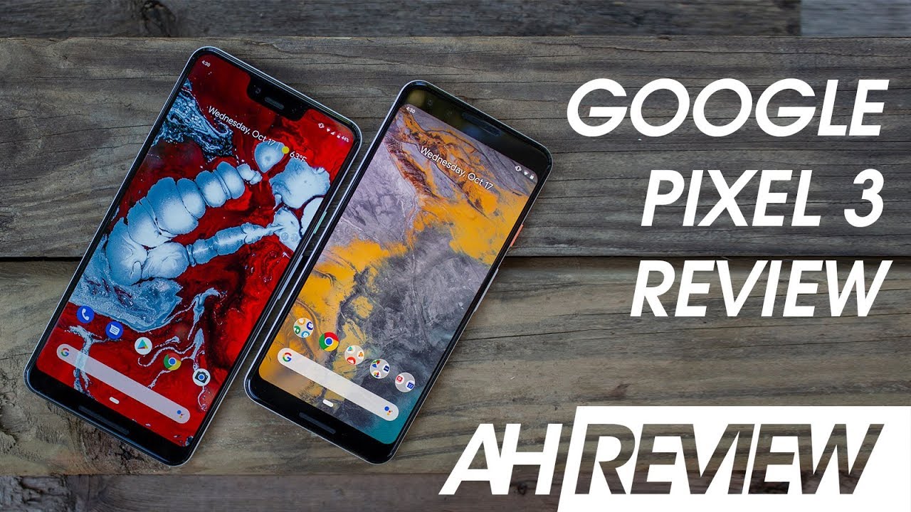
Let's start with what's new and good. First, this year, both the pixel 3 and pixel 3 XL are nearly identical in the overall design language, including the same camera configuration in design as well as a classy new fogged glass back. We were definitely concerned with slipperiness and scratch resistance of this new coating, but it seems Google has at least thought through the scratch resistance piece, a bit as scratching it with even a key does not leave a lasting mark. Rather, a quick rub of the finger takes the appearance of the scratch right out. Awful scratches can actually be washed out in the sink too, which is an interesting concept.
This is a pretty cool. Coating slipperiness, on the other hand, is very surface dependent on one hand, it's better than uncoated glass when sitting on a flat surface, as it doesn't seem to slide around at all, whereas there are plenty of all glass phones that will practically fly off a table if it's even at a slight slant, it's definitely more slippery than glass in the hand, though, as it feels powdery and soft, and will definitely be a problem for folks in cooler or drier climates. The advantage of having glass is the ability to wireless charge, which is certainly nice. If you use such a thing, this glass build will likely not be a big deal for many, as it's likely that most people will keep a case on it touching on battery life. These phones have a good battery life in general, with better than average standby time and good lasting power, even through heavy use.
For reviews like these with two phones, my wife will use one of them while I use the other, and both of us got a day's worth of battery out of the phone with no problem. Surprisingly enough, the smaller pixel 3 managed to squeeze an average of 2 hours of screen on time more than the pixel 3xl did, with around 7 hours for the smaller pixel 3 and 5 hours for the 3 XL on the best days at 29, 15 William hours and a 5 and a half inch OLED screen. The smaller pixel 3 has better than average battery life. The pixel 3 Excel sports, a 6.3 inch display with a 30 for 30 million power battery, which is a reasonable ratio of increased between the two Android PI's new adaptive battery tech is supposed to help identify rogue apps that are draining battery and digital, well-being will keep you from overusing apps, like social media, where you can set a daily maximum use time for each app once that daily maximum is reached. The app is completely paused from use, keeping it from harassing you with notifications and from draining the battery.
Excessively digital well-being is probably the single best new feature in Android Pi, but this is not exclusive to the pixel 3 by any means before we delve too far off Hardware, though, let's go over some interesting tidbits that are worth noting. Both phones are almost completely flat on front and back similar to last year's, smaller pixel 2, but with rounded edges, rather than the straight flat ones that that phone had this makes screen protectors way easier to install than phones with curved screens, which means that you won't have to shell out for expensive ones like the white dome liquid type, which is always a plus. It also makes case coverage of the phone easier, since cases can provide an even lip around the whole phone. This is fine I suppose, since the phone colors are pretty darn boring this year, and we don't even get a panda model this time around. Rather it's just black and white or if you prefer, the not pink model which is sort of rosy sand.
Color they're a far cry from the beautiful colors of mini flagships this year, and even the colored plastic power buttons, look and feel a bit cheap. The displays themselves are much improved over last year, well at least compared into the pixel to excel. Anyway. The manufacturers at displays are swapped. This time, however, the results seem to be fairly identical.
The smaller pixel 3 display is solid, with a warm white point and no obvious color, shifting or rain bowing at any angle. The pixel 3 excel has a much more accurate white point, but it has an immediate cool shift at any angle. Both are super bright LED panels, but the three excel has that horrid notch up top to house the two front facing cameras and the top speaker Google was able to pull the screen all the way to the edges and have very small bezels around which is a plus, but this notch really just looks bad and along gates, the status bar in a way that doesn't make it any more useful and, in fact, looks really obnoxious when viewing certain apps in full-screen YouTube videos aren't centered. Although google says they're working on a fix for that and zooming in will cover the content with a notch because of its enormous size. Why Google is allowing content to be infringed upon by the notches? Beyond bizarre has almost no other Android phone with the notch will allow? This, Google has put some rather excellent front-facing speakers on both phones, though hoping you'll excuse.
The notch and or larger bezels of the device because of the speaker quality. These are definitely better than most phone speakers out there, and I can see plenty of folks replacing the cheaper Bluetooth speakers with the phone speakers because of it. They've got better lows than the Xperia xc3, but don't feature the high range or ability to handle more complex audio, like those speakers have they're better than the Galaxy Note 9, though, which is somewhat surprising given how nice those speakers can sound, but the loud volume level, combined with overall clarity and lower range, make them sound less like a tinny phone speaker and more like an actual speaker that you can enjoy listening to music with Google, has also included a really nice pair of wired, Pixel Buds, which feature the same loop design as that wireless pair from last year, which work to keep them snug in the ear. These are wired headphones this time around with a USB type-c connection at the end, and they support 24-bit high-res audio. These are actually really nice and are probably the best pack in earbuds I can think of using there's, also an updated 3.5 millimeter adapter in the box. That's supposed to reduce latency by 50 and have 38% better power usage versus last years.
I can't say: I really cared for the sound output quality from this adapter, though it seems like sort of the opposite of what comes out of the speakers and that the lows really aren't strong enough and the sound reproduction is just not all that powerful. Unfortunately, unlike other flagships at this price range, you won't find any crazy, advanced, sound options or upscaling the tweak. The experience much so what you hear is mostly what you get something that has gone unchanged for generations, but is finally seeing some attention to the vibration motors Google has updated these vibration motors, and they are the absolute best in the business without any doubt, there's some new behavioral changes and how vibrations are managed, and there really are something special. We cover this in the preview, but it's well worth noting again here nuances, like the clicks between letters when swiping on the space bar to scroll the cursor or even the light taps from the motors when grabbing the notification shade just feel great you'll find this phone focuses a lot on the look and feel of the experience, and this is certainly part of that. The difference is between the Nexus and pixel lines have been pretty subtle in the past and that really doesn't change much here.
While there are a few additions over AOSP, this is still a pretty bare bone stock experience. There are some customizations in the look and some unfortunate ones like that: horrendously ugly all-white dialer and there are a few Google related additions like support and unlimited photo and video backups through the Google Photos app, which have been there since the beginning of the pixel experience. Google has been using the pixel as a tested for some new features like call screening, which is available on the pixel 3 right now, but will make its way elsewhere in the future. This is a definite improvement over just sending in I'll call you back later message from the dialer as it actually answers the call and transcribes the dialogue for you providing preset buttons, so that Google Assistant can help feel the call it's limited, and the transcript is generally not super great. It's sort of like the voicemail transcripts, but it's an improvement nonetheless just be aware that you're sure to tick some people off with this, if they're not expecting to talk to a robot, there's a good amount of positives for sure.
But there are many areas where I'm just not happy about the overall experience, though first off multitasking, just sucks. Four gigs of RAM on a 1080p phone is mostly fine in 2018, and this is reflected in the difference between a preloading rates on the smaller pixel 3 and the pixel 3 XL, with a much higher resolution panel and still only four gigs of RAM. The pixel 3xl pretty consistently reloads apps, even ones that were just previously opened. I had issues with Jenkins, pretty often we're switching back and forth between apps would get stuck, and the apps would hang from time to time. I could consistently reproduce the issue where I would watch a YouTube video pause.
It turns off the screen for a few seconds and then have the entire app reload. When I unlock the phone again constantly having to see splash screens of apps as you switch back and forth is not just lame. It's a big problem for certain types of apps mobile gamers, for instance, are sure to get annoyed when getting interrupted from their games as navigating away from most games caused an immediate reload, meaning even a phone call can mess up your progress. Then, of course there's the new overview, design and navigation style that Android PI assured N and the pixel 3 forces us to use. We critique to this design pretty heavily in the Android 9 PI review, and it hasn't aged well at all.
After taking a break from using a PI powered pixel for over a month now, I find myself once again completely ignoring the useless tiles in the top half and instead treating overview like the home screen. In fact, I wonder if replacing the home screen was the intended purpose, as I almost never use anything on the screen, except for the app drawer at the bottom. There's simultaneously too much going on that's unrelated to efficiently do anything and not enough happening to truly replace the home screen. Do I swipe sideways on the tiles after swiping up to call in the interface do I click on the dynamically changing row of icons at the bottom? Do I just swipe up again to open the app drawer? It's too many options that are constantly changing and, on top of this, all three require very different actions to perform. It's confusing, and I found myself constantly pausing for a moment to consider what I wanted to do.
Next I never had this problem with the previous version of the interface, which made it considerably easier to see what was going on thanks to well-defined app colors names and borders and enabled quick switching between tasks. For someone like me, who uses 10 to 12 apps regular throughout the day, it's far easier and quicker to use that vertical task, switcher style we had before even horizontal scrolling is fine, which we pointed out in the Android 9pi review. But it needs to be done in a certain way to be efficient. If you're, someone who uses two to three apps at most, then that bottomed of icons will likely suffice for switching back and forth. But it feels like a throwback to the android 2.0 days, where all we had were icons to switch back and forth between. On top of this, there's no longer a quick way to call up split screen mode.
Rather, you've got to find the app you want to split in the tiles and click on the icon. On top of those tiles and then click split screen, this design basically turns overview into the home screen desktop and really, what's the point of that, I can't organize folders and make widgets like I can on the home screen. So why try to replace it like this? It requires two swipes up to realistically pull the app drawer up from anywhere. So why not just go home and then swipe up like many other decisions on this phone line. In particular, it feels like another removal of options instead of giving us the choice of deciding what works best for us as individuals.
Essentially, a rejection of the Android motto be together, not the same as far as gestures are concerned. This system that Google has devised solves 0 issues and only makes it more confusing to do things. It does not solve the problem of having a navigation bar at the bottom, which increases the size of an already large chin and still leaves something constantly on the screen that could get burned in overtime. It's also just plain slower than navigation buttons, which can be said about most navigation gestures in one form or another, but without the positives are removing on-screen elements or the space for the chin that physical buttons require makes it feel like a step backwards altogether. Google removed the option to use normal software of navigation buttons on the pixel 3, which means, unlike Android, Pi on other phones.
You don't have the choice of how to navigate your phone without performing ADB commands, which most people will just never bother with Android 9 Pi has also introduced some new themes and, finally, a dark mode, but it's half-baked at best and feels at odds with Google's latest app redesigns, dark mode changes, the notification shade color, but not the rest of the settings. You'll also notice that a notification shade changes color to match wallpaper by default, which is a bit weird to see. Google, adding color here all while they've been consistently removing color from basically everything instead replacing colors with overly large amounts of white space. This creates a number of issues that weren't present before most apps now look incredibly similar, if not virtually identical to each other, which makes the new overview tile design even worse than we critiqued it a few months ago, since many apps are now devoid of those original colors and styles, having no color and tons of white space without any real dividing lines on many of these apps makes things feel pretty devoid of life, which seems counter to the lively new animations throughout the OS. Many changes with android pi and the pixel 3 customizations in general, just kind of feel like an iPhone off' location of android as a whole.
One there's really just no reason for it. If I wanted, an iPhone I would have just bought one Google I've harped on the idea of $1,000 plus phone since we started getting them, but phones. Like the Galaxy Note, 9 make the pixel 3xl look like a joke for 999 bucks. The pixel three XL packs the same 128 gigs of storage as the note 9, but the note 9 sports 50% more RAM and has expandable storage support this. On top of everything else, the note 9 brings to the table doesn't even begin to point out how basic it makes Google's latest phone feel when taking everything into account the smaller $800 pixel 3 just feels like the better option.
We don't have too many small phones out there nowadays, so it's nice to see Google, giving the full experience without any hardware trade-offs when compared to the three XL. In reality, though, given the price of the pixel 3, and especially the 3 Excel in regard to the competition as well as a general lack of features in the pixel line, it's far easier to recommend any number of other flagships this year, for almost any reason need good multitasking performance look elsewhere want two day battery life. This isn't the phone for you want the best camera on the market. That's no longer the pixel. Looking for amazing mobile gaming features, general quality of life features customization ways to make the phone look and feel your own interesting hardware, colors or practically anything else.
You really shouldn't be considering a pixel 3, especially with so many other awesome phone choices and 20:18 again. This goes even more so for the pixel 3xl, considering how many other awesome big phone choices there are this years even a feature that was once the envy of many monthly updates and immediate system updates, doesn't really feel like much of an advantage when every update seems to either break one thing or another, or a major system updates massively changed the way your phone looks and operates, not to mention removing options that were once available. I really don't want this vision of Android. This is one of fewer options, less innovation and less control over the experience, it favors style and feeling over substance, and this is quite the opposite reason. I love Android and have preferred it for years.
Google and 2018 has shown me that they are confused and are not sure where to go or what to do and don't seem to know how to make something any more without following Apple. First, almost every change google has made in 2018 is counterintuitive, or at least the polar opposite of what we have seen from the company since the beginning of Android. In some ways this is good, but in most ways this is not the Android I signed up for is this phone? A solid experience. Definitely does it feel like androids iPhone absolutely. Is that what I want from an Android phone? Emphatically? No! Thank you.
We hope you enjoyed that review and will subscribe to us for regularly updated content chat with us in your favorite social media network and don't forget to check out android headlines' comm for 24/7 tech news coverage thanks for watching and until next time.
Phones In This Article
Related Articles


Comments are disabled
Latest Articles