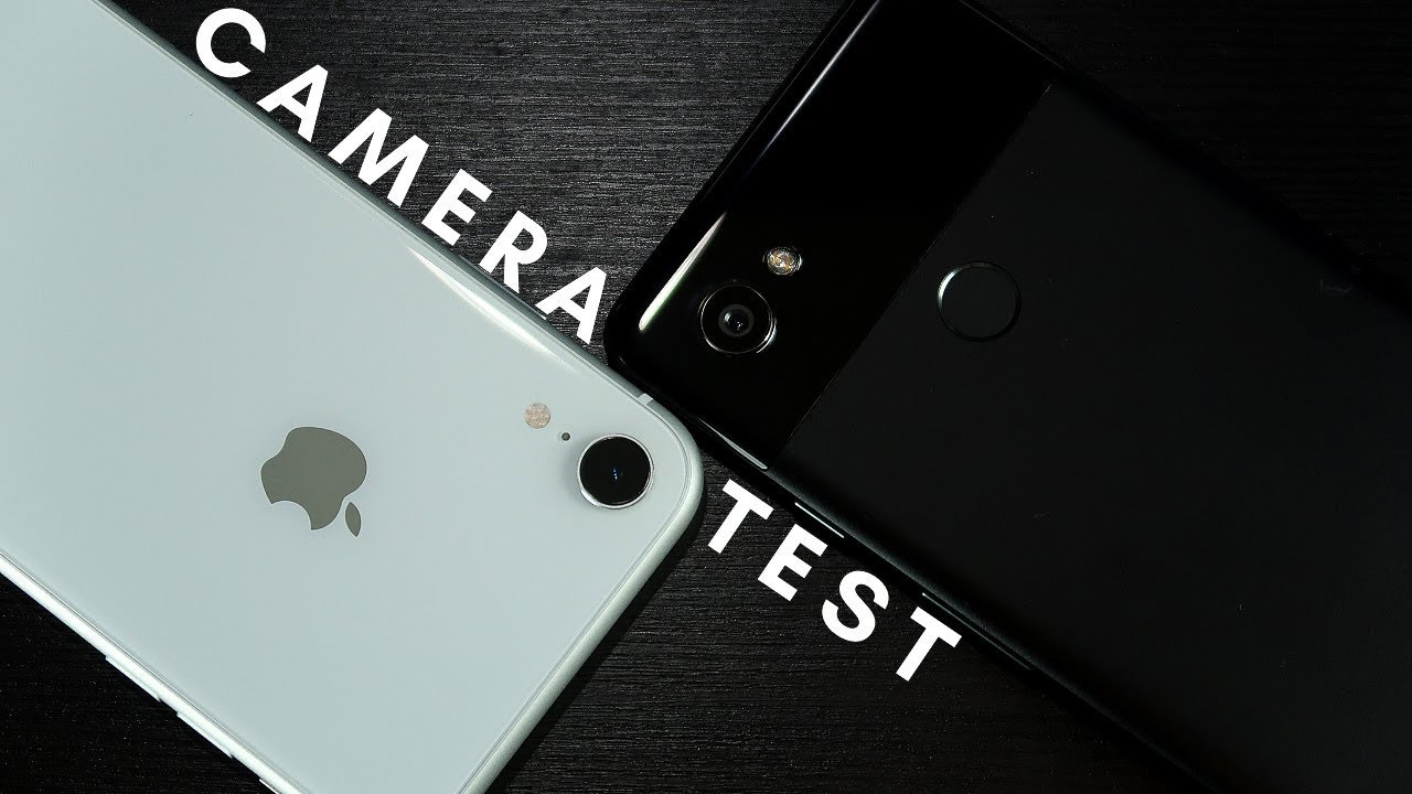
IPHONE XR VS PIXEL 2XL: CAMERA COMPARISON By Anthony Najera
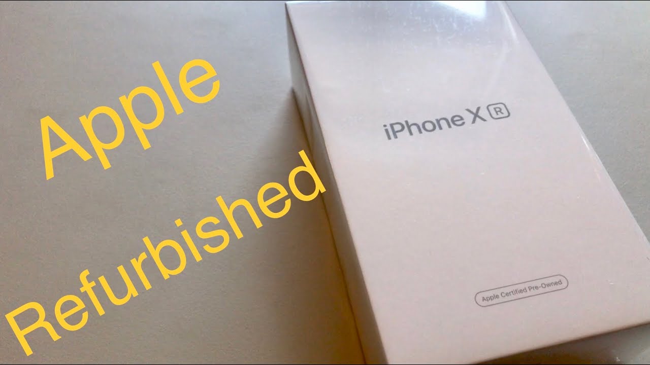
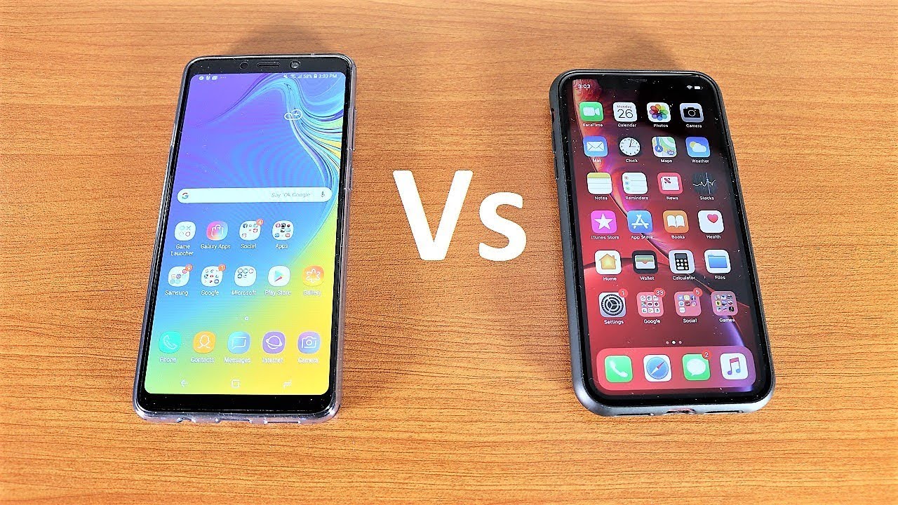
Hello guys Anthony here in today's video, we're gonna, be looking at the iPhone 10, our camera versus the pixel to excel both take excellent instagram-worthy pictures, but we're going to take a closer look at some examples of each, so you guys can decide which one you prefer. Both the 10r and the pixel to Excel have a single lens camera setup, but they have slightly different, specs and features before we get into that. Though, I want to give a shout-out to Oswald 2004 go check out his page on Instagram anyway onto the specs, so for the iPhone 10 R, we have a 12 megapixel sensor with a 1.8 aperture adjustable portrait mode, which does not work on objects, optical image, stabilization, quad, LED, true tone, flash and smart HDR or high dynamic range in comparison. The pixel 2 XL has a 12 point: two megapixel sensor again with a 1.8 aperture, an adjustable portrait mode optical image stabilisation, and this year the pixel also features a nighttime mode called night side which, unless otherwise stated, is going to be used on a low-light test in this video. For this first test, the pictures were taken as the Sun was going down, and you can see the iPhone 10 R is still able to capture a great amount of detail. If you look at the background, specifically you can see, the dynamic range is looking perfect.
In this picture. It manages to capture a lot of details in the clouds and in the sky. However, the model which is the main focus, looks very underexposed, which makes for a bad picture on the right side. We see the Google Pixel night side at work and working very well. Almost every color on the image is looking vibrant and although it is using a lot of software, the picture looks sharp and accurate one.
A that the pixel 2 could improve on is the dynamic range, because the sky looks very washed out compared to the iPhone 10 art. Overall, though, I definitely prefer the Google Pixel photo on this one. For this next example, the iPhone 10 are done way better than I expected, there's lots of light coming from the building, but other than that it's pretty much completely dark. At this point, the picture captures enough light to make the image look really sharp and the colors look great. Although the background is a little too dark for my liking.
The overall image looks really nice, given the dark conditions again, the image that comes from the pixel looks fantastic, the colors are popping and crazy, vibrant the image is bright, and the colors are saturated just enough to make the subject and background seem natural. This is a great photo, but it does fall short in a few places compared to the iPhone. The image is full of noise, especially in the background and around the flowers and stairway as well. This makes the overall picture look a little fuzzy and less sharp, and, although the colors almost completely make up for that, I can definitely say the iPhone took the win for this one. Let me know if you agree down in the comments below this is probably one of the best low-light pictures I was able to get on the iPhone 10 are the color, sharpness and dynamic range are all pretty great.
The only place that this really takes a hit is the trees. On the left hand, side they look a little blurred together and not as sharp but all-in-all a very decent picture. The image captured on the pixel to excel looks great as well. It's very saturated but not overdone. The skin, on the models, hand, is glowing and doesn't look dull like it does on the iPhone.
There is more detail and shadows preserved in this picture, especially in the tree line compared to the iPhone photo. The branches are more visible and look less like a giant blur again. I'm going to have to give the win to the Google Pixel to excel, just because it does preserve a lot more detail for the fourth test. The pictures look almost the same to me. I couldn't really find a big difference.
The pixel two is slightly more detailed, but not by much the pictures both use flash for this one and the pixel to Excel was not using nitrite. Once again, both images were taken with the flash, but there's a significant difference with the colors and quality the iPhone was able to capture the color of the table almost exactly, and it is super detailed, although it does lose some of that in the objects. In the background, the subject and the colors are very precise, there's very little noise, and I'm very impressed with how this shot turned out on the pixel. You can immediately tell the table and the subject are both washed out, and they don't look accurate when it comes to color. Although there is a little of noise, the rest of the image looks clean the table and the surrounding details are not as sharp and the subject just looks a little hazy in this test.
I'm definitely going to have to give the iPhone the wind okay. So now we're going to be moving on to the next part of the test, which is adequate lighting conditions for this set of photos. The iPhone 10 are created a natural background blur with eye-popping colors. The image is very detailed and very sharp. In contrast, the pixel photo looks a little dull and the colors don't look as flattering aside from that, though.
The details and the blur look really nice, and this is by no means a bad photo, but when placed side by side against the iPhone, the pixel looks like it under delivers for this test and for once the iPhone is the one that stands out because of its over saturated colors, not a bad thing, though. So, once again, the images are very similar. The grass and the leaves are crisp on both images, and they do look a little better on the iPhone.10 are the only real difference, though, is the colors on the pixel to excel. They are a lot more cool and on the iPhone 10 are you can see that the colors are a little warmer, so it really comes down to preference for this image, I personally, like the pixel to excel, because it makes the metal look truer to life and more color accurate. But when it comes down to an image, this good, like I, said it pretty.
Much is up to preference. So, for me, I'm going to have to go with the pixel to excel okay, so onto the next test, which is going to be portrait mode. The first test is going to be on the selfie cameras, and here are some additional specs for those, so on the iPhone 10 are as a 7 megapixel front-facing sensor and on the pixel 2 Excel has an 8 megapixel sensor, so it's not a huge difference, but it is a little different. So here are my thoughts. The iPhone 10 R does a perfect job of capturing the true to life color.
That is my hoodie. It captures that whole worn out look while on the pixel to excel. It makes it look more like new. Besides both images, looking good in the color Department, there are other differences to be noted, and the first is the noise. The iPhone 10 R starts to lose a lot of detail on the surface of the Hat and loses sharpness the closer to the edge you look.
The pixel is a lot harsher with the outlining and separating the subject. From the background, this makes the image look touched up and unnatural, and adding to that, the colors look, very saturated, and the picture overall looks heavily edited I, however, love the look of that, and definitely prefer it over the iPhone, but I know a lot of you would rather go for the more natural-looking photo which, by the way, you could touch up later. The last thing that I notice is that the lighting in the background seems very blown out on the iPhone and the pixel 2xl makes it look more like a soft glow. Let me know which portrait selfie, you think looks better. The final test is the main camera portrait mode test, keep in mind that both of these phones have a single lens sub, and what that means in terms of portrait mode is that the phones are gonna, be relying on software to blur the background.
With that in mind, let's take a look at the iPhone image. First, so right off the bat you can tell the colors are eye-catching. They are very vibrant and look really nice. The whole image is a bit cooler, but nothing to complain about with the colors I tried to trick the camera by wearing a hat and sunglasses, but even then the iPhone did a perfect job at separating me from the background and creating that awesome blur effect. Taking a look at the other side, we see that things are drastically different.
The pixel took a warmer approach in terms of color and I. Think it looks amazing. The colors look more accurate, but are still saturated enough that they stand out note that the gray sky seems to be a reoccurring pattern with the pixel to excel, but I actually really love the look of it as it makes for a more dramatic shot. So I, really like the background blur on this picture, it did a perfect job of making me stand out. However, I was able to trick the software this time around with my glasses, so in terms of quality, the iPhone would definitely take the win for its flawless portrait shot.
Even though the bouquet was better on the iPhone I think my go-to for portrait shots would definitely be the pixel -. The colors are simply better in my opinion, and the background blur was good enough for me, so that's gonna, be it for this camera comparison. I hope you guys liked it make sure to stick around for more content and I hope to see you in the next one.
Source : Anthony Najera
