iPhone 11 Pro: All Colors In-Depth Comparison! Which is Best? By Daniel Romero
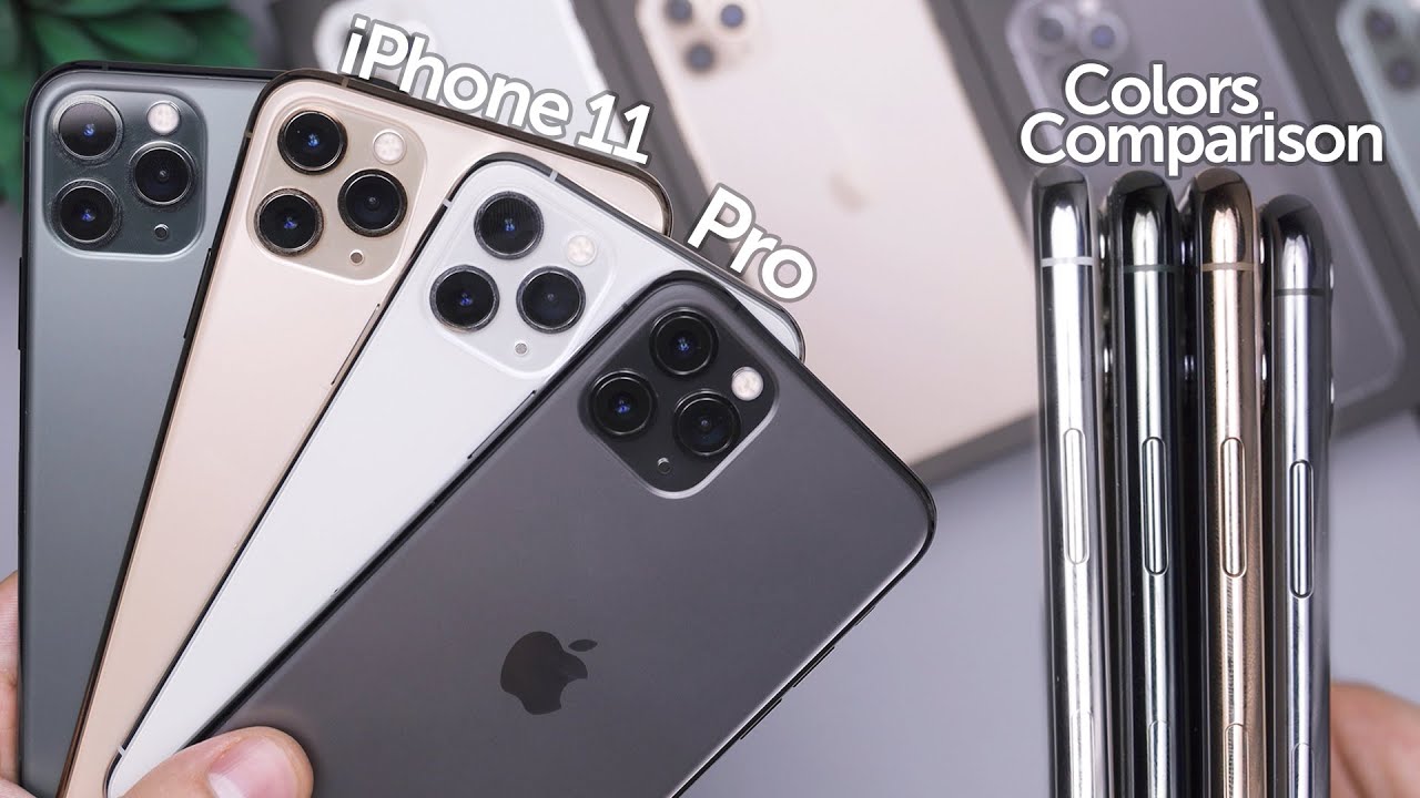
Hey guys how's it going down here today when we take a look at the iPhone 11 Pro in the silver midnight green space, gray and gold colors here and now. The point of this video is to show you guys the colors in different lighting conditions and give you a feel for how these colors look in case. You can't go to the store and check them on all for yourself and just to you know, show you those different lighting conditions, because in the store they do look quite different to how they would look with all these lights turned off yeah, let's go ahead and get right into this. Of course, here is the silver and the green I would say that the most popular colors this year are probably the green and the gold within the space gray and the silver being the one kind of left behind that people aren't really looking into whatever color you choose. They're. All perfect I personally want what the midnight green before seeing any of these do.
I regret it not necessarily, but uh you know, I would have preferred the space gray, but I'm good with the midnight green, because in most cases, even when it's dark, it looks pretty much like a really dark phone, and it's close enough looks good, and it's different to the space gray that I've had in previous years. However, I do want to say that my favorite clock is most definitely that Space Gray right there. It just looks perfect and ever since I unboxed it I, was just really blown away about how good the color looks, and I think Apple really finally nailed this space gray color in the past. I haven't really been a fan of the gold color for apples, phones, but I think that this year in particular, it actually does kind of do a nice mix between what we've had in the past with rose gold and normal gold, and this kind of does a nice mix in between there and the sides look nicely gold, so I think. Finally, I do kind of like this year's gold and matches really nice with that matte frosted back looks perfect and yeah.
Well, it's not my favorite here. I would actually say it's. My least favorite out of three I do prefer the other three more than I. Do the gold I still do think that if I ended up with a gold phone, I really wouldn't mind at all now in case anyone's wondering this is a little larger, because this is the max model. So these are just the regular pros.
This is the pro max, and I'm not really going to show the fronts that much because, honestly from the front, they all are basically the same thing: I used to show the front and the that's, because some devices had white fronts and that made a difference to when you were using it. But now all these have OLED displays, and they have a black front like this. So there's really no point in showing the fronts that often- and you can barely even see the sides when you're looking at the front, because the display kind of wraps around. So that's worth noting I've seen some comments regarding why I don't show the front or with the phone on they all basically look the same from the front. You're really only seeing changes from the sides in the back and, of course, if you put a case on you're, really only seeing changes from what you see with the camera lenses and some portholes at the bottom and the volume buttons now they're.
Taking a closer look at all four colors, you can kind of see that camera bump there on all of them. I. Think overall, Apple did a perfect job of designing the camera bump for the fact that it has three lenses on there and, of course it would have been nice to have that flush with a device. I would definitely take a thicker phone in exchange for not having a bump at all, but for what it is for having three lenses I think, overall, each device looks good with its corresponding bump. If anything, I would say the worst one would be the silver for me just because it contrasts a lot and that bump really stands out and not even the bump, but just the three lenses themselves is what really stands out on the silver on the Space Grant on the green.
You really just see the bump, but since the bump is clear on the silver and also a little clearer on the gold, you kind of just really focus on those lenses there. So if you're looking to hide that I'd say the green and the space gray do the best job of doing that when Apple announced these devices- and they talked about the matte frosted back, so I was super excited, and I still am, and I really do love the look and the feel of these don't get me wrong. However, there's one thing that didn't really cross my mind when, when I got it and that's the fact that when I hold it without a case because for the past six months or so, I was using my 10s without a case and that one has a glass back. Just like this. Ten are well I was using that I didn't really care about getting the back scratch.
I actually stopped caring completely about the back, because it just felt like and never got scratched. My screen would get scratched, but the back felt like indestructible, and now I've been trying to use the green without a case and I just do not feel as comfortable. It could be because I just got the phone, you know still new I don't want to scratch it. However, the feeling of it just makes me want to put a case on it more so than when I had my Space Gray 10 s. That could just be me, but it's definitely something worth noting.
It doesn't feel as drippy, and it doesn't feel as safe in my hand, I don't feel like I just feel like it's going to get scratched with something that I put it on. Well, with my tennis and like this 10 R or just the 11, it doesn't feel like it'll get scratched with pretty much anything like there's a stock that I have that has a metal backing to it and I have to remove the case. To put it onto it and every time I do I can kind of hear that sound of this sliding into it and it kind of feels like it's scratching the device, that's something that didn't happen with the glass, so I'm thinking of changing that dock now, because I feel, like eventually I'm gonna, get this back scratched and I feel like a scratch on. This is going to end up being worse than a scratch on the glass, because on glass you can kind of like you have to really look for it. On this instance, Matt I'm not really sure what happens, but I'm pretty sure it would be like a super notice.
Will scratch right so something to keep in mind with these Matt backs? Look very beautiful: will they hold up? Who knows? I've really been thinking about that and how well they're going to last over time with that said again as far as colors go I think if you've always liked the gold you're gonna, like this year's gold, if you've always liked Space, Gray you're going to be blown away by this. Your space great, if you've, always liked silver, then you're gonna, like this, your silver again, because the silver as I mentioned in the unboxing for this one, it is not white, and I've, just been wanting it to be white for longest time because apple since the time they've been taking out this kind of cloudy looking white, which doesn't look as good. In my opinion, as what they've been doing with the iPhone 11 and D 10 are where the whites are very white, and it just looks spotless. You can kind of see it right there. It just doesn't really look.
What does it thereare something about it, and it's not super noticeable on camera? It's more noticeable in real life, throw some shots that I'll take where you can see it a little more. Somebody in the comments mentioned in the last video that it looks like a pearl white, and that is exactly it. It's like adolescent pearl and this kind of weird tint to it. That still looks good. However, it's worth noting that that's what it is in that this is not white at all, in the same way that the space gray is not black this year, because in previous years this base grade was pretty much almost black.
However, this is definitely not black. This is definitely a gray color, and this year in particular, this white is definitely not white. It is definitely a silverfish whitish, pearl, is, type, color and I. Think the same thing applies to the gold: it's not really gold. It's like this.
Furthermore, it has a some tone to it's like pink hue to it. That adds a little of that rosiness from previous years, which still looks good. However, is his not a straight-up gold color. The midnight green I think this one lives up to its name, the most almost because it is green, and it is a darker green. That's not very easy to spot, so it doesn't shine bright.
It doesn't stand out too much, which is why I ended up keeping this one. Instead of switching it back to the space gray. Had this midnight green been any brighter or if the sides had been brighter and not as dark I would have brought it back and switched it for these space gray because I don't want stainless steel sides that reflect a lot of green, and I wanted something that didn't attract too much attention, and this one is close enough and especially the case it might as well just be the space gray. Now, the stainless steel on all these devices look really great, and you can kind of see it there and yeah I can't really stack them back-to-back, as I mentioned in a previous video, because I can scratch the screens if I do that, with the lenses of the backs of other devices. So this is the max I can do right here, and they all look great, don't worry about the sides.
They all look. Really nice worry about the back. If you like, the back, you will like the sides of the devices I. Think the gold side is really nice. The green is really nice.
The silver looks really great this here and the Space Gray does too. They all look really great from the sides, and I really have begun to love that stainless steel border. It's basically indestructible feels really great in the hand, and it allows you to basically use the phone and click things and bump it into things without really worrying about dinging it too easily, like you, could, with an aluminum device like the 10r, the iPhone 11 and older iPhones. As far as the boxes go, I didn't show the boxes here you go in case. You want to see how the box for every single color is I did do unboxing of all of them and I know some of you guys saw them.
So this might be pointless, but these are the boxes for each color. You can see that there and let's put every phone on top. So yet you can see that the colors don't quite match the box. For example, on the space gray box, the color is definitely darker than one. It is in real life.
The gold one looks kind of paler on the box and the green one looks far more green on the box. While the silver one looks far more white on the box, so the boxes aren't really representing the colors and online I would have to say the exact same thing holds true online. The pictures for the pros are not representing the color as that great they definitely go out of their way to make them look a little better, at least in my opinion, for the gold and the silver of the civil one looks like white in a lot of the promo images and shots that I've seen, but it really isn't as long as you know that it's cloudy white kind of adolescent going into it, you were gonna really like it, but if you're ordering this thinking, it's a white phone you're going to be super disappointed because it is definitely not, and it's not very close to the white of the iPhone 11 yeah guys. That's pretty much of this video didn't want to really go into cases in this one, because I feel like I've done, that in pretty much every video and every unboxing and stuff. So you want to check out cases also did a case review of Apple's, silicone and leather cases previously, and that one shows pretty much all these colors in those cases make sure to check that out.
If you have any specific questions or anything, make sure to leave a comment down below, and I'll get back to you as soon as I can and make sure to leave a comment down below with what your favorite color is out of all these four I'm definitely sticking to the fact that I think the Space Gray is just killer this year, it's just they nailed this base gray color. Second I would choose the green third silver and fourth gold, but with that said, I think the all really great this year, and you can't really go wrong if you like a certain color, so I yeah, guys that's pretty much it for this video again, I will catch you guys in the next one go bye.
Source : Daniel Romero
Phones In This Article
Related Articles


Comments are disabled
Latest Articles