HTC Desire Eye Review! By Android Authority
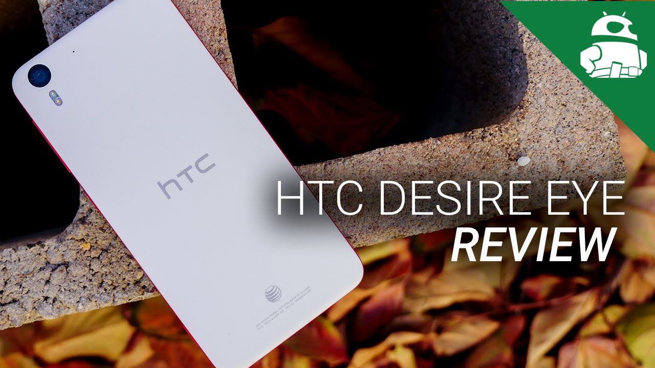
As, the so-called selfie revolution continues to gain steam. Phone manufacturers are finding new ways of making yourself portraits better in HTC's case, the solution was to simply take the rear, camera copy it and paste it on the front. Is it the camera combination that we've been waiting for? Well, let's find out because it's Josh of Garth Android Authority, what's going on everybody- and this is the HTC Desire eye HTC- continues to push their design language in the desire series, and I'm definitely a fan of how it makes the eye look, given that it is considered a mid-range device. The Desire eye gets a plastic construction that still feels pretty sturdy nonetheless, due to a little of weight, but the real story deals with the color. Yes, I do have an AT&T version of this phone, and thus it comes with an expected red orange motif. But this dual color palette is the desire eyes calling card something I should mention is that the version I'm currently reviewing is the red and orange version from AT&T.
But there was a gray in blue edition that was available when I first got a look at the desire. I currently I'm, not to sure what that version has gone elements around. The phone includes the boom sound speakers almost ingeniously, tucked between the screen and the bezels at the top and bottom. The button layout is all found on the right side and includes the dedicated camera button near the bottom. These buttons are made of the same plastic and can be quite squishy, especially the camera button, which was the most significant bummer and, of course, the dual 13 megapixel camera is adorned the typical spots at the top of both sides.
It's a little odd to see such a large optical package above the screen, but that is the eye looking right at you. The shape of the phone is best described as simplistic, but very effective, subtle curves around the sides and in the corners further add to the attractive, aesthetic and with an accessible 5.2 inch display. The handling experience is up there with the best HTC likes to keep their devices rather narrow, so the side to side grip is easy, and the smooth plastic keeps things from getting smudgy which provides a pretty safe tactile feel the best part being that this entire phone is actually waterproof. It almost makes you wonder why other manufacturers don't try to let's say experiment a little more with their phones, looks like the Desire eye does with color, and perhaps they should return to a more classical shape, like the Desire eye does quite symmetrically HTC, thus, does it again in the design department creating a phone that looks and feels pretty great, as mentioned before, a 5.2 inch display keeps the desire from being too big, perhaps a better choice compared to the earlier brethren. The larger desire 8 to 6 specs, come in with the standard 1080p display rocking 424 pixels per inch, which is a pretty great density for sharpness across the board.
This is an IPS panel, which then brings the expected brightness levels. You'd want to make this a good performer in even direct sunlight and HTC's penchant for darker interface. Element works well on the screen that solidly handles contrast, watching movies and playing games brought me an enjoyable experience, though. I will admit that the boom sound front-facing speakers deserve quite a bit of the credit here as well. Now, despite being in the mid-range segment of HTC's lineup, the desire I manage to pack in a snapdragon 801 the Trait 400 quad-core variation that brings 2.3 gigahertz and speed. This is along with the Adrian 330 and two gigabytes of RAM I didn't play super intensive games with the Desire eye, but I don't doubt that it will get the job done with minimal lag.
The games I did play on it performed with little to no incidents getting around the interfaces nice and smooth, but that's due in part to HTC senses, simpler architecture, which is certainly a different, take on the classic Android experience, but it's still a highly accessible iteration HTC is grid design and the recent apps screen allows for jumping among nine applications, and that was more than enough for my multitasking needs, as HTC has always managed to get right to their interface. More than anything else keeps things simple, and thus the Snapdragon 801 is able to keep things fast, Hardware aspects for an HTC phone, almost always start off. On the same positive note, quite literally, the boom sound speakers found on the front and given the placements almost out of plain sight, really HTC continues to be a pioneer for a feature that many other manufacturers seem to stray away from in their own design languages. So the sound from these speakers is already vastly better than any rear or even side mounted speakers, though, I will say that it lacks the oomph of its flagship brethren, the HTC One speaking of sound call qualities. Word should be with no drops on either end a little issue.
Hearing the other party, clearly speaker, phoning, is still pretty nice with the boom. Sound speakers, though, and the same sensor suite that helped the HTC One m8 in the usability Department comes here in the desire I'm allowing for easy access to the interface via swipes or taps after raising the phone from a table or pocket. It's not hard to trigger these gestures by accident, though, but at least they just get into the actual interface and don't really trigger anything that could be troublesome. Otherwise, you get many of the same bits and pieces inside the desire eye, and this AT&T catered version did well to provide fast and reliable internet battery. Life relies on the 24 hundred million power unit inside which is a little smaller than may be expected for phone this size.
Thankfully, however, the general experience has yielded the full day's worth of usage at bare minimum. A lot of different power. Saving features are available in order to make it push closer to the two-day mark, but that will probably be only possible with the superpower saver that strips the phone usage down to its bare essentials, as is the growing trend with phones. These days, this Snapdragon processor, underneath coupled with a capable quick charge, adapter allows you to get half of the battery life back in about half an hour. That was mostly right.
It took a little longer than half an hour for me to get 50% back on here, but nonetheless it is a trend that is good for a lot of users out there and looks to be the growing norm. But, of course you want to know about the camera experience, which is the crux of the desire I experienced. Not only does it sport a 13 megapixel camera up front, but the software and sharing experiences are also in HTC's bag of tricks holding down the camera button can activate the camera app, which is a nice shortcut to have, but ultimately was the only time that I use the button. This is because the dedicated camera button is simply too squishy for what it's supposed to do. The soft press halfway down to gain focus, isn't too bad, but pressing down even harder to trigger the shutter, almost always makes my handshake and thus yield a pretty blurry photo more often than not simply put.
This was more of a frustration when it didn't need to be, and speaking of frustration using both cameras in unison using the relevant modes seem to be sometimes too much trouble for the phone to handle. I found it hard to get a uniform exposure on both and sometimes even focus on. Just one side was alright. Thankfully, there is a mode here in the split capture that allows you to take a picture on one side first and then take a picture on the other side, but it's a little more work than I feel should be needed for something like this. Overall, the app itself is pretty easy to get around, which shouldn't be a surprise to any HTC veterans, simply swiping from the very sides of the viewfinder changes the modes, and when you hit the button you can still see the various ways of using the camera.
Split capture is a really nice way of using both cameras in unison, especially in video, because when using photos and split capture, some of those frustrations like I just mentioned, can come up photo booth, splits, a number of sequential shots, making it easy to make a collage on the fly. This is a mode that I feel could be used often by social media users, and there are many modes and manual controls available, though having to go through the little menu just to activate a mode like HDR. Is it really an ideal way to access a feature that has become essential for many pictures? Quality is hit-and-miss at best, unfortunately, for a camera setup that is supposed to champion self-portraits. It just isn't practical to use in most situations where you would want to take a picture of yourself. The main issues come up when indoors and in low lights.
For the most part, this should be expected, but, let's just say, our hopes were a little higher with the Desire eye. A very distinct fuzz and grain showed up on any pictures away from the comfort of broad daylight. This was also true for the rear facing camera and, while both cameras benefit from dual LED flashes, their harshness on the subject just made for pretty much equally unattractive photos out in the wild. The cameras fare much better, and it is really in these situations that I had a better time having fun with the extra modes and taking advantage of the HDR and right in the right environments. It's a shame that the camera experience is a letdown in the desire I, as it is what this phone is marketed for, and it's also ashamed, given all the other things that HTC got rights with this device.
And finally, we have HTC Sense, which is once again at the helm here, bringing its version of Android complete with blink feed. The second screen news aggregation experience for anyone that is used to sense in the past. This will feel exactly like. It has a more recent iteration. The app drawer is a vertical list.
The recent apps screen is a three by three grids of your apps. The home screens are secondary, ? the blink feed and vice versa, and the overall operating system takes on HTC's typical, dark motif. It's really not that hard to get around sense, making it one of the more easily accessible versions of Android. That I would recommend to new users. Colors take on a very important role in this newer version, providing cues for where you are in the system like blink feed or the gallery.
Many of these elements are customizable in a theme section, though, the changes don't do too much to detract from senses. General aesthetic, HTC's applications help make the experience more unique as well. Blink feed is still one of the best second-screen experiences available on android, showing a grid of news stories or social media feeds that are easy on the eyes and full of customization options and like in the case for the gallery. Pictures and videos are bundled together in a number of ways, the most useful of which, being probably by date, so you can trigger the readily available photo editing tools and even a nice highlight Zoe reel for your daily memories and speaking of Zoe's. The Zoe app is now fully available and is a place for you to share your custom, made memories with the masses, though my only gripe with it is the lack of users currently on that ecosystem sense has matured much since its original versions and in the most recent iterations.
It still is one of the best Android iterations out there, at least in my estimation, because it is very accessible for even the novice user. So also HTC has proven that their operating system is not only at home under flagships, but can bring a lot if not all, of the features available to the user to their mid-range as well, and in this case the desire, I Rock sense very well. Currently, the HTC Desire eye is available on ATT in the States and can be had on either of their contracts or monthly payment plans. Though it's full unlocked price on the website comes up at five hundred and forty-nine dollars, though there are plenty of mid-range offerings that provide many of the same experiences. None have the dual powerful camera setup of the Desire eye, which makes it a bit of a bummer that this phone's differentiating feature just doesn't go above and beyond, and so there you have it.
The HTC Desire eye is HTC's first take on a common problem. Front-Facing cameras are just not as powerful as their rear facing iterations and HTC believes they need to be for our self-portrait obsessed generation. Does it do the selfie revolution justice? Well, yes, and no, while HTC provided fun and useful modes take advantage of its front-facing optics, their picture quality just isn't a step forward where we did hope it would be a bounding leap. Perhaps HTC needs to perfect their rear facing cameras before thinking of putting two of them on the same phone. But when you look at the rest of the phone, the Desire eye is a very compelling package of attractive design, great internals, waterproofing and boom sound speakers that could make many flagships flinch and this disparity in quality, especially considering what this phone was supposed to be able to do or let's say capture, is ultimately it's unfortunate, Achilles heel.
As always. Thank you guys very much for watching, and I hope. You enjoyed this review of the HTC Desire eye. You can check out the camera shootout, which is over on the side in order to get a more in-depth look at the picture quality and then, after that, if you missed our live hangout for our 1 million subscriber celebration, you can also see that right over on the side, just an hour of us kicking it, and you get to have some fun watching us talk about our 1 million subscribers. So from there keep it into Android authority, don't forget to drop us some likes on our videos and to subscribe to our channel.
If you haven't already check out the content from all of my colleagues in Android and when you're done with all of that, you can head on over to android authority comm, because we are your source for all things. Android.
Source : Android Authority
