Apple iPhone 7 & 7 Plus (PRODUCT RED): Unboxing & Review By DetroitBORG
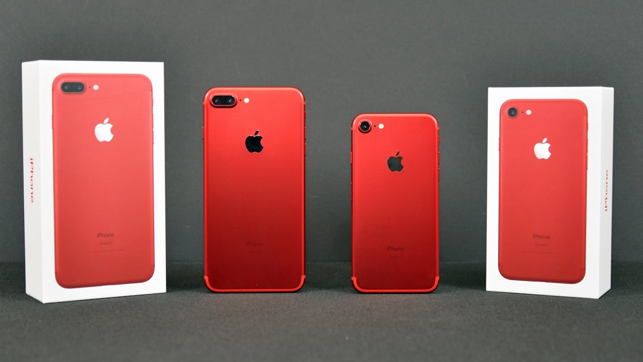
What's up guys Mike here, the Detroit, Borg and Apple have finally released a product red version of its iPhones so midway through the lifecycle of the iPhone 7 and 7. Plus we get this brand-new color we've seen this color before on iPods and accessories, but we finally get it on the iPhone now very similar to jet black. This is only available in the two larger capacities 128 or 256 gigs. So that means you do have to pay a bit more to get this phone because you can't get the 32 gig model. Of course, we have both models to take a look at so let's get to the unboxing now I'm going to start off with the 7 plus, because that's my daily driver- and they make it very easy to unwrap this- just pull the tab, remove the plastic, and we're ready to go ahead and lift the lid so lifting the lid. The first thing you see here won't be the phone, but the paperwork, so the paperwork in this case has been tweaked for this specific model.
That's because this is a product red cost, meaning that a portion of the profit from this film goes to the product red cause, and you can find out more by going to the link. Besides that, we have some pretty familiar paperwork: a Quick, Start Guide, highlighting the main buttons and features of the phone along with a sim ejection tool and I get this because I have a sim unlocked phone. So there's no sim in this film, so at least I get a tool to install my own. Of course, we get some warranty and regulatory information along with some Apple stickers. Unfortunately, they're not run that would have been fantastic, they're just white, and they come on this clear sheet, just like the other iPhone 7 & 7 pluses.
So once we get all of that out of the way we can get to the phone itself now, at first glance it actually looks like a silver phone: that's because we have a white front and a silver touch ID ring, but as soon as you flip it over, you get this very stunning, vibrant red color. So the more light you have on this, the more it glows it really is stunning in person, so we can go ahead and peel off the plastic to reveal the final finish. So this is the matte finish very similar to the other iPhones that anodized aluminum finish. This is not like the jet-black glossy finish, so it should be pretty durable. The other thing you might notice right away is that the inset Apple logo is silver instead of a matching color or matching tone, as we see with the other iPhone.
So really. The same here is white silver and red, but, unlike the other phones with a white bezel, the antenna lines are matched to the color of the chassis. So setting that aside really quickly, let's get to the accessories which are all familiar, we get at five watt power adapter, along with a set of ear pods, also included on the back, is a lightning to headphone adapter. In case you forgot that this does not have a headphone jack and, lastly, very compactly. Tied up here is the lightning cable for charging the phone.
Next up, let's dig into the 4.7 inch iPhone 7, so the packaging here is identical. It's just shrunken down to size, I'm, going to make this fairly quick, we're going to unwrap the box, lift the lid, and we'll find very similar paperwork, and underneath that we have the iPhone 7 wrapped in plastic, unwrapping that looks just as stunning as the 7 plus and, of course, in the box, we get all the same accessories just more tightly packaged so putting these phones up. For the first time you can see, the boot screen is white to reflect the white bezel, so it's not red or some other funky color here it just reflects the color of the bezels, just like the other iPhones in terms of software and features. There really is no difference between this and the other iPhone 7. So if you want to see more detail about the iPhone, 7 and 7 plus I'll leave my video linked below, so you can check it out terms of this color.
It's really impressive. Now this is an anodized aluminum finish, so that texture sort of reflects the color a bit differently, depending on the angle or source of the light. So there is quite a bit of depth to it and the more lights you have on this, the better. So it really is kind of like a candy apple or metallic red on a car. It really shows off the curves and I like how it plays with the light.
Now. One of the details- I really like about this design and color- is the polished Apple logo. Not only does it stand out a bit more, but it also contrasts nicely with a deeper matte red finish, so that glossy finish that mirror finish, looks really impressive against this surface. Of course, this is a product red phone, so you'll find the product red branding just below the iPhone text. So taking a closer look at those details, the buttons along the side are color matched to the phones.
Of course, we have the power button along the right and the Vaughn controls along the left, along with our mute switch and as you can see something a bit different here. Instead of an orange stripe for the mute switch, we get a white stripe. That's the contrast with the red color, so long, the bottom edge will find the speaker the microphone along with a lightning connector and the screws- and they kind of pop out here, because they're silver into the match to the color of the body like they are on some other iPhones. So they don't completely match the color. Here you can see the speaker.
Grilles are black instead of red, so those details have been missed in this case. I'm, not sure why, but it does work with the design I think, because we have those silver accents on the front and back and as always, the NATO SIM tray is color masked to the body of the phone. There's also a gasket to keep water out something on noticing for the first time with this one is the patterns or dots at the end of it I'm not sure what that is. If you know, let me know in the comment section below now, as I mentioned earlier. This is not the first time we've seen this product read design, it's exactly identical to that of the iPod Touch product red, including these silver accents and white bezel.
Now I have noticed that the product red on the iPhone, 7 and 7 plus is a bit deeper than the product red color on the iPod Touch. So it seems to be a bit redder a bit darker compared to the more Orange II red of the iPod Touch, at least compared to the iPhone 7 plus. But you do need quite a bit of light to see the difference. Now, a lot of people wanted a black, bezel and I think that would look great with a red phone, but it's also kind of intense, so I mean that red and black is a little more sinister I. Don't think Apple particularly liked that look and that's why you don't see it with the iPod touch, the iPod NATO and finally, the iPhone 7 and 7 plus.
This was also the same case with the gold iPhone. A lot of people wanted the black bezel. Instead, we got the white bezel I, still think that was the right decision, but for me, I definitely liked the wait and read and have no complaints that it's not black. Now in terms of what my favorite color is I still think jet black is my favorite overall, and that's because of that glossy finish: I love the way it works with the design of the iPhone. Everything else contrasts more with these surfaces and textures and colors, but in the end, this product red version is going to be my daily driver until they released the next iPhone, although I'm probably is going to cover it with a case anyway.
Alright, you guys don't we enjoy this, look at the new product, red iPhone, 7 and 7 plus, if you guys enjoyed this video, please give it a thumbs up to. Let me know, and I'll see you again in the next video.
Source : DetroitBORG
Phones In This Article
Related Articles


Comments are disabled
Latest Articles