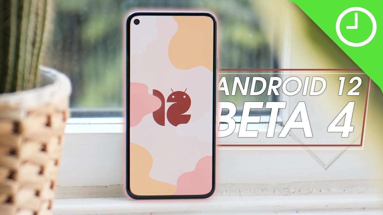
Android 12 Beta 4: Top new features! By 9to5Google
Android 12 beta 4 has arrived, and if you haven't already installed it on your device, then you probably want to know what's new or maybe what the best new features are. Well, we've got it covered. So, let's dive in thanks for watching 95 google here on YouTube, remember to thumbs up, hit, subscribe and then tap the bell icon to be among the first to watch our upcoming videos. Before we properly kick off, though, google says that android 12 beta 4 has platform stability. This simply means that all app facing behaviors and nonuser interface restrictions are now finalized. It doesn't actually mean that any user facing bugs won't be present or aren't present in this build.
We expect those to be fully ironed out in the final two beta releases before launch, meaning we'll see beta 5 and beta 6 before the stable release, but with those warnings out the way, let's show off some new stuff. Let's start off with some minor interface changes, including the home controls, quick settings, toggle simply being renamed to device controls that might help if you were wondering where it went, but it isn't a massive change in the grand scheme of things. Also, on top of that, the Wi-Fi toggle is now returning to the internet section. Yes, you can turn off device Wi-Fi from a toggle within that internet pop-up pane after opening it through quick settings, it's still not quite as fast as a long press, but it is better than it was previously another, very, very small change, and because of the lack of third-party icons, the themed icons option as part of the pixel launcher's, wallpaper and style. Section is now labeled, as in beta.
On top of this, Google has added more themed icons that will better flow with your system. Color scheme, google tasks is one such new option, with plenty more first-party apps now adhering to this design change, but not all apps are fully themed as, yet we saw the settings pages get a fairly substantial makeover earlier in the android 12 beta phases, but this was clearly a first phase change almost all pages within settings now much better adapt to your system color as per the dynamic color changes with full page shifts for icons, image, previews and actual section toggles themselves. Rounded corners seem to be more prominent to fit with the rest of the android 12 aesthetic. On top of this, the dark theme, legibility issues that we've seen in previous releases, are now fixed with this change and when a toggle is activated, a circular accent indicates where you have these enabled in said settings page, it's clearer and much more obvious at a glance, especially when using that system dark theme to help you better crop and then fine-tune selections when using the inbuilt markup tool. Android 12 beta 4 has a much more prominent and color appropriate guideline for greater accuracy.
The corner tabs from the previous cropping tool are being ditched in favor of centrally placed circular grid tabs that should be easier to spot and then grasp with your finger. Sometimes the corner placed crop tool in previous versions would be harder to get hold of, and so these changes should make it an easier to spot the outline and b maneuver and adjust to the right shape and size when you want to crop a screenshot image or anything else for that matter, although not technically as a result of this android 12 beta 4 updates when making a call using the Google phone app alongside the new microphone access indicator in the upper right, you'll see a small chip in the upper left to note just how long a phone call has been in progress tapping this icon should take you back to the call screen where you can access all the regular toggles such as muting ending the call and then the keypad itself again. This is not technically directly linked to beta 4, but it did arrive just as the latest public preview has dropped and will likely appear on your device around the same time, if you are running the android beta 4 updates on your pixel devices, on top of that, it's just a knee added extra that makes it even easier to leave the calling screen and use all other areas of device and keep an eye on just how long you've been on a phone call likely tied to the wider roller of themed icons. If you have this, setting enabled you'll get a really nice little added tweak. That could be one of the standout new additions.
So when the themed icons is enabled the Google search bar widget on the pixel launcher down, the bottom of the screen will be tweaked to fit your system theming style. The result is really subtle, but it genuinely looks incredible in person, depending on your wallpaper. You can adjust these colors by opening the wallpaper and style section and then selecting the three core colors that will be used in all areas of android 12. This should restyle the g logo and the microphone icon for a much more cohesive. Look with your system theme.
The game dashboard is now also fully usable when gaming on android 12 beta 4 courtesy of a working in-game, quick toggle that grants you direct access to YouTube live-streaming. They do not disturb mode screen, recording quickly taking a screenshot on even the fps counter for gaming. If you do turn that fps counter on the floating, toggle will show the current screen frame rate so that you can keep an eye on your in-game performance. It does seem to fluctuate a substantial amount as games hit loading screens and in-game menus. You can also drag this into the four corners of your display with a little of padding inward to try and stay out of the way of those on-screen elements and buttons, and you can just drag this around your screen, as you see fit in any game, you're playing any option that expands upon the existing URL copy option that was added in a previous beta android 12 beta 4 now sees recent recognized images and similarly mark them with a generic picture target tapping.
This elevates and zooms in on the photo with top shortcuts for lens copy share and save. This toolbar already exists in android 11, but Google is now better surfacing it to end users after tapping this image. Meanwhile, you can tap the row of people or drag the image over to a contact icon with the option to expand this, to use more applications and share with more people. Tapping lens just opens up a larger preview of similar images, while you can use the quick share targets to send things now in super quick fashion, which may be really helpful. And finally, it's been a long time coming, but we now have the android 12 Easter egg live and ready to play with in beta 4.
Unfortunately, it's not quite as in-depth as the cat feeding mini-game from android 11, but Google is showcasing the extent of the dynamic color steaming engine. That's part of the massive material you overhaul. You can get the android 12 Easter egg, as you would, with any other version by heading to the settings app opening about phone. Then android version from this page tap the android version until the Easter egg pops up on screen. This will open to a view of your wallpaper that you've selected covered by a material use style, clock widget, showing the current time on your device tap and spin.
The minute and hour hands and spinning to 12 o'clock will animate that android 12 logos into view, while the page will then be covered in circles of various sizes, all using colors from your current wallpaper, which is one of the hallmarks of the entire material you design language. So from what we've seen, or you've seen thus far. What is your favorite new feature or features with android 12 beta 4? Let us know down in the comment sections below and if this video manages to reach say 2 500 likes we'll also share another of our new and exclusive android 12 beta 4 wallpapers so be sure to share this video with as many people as possible, and if you want our previous designs, then be sure to check the link in the description, but as always until next time, this is Damian with 95 google saying thanks for watching, and I will speak to you later. You.
Source : 9to5Google
