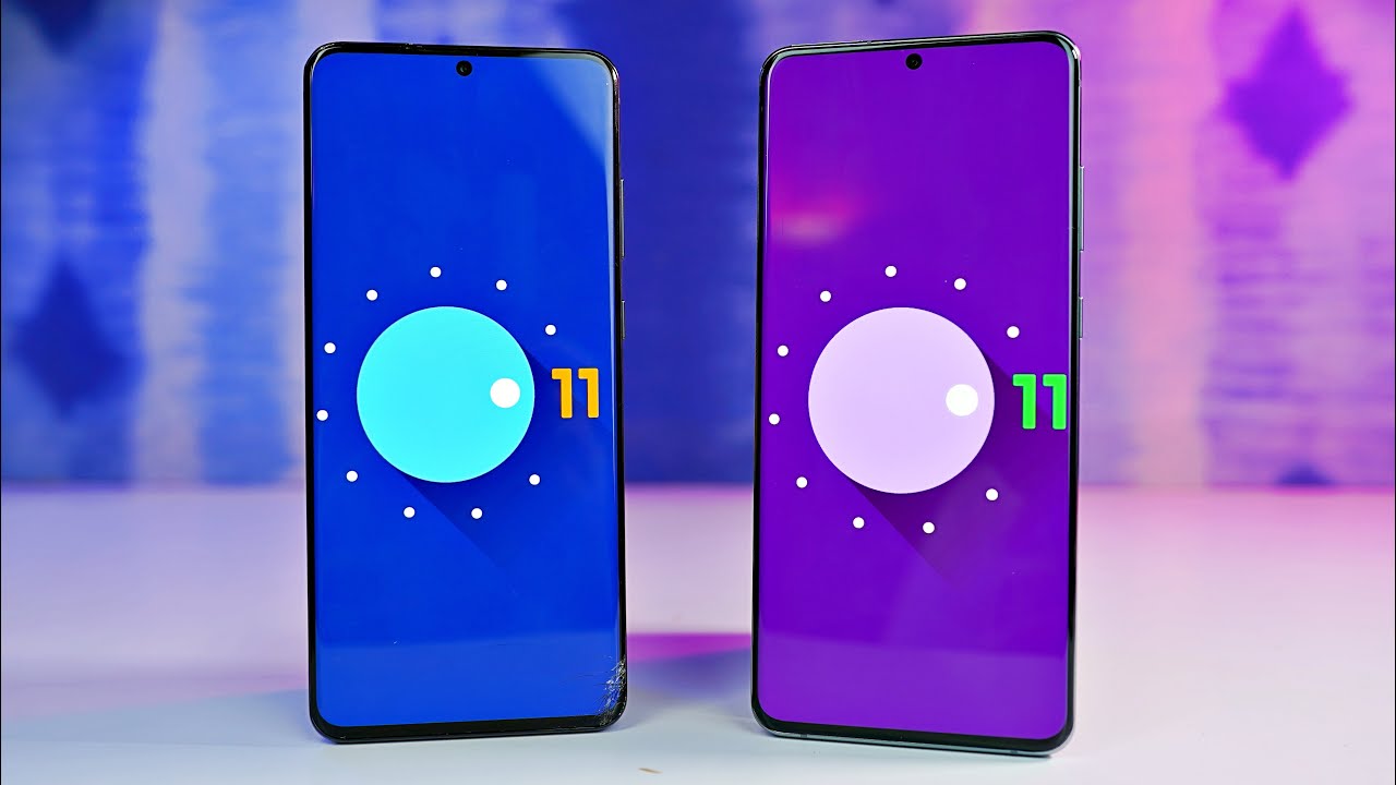
Samsung One UI 3.0 Android 11 OFFICIAL Review! New Features & Changes! By XEETECHCARE
Hey, what's up guys, and it's time to finally take a look at the android 11 based one UI 3.0. This update right now is only open for developers. It's the beta one, and it's only present in selective countries like South Korea and USA, where we have these snapdragon models. So if you're rocking the exodus model, you cannot install this update. But if you have a Qualcomm model, a spare s20 phone that you want to try it out. I will leave the link in the description again install only if you have a spare device, because this is a developer beta 1.
Now, even though this is a developer beta 1, it still shows off about 85 of Samsung's vision of what features that they're going to bring with the one UI 3.0. Now full credit goes to the developers over the DA forums. They were able to install this and post all the features and screenshots. So if you actually want to take a full deep dive of the review, you can check the link in the description first up, starting with the lock screen you can see. Samsung has done some change to the clock.
Now it's appearing towards the middle. You can also see the calendar information down below this in a more of a cleaner way. Now, taking a look at the home screen, you can see that we can't really tell a difference between the one UI 3.0 and the one UI 2.5, the first major visual change comes in the form of the notification panel. Previously, when you bring out the notification panel down, you can see it kind of turns everything dark, and it does the same thing when you switch to the multitasking tray, but now with the new one, UI 3.5, it actually blows the background. So if you bring down the notification panel, all the way down, you can see this new blurred.
Look, it's kind of highlighting the wallpaper a little as well. Once again, Samsung has done the change to the clock and calendar information. You can see the time is appearing in the middle and then the calendar information down below a little of change to the icons as well, overall, just more of a cleaner and something new visually with the one UI 3.0 that I'm sure most people will love. Now, as you guys know, the whole point of having the one UI is to have the comfortable experience with the launch screens and for the most part, Samsung has done a great job, implementing and optimizing everything, but one key area where Samsung didn't really think that much is when you're, actually playing with the volume keys. If I press the volume button, you can see the volume controls are all the way on the top, and they should have been somewhere on the side.
So Samsung is finally bringing that change with the 1ua 3.0. Now this is how the new volume rocker will appear on the side when you press it, so now it is much closer to your thumb, and you can pretty much play with it comfortably. This is very similar to how things appear on the pure android 11.0 update on my Pixel 4 XL. So you can further expand the media controls. As you can see, you can control the ringtone, your media uh, the voice for the Bixby.
All that stuff is there now you're getting some new android 11 google features such as the new media player. Look in the quick setting area if you're having a conversation with someone. You have this separate conversation, tab further, making the android notification system a lot more refined, android 11 also brings chat bubbles, so you can easily have the conversation while doing other things on the phone. Just like the notification panel. Samsung has done this blur thing with the multitasking tray as well.
So, instead of this shadow uh, this is also getting blurred and the close all key is having a bit of a different graphical. Look to it. Now, if you want to turn off the chat bubbles, you do have this option called as floating icons with the one UI 3.0. We get the brand new Samsung internet 13.0 browser. This browser has some nice features such as it allows you to lock a certain bookmark other than that there's a bit of an UI change.
Now, as always, we have some improvement to the actual home screen launcher so uh. Previously, if you actually hold on an icon, you don't really get the option to access the widgets. But now, if you hold on to an icon, you have a separate option to toggle the widgets directly from this shortcut. So now you don't have to hold the screen and go to the widget option separately and select the widget. You can do this individually with whatever app you choose, and it looks pretty good.
Also. We have an OG feature coming to Samsung devices and that is double tap to sleep. I'm sure a lot of people know what this means, but in case you don't know, you can pretty much double tap the screen to put your phone to sleep without using any power button. Now android 11 brings a brand-new power menu system. So if I quickly show you guys here, if I hold down the power button on my pixel 4, you can see.
I have the ability to basically restart power off or go to emergency, but if I have my smart devices connected, all of that will appear here and unfortunately, Samsung has not implemented anything at least with the beta one. So hopefully, they're going to do something like this with the upcoming future updates. Now, as always, every stock application is getting an UI redesign. So if you want to see every application, screenshot individually do check out the DA link, you actually do have to update some of these apps separately in order to have that new UI and the exciting features of the one way 3.0 is the wireless DEX capability. Uh Samsung has implemented this to some devices with the one year 2.5, as you can see right here, but this is definitely coming to all Samsung phones that can run one UI 3.0 and those phones who support DEX capability. Now we also have a brand-new minimal battery mode.
That gives you a minimal setup. It gives you limited access to some applications in order to conserve battery. Consider it like a smarter power saving mode. In addition to that, Samsung has also implemented a brand-new high performance mode now other than the note 20 ultra all other Samsung phones with 120s display are not rocking LPO, which is basically the variable refresh rate so with the android 11 one UI 3.0 Samsung will be able to completely customize the way, 120 hertz and 60hz mode switches in different situations. So this is going to be much more intelligent thanks to the features that google has built in with android 11.
So I definitely expect to see better battery life on the galaxy s20 ultra uh, when it gets fully updated to the official version. Other interesting features include the ability to have a custom call background. You can set any image any wallpaper to it, which is pretty cool. There's. Also, some new changes to the dynamic lock screen Samsung has apparently added some categories, so now you'll have a much more wallpaper variety than before, so that is pretty much what is mainly changed with the android 11 based one UI 3.0. As always, if you want to see every single detail, every single thing do check out the DA article.
That is linked in the description, and definitely this update will come out pretty soon. Uh public beta is right. Around the corner, official update is probably coming out very, very soon as well. I will be doing a full video, then, and probably doing some testing as well as some testing so be sure to subscribe to the channel for that coverage.
Source : XEETECHCARE
