Samsung Galaxy Watch 3 - New Leaked Photos & Was Huawei Smartwatch an Inspiration for GW3? By Jibber Jab Reviews
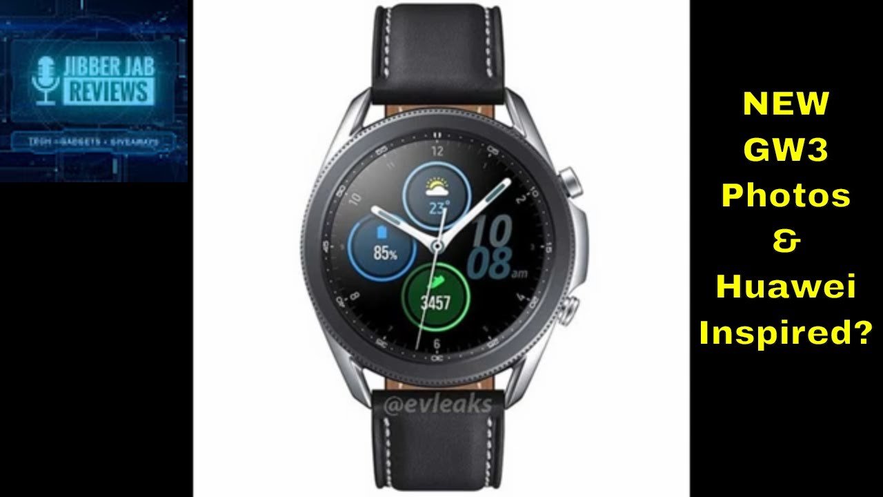
Hey guys welcome back to jobber jabber views. Well, I told you guys a couple of days ago, when the first leaked photos of the galaxy watch, 3 were released, that the floodgates would open two more leaks and I think we can officially say that they have now burst open, because several more detailed renders of the watch have now appeared online, and this provides us with a very clear picture of what this should look like when it's officially unveiled, which may be as early as this summer, or possibly even in September. So my purpose for this review is to provide you guys with the latest leaked photos of the upcoming Smartwatch, as well as to mention one feature that I noticed on the galaxy 3, which I thought was interesting and I. Don't know how you guys feel about it, but I thought I would throw it out there for comment. Anyways now, one of the main design differences I noticed right away on the watch. Are these protruding buttons on the side which most likely are gonna, have the same functionality as the Galaxy watch, I think having buttons that stick out may result in some wardrobe challenges, meaning I can see them easily catching on your clothing or possibly getting in the way.
If you decide to wear this to the gym, I can see them coming into contact with equipment fairly easily, which may result in damage or possibly scratches it's hard to say if this is gonna, be a problem without having an actual device to test this theory. But anytime, you have something for true ting from a device you're just asking for some kind of trouble. Now many of you may wonder why Samsung would go with this style of button for its case and here's where I thought it would throw another interesting perspective into the mix. The photo that I have up now is not a rendering of the galaxy 3, but it's actually the Huawei GT Smartwatch, which was released back in November 2018. This one had a very similar design to the upcoming Galaxy 3, albeit without a rotating bezel.
However, you can see that Huawei went with the same protruding buttons on the side with the GT, as well as with its updated version in the GT 2, when that one was released last year. So it's a possibility to Samsung got its inspiration for the Galaxy 3 from Huawei. Now, interestingly enough, the newest Huawei Smartwatch, which was just released a couple of months ago, resembles more of the original Galaxy watch, as you have those much thinner buttons on the sides. So perhaps you could even argue that the Galaxy watch was used as an inspiration for the GT 2e. Whatever reasons were behind the design decisions, I wanted to at least show you that having protruding buttons on a Smartwatch is not new, and it may be more popular among customers than I.
Originally thought, and the last thing that I want to mention the Galaxy watch.3 based on the latest leaked photos, is that it appears to come with three color choices for the case, that being the classic silver black and now a new bronze color so gone. Is that rose gold case that we saw on the Galaxy watch, which, for me, isn't a big deal, and personally I prefer the brushed look of bronze over gold anyways? What isn't clear yet is what finished the premium titanium case is going to be offered in? Will it be all three colors or just to select one or two that still needs to be flushed out, but if it is offered in that bronze finish, then I will definitely be leaning towards that case. Alright, guys, that's a quick recap of the newest photos that were just released, and what are your thoughts on those larger size buttons on the side of the case? Do you guys like them? Do you hate them, or you're, just indifferent to them? Let me know in the comments below thanks again for watching the review, and I'll continue to keep you guys updated as new information is released. I'll see you all in the next video until then take care.
Source : Jibber Jab Reviews
