Pixel 3a - A 2020 review! By TechFocus
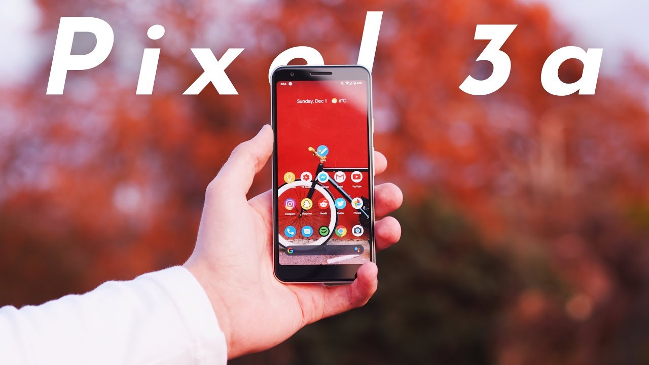
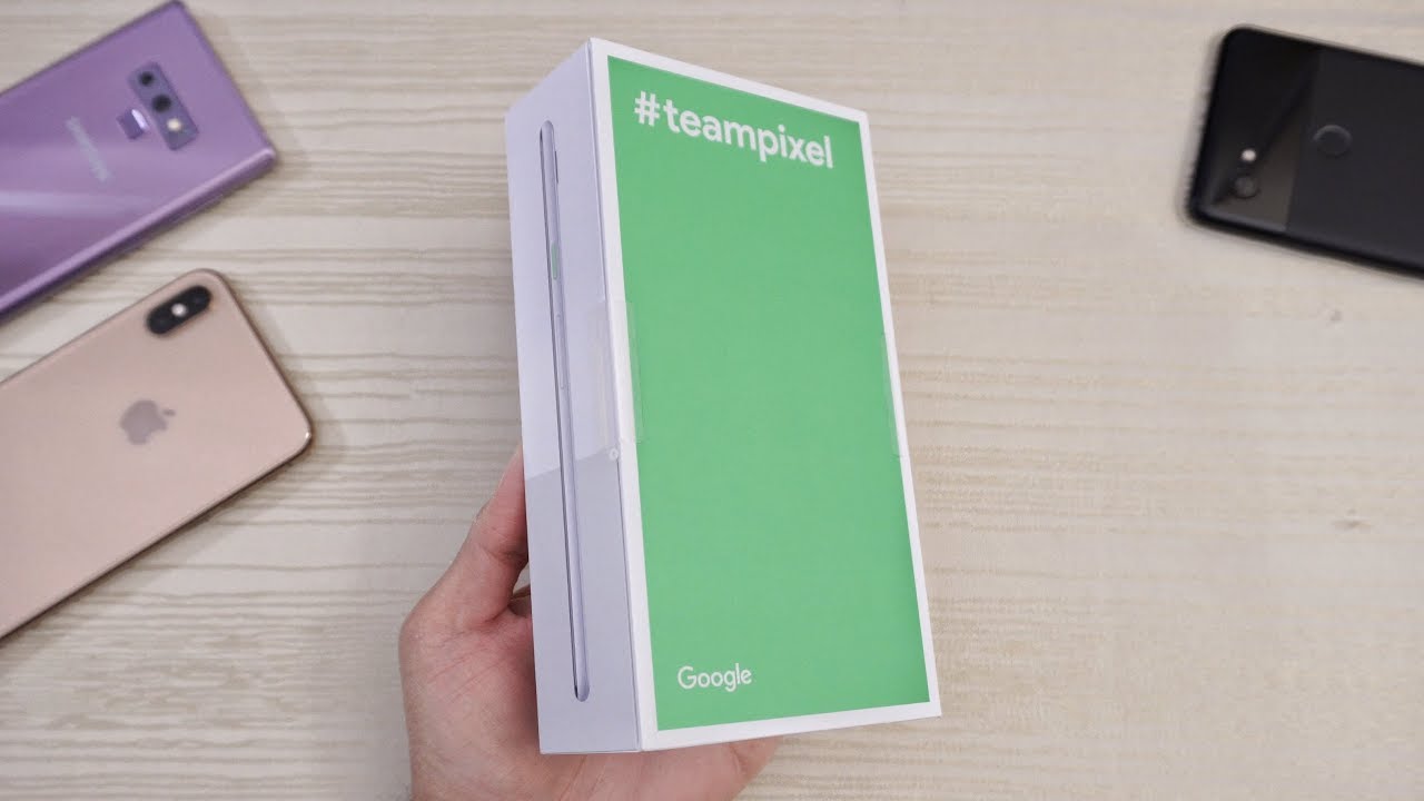
This is the Pixel 3a, it's a device that is aimed at taking on the mid-range market whilst offering the features of its bigger brothers, but for 400 pounds, do you get what you pay for, or did Google just simply cut too much out using the pixel 3 a reminders me of my time with the Nexus 5x. It doesn't have the most premium of builds or the best aspects, but there's a great deal of character to this phone and, most importantly, you get the best features of other pixel phones in a device that cost less than half the price of them. But that's not to say that it's perfect there's some noticeable removals that have taken place on this phone, the biggest of which being the build. The materials are where most of this price cut shows. Google have gone with the old plastic bill, which is not necessarily a bad thing. Is its a lot more durable and won't shatter like glass, but it just simply doesn't feel quite as nice to hold, maybe because it's lighter or because you don't get the feel of cold metal when you pick it up, but I.
Just simply haven't enjoyed the plastic as much as I would, as if it was glass and metal. Putting the feel aside for a second, the design is pretty much exactly the same as the pixel 3. It is less rounded from the sides to the back, which is refreshing, but all the best design features from their other phones, like the accent power button, the two-tone design and the high contrast looks of the camera are still here on this phone and speaking of things that are the best. This video was sponsored by mogul news, publishers, hand-picked stories from some of the world's largest publishers, including The Economist's of the times Bloomberg and more. It covers largely tech, business and political news and is my new go-to for news.
Reading. Mogul news is a new type of news platform, giving you a daily briefing that covers the most important headlines collections that are deep dives into certain topics and my personal favorite perspectives that are groups of articles offering opposing viewpoints on particular topics available for Android and iOS. Mogul news is my new favorite news platform check out the link below to make it yours to run the front. We have a dragon glass protected display, and this is the most noticeable feature loss here. Basically, all the flagships have Gorilla Glass, and this has dragon glass, because they've decided to cut out one of the most protective features of the phone which doesn't seem to make sense.
The display itself is great. It's a five point, six inches OLED with a resolution of twenty to twenty by ten eighty, and just like other pixel phones. It has a great brightness range, excellent color representation, with options for how colors are displayed and is overall, a really great screen to use the bezels. Aren't the prettiest things being chunky at the top and bottom and with some slight asymmetry they're, definitely not as good to look at as some other phones in this price range, but it's manageable being an OLED screen. There is still an always-on display on this device, and it is definitely still one of the best features of stock Android.
Sadly, the animations aren't quite as slick as they were on the pixel 3 Excel, which I reviewed just a few weeks ago. Instead of seamlessly changing from the lock screen to the always-on display, this phone breaks it up into two separate animations, and that was to me one of the real sources of polish and refinement for the pixel 3 Excel. So the fact that it's not here kind of doesn't make sense. I know that Google are trying to cut this phone down to not undercut their own products, but at the same time it's such a minor difference to add such a big benefit to user experience and just makes the whole device seem a lot more seamless. The front-facing camera is just average.
It looks to be lower quality than the pixel 3 Excel to me, but as someone who doesn't take selfies, it's not a big deal, but it really still isn't the best. Regardless you still have the portrait modes and all the other camera modes available on the front-facing camera, but the quality just simply isn't as good as some other phones in its price range or, more importantly, as it's bigger brother devices, there's no dual forward facing speakers on this device, which is a bit disappointing. Instead, Google have opted for one forward facing speaker and one downward facing, but despite what it looks like on the surface, the bottom speaker is deliberately louder to create the illusion of true stereo, which is a little detail that I actually really enjoy bass. Production is surprisingly great. It doesn't feel too bass heavy, but there's enough so that it doesn't sound tinny or treble heavy.
But if you want even better sound quality, that's where one of the best features of this phone comes into play. That's right! It has a headphone jack who would have thought in 2019 we'd see a phone released with a connector that everyone's still using just without the extra step of a dongle. Although you lose the IP rating I'm more than happy to give it up for the convenience factor, you get back. The best software features that the regular pixel 3 had been all on this phone with squeezer assistant, which is the most useful implementation of Google Assistant, flip first news, which I end up using all the time and an always-on display that recognizes music, which is honestly the best source for finding new music. If you hear something, there's very little, there's been cut out other we're.
The most noticeable thing that has been cut out are the live. Wallpapers. In fact, there's no live wallpapers available through the stock app. These were at least to me another source of polish for the pixel 3xl, the little animations you had from the live wallpapers. When you went from the lock screen to the home screen when you unlock the phone, those are missing, and it's another element to the Google cutout that I just can't seem to get behind the fact that they're, not here on the Pixel 3a, will always be disappointing.
With all they've removed from the animations of the always-on display the build and the bezel design. It simply doesn't make sense to cut this out, ?, thankfully, still having the pixel software status. You get all the best bits of Android in one place, everything that the pixel 4 has to offer like macrophotography and the ability to turn voice recordings into text documents. Kind of proves that there is nothing like stock. Currently, Android 10 has the most diverse and well implemented feature set like the recently added system-wide dark mode that you can change the accent color of all the integrations of Google Assistant and the best new addition, which is the iPhone.
Like gestures now say what you will about them being copied from the iPhone 10 and above it is still a very useful feature to have. If we put all the copying and Android versus Apple arguments aside, it does change the game completely with this phone, and it feels so much nicer to use. It may take a little more time to get used to by now find it jarring to use any phone that doesn't support gestures in the way that this does. The addition of gestures has also significantly improves the animations used with an Android closing or opening an app now goes back to its original home screen position, which is another feature that is sort of iOS like, but I'm willing to forgive it because it looks so good and in practice, switching apps and closing apps just feels a lot more smooth, but these animations only work if the hardware performance can keep up and looking at its spec sheet with a snapdragon, 670 and yoga bytes of ram. This is one of those rare instances where you should completely forget any premeditated thoughts that you had about the chipset inside this phone.
It performs just as well, if not better than the pixel 3 Excel I was using before I got this phone I haven't tested it against the pixel force. So I can't comment on how it compares, but I am truly taken back at house snappy. This phone is, and I can categorically say that it is because of Google's software implementation. Being able to run so quickly would usually mean that they're being aggressive with RAM management, but I, haven't found any instances of an app being closed in the background, which is something that makes a lot of difference to your overall experience with the phone gaming performance is where the limitations of the chip do start to show, but even then it's not as noticeable as you'd expect. So my general use I tend to switch between the same four or five apps and I always have music playing, and despite how limited my use case sounds it can handle anything I throw at it.
I was not expecting such good stuff from a phone that it solves being far less powerful than its competition. So, like me, you're, probably thinking that if it can run this chipset and all these animations and everything so quickly and so well, then the battery life must suffer, but actually I'm completely wrong. And if you thought the same then so are you. It has a 3000 William hour battery inside that can last me a good five or more hours of screen on time and being able to charge up so quickly with the included power. Brick.
There is really nothing missing here now. The biggest selling point of this phone is what I've left until last, and you've, probably guess what it is. The cameras, the rear camera is simply put the best single lens on a phone camera that you can get in the regular camera mode. Things are exactly the same as other pixels as usual, all the magic happens after you press the shutter, but that is not a bad thing. Here's a few examples of photos shot in the normal camera mode.
Portrait mode is, if you hadn't guessed, it already still absolutely amazing, with a single sensor, doing all of this I'm so confused as to how it can be so accurate. Of course, it's not going to be quite as precise as the pixel 4 or the iPhone 11 or 11 Pro, with their multiple camera setups, but it's pretty damn impressive. I tend to do Castro photography with my Lu mix G X 80, although it won't be able to create photos like this anytime soon. If it can replicate something similar to this, then that would be absolutely amazing when you consider it's being done on a phone just like every pixel. The video options are limited to 4k, xxx and 1080p up to 120 frames a second, the video.
These options shoot is very stable, but it's just not option rich like it really should be. In my opinion, the rear camera is the best bit of this phone aside from is limited video options. There is not a better camera to be had I know that the iPhone 11 is also an excellent camera, but it suffers with a lot of flaring and if I try to flare with this phone, this is the extent that you get a flaring, so that in itself is a deal-breaker for the iPhone 11s camera. For me, when they made this phone, it's clear that Google were really trying not to undercut their own flagships in doing so. They not only added one of the best and most unusual features, but they also cut out some of my favorite little touches from the pixel 3xl in the form of the live, wallpapers and animations.
Considering they're, only little missing features from an otherwise feature-rich phone I can wholeheartedly recommend the Pixel 3a to absolutely anyone. It's hard to find such a feature-rich pleasing to use and generally so well refined phone for this price tag, but Google have somehow done it very often. It'll. Take me a little of a while to get into a project once I'm into it, and once it actually gets up and going. That is when it's like unstoppable I'm working for hours on end, and it just genuinely works, and that is pretty much how making this video has gone so far, I'm trying to work on lighting quite a lot, so I'm trying to figure out how to get the right balance, and I'm trying to also make it so that my face is obviously not overexposed to have this light by here you can see a lot of overexposure on my face by there, so I'm just trying to figure this out.
I'm, not a professional I, don't really know what I'm doing I'm just learning by doing here. So if it doesn't look good every now and again, that is probably why? Because I haven't set it up right and if you guys like to see these behind the scenes segments, then please let me know, because I am more than happy to include them in my future big reviews. The little reviews, like the band for video, that I just posted, will not be having those little behind-the-scenes segments, because there's just simply not enough going on in the production to actually show you guys how I'm doing it.
Source : TechFocus
