Oppo Reno 4 Pro Camera Test - Better than iPhone 12 Pro Max? By WhatGear
Now we'll see how good you are welcome to world gear reviews if you're finding this channel for the first time consider subscribing if you like, smartphone reviews, headphone reviews and loads of other tech related stuff, and today, I'm finding out, if twice as much, is twice as good when it comes to smartphone cameras, and it is the Oppo reno4 pro versus the most expensive or one of the most expensive phones. You can buy right now, the iPhone 12 Pro max and if you're shopping around, you can actually find a Reno 4 pro for even less than half the price of the iPhone right. Now because the 5 has just been launched, both phones do rock triple camera layouts, but is that where the similarities end well we're about to find out and the way I'm going to do this video, which is very different from how I used to do it is I haven't, even looked at all the photos side by side, yet I'm going to throw them onto the software, and we're going to go through them together, and we'll talk through the differences that I see and my opinions on them, but always keep in mind, guys, photography and anything creative is very subjective. So what I like might not be what you like. So let me know in the comments below you have your freedom of speech to say whatever you want. If you disagree with me, let me know I won't be upset anyway.
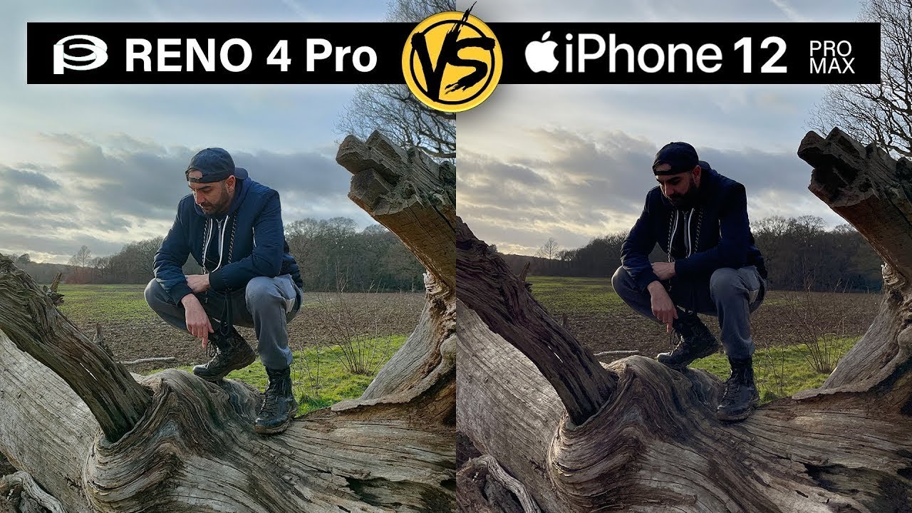
You ready, let's go so. This is picture one, and it's kind of a HDR scenario, and if you were to guess which one was which tell me right now in the comments which one you think is the iPhone, I would bet that most of you would probably assume the one. On the right hand, side is the iPhone 12 Pro max being that it seems to be a much better picture, but guess what that one is, in fact the Oppo Reno 4 pro, which is less than half the price of the iPhone, is really much better in this scenario. So if we zoom in on my jacket here, have a look at this, we go right in on the jacket and look how much detail is lost here on that chain around my neck. It's crushed all the detail in my face, whereas on the Oppo Reno, you can see even the wrinkles.
Next to my eyes, you can see the Jordan logo there on my hat as well. The details are crazy and when it comes to the HDR side of things, yes, the iPhone is doing a great job, because the sun is basically entirely in the frame, and it's kind of containing that there, but it's sacrificing all the details in the foreground. Let's have a look at this tree here. You'll see what I mean. Look at that the difference is insane, so this really comes down to the style.
You prefer, if you like, that kind of crushed black look you're getting there on the iPhone, but preserving all of that detail up there in the sky, which arguably is a bit better, maybe on the iPhone then uh you might prefer the iPhone. But overall, as a pitcher, I would definitely say the Oppo Reno 4 pro is winning this one by a mile. Look at the detail there on my jogging bombs, clear, win here for the Xperia arena.4. If you disagree, let me know why, in the comments below now, let's move on to picture 2. So once again we got the iPhone 12 Pro max.
On the left hand, side we've got the Oppo vino, 4 pro on the right hand, side and again this is kind of a HDR scenario- it's not as harsh as the other one, because the sun is behind the trees at the back here now, one of the things I want to bring your attention to is the detail in this one. So if we go right in on the dog's eye- and we get a good side by side, look at the amount of detail we got here on the two phones, both are quite close- I'd, probably say the Xperia arena.4 pro is doing a better detail. We can see more of the fur and the lines in the fur around the face. You can't really see that here again on the iPhone and again the iPhone's going way too magenta. In my opinion, all of that purple tones here in the face is a bit too much it's slightly greener here, but the color of the dog's fur is definitely more accurate to real life here on the OPPO.
So in that area I would definitely say the opposite head again, but one thing I noticed here is the exposure on the iPhone you notice. The image is a lot brighter that on Instagram goes down pretty well, whereas you see here on the Reno, it's a darker image overall, but it's retaining a lot more detail than the iPhone in my opinion, but in terms of detail, I think you have to go with the Reno again anyway picture three, so this is one where I think the iPhone actually wins, and this is kind of a HDR scenario. Again the sun is back there. Both phones do a great job with the HDR control. Here the sun was going down, so it wasn't as bright.
But what I really wanted to check out here was the sort of focal range, the focal distance. The phones were pretty much resting along this tree, so you can kind of see the foreground is blurry and then we kind of get an idea of what point it starts to pick up focus. So if we just kind of scroll down, we see both phones kind of pickup, focus at more or less the same point in the photo. If we go in on the detail part here and see how they compare it's pretty close, arguably, maybe the iPhone's got a bit more detail there, a little when you zoom right in, but overall both phones, look perfect. I do like the amount of detail showing here there's a lot brighter highlights again.
It's the exposure thing, the iPhone's boosting up that exposure to give you this more satisfying picture in a way without you having to do any filters, it's a really, really close one anyway, let's move on to a selfie, so here's a quick selfie I just snapped at home, and you'll notice, the difference again, I don't know why iPhone apple do this, but there's always this kind of yellowish tone. Even the walls behind me look way too. Yellow my face looks way too yellow the detail. There is really great, but my eyes are very dull here on the iPhone, whereas on the upper you can see the kind of bright brown more satisfying color. Here I wouldn't say more detail, but a more satisfying white balance.
The walls look white. My skin tones look more accurate, but if we zoom in you can see here, my eyebrow there's way more detail on the iPhone, so you can actually see the individual hairs a bit clearer. So arguably more detail here on the iPhone better overall picture. In my opinion on the Oppo arena, 4 pro, I prefer the color balance less orange, but you can see here. Actually this is really a big difference.
Look at the difference in the uh exposure here we're blowing out all the colors on the screen on the monitor behind me, but we're not doing that here at all on the iPhone. So it's controlling that a lot better on the selfie camera. Let me know what you think about this one pretty close anyway. Now, let's roll some side by side, video, and then we'll get into the lower light photos do here so so, so both phones have a night mode. The iPhone just kind of automatically assesses the scene and does the night mode automatically.
Whereas on the Oppo arena 4 pro, you have to select the night mode, but one thing's quite evident here. One thing I noticed straight away is on the little burger restaurant sign at the side of the building. You'll notice that the Reno does a better job handling the highlights here and that's quite clear to see. In fact, all the lights around the building are better on the Reno. You can see there's a little of blurring going on here and that might be to do with how I was holding the phone, maybe my hand moved a little when I was taking the photo and that's what caused that blur.
The Reno just did a better job in this scenario, and actually the Reno did a lot better when it came to HDR and that's nothing to do with hand, movement or handshake or anything like that. Look at the sign outside the front of the building you can see here. You can actually almost make out some lettering there. It's not perfectly clear but on the iPhone is completely not visible at all. So in a night scenario, the night modes compared you've got to say the HDR is better on the Oppo RINO 4 pro.
Overall, both photos are acceptable and quite comparable in some areas. In fact, here you'll actually notice. The iPhone does a bit better around the lettering at the top here does not light up and on the brickwork as well. You can see more defined lines here, whereas it's slightly more pixelated slightly noisier here on the opening when we zoom back out, let me know which one you like better: let's move on to the next one, so this one is an incredibly low light scenario, the second-lowest light scenario. There's actually one that's going to be darker than this, which I'm going to show you next.
But what we can see here is the iPhone it's actually fantastic when it comes to this kind of scenarios, where there's no bright neon lights or anything like that, and just being able to pick up all the details here in this really dark area. It's really quite impressive, although quite pixelated, you see there look how pixelated. That is the same! Writing here on the Reno's, not quite as pixelated, but it's not quite as bright as well. So maybe it's boosted up the exposure, a certain amount, and it's done a good job of sharpening around the edges, whereas the Reno we've got this kind of orange tone. We haven't got as much sharpening going on, not as sharp edges around the tree branches and stuff like that, quite a lot of artifacts going on here in the shadows.
I think it's quite clear that this in the extreme low light scenario, is gonna, be a win for the iPhone. Let me know if you agree with that or not, and let's move on to the extreme dark photo so literally where I'm standing where I'm taking this picture from is pitch black literally. I can't even see my feet. It was that dark where I'm standing and this basketball hoop. You could barely see it if you look up at it, so it's incredibly dark here and once again the iPhone has done a fantastic job of brightening up this scene.
Let's have a look at this backboard here. You can see way better lines. Sharper, edges way more detail here on the net in this photo. The Oppo is doing a good job as well, but you can see its blowing out these lights way more than it is on the iPhone. The tones are very dark.
There are loads of noise here on the ground. Look at that. It's just completely matted out, whereas on the iPhone we've got a lot more detail information here, and you can see what that extra money gets you there on the iPhone. It gets you a better night mode in some cases, because this one looks like a clear win for the iPhone to me. If you disagree, let me know- and let me know what you thought of this video this is the very last photo.
I took this with the night selfie mode on the Oppo Reno 4 pro the iPhone does kind of do a longer exposure as well when you do a selfie at night, but I think again, I've got to give this one to the Oppo on the iPhone. I just look a bit too yellow a bit too green. Maybe it doesn't look very lifelike. Let me know which one of these won and let me know whether you think twice as much money is worth the price when it comes to camera. When you compare the iPhone 12 Pro max to the Oppo Reno 4 pro- and I know I'm six months too late with this video and there is the Xperia arena 5 pro out now, I'm hoping I get to test that out at some point.
Let me know if you want to see anything on that in the comments below so there we have it. Let me know in the comments below which one won and don't forget to subscribe right here right now, if you enjoyed this video, because if you do that, you will be one of the finest subscribers known to man, and I'll see you in the next one, don't be late right. Something else.
Source : WhatGear
