OnePlus Watch unboxing By CNET
The 160 dollar OnePlus watch has arrived now. Let's take a look at what's inside the box, and I'm going to give you my very first impressions. OnePlus has been around for a while they're, mainly known for their smartphones, but this is the very first smartwatch for the company, which is why I'm so interested to see what they include inside the box, particularly because it is at such a low price point compared to its competitors. Now you know first things. First, the red box, it's their signature, color, I kind of like the red and the black, it's very obvious as to what's inside the box, the OnePlus watch- and it doesn't give you a lot more information than that. Now there is a tab over here indicating that this is how I'm going to open it.
So I might not even need my box cutter start with that and then peel off the plastic, I'm going to take it off camera and pick it up later, just to clear out the clutter and shake it a little so that it comes out and open the box. Okay, it's harder than it looks guys come on, and here you have it. My first thought is that it looks kind of big kind of manly if you will, which may not be a problem for a lot of you now, I'm going to set this aside and just bring out the watch here and then continue to unbox it, and then we'll come back to the watch. So it's got another layer over here, and it says accessories now. My second thought is that it looks a lot like the packaging of the Apple Watch, and it's no coincidence it has a lot of the same features as the Apple Watch, including that spo2 tracking and the high and low heart rate alerts.
So it does resemble the Apple Watch in packaging as well. So, let's see what we have here, let's get started. It is an instructions manual with kind of general look at how you're going to be using the watch. I'm going to continue on dig in what else is in here. Oh wait, sorry, the main event accessories, but there's actually no accessories.
The accessory is more instructions. I was kind of expecting a different sized watch band, considering they said accessories right there, but no okay, sure if you want to be misleading like that. And lastly, let's take a look at what's in here: okay, there's a tab supposedly to put your finger in, but it's not as easy to grab onto okay. Here we go. This is the charger, so, like other smartwatches, it doesn't include the charging brick just the cable and the charging dock, which is branded one plus and then there's a little plastic which I will get rid of as well to protect.
Let's get the full look of the watch, and here it is, and now that we've unboxed the watch, I'm kind of going to put all of this stuff aside, so that we can take a closer look at what we really want to see, which is the watch itself. In conclusion, it doesn't have much it has the watch itself, instructions, warranty, information, the charging, cable and the charging dock, no brick, but also no extra strap. So that's important to note if you are worried about how it's going to fit on your wrist. Now, let's take the plastic off over here. It tells me what the two buttons are for.
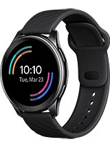
In this case, we have an app list, main dial right here and the function key and power key, so basically just two buttons on the side. No digital crown, no rotating bezel, none of the sort all right take the plastic off and yeah. It's a smartwatch. I already said this, but I'm just very taken by its large mess. It's a round watch, obviously, but it uh.
It just looks big. Furthermore, it's not necessarily a bad thing. I just this is the 46 millimeter watch face, and this is how it looks. Take it with a grain of salt. This is the only option in terms of sizing for the watch face now that it's on it doesn't look as bad.
I think it kind of reminds me a lot of the Samsung Galaxy watch um. It's its a little less clunky than the watch 3, because it doesn't have that rotating bezel, not quite as sleek as the galaxy watch active 2, mainly because it is just larger. I have only tried the smaller size um, but yeah. It looks actually pretty elegant, it's stainless steel, and you really can't tell that it looks high-end and the watch band itself also seems comfortable and on par with some of its more expensive competitors. Now it is important to note that while I am referencing the Apple Watch galaxy watch, this watch is only compatible with android devices.
For now, according to the company, iOS compatibility is coming but down the line, and we don't know the timeline for that. Yet now here are some of the sensors on the back, as I mentioned before, it does measure spo2. It also measures heart rate. It can give you high and low heart rate alerts, and it also measures stress levels. This is something that we're starting to see on smartwatches.
Actually, this is something that the galaxy watch has done for a while they kind of vary in how they do it. The Fitbit sense also measures stress, but it has a designated sensor to do this. This particular watch is using the heart rate to determine stress levels, much like the galaxy watch now, as you can see here, as I'm looking at the sensors, I can also see the quick release for the watch band, so this looks like a pretty standard watch band, and I'm sure you could switch it up to whatever your preference is or what it comes with. It's actually not bad, and it seems pretty, pretty comfortable on my wrist and the mechanism for putting it on is very, very, very similar to that of the Apple Watch. It's the first, you clip it in here, and then you tuck the loop underneath like that.
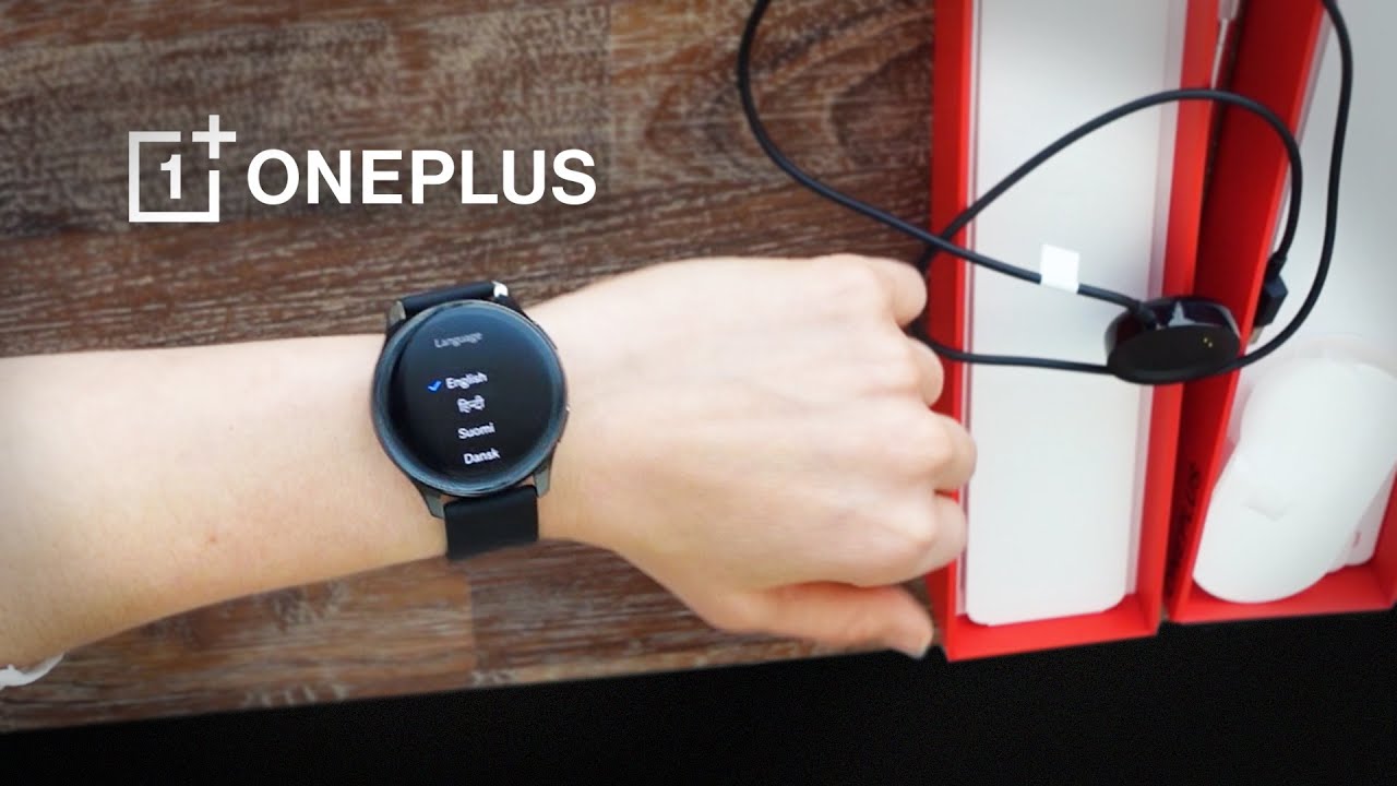
So I'm going to go ahead and power it up right now, assuming that it has a little of power to do this, so I think I'm pressing the wrong the right one. I'm trying to do this to face you so that you can see it, but I just powered it on with the on button and there it is there's the interface. So as my closing thoughts, I would say that it has impressed me in terms of the design. It does not look like a 160 dollar smartwatch, I've reviewed cheaper, smartwatches in the past, and they tend to look like what you pay for, but in this case it really does look like a premium smartwatch, whether the functionality of that reflects it. I don't know, but I will be reviewing it for the next week or so.
So, please check back with us for that full review and in the meantime let me know what else you want to know about the OnePlus watch and what I should look out for as I go into this review till next time.
Source : CNET
