Official Google Fabric Case Fog For Pixel 3 XL Unboxing and Review By Big Unbox
What is up guys welcome to the big unbox, where we do that small ticking today, I am back with another big on boxing for you today we're back with the pixel three XL fabric case. This is gonna, be the fall version for the XL, obviously comes in quite a few different color options. You got the peak moon, the fog, that's going to match the white indigo, which is blue and then the carbon, which is definitely gonna, match that just black. So on with this one, because it looks like it's going to be very compatible with that white and look very sleek with it. Forty Brook forty bucks is the price point, so you know premium, but I'm. Actually a huge fan of this particular case.
It's got a premium, feel to a very nice natural touch to it. We'll check it out, though, guys and see. If it's a hit or miss presentation. Look at decent-enough got the G up top Google Pixel three Google on the side and that's pretty much it in terms of presentation, very clean presentation as I'm trying to find my knife here. Let's go and try to bust this out and see if it's a hit or miss and how it looks with that white hopefully looks clean.
I would expect this one to be the one that everybody that's got that white version wants to go with, but you just never know. I can imagine that probably looks pretty good with either the blue or the black as well Carbon version. So let's go and pop this off right, this very nice. It's a team pick! So that's pretty much it right there. Lets going to get to this, you can see how it's got that fabric feel to it all the way around, and I really like the way.
This feels I was a big fan of the original or pixel 2 version of the fabric case. They really did it right. It's got this very nice quality to it. That actually is a nice subtle. Look to the phone, so I think it adds something to the phone it kind of complements it.
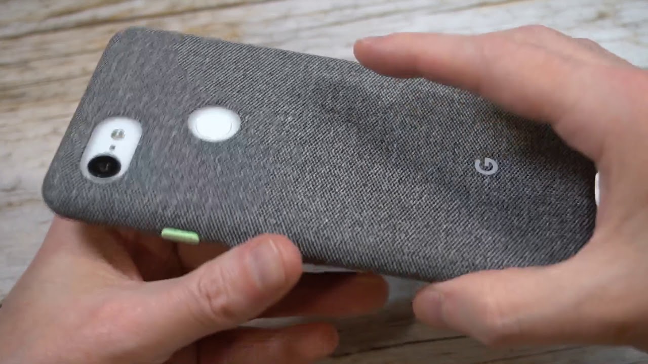
You got the G right there, fingerprint sensor. You can see that looks real sleek right there that matches that mint, green, very nice and subtle volume up and down our cover it up on the inside is this is where it really gets. Nice I, like that fabric on the insides that this felt like finish, got the Google Pixel three right there, and it looks very clean. So this is the felt like finish: work transitions back in take the fabric around the bumper case itself. Bottom is pretty much covered a little exposed right there for the power, but for the most part it's covered up.
You get some decent protection and then pretty much, no bulk whatsoever. So let's go and pop it in and see how that looks. Oh, yeah! This is the way to go. Look at that that white on gray. This is the way to go.
What do you? What do you guys think about this once that compliments very nicely looks just as nice at the black one, at least in my opinion, and if anybody's rocking that white, one that looks very clean, G right there, fingerprint sensors cut out of the precise you're getting some decent camera coverage? Look at that, so it's not quite flush you're, getting some decent camera protection for such a minimal minimalist case power buttons clicking responsive! Let's check out that lip, so you're really not getting any lip protection. I am rocking a tempered glass screen protector at this point, but you can see how much lip protection you're getting, which is very little. So if you do drop, it's probably me him that timber glass rooted sector or hopefully not your screen, but it probably would be hitting that screen because the lack of lip coverage this is very clean on the sides. Obviously you don't go out any cutouts right there, so I mean if you did drop it. I wouldn't be too worried about that because, for the most part it's covered up, you just got that little part right there exposed, but otherwise very clean.
No one thing I'm a wish. They would have done a little different, the volume up and down or covered, and they just look like the exact same thing as the actual fabric I wish they would have done something like they did with the power button to differentiate itself, because you can see it's its not hard to get to, but if you just kind of reach in its nice to have a button that sticks out where these two kind of just blend together. So that would be my only critique of this case. Otherwise, I think this one looks very, very nice. Let's just check this one out that white with that gray fabric whoa yeah.
This is probably my favorite combo for sure right now. Look at that very clean look. Let me know what you guys think in the comments section I'll give you guys. A couple looks at this one zombie mess with it move that fabric up close. You can just see that texture, it does add some grip to the phone as well and it really, in my opinion, it adds this very nice.
Look to it as well. It doesn't add a lot of bulk, so it's really going to complement the phone very nicely and is it worth 40 bucks? Probably not, but it is a premium case and I say premium, because it's a premium price, and it actually feels like it's an it feels that you're paying that much for that particular things. I feel like you, you're not getting ripped off, and you bring a home like this one feels legit. So that's what I mean. Let me know what you guys think in the comments section it's it hit.
Is it a miss? I say this was a hit the subscribe button. We'll see you guys next time you.
Source : Big Unbox
