Meizu MX4 Ubuntu Edition Unboxing, First Boot, and Initial Impressions By Jordan Keyes
Hello again guys I got a package in the mail today from canonical. As you can see here, it's got a little canonical letterhead with it that says: hey Jordan, we're looking forward to hearing your thoughts on the new maze mx4 device and, of course, included along with that was the maze mx4 running Ubuntu. So let's go ahead and open it up, we'll take a look at it and then after I've used it for a week or maybe a little more, we will come back with a full review. So here first we have the amazing power. Brick, unfortunately, will not be able to use that here, but in case you're curious you can see there. It does have an output of 5 volts at 2 amps moving on down in the package.
Here's a little box which I would assume is the actual phone itself we'll put that off to the side for now, there's a little piece of paper in here that says: earphone not included not heartbroken by that or anything, but it's a little confusing and then the microUSB cable to charge it with. So, let's go and move on to the meat and potatoes of the package. There you open it up. It actually says in here flying for more color more fun. This, if I remember correctly, is all the the maze UI stuff, which should not be on this, since it's a blue phone move this over for just a minute here is the warranty terms and conditions stuff that I'm not gonna, be reading through important safety information.
It's a phone, oh and I, missed some stuff in here, more than better the camera. That knows you. That's the one thing I'm really looking forward to with this aside from running Ubuntu is a 20 megapixel, camera, and I've seen some excellent photos coming out of it. So I cannot wait to give it a shot. So let's go and take a look at what you guys are actually here to see.
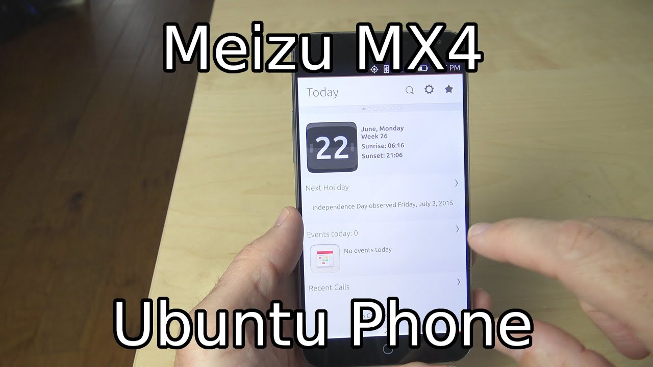
This is the maze mx4 I wouldn't peel this plastic off, so we can get started and actually before I completely remove this. It says slide up to open to multitask bar slide up to open to multitask bar and slide up to return. I'll be curious to see if these are actually applicable to a bun ? as we go ahead and move around the device. You see, we got this front-facing camera up here we have the home button. On the left hand, side we have the volume rocker on the right hand, side there's a lot of nothing on the top.
You've got the power button and the microphone a three-and-a-half millimeter headphone jack on the bottom. You have speaker another microphone and the micro USB port with a removable back. That's very nice. In here it actually mentions insert sim card, not sure how long I'm going to have a SIM card in this thing, because from what I understand it does not work here in the US during the insiders call I actually asked about that, because you know that's what I do, and it was mentioned that they're really focusing other markets for the moment. So there may not actually be an u.
s. friendly bun to device for the time being is very tightly on there. There we go. That was some strong plastic, so there you go, the back has been removed. This I figured would be a removable battery, but it is not, unfortunately, but here's where your micro sim would go.
I'll probably go ahead and stick one in there here in a little while just to see if it actually does anything here in the States I'm fairly, certain it does 2g, and I think it might actually do 3G as well, but it definitely does not do 4G. Unfortunately, so for now, I wouldn't put this back on there nice to see. That goes on a little easier than it comes off, but let's go ahead and boot it up and just see what it looks like there you go. There says maze powered by Ubuntu, and actually I see down here. It said normal boot, I, don't know.
If you can see there, you go normal boot. That's interesting to see on a boot screen. I will say just this little of time: I've been holding in my hand, I like the way that it feels in the hand it's very comfortable. It's got a not slicked back, but it's its got a metal feeling plastic. It's its a really odd combination.
There's our spinning a bun ? logo, and we're ready to get started. I will have sped past most of that or cut it all out. It probably took like 45 seconds to start out. Maybe a little less I'll go ahead and overlay it on the screen. Just so you can see how long it actually took.
So it says hi welcome to your bun 2 phones. Let's get started, it says, add a SIM card, we're not going to do that at the moment, so we'll just skip it. It's asking for lock security, I'm gonna, say just swipe. We don't need security on it at the moment. Here are the networks we have available, so I'll just go ahead and pick one and put my information in I will say: I like the way that keyboard typing felt ? asking for location, whether you're allowed to use location detection sure go ahead and do that if you want to and then approving your experience through system settings, security and privacy already all done all right, there you go.
This is the first look at the maze mx4. Let's go ahead and unlock the phone, and it gives us a little of an intro. This is a little different from the one I saw on the BY Aquarius II 4.5, so there says open the launcher swipe from the left edge. There you go. These are the shortcuts, the favorite apps except here.
Do you continue to view open, apps swipe from the right edge there you go? There's all your running tasks tap here to continue. It's a lot more polish on this I'm definitely liking the intro tutorial so far to open special menu swipe up from the bottom edge. There you go, and this does different things for different apps tap here. To finish, so now we're ready to set up our today's scope. You can put in google sync settings your Fitbit activity, we're going to go ahead and skip that for now as well.
Just because I want to go head and get started, that's interesting! It does say start instead of anything else all right, and it appears to be done. It took about 15 or 20 seconds for that to actually happen, I'm guessing it was just going through and polling stuff about location and just getting some local information out of it. This is an interesting thing to see it said start instead of today and had a back button, and it's doing another loading screen now that I've hit back, but it pulled in some holiday information. It has no recent calls or anything things trending on Twitter, more things trending on Twitter. This is a very smooth interface.
So far, of course, you've got some nearby information. There I've gone ahead and skip part of that just for location purposes. I! Don't really want to go into that. Here's, your list of apps that are available or apps that are installed. Excuse me: you can get more apps from the Ubuntu Store, but yeah it comes with just a few apps installed to it, not a lot external drives, don't recall there being a micro SD card slot on this.
So I don't know about that. One! Moving on over. We have news all sorts of news information, and you can change the news sources that you're pulling from right here. It buzzed at me quite a bit there. Let's go ahead and go back then we'll go on over.
This is the music scope, and you should be able to change what you're pulling music from right here. Still don't have the ability to customize these beyond just clicking things on and off, but I think developers can do a little more with it. Here's where we would actually manage what scopes are shown and remove scopes. If you don't want them, and then you can move on over. You've got a video scope by the way that swipe up I did can be done from anywhere on the set of home screens but yeah.
Here's our video scope again. You've got my videos, YouTube and Vimeo. Unfortunately, still can't add more things to this and your photos, scope. You've got a bunch of different accounts there. You can pull from there's your list of things.
Furthermore, you can show photos from so lots of good options there. Let's go ahead and go right back over here. Swiping through it does swipe decently fast, it's not not the fastest thing. I've seen it gets a little laggy around some larger scopes like music and news, specifically news, because news has lots and lots of stuff in it, but can't really complain all that much and there's your menu again. It does show I think they actually said there would be an immediate update, so I'll go ahead and check that as well updates available.
It says it's checking for updates, I, think, there's actually yeah. There's a 470 megabyte update that it's going to go ahead and do right now, so I'm, not gonna. Let sit here and let that finish, but I'll take this into account. Whenever I do the full review down the road and when I hit that button, it takes me back to home I kind of wondered what that button was going to do, and it appears to just be a home button which that's not bad at all. Yeah, home takes you right back to the today's screen.
Definitely pretty snappy! So far and there's your highlighted app of the week, some essential apps top apps game of the week lots and lots of things in there and actually, let's take just a second and open the camera, because I'm really curious about the camera. As I said earlier, there you go. That's what the camera app looks like just a quick look at it. I noticed some elements are still not rotating properly. You saw there.
TTA did not rotate, but you swipe out on it, and you get options here, like HDR and your grid, which again didn't rotate on and off and then location, I, don't want location on my photos, timer, auto, flash I'm just again didn't rotate properly and your quality settings I'm going to set it to fine quality because I really want the best out of my photos and videos put it into video mode, and you get some similar options here. You've got whether you want to have the light on or off which does appear to work. There you go. There's your LED flash, which you can use as a video light. You've got the same grids.
You can turn on if you wanted to use the rule of thirds, but there you go. There's your rule of thirds grid, you've got HDR and video mode, that's fascinating to see if it works properly, and we've also got location and a timer and the video quality goes up to 1080p. If you can see that well, switch back over to photo mode, I'll take a couple of shots here. There you go says swipe left for the photo role that wasn't it swipe left for photo role. There you go and that's still one of the things I think they're having some issues with is dealing with things, while you're in this landscape mode.
So right now the UI is kind of messed up. So if I swipe yeah, it's going to bring up everything, because this is still the edge to be used for going into the multitasking, but yeah that photo doesn't look terrible. There are things in the background that are you know this is zoomed in 100%, and you've got a bit of graininess to it, but it could definitely be worse, I'm, not in the best lighting situation. So if there's anything in particular, you would like to see about this device. If there's anything you'd like to know about it.
Definitely let me know down in the comment section below definitely like I said before loving the way that it feels in the hand and really looking forward to trying out this 20 megapixel camera out in some good lighting, as well as trying out the video mode on it because I'm a big fan of video mode on smartphones. But as always, thank you guys so much for watching. Remember if you like this video hit the like button down below the video and subscribe to receive more videos when they become available, and I'll, see you again next time.
Source : Jordan Keyes
