Meizu MX4 Pro Unboxing and First Impressions By Android Authority
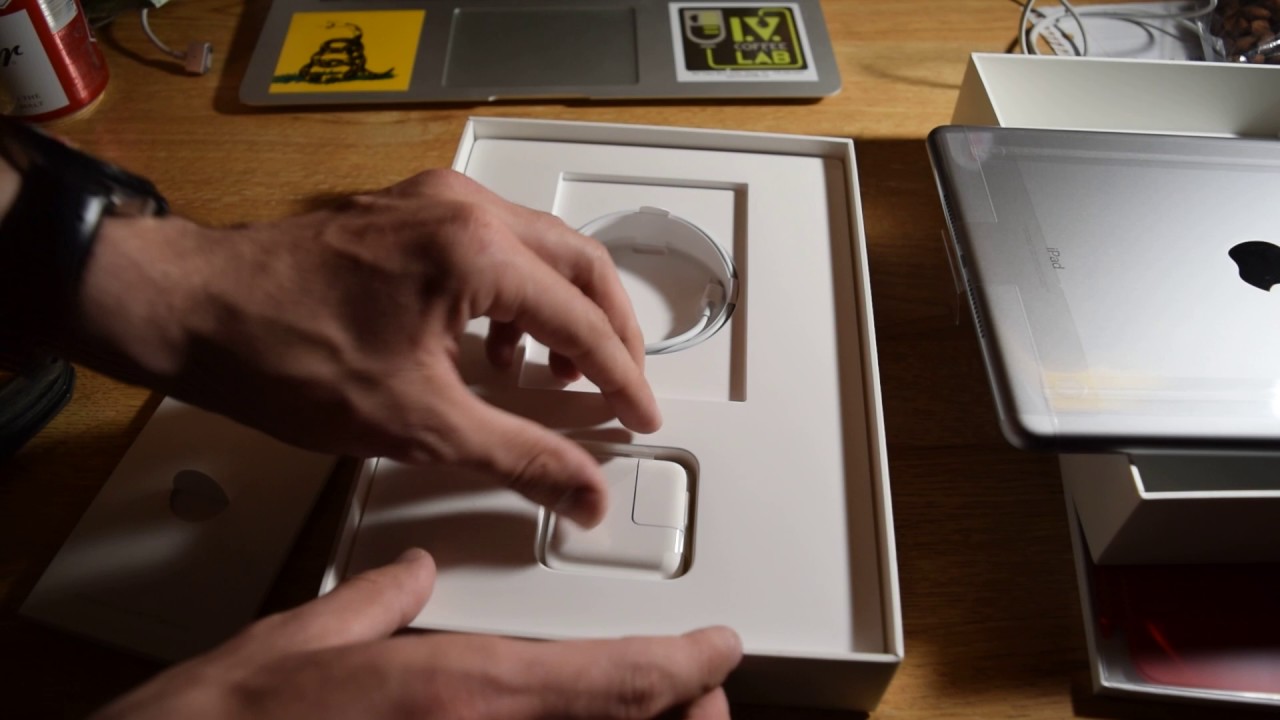
Malay has been able to put out some pretty solid offerings as of late, but do they have yet to really hit that large form factor market? Well, they took their recent flagship, the MX 4 and just went ahead and blew it up, and we're going to take a look at it right now, because it's Josh Lugar from Android authority. What's going on everybody, and it's time to unbox and give my first impressions on the maze mx4pro, alright, so we're going to go ahead and get right into it. What we have here is the maze mx4pro we did do an unboxing and the review for the MX for proper is going to be up very soon, but I just received the pro version, which enhances some features and I thought. I will go ahead and do that unboxing for you right off the bat. So here we go we're just going to go ahead and jump right in I shouldn't me bring that over to the side closer to where you will be able to see it and the unboxing as I suspected is going to be much like the MX for proper. We do have the plug adapter.
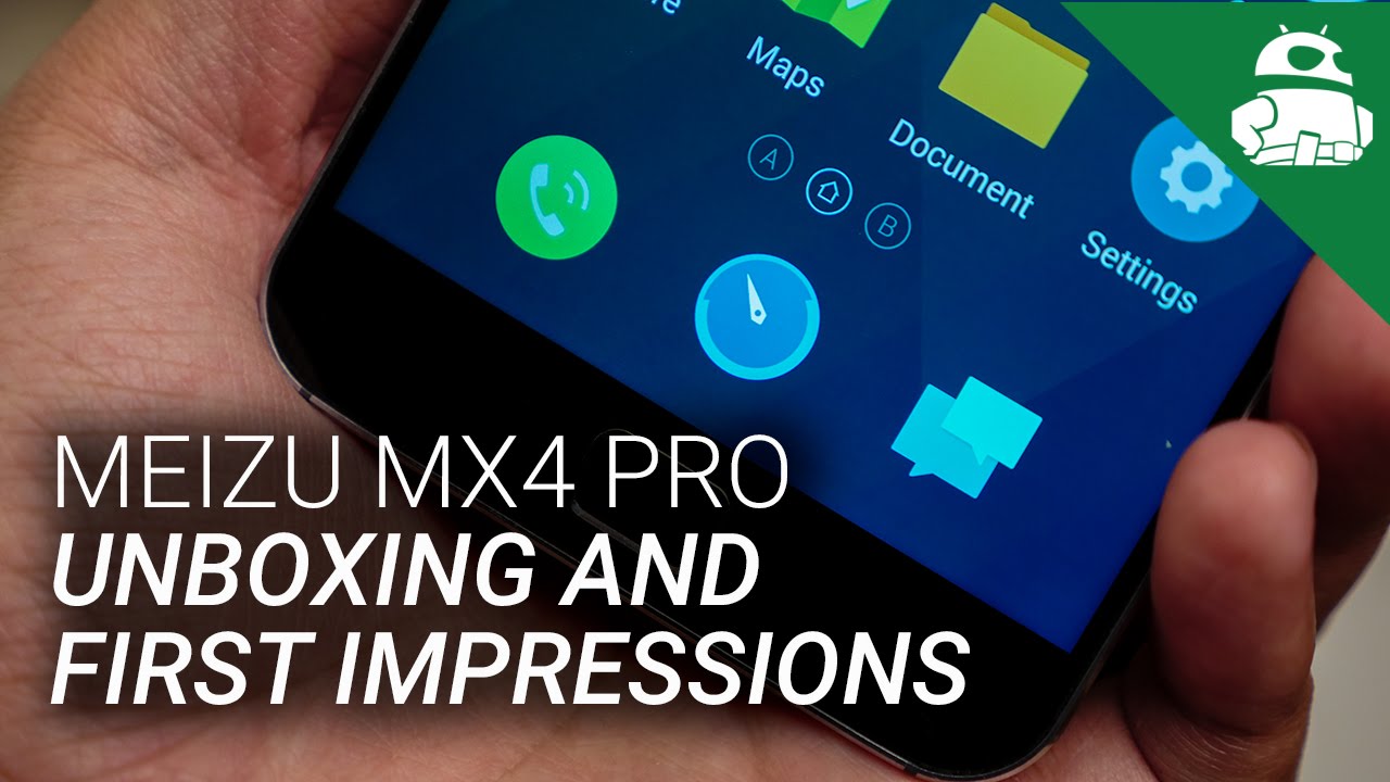
That is right here and on the left side, we are also going to have the book motif that they had where the phone is inside, but it will tell you a lot of the features that are a part of this phone underneath earphones, unfortunately, again are not included in this version of the phone. I suspect we're going to have another sample edition. This is obviously going to be a review unit and, of course, the microUSB charging cable, I'm going to go ahead and put those right here for now and get that out of the way, find me four, and there is the phone itself right there so go ahead and pop that out and some manuals are underneath and there we are. We have a number of elements already on the screen that you're seeing the close-up of right now, not just that home button on the bottom. That has the touch ID as they call it, but also elements that show the different things you can do swiping up from the bottom.
That is, of course, what the fly me operating system allows you to do. It's a different take on Android. If we come around to the sides, we do still have this sort of iPhone, issue, iPhone 3GS, let's say design right here, that's highly curved: it has a metal construction here. This is, of course, a larger device overall and the volume rockers are on the left. You can feel over here and the power button is up at the top and with this home button on the bottom.
Yes, people are going to end up saying that this has even more inspiration from Apple's own product, but nonetheless it still provides a very nice look. Amazing does a pretty good job with that particular design, language and well. It makes for a phone that, despite its larger size and its screen, still feels pretty nice, especially with the curves on the back. But here we go just going to hit this power button right here on the top and let's jump right into the operating system. Well, there's not much of a setup at all, and here we are with the maze mx4 selfie me OS.
It does look a little less, let's say refined, mostly because it doesn't have an app drawer you're, going to be putting all of your applications in folders like this, but ultimately it still looks very clean, and as long as you keep things inside the folders well enough, you will be able to keep things looking very tidy coming down to the notification drop-down. The toggles are right here and the notifications will come down here, open up the shade a little, and you'll see a lot of the other abilities that you have here. But what makes fly me very different is the fact that it's navigation properties are a little different. Of course, we do have the button right here in order to get back to the home screen. Obviously, if we hit that, but you aren't also able to swipe down from the box wipe up rather from the bottom portion of the screen in order to bring up things like the recent apps screen or if you happen to be in a number of different places, you also get this little contextual bar.
That will allow you to go backwards and to do a couple of functions, including having a menu button. But of course now, as was not the case with the original and techs for you now have a tactile home button right here to be able to get back to the home screens quite easily and if I get into the settings which I'll do actually by going the settings over here, we do also have a fingerprint scanner. You can use it as an unlock method, so you can rest the finger on the home screen and I can go ahead and go through the setup right now. So just keep putting the thumb right here and to test out the fingerprint scanner we're going to unlock the phone right here, put the thumb right onto there, and it comes on very quickly. I, don't believe that it is able to wake the phone.
But of course you can always press the home button. Have your finger on there already since you're pressing down on that button, and it will get you right into there. So that's actually a pretty nice way of getting into it. Just press down hold your fingerprint onto there and is really nice. It kind of reminds me of the Oppo n3 iteration, except instead of it being on the baguette, is, of course, the tactile home button up front.
As we talked about the device itself, I really do enjoy what I'm seeing right here, maze from the mx3 that we saw a little while back in then the MX 4 most recently, that is going to be reviewed by Brian. It does have a very nice look and feel this curve that, despite its design, language, seemingly coming from something a little more apple-like in nature, does do a very good job to make mazes devices. Look quite nice, and this curve on the back does a perfect job of keeping the handling from getting a little too out of the way, because this is a five point, four six inches screen. But if we take a closer look at this particular display right here, we do have the sizable bezels on the top and bottom, which makes for some easy placement in the hand right here. But what I really enjoy is the fact that the side bezels are so thin.
It's really something Major has done a very good job with in the past and continues to do so now. With this display, it just makes more a really easy on the eyes display experience. Of course, we have the fingerprint scanner down here, which is a nice addition that allows for an easy way of getting into the operating system. It's a nice idea to have it embedded in there as a touch type. That way you can just press down, wake it up and then, as your finger is already on there, it unlocks it I'm pretty excited to put the mx4pro through its paces.
I will be reviewing this one in particular, as you can see, the MX for review will be available very soon, so make sure you guys stay tuned for that and keep it into Android 34 all the best coverage, including coverage from all of my colleagues and Android Java, so Mike's in our video subscribe. If you haven't already and stay tuned for my full review of the mx4pro, there's a lot of coming down the line as we round off the year, 20 14 and move into 2015, you can stay tuned for a lot in the coming year. So keep it tuned here and remember that Android Authority comm is your source for all things. Android.
Source : Android Authority
