iPhone 12 vs 12 Pro: Which Display is Best? (Analysis) By Erica Griffin
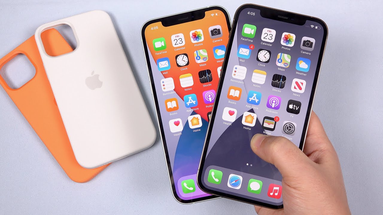
Hey everybody: this is Erica the technology nerd likes to film stuff, and before me, I have the iPhone 12 and the iPhone 12 Pro the reviews are pouring in, and I want to take a second to look at these screens and give my first impressions on them. Apple was so nice to provide these. I've got the 12 in the green, and we've got the gold in the pro. Let's just rip them open packaging going everywhere, let's open them side by side, and there you are oh okay, so this is like a light. Minty green. I went and got a joy-con to compare this to, or this is like a really saturated, minty green, it's quite subtle, but I actually quite like it.
Let's go ahead and pull this off here. Yes, I like that that boxy feeling let's go ahead and get the iPhone 10 beside it here. There certainly feels like a lot more to grab onto now this I always felt like I would drop these rounded iPhones without a case on them, but this feels good. This is secure. Let's go ahead and grab that gold out as well.
Very, very simple packaging. This time around and already I've already smudged up that band to heck. This is quite a subtle gold as well. This is more like a beige. Here's the back of this animal crossing joy-con.
This is like a sand, a very light sand, color, where this guy here is a banish gold. It's not really in your face, which is quite nice, though this band really does stick out as an accent. Then, of course we don't have a power adapter in the box, and we don't get any earbuds either whatever. So, as you can see, both of these guys are the exact same size, 6.1 inch OLED displays here we have my iPhone 11 Pro max, and then we've got the iPhone 10, and you can see the respective sizes here. So if you were a big fan of the size of the iPhone 10 or iPhone 11 Pro, you can see here that we now have a little bigger phone, not too much bigger, definitely not unwieldy, where the iPhone 12 actually shrunk in size from the iPhone 11.
So this guy got a little bigger. This guy got a little smaller, still both smaller than the iPhone 11 Pro max here now enough blubbering, let's get these guys turned on. I really am excited to see what these displays. Look like, I'm hoping that the color temperatures are really lovely. It's nice, that these are pretty much the same screen except for the pro here gets 200 nits brighter typical brightness, where this one is 600 nits.
This is 800 nits, so they both can reach a peak brightness of 1200 nits. That is, whites for HDR, really curious to see. If there are really any differences between these panels and if there are any differences, it could be down to variation. So I'm going to measure these guys get my calorimeter out alright, so the preliminary results are in. I had a chance to go and measure these and just test out the performance and see what I thought about them.
These are very, very similar performing displays. I would say that they're probably the same display. I would need somebody to correct me, but calibration wise they've been calibrated very similarly. The first thing that I really like is that these are really nice uniform displays. We don't see a cooler, color temperature up here and a warmer one here, they're, really nice and even, even white.
Now I'm sure there's going to be variations on that, but these two look great. They do shift a little off axis. They do have a little. Off-Axis color shift. It's nothing horrific! I really don't mind it now.
This guy right here is the pro, and this is the 12. Now I measured to see how bright they got and just like apple said this one can get a little brighter. So what I did was go underneath these settings and toggle off auto brightness, and then I turned the brightness up all the way to 100 on both of them and sure enough. I can see that the pro here gets a little brighter. I measured 803 nits, that's pretty close on the button to what they were saying where I got 630 nits on this one, so in practice yeah you can see that this gets a tad bit brighter.
Really it just ends up looking like it's got more of a kick to it, so it's going to be something you mostly see outdoors, but really they look so very, very similar, even in brightness, most of the time you're going to be keeping them on auto brightness anyway. Okay, so now, looking at the white points and the calibration again, we've got the pro here, and we've got the 12 right here and in the center I just have an iPhone 10 to compare. You may not be able to see a difference on camera here, but actually this is a little cooler white point. This is a little more pleasing to the eye where these guys are a little warmer and actually measured, they're, 6500, kelvin or very, very close to 6500 kelvin. Although I'm seeing that they're lacking blue a little also a little of red is lacking, and it's interesting because on both of these guys through the grayscale, I can see that, as it goes from mid-tones to shadows, we're lacking more and more red and blue.
So that makes mid-tones and shadows look increasingly greenish, so they both do that, but the pro fares a little better. I don't know if there's going to be variations on this, that's just something that I've observed. So if you like a really nice cool white point, that is not what you're going to get here, although if you have nothing to compare these two, you may not notice that's what I'm hoping and just for your reference, the Galaxy Note 20 ultra, looks the same way with white and also the z fold too. So this is just kind of par. For the course gone are the nice cool whites now otherwise, my preliminary results show that they're very closely calibrated to RGB the color primaries are very close, especially red and green blue is just the hair bit off the saturations.
Look. Great gamma is pretty much on the dot at 2.2, so not too washed out and not too dark good image. Contrast overall and of course, I'm really happy with how shadows look. Shadow performance is fantastic. So again, here we have the pro, and here we have the 12, and here is a gradient that shows near what black looks like very dark gray from 21 all the way down to zero.
This should be a nice smooth gradient, and it really is that, and we can see all the way down until one and then zero is black like it should be so dark scenes and movies are going to look fantastic on both of these, and they continue to look great, even as we turn down the brightness great performance on both of them now. The last thing that I want to talk about today is some practical advice for the HDR experience, so both the iPhone 12 and iPhone 12 Pro record video in Dolby Vision, where you're able to shoot 10 bit high log gamma HDR footage with Dolby Vision, metadata generated frame by frame so the ISP processes each frame individually and looks at the bright parts, middle range parts and dark parts of an image so highlights mid-tones and shadows and tells each frame how it's supposed to look when played back the result is a bright contrast, colorful image that really pops. Now all the iPhones back until iPhone 7 can play this back and any iPad with a12 or later so. This HDR setting is on by default, and you can toggle it on or off from the camera app settings. Now for my preliminary testing, I don't recommend keeping Dolby Vision on for everything, particularly while filming people with dark hair.
Like myself, I see it sometimes decides that my hair and eyes should be dark shadows. While my skin is overly bright in places. I look sallow and heaven forbid having some blemishes because they really stand out. I will keep HDR off while filming people- that's kind of my decision here, but for scenery it can make videos really pop a drab. Looking image suddenly has very bright highlights, but again some things like these leaves here look unnatural, like unnaturally contrast, so try it out, but be careful with it now support is mixed.
Anything that doesn't support this version of Dolby Vision plays back hog, or it gets converted to standard dynamic range. So I found when sharing to social media directly from the phone it converts the video to standard dynamic range for compatibility reasons. If I airdrop the video to my Mac, the mac plays back hog, at least until Big Sur is released. Then, if I upload that file from my Mac to YouTube, chrome, totally messes up highlight gamma and blows out all the highlights, safari plays it back. Fine, though, as a standard, dynamic range video looks great.
So this is going to look best on your smartphones. For now, it seems which is where apple is betting you're going to watch these anyway. Let me know what your results are on your TVs, though, so these phones are extremely cool. I'm really excited to get my hands on the mini and also the holy grail, which is going to be the 12 pro max so stay tuned. I hope this video was helpful, so this has been Erica.
The technology nerd who likes to film stuff, please like if this was helpful to you, comment and subscribe, make sure to hit the notification bell. So you don't miss future videos and select all notifications and have a good day guys bye.
Source : Erica Griffin
