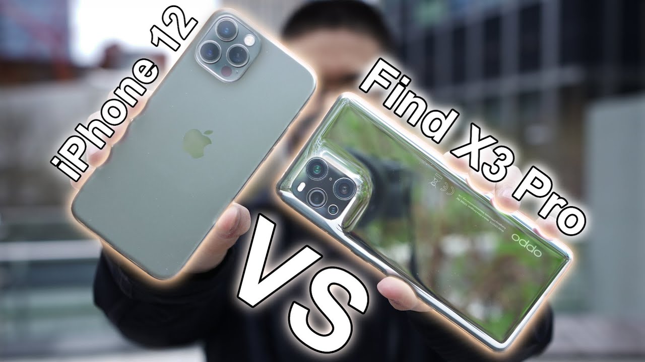
iPhone 12 Pro VS Oppo Find X3 Pro / Simple Camera Comparison By Daniel Sin
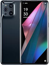
Today we're going to prepare the Oppo find x3 pro versus the iPhone 12 Pro shooting on the iPhone is super easy to use. I really like how I can just swipe up in the camera app and I can reach for any camera setting. I need to its nice that I don't have to reach for anything, so I don't feel like I'm dropping my phone one big win on the iPhone is that if you shoot up to 4k 60 on the front camera, which the apple can't and that's kind of disappointing for a pro model, the apple phone x3 pro does offer a lot more camera modes, like pro video pro photo and the microscope lens, which I think it does capture cool photos. But not a lot of people would probably use it in the long term. But when the max resolution on the front facing camera is 1080p, so that's a bummer now that I'm on my computer, looking at them side by side in Poisson mode, the iPhone does have the creamier and denser background blur. You can shoot in 1x or 2x.
So it's great to have some flexibility there and for the colors I would say the opposite: more vibrant and punchier look. The white balance is also a bit different as well, and I noticed that the blacks are more crushed on the opp, as you can easily see by the details on my black sweater, the portrait mode is not perfect, though, in this picture the iPhone does capture me the apple didn't, but in the second picture the apple did the iPhone didn't for the front facing portion mode. The camera on elbow is wider, but the HDR is not as good. Clearly the sky is blown out, the buildings are barely there and also the branches as well. The colors are still the same.
My sweater is a bit more crushed on OPPO. Now, if you're taking pictures without the portion mode, both actually looks really identical to each other. Now for the back camera, let's start with the ultra-wide angle. I noticed that the colors generally on the iPhone is more on a greenish hue which stacking it right. Next to the apple pictures, the apple looks really natural, so the white building looks white, and the floor looks actually gray.
Now, it's not always perfect. The Oppo does lean towards the magenta side a bit more, so it's still closer to a natural looking picture than the iPhone, and I would say the colors are a bit punchier too. For HDR, I'm going to give it to the combo a lot of the times. The images are pretty close, but there are times when the output does clearly win. Now, moving on to the main camera, the white balancing issue still the same on iPhone.
You still got that greenish hue and on the Oppo it looks more towards the natural side. I know that the iPhone tends to lean more towards the flatter look, but I would say the greenish hue is really killing the whole image. They both have telephoto lenses. You can get to 2x if you need to, and they look perfect again. You still see that green on the iPhone I'm going to assume for the casual consumer, they're, probably going to lean towards the colors and look on the elbow.
Just because of the vibrant color- and you don't really have that greenish look it's more natural! Looking for low light photos, I do notice that on the iPhone it's a bit brighter when you do have a light source on the opp, the blacks are more crushed, so you're losing a lot of details there. Now, if you are in a darker situation, then the Oppo does win, because you can see a bit more in the shadows. The colors are more vibrant and punchy, so it stands out better now for video. They both can shoot up to 4k 60. Stabilization are pretty similar and the colors are almost identical, but I'm still going to say on opp, it's still punchier and vibrant, whereas on the iPhone it does get that flatter, look which I'm going to give the HDR to iPhone.
Just because I can see a bit more in the shadows now in this clip. The greenish hue is back on the iPhone, which doesn't look too great when you're looking at the ground or floor, it's not gray. Now on the apple phone x3, it's not perfect as well. It's leaning towards the magenta side, but it's still closer to gray than the iPhone. Those are just my opinions and what I think and see, let me know what you guys think and which one would you prefer if you do like this new format of this behind-the-scenes camera, where I'm just taking pictures, let me know by hitting the like button.
That is my comparison. Thanks for watching, and I'll see you guys later.
Source : Daniel Sin
