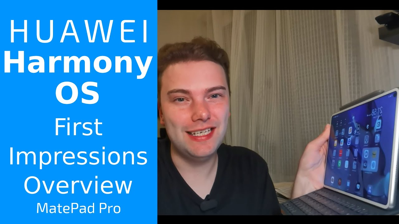
Harmony OS First Impressions Overview on my MatePad Pro By Techview Podcast
Welcome to a new video- and this is a pretty spontaneous video, but nevertheless, today on my mate pat pro and my mate 30 pro harmony oses arrived, so I want to give you a short little overview of the operating system and the user interface changes. So let's get started. So what I can tell you right now already is that harmony OS the upgrade process worked pretty much the same as any normal over-the-air update that you do on your emotion, UI from 10 10.1 to 11, for example. The only difference is that yeah you're downloading, roughly five gigabytes of uh data, instead of only like a few hundred megabytes or under one gigabyte. So it was an interesting experience, but it worked nevertheless, without any issues, so the system booted up it was still showing powered by android. Then the upgrade process was running.
It was showing harmony OS and when it rebooted it was only showing the Huawei logo without the powered by android, and then it was showing the new harmony OS boot logo. Boot screen. I had the noise turned off for my tablet, so it didn't make any like startup sound or something like this and then in boot. It up normally, and it asked me then, with this first installation wizard. If I want to use a new home launcher, I said yes, and it was also telling me okay, if you are using this, then it will remove, or it will destroy your configuration that you had previously.
So it's not like taking over the configuration of where every app icon will sit from the previous installation, but every application was still there all the android applications. I've installed are still there and everything is running so far. Fine. So I want to show you right now how it looks like on the operating system itself. So let's go to the new launcher and to the new harmony OS on my mate pad pro.
What we see here right now is the new harmony desktop, and we see some or home screen or launcher or, however, you want to call it. We see some changes. First, you can see here this little Celia suggestions, which is simply, as far as I understand, an option where it suggests your applications that it, the system, Celia the voice, assistant or assistant things that I will use uh next. So, for example, sync is installed here, which is a Reddit client that is especially optimized for tablets and works. Pretty nicely here on the uh mate pad.
You can see, the animations are super fluid, and you can see even like the thumbnail is like you can see like it's getting smaller. It's super fluid, it's more fluid than the emotional eye 11. Definitely you can feel the more smooth UI. We have some new widgets just like, for example, the time widgets, as you can see here, has now the weather as well. But it's not underneath the time anymore.
It can be like horizontally, laid out your tablet optimized, and you get not only the day. Uh, the today's weather, but also the forecast for the next three days as well, and you can tap on this to go to the weather application and as well. The weather application is now um. Yeah, optimized for tablets, as you can see it's showing on the left, the big number of the current weather and temperature, and it shows me all the other information that I might need for the next days here on the right. So this is pretty interesting.
What you also see is like in comparison to emotion, UI, um 11. They changed the font a slight bit and also some icons have been changed. For example, the option icon is now not a three dots menu, but a four dots menu, because yeah four is bigger than three anyway. It's like these four dots uh in yeah in a square shape, and if I click on this, I get like the context menu where I have the option to set up things and yeah again, animation, very fluid. All the applications that I had installed before, like KD connect, which is an android application, 9gag TV program, uh even YouTube vans that I installed.
Still there work fine without any issues. If I go to YouTube advanced, you can see, it is loading up a nice video here and yeah. I can also go out of this. You can see animations work, pretty nice, what you see for certain applications, mostly native applications, just like notepad or calendar. There are some uh some little line underneath them, which is an indicator that there's a widget hiding for it.
That supports the new harmony OS widget library and what it allows you to do is swipe on the icon to open up the widget, and in this case I could pin the widget to this desktop. So it will be like, like this see a suggestion widget. Another thing that I can do is like. If I use certain uh applications that I have put in the folder like, for example, the video editors' folder, I can long press and say enlarge, and then I get an enlarged version where I have not the names of the icons but the icons itself in a smaller view, and I can directly launch if I want to like launch quick, I can directly launch it from there, which is pretty, pretty nice. Of course, I can also say, shrink it again, and then I have the option, of course, to go and put it back here.
So these are the optimizations in terms of widgets. You can, of course it kind of reminds me a little of iOS, I have to say those widgets that can be here in the square and a little of blackberry as well. That had also swipe up features for certain um to show certain widgets, but this is more fluid, and it seems more integrated in the operating system as well when it comes to android applications like I said, android applications run without any problems. Um 9gag, for example, can run here uh without any issues. Okay, it's not not in portrait mode, it's going into uh it's going into portrait mode instead of landscape mode uh, but all the applications work.
Fine, animations work, fine and fluid without any big issues, and I did not notice any applications not working. I even heard people that had Google services installed still can use the Google services on their device, because what it does is not replacing the asp or the android part of your system. It is only adding the harmony OS part, so the android part of your system is untouched and all the APK files that you want to install via pedal search or something like this. Where do I have my app stores? I have a horror story, for example, to access Google Play Store run without any issues. I can install um applications here from the Google Play Store, for example, no issue at all.
If I want to- and I can even update, uh APK files without any issue takes a while to load them, and if I want to update uh 9gag here um. Hopefully this is a bit quick uh. It will download that, and it's an APK file. Of course, it will allow you to install the APK file as well as uh h, a p files which are the new file format, which is the new file format for harmony uh. It's one part of the new file format of harmony OS that ultimately will end up in the dot app file.
I think the same file that file system that apple uses to go in here. I think it tries to download again it's like a stupid bug in aurora store, currently uh, that in the previous window the upload update function is not working. Uh like I want, but here it will work, and it will yeah prompt you for installing. As you can see, it is the same probably the same thing that you have here, as in the normal emotion, UI, 11 app guard enabled to ensure your security recommend you uh to install apps from app gallery when possible. If you still want to install this app, you can disable app guard in settings system updates and app guard.
So this is a new thing, which is like an application guard which only allows you to install application applications that are safe or come from the store and yeah. This is maybe the only big change that I noticed so far. You can disable it, and then it works like it should work before. The other thing that you will see is, if I swipe to the left that you get the same um today, page Huawei today. I think it's called page that you had before you get like the option to go to your profile.
You see the moments like it's raining currently uh events uh all the other things you can see here, news and the stock market, for example, sports events and some news going on here as well. So this is basically the same that you saw or see already on emotional 11. This didn't change. What changed is the multitasking overview, which looks like this right now, which makes absolutely more sense for a tablet, because you're, using just simply more space that you have here on your tablet, especially the bigger tablets like the new mat pat pro, which is like 12 inches big and what I noticed is I have much more applications open and running at the same time as you can see here, so it doesn't close applications so quickly as it did before on the emotional i11, and you can see here all the applications stay longer in memory, which is also a pretty nice side effect of this. What we can also see is like um on some applications, not all the applications.
They have a new logo in the top right corner, and this is just an option to like. If I go in here, and I'm in, for example, the tips' app. If I click on this, it will open up in a smaller window, which is pretty good for multitasking, because of course I have the option to resize the window. If I like to this is a feature that we had already in emotional 11, but here I think it is more refined, and I can minimize it have it here. Running, can open up my files.
Application can run this and open this up. I can go in here in my files and just drag and drop a file uh to here. If I want to, and it would if it's a browser or other application that allows to use this, I could work as well and of course I have the option to drag it around and also put it sideways here, and now I have like two applications running. At the same time, I still have the option to open up here some other applications and, as you can see here, it is also showing me running applications like the tips' application that I have running here and if I want to have like a calculator, I can click on this and have calculator here as well. I can minimize it and yeah.
This is working pretty nicely. Also, of course, as it is a tablet with a keyboard that I have attached. If I go into one application, I want to switch to the other application. You can use alt tab. You know it has this nice kind of use I'll tap this nice animation, where it goes in from one application to another, which is pretty nice, and if I press and hold alt tab, I can go to the navigation switcher here if I press alt and let go of tab, which is also pretty nice, as you can see here.
So this is also possible with the new harmony OS and, like I said many under the hood changes have been made, but also some changes that I can show you right now like, for example, the new control center. If I swipe from the top right corner down, I get all my new uh controls. Control panel looks a lot like iOS, I would say so. I have like a panel here for playing applications. That means everything that plays stuff and is connected to this, like the music player or Huawei video will appear here.
I have my Wi-Fi here I can. Without going to my settings, I can just press here on the side and then connect to my other Wi-Fi's. If I want to- or the same goes for my Bluetooth devices, I can connect to other Bluetooth devices. If I want to, I have my quick toggles here I have the brightness control. I can swipe down to see more quick options that I have here.
I can, of course, still edit this by going in here, say edit switches or hide super devices or edit devices, because I have of course also here oops here, the super devices, so I can touch and search for nearby devices. Furthermore, I have my mate 30 pro. Furthermore, I think this is not working yet. My mate 30 pro has a support for my mate.30 pro shows my mate pad pro now but uh. I don't see my mate 30 pro here in the super devices, but what I can do is maybe let's do this here and I connect my mate 30 pro now here, and you can see in the multi collaboration my mate 30 pro also running harmony, OS and if I swipe down from here, you can see here.
I have my super device, Huawei Mate pad pro, and if I can tap on this it uh yeah. It will go away now because it doesn't make any sense to have it like this, but I could do here again press on connecting to Huawei mate pad pro and what it does is starting the multi-collaboration window here in this case, because it does make sense. Of course, I can go here in here options and can do the same as Huawei did in the presentation. I can also say: okay, I want to detach it, and then it's like detached completely, and I can also attach it again here on my mate 30 pro, and then it is attaching again. So this is working fine.
What I didn't try out yet is what happens if I go to my camera application and if I go to switch cameras, oh you can see me, but the multi-camera feature, I think, is not working yet, at least maybe this will come with an update later on, but this is working fine, as you can see here, multi calibration window, and this is how you can use the control panel to connect to super devices. What Huawei show I'm not sure why I cannot connect my tablet to my phone, probably because there's no functionality yet for this kind of scenario, but the other way around connecting the phone to the tablet is working um. It would be nice if I could do this here from my tablet as well. If I want to connect my phone but yeah, this is an option otherwise on. If I want to notifications on my left, I have of course, notifications here you can see a screen recording right now.
I have um, do not disturb mode on I've got a connect running in the background, so android applications run without any issues. I have a system notification. That's telling me that uh, the screen recording is now accessing my microphone. I can view the app info. I have the aurora store downloading stuff, download it here and fail downloading the adobe something and some new comment of uh on reddit in the sync client, which is ready, client, then my microphone that I have attached via USB type c dongle, which is not a Huawei one and some email that arrived here.
So these are the options that I can show you right now, there's a lot more underneath the hood of harmony us, like the super devices, like collaboration, feature that is already built under the hood, but all the devices needed to needs to need to be updated to see a little more here and there. What has been done is like some optimization for the tablet, especially because the new mate pad comes out? So if we go to Huawei store, for example, you can see that the tabs are now aligned on the left side here, not down at the bottom, and some other applications use the same kind of layout for the tablet. So you have various different tabs. You can switch to uh. You have them here now on the left, instead of at the bottom, like on a smartphone anyway, android applications are running, as I showed you already.
So no issues at all even play store would run on applications that have like play, store, installed or GSM installed, because Huawei with farming us is shipping, their own asp, com or android com compatibility layer, which is basically AOSP. Lots of asp parts still but has also under the hood, their own harmony as uh stuff you can of in China. Already there are some apps, I think five or ten is, like apps, officially released as hip files that are exclusive services, because how many has of course launched in China first, which are native applications to harmony OS that don't use so much android code. But currently it looks like that. Even those are running through the android runtime through the AOSP part of harmony OS in here.
But this is all speculation on my side so far or like things that I put together from documentations and um yeah reviewers and people who tested this out. So you can run hip files on harmony s, so it is working somehow, but it's running through the art, android compiler currently and not the harmonious own compiler. As far as I can tell when it comes to search, the AI search is still there, as you can see here, you can still search here, has new icon to go to settings and so on. We can uh configure this, and this is, I think, also a new tablet, UI element, and when I go into settings you can see that the settings changed a little the design changed. The font has changed.
You can see now it's showing harmony us here, it's showing uh that it's running on the mate pad pro, and it's version, 200 115 of harmony OS with GPU turbo, and this all is running. Currently, the old UI is running in an optimized way, but it's running on this uh asp, android layer. This is why how many years- or this is what some say harmonious is just a clone or fork of android. In this case yeah. It is running on a fork of android, but we have also hm score here, where you have various different options: to set up uh like the kovid9 contact shield.
We don't have supported apps for this right. Now we have the option to set up ads like disable personalized ads. I don't want personalized ads, so I can disable this here. I can auto update hm score. Furthermore, I have system update here and here I have the same options that I had previously um.
Furthermore, I can yeah set up users and accounts. All my accounts are still here. Work. Fine, you can see advanced micro g is working, so YouTube advanced, for example, is working. Fine.
My telegram account is working me time is added and integrated into the system nicely. So all my accounts are working. I didn't see so many new features here. I have to say keep in mind this Chinese version, so Huawei assistant, for example, AI voice, is um. If I go in here the voice, wake up, you can see, say some Chinese word, because it's using the Chinese AI voice instead of hey Celia, then we have some privacy features uh.
We have a privacy space, everything that we had on emotion, UI, 11 as well, so new animations here for storage, for example. So they cleaned this up a little. You can see that we have this rounded corners and white background on the gray, and if I go, can I go to the dark mode? Do I have the dark mode in here dark mode? You can also see how it will look like in dark mode uh. You can see also this grayish on black background. I think it's pretty nice.
It looks pretty nice in dark mode and in the daylight mode and yeah pretty nicely done by Huawei. Have this nice little animation and uh? Where was I? I wanted to go to battery still looks like this. Nothing much changed here, I think and yeah. What do we have something else that is new? I don't think there's something new either the loading animation you saw is, I think, new. I think there were some applications already using this new loading animation.
Also, on the motion i11. I think the app gallery used this already. We have new sliders here. You can see for notification the sliders here or in general, the sliders look a bit different when it looked before here you can see also for the brightness one uh, the text style. The new uh font uh is available, uh themes, and we have harmony OS style right now with the aquamarine.
We can also change to all the other styles that were there before, and we have some featured themes as well. In the theme category, you can see the new style and design. We have a new um font. That looks a lot clearer. I think especially the tablet.
I noticed that on the phone, I have to say. Maybe I did not use the phone enough to tell you this, but it is a lot clearer, uh to read and looks a bit sharper the text actually for some reason, then the thing that we have new is this super device option where I can see like. I have two Huawei harmony devices like the mate 30 pro is also here, and I have already the mate pad pro running here. I have more settings like suggest devices multi-device file support, so you can see it is a little limited in this early version that I have here running. Everything else looks the same, behaves the same as before, but it's more fluid uh, and this is what is my first impression: it's a lot more fluid when opening apps the apps in general.
I think the o uh supports of copying files and folders is a bit quicker noticeably quickly than on emotion, y11. When it comes to loading at times of applications, I didn't notice so much especially games or something. I think it is still using full potential of the Karin process, in my case, the q990 processor, without much issue, uh loading times of web pages or internet stuff like loading times of wallpapers. Here, for example, when I load some wallpapers here, you can see uh yeah, it's working, fine animations work, fine uh without any issues and stutter uh. What I had sometimes emotional 11 are lags when going to multiview or something else here.
I don't have this, so they have optimized the rendering engine here, uh. Definitely so, overall, I'm impressed by the new um harmony OS because of the speed that changed. So it feels like. I have a new tablet really to be honest, because the speed is definitely uh changed and I o as soon as you do. I o like, when I cut this video, for example, and I do this in kine master or power director, and I'm rendering this out.
Furthermore, I notice the speed difference in terms of rendering time it is. Furthermore, I don't have a comparison, uh, video but uh, a project that I can do but uh yeah. This is what I noticed and as well. You can see here the folders that don't have like the outline that, in the old emotional i11 that you had, which is just full screen, folder uh, maybe you can make it like. Yeah, use the space a little more, not like this, only but maybe the whole when they do a full screen anyway, for this anyway um.
This is my first impressions and hands-on with farming us on my mate, pat pro. If you have some questions, something that I test have to test out, try out. Definitely, then I can inform you uh. What do we have here? What we can do? I can show you too just to prove my point. You can install android applications.
We have here. We go, we have maps, but what I can do is I can go to the not social media, but to the app stores I could go to the aurora store. I maybe have to go to settings first and disable the app guard uh I've got disable. I have to enter the super secret. Pin that I have now.
Epcot is not interfering with me and I go to aurora store search for apps, and we search for the Google Maps app and just install it, because we know that this one is working fine on emotion, UI, 11, and it should work fine on harmonious as well. So, let's download it takes a while. Not the fastest internet could switch to another internet. If I want a fast internet, but this one is, I think, working nicely. So some people are asking are those applications working that rely on android, or how about google applications? We don't have Google mobile services on my device in particular, but if you have them they should work the same as before, and thread detected find similar apps blah blah blah install anyway, and it will install it and yeah installing installing installing now we can.
Click here open- and you can see here sign in will not work. The ad account option is coming from, I think, the micro g services, so in general, if you have micro g installed, it would like try to do stuff, but it's not working, but this, as you can see, is working nicely, and I can go to uh. I can go to cologne here, cologne, cologne, Germany and you can see cologne cathedral here, and it's working nicely without any issues. Everything here church, for example, this church. I can take a look at the pictures here, taken probably with a smartphone, and you can see this is working without any issues.
So I can install google apps it's working fine here, and I can also drag this. I can. I have all the possibilities here. Furthermore, I can see: share work or home navigation. Stuff is working directly, and I can drag this here into my maps and yeah.
It's working fine, as you can see so no issues on that front. So this is now really everything for this a little overview, video of harmony us first impressions of harmony OS. So far. If you have some questions, write them down in the comment section stuff, I should try out on harmony, OS, 2.0 and yeah. That's everything for this video hope you enjoyed it thanks for watching, you can leave a like.
You can subscribe and share videos of course, and tell others to subscribe as well, and that's everything this video hope you enjoyed it thanks for watching until the next time, bye.
Source : Techview Podcast

![POCO X3 PRO HANDCAM 📲 SETTINGS ⚙️ HUD + SENSI + DPI [FREE FIRE HIGHLIGHTS] 😍](https://img.youtube.com/vi/ew2MOR9dLm4/maxresdefault.jpg )
![Samsung Galaxy A51 unboxing & initial review.[White Colour]](https://img.youtube.com/vi/ItJeuuMrZUM/maxresdefault.jpg )
