BlackBerry KEY2: 1 Week Later (Black & Silver) Review By Erica Griffin
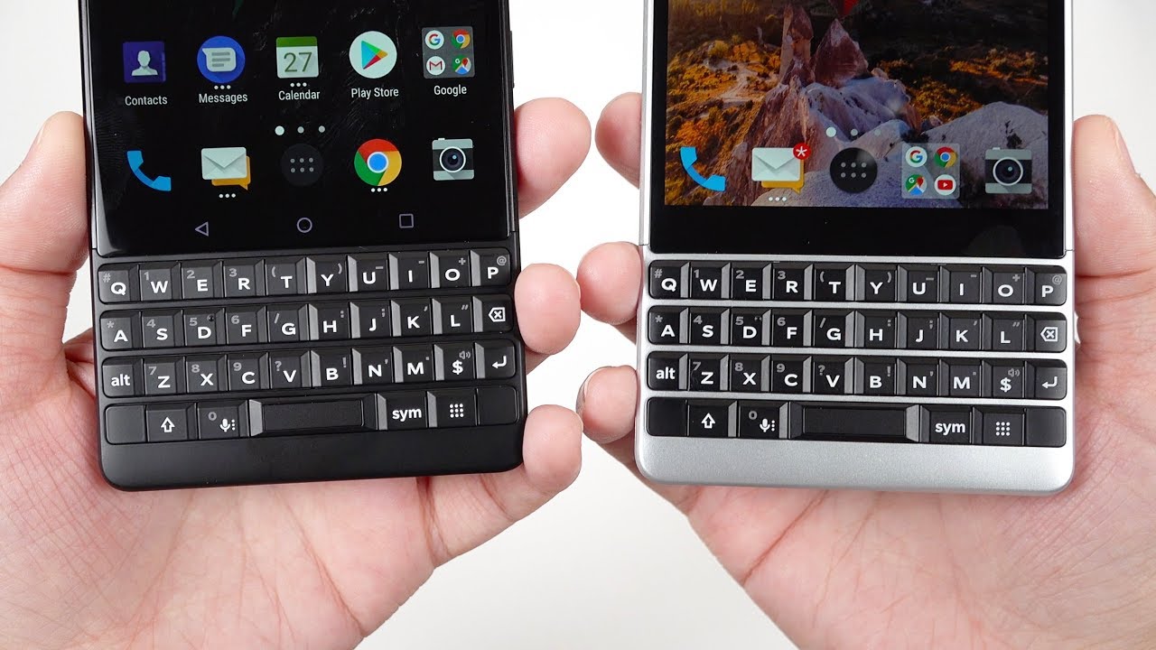
Hey everybody: this is Erica the technology nerd likes to film stuff, and this is the BlackBerry key ? in black. So I asked you guys if you would want to see both colors we've got the silver version right here: I already unboxed the key ?, but we're just going to show you what this one looks like in comparison. Hopefully this can help you decide which one you want to go for, and then I have a little more impressions, I'm, not ready to do the full review as I take plenty of time to use a device, but I do have some thoughts. Nonetheless, so let's go ahead and get into this, you can see that this is the 64 gigabyte, 6 gigabytes, RAM version just in black, and this is actually the color that I think I'm going to like more than the silver one. So here we have the phone right here: let's go ahead and lift it out, and we've got this really nice black color, this nice matte finish, and you can see that it matches all throughout now. Let's go ahead and pull these off.
Take this off here as well, and so here we have the silver with its side by side, and you can see that yes, even the back is fully black. You can see that the BlackBerry logo is also black and just at first glance, this looks more elegant. Looking to me, the continuation of color just really makes sense. So, looking here at the bottom, you can see. We've got our USB-C charging port speaker microphone at the top.
We have the headphone jack and microphone left-hand side. Furthermore, we've got the SIM tray and SD card slot. Then, on the right hand, side we have the volume rocker, also the power button and the convenience key, and actually what I really like about the black model of the phone is that you can see that it's black yes, but where it's chambered, it's actually silver to me. That looks really, really nice. Now, we've already taken a look at what's in the box, we've just got the tray here.
We've got some documentation, sim ejection tool. Then we've got the charging brick the headphones and also the USB-C charging cable. So totally when looking at this I would definitely go with the black one. This is kind of reminding me of what was it the Samsung Black Jack, the Motorola Q days. This feels like a blast from the past holding and looking at this phone, and I'm sure a lot of people are going to want to join in on that nostalgia.
This gives me a bit of that nostalgic feeling as well, but the black one really does it for me, what I do find charming about the silver one? As you can see, we've got the black face here, and then we've got to the silver that frames it. That does look really nice. So we think that it's just going to be a matter of taste here. You cannot go wrong with the black one looks sleek looks very business, classy very nostalgic and the keyboard doesn't stick out as much on this black one. So if you want to be more inconspicuous about having a keyboard, the black one might help you with that.
Still both of these are very beautiful, looking devices and when holding the black version next to the BlackBerry key one, there's just no competition and appearance here. This is beautiful. I love, those matte keys, especially and without having these capacitive buttons actually showing, except for when they light up. It just looks like a business class device very sleek. Now for those of you that watched my first unboxing I'm in a little of a comment about the space bar and I want to update you with how that's going, so it does sound still different from the rest of the keys here, but I've noticed that, after using it and letting it what you could call break in a little that is clicking.
This is not as loud, so it still sounds different, but it's softened a bit, and so I would call it a non-issue. An interesting thing. I just found those that there does seem to be some variations with the space bars. I can see that this one's a lot looser feeling I can just tap it, and it moves around a bit without actually even pressing it. Where this one is nice and tight on the silver one, so I'm expecting some variations with the tightness of the keys, and you guys can.
Let me know what you think about that as you get yours, I'm, not sure, if this is something I would return it for, so I just need to use it and really see how I feel, but I just wanted to let you know so how about some of my impressions after a week of use, while I can tell you guys that I am absolutely in love with this keyboard yeah, it's easier to type on glass, and I'm, actually faster typing on glass, but I. Just love that sure feel that these keys present I've got really fast and really reliable, and I love. These mat keys versus what we had last year. With these glossy keys, it's making all the difference in the feel for me, I'm really loving the shortcut keys that we have here and the one that I'm actually digging the most is the currency key. So right now, I have this programmed to pull down the notification shade, so you can see instead of having to pull downward the notification shade.
I can just simply access it right here and if we go under settings you can customize the currency key to being the control key. A lot of you guys ask me: hey, there's no control key. Why is that? Well, you can make the currency key your control key, so you can use it to view notifications like I showed you, you can switch the keyboard language, and you can also use it as a second shift key. So that's been excellent. I'm also really liking this speed key.
So if I don't want to fill up, my screen with icons I can simply hold it and click T, and it's going to bring me in to Twitter, so that has been insanely satisfying I've been so happy to have a convenience key that I can have control over, so I've, linked it to the Google Assistant, so pressing it there and there's the Google Assistant, of course, I'm loving the capacitive scrolling. And yes, we had this on the key one as well. So, instead of having to touch the glass on the screen, you really can use this keyboard for a lot of things. The emoji keyboard is now very simple to access. It just sits and resides right here instead of using the capacitive keyboard as a cursor.
They've also created another little shortcut, so click right here, and you can see that you can go back and forth right here on the screen. If you feel like you need that bit of extra precision, it's been great to have quick access to my clipboard, so I feel that they just made this a little more accessible overall I've been adoring the battery life and quick charge 3.0. You can see that I've got over seven hours of on-screen time, and it's still 16% battery life, of course, on a very heavy day, I'm not getting seven hours, but I can actually get that. This is one phone where I can use it all day. Long and I'm not worried about it dying on me now as far as performance I'm still testing that out.
But it's been a lot better already than the key one, and I'm sure that we can think more RAM for this and whatever optimizations that BlackBerry has done with the interface. So I will continue testing this now. As far as the camera I really haven't been so impressed, I can tell you that this truncated, looking viewfinder, really doesn't help. You very much you've got this big bar here and it kind of obstructs your framing. So a lot of the time I find myself framing for this little visible square here and then forgetting about this part where the controls are and I screw up, my framing.
So you have to be careful with how you are framing things: there's no optical image, stabilization, which I do find to be quite a fault. I've experienced several times when I get motion blur in my photos because of it and I think the biggest bummer right now is this telephoto mode, as the results really are not very good. They look very watercolor, II, very smooth and devoid of detail, and yes, this is what I'm making sure to use the actual telephoto camera, because, depending on the lighting or depending on how close it is to something it's going to use. Just the main camera and crop, so I've made sure that it's using the telephoto camera and still the results are really quite poor, so I'm hoping that they can make some improvements with updates with that. So for now, my last critique is that the display really is not very good.
I think that it gets bright enough. I can see it fine enough in direct sunlight, but I'm sure you've noticed that it looks really quite greenish on camera here, and it actually does not look this bad in person. This is due to a combination of the white balance with this camera and also with my lights. But still these displays are really quite cool and for charging a hundred dollars more versus the BlackBerry key one I would have expected. They use a better display or one that they calibrated better, at least but if notices that they've had quite a bit of trouble with grayscale calibration, where there's a lot of banding in the grayscale, and you get some pink bands as well.
So what I've been noticing specifically on both of these phones I, was hoping that this one would not have this issue and I will tell BlackBerry what I'm seeing here is that you have a very foolish looking white point. It looks kind of greenish, bluish foolish, and you can see there gray looks pink, so we have a pinkish looking gray along with a greenish bluish white and that's just not looking nice, especially when Android has a lot of Gray's in various banners. So I'll point this out to blackberry, but it really should not be like this. You do get used to it, but it looks quite weird so, with some of these little quirks that I've been pointing out, am I going to want to use this any less. No I really like this phone.
It gets me excited in a way that I haven't been excited in a while. I love, especially how this black one looks. I can hope that they'll do a little better with this camera here, but honestly I'm going to be carrying around one of my other phones. Furthermore, I think this does an okay job as a camera, but this is not a camera. Furthermore, I would choose, as my daily and with this screen I'm, obviously not going to want to consume media anyway, because well, it's not 16:9, and you get a lot of this letter boxing pillar boxing, whatever you call it, and it's a little odd for gameplay, but for communication.
You really can't steer wrong with this. This keyboard is fantastic, all the little shortcuts that it's got are just so nice, so I'm going to continue using this I'm, going to continue seeing how it performs I, especially want to compare it to the key one. I'm pretty darn sure that this is a worthy upgrade, although it's $100 more. So that's something you really have to think about. So let me know what you guys think about this.
Let me know which color that you would choose. I personally choose the black one I'm going to keep an eye out for hearing what people are saying about the loose space bar here but other than a couple of quarks. This has been a great phone so far, so this has been Erica the technology nerd likes to film stuff. Please rate comment subscribe, make sure to hit the notification bell so that you get notified when the full review drops on this, and please again ask as many questions as you can below I'm really enjoying seeing all these questions. It's given me a great direction to know what you want to know for the full review so have a good night.
You guys bye.
Source : Erica Griffin
