Best Android Launchers (2021) By Tech Spurt
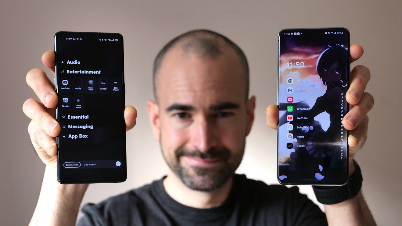
So the best thing about android is the way you can really make it your own. It's like it's like a pizza where you can add whatever toppings you like, gets more meat on there, a bit of bacon bit of ham, basically all the pig or, if you're a veggie person, then some- I don't know some kale. I used to live next to some posh pizzeria that did a broccoli pizza. Frankly, I'd rather have a bucket of llama on their hang on. Why am I doing a video about pizza, uh launches android launches, so the launchers are like the toppings on top of the android pizza. You know what just skip all this.
It's bollocks anyway, so I've been testing out more android launchers recently and revisiting some of my favorites, like the Microsoft launcher, which has just been updated fresh for 2021. So here's my personal roundup, of the very best android launchers that you can download from the Google Play Store for your smartphone in 2021 and buy the very best. I of course mean my own personal favorites. I might have missed out your own favorites if I have done that. Definitely let me know what a massive danger I am in the comments below and clear me in and for the latest and greatest tech.
Please do poke subscribe, ending that notifications bell cheers now. One of my long-term favorite android launchers is still at all-time classic nova. It's been around longer than sir David Attenborough and, like our treasured death dodger nature lover, it gets better with age once again, pretty much. Every aspect of the nova overlay can be meddled about with everything is fair game here from the transitions and those icon visuals to the app store and animations nova offers impressive gesture control too. As an example, you can set it up so swiping across an app icon, performs a very different action to simply tap on it to open it up.
I've actually done a full nova launcher tips and tricks guide as well, so go check that bad boy out for a much closer look at these awesome features and whether the prime version is actually worth an upgrade spoiler alert. It totally is and there are big changes coming to nova launcher with a fully revitalized version currently in beta. So when that update, officially drops I'll be checking it out, I've also got a lot of love for the Poco launcher 2.0, which is free to download from the Google Play Store, as popularized, of course, by those Poco smartphones and now packing. All of those great android, 10 style features like a proper dark mode and if you're unfamiliar with the Poco launcher, the main benefits are that it's fast and light, so it definitely won't go draining your battery unexpectedly or also pilfering your phone's resources. I definitely love the simple minimalist design that stock android layout hasn't been molested at all, just tweaked enough with plenty of cool little improvements.
You still got an apps' tray, thankfully, and this includes groups of icons based on type, so you can quickly access all of your games, messaging, apps and so on or, alternatively, you can also cluster them all based on the icon, color, if you prefer- and you can also easily pull out that notifications bar by swiping down anywhere on the desktop, which is particularly handy if your phone is enormous, like pretty much any smartphone in 2020, while conjuring the Google Assistant is but a simple swipe from the bottom corner. A nifty desktop shortcut can be tapped to cleanse the memory and speed things up and, despite that simple layout, there's still a fairly respectable level of customization. Here you can chuck in your own icon packs, for example, as well as playing around with grid sizes and all kinds of other shenanigans and yeah Poco launcher.2.0 is kind of limited in the customization stake, certainly compared with a lot of the other launchers that I'll mention in this roundup. But if you just want something, that's neat tidy and fast then definitely check it out. Alternatively, if you're more sold on nova's approach, where you've got that nice sort of stock, android vibe, but you've got really, really deep customization once you dive under the surface, then definitely have a squinted Hyperion launcher at first glance, there's little to distinguish Hyperion from the pixel launcher, but, like nova, you could basically piddle about with pretty much every aspect of the UI.
All the features you'd expect are packed away in those settings, including some smart gesture support for easier one-handed use. So there's plenty of control over the UI theming, including the color schemes animations and the icons, as well as the ability to add folders to your app straw and basically so much stuff. I could even possibly go into all the loveliest bits right here and best of all it stays a silky smooth. Experience. Note, however, that to unlock all the luscious type hearing features you will have to stump up for the pro version, although that was less than two quid, and it's a one-off fee, so not exactly bank breaking.
If you're looking for more launches like nova and Hyperion, then definitely check out the action launcher. Pixel edition, which once again keeps that sort of stock android feel but again with plenty of customization options, and you'll also get very similar vibes from the rollerbornely titled customized pixel launcher just remember to spell customized wrong with a zed when you type it into the Google Play Store customized now I often get asked about how to tailor android to suit all the users and those with limited sites and while android has accessibility features built into it. I'd also highly recommend trying out the big launcher. This free to download tool serves up a very simple streamlined interface. Only the most essential features are there to access via the main desktops, via these massive oversized icons, they're, nice and clear and easy to see.
You've also got up top a battery indicator and a signal strength indicator as well. Any text is also nice and big and easy to read and there's a SOS feature which can immediately call and text your key contacts once it's tapped, all in all great stuff and another android launcher that doesn't mess around with that stock. Look and feel is the rather brilliant launch air launcher now in an even more awesome version too, like the others, I've already mentioned, you get a great selection of customization options. Basically, everything you see can be tweaked and fiddled with. You can keep the likes of the Google feed if you download the separate lawn feed plug-in or ditch it entirely, if you'd prefer- and I like the selection of gesture shortcuts too, which allow you to easily yank down that notifications panel hibernate the phone or load up your favorite app and best of all the launcher is completely free to download and check out.
So you've got no excuses whatsoever. Now, if you've used one of blackberry's android smartphones in the past, something like the amusingly, titled, blackberry, PRI, then you'll know just how good that blackberry, android launcher, really is well. The good news is, you can download a version of the blackberry launcher right now from the Google Play Store and while it's not quite as fully featured as the ones that you'll get on the actual blackberry smartphones, it's still pretty damn good with a lot of those best bits chucked in there as you'd probably expect this launcher is all about staying organized. One of my favorite features is the task shortcuts, which saves buckets of time on anything you do over and over again just shove, one on your desktop, and you can jump straight into that specific action rather than having to tap your way to it through the relevant app and, if you're, a massive fan of widgets. The point where your desktops are absolutely crammed full of them.
Well, blackberry. Definitely, has you covered there as well, because now you can actually hide those widgets away and then reveal them with just a quick swipe over the app icon. It's a really neat and tidy setup, and it works a treat and, of course you can use all of blackberry's own apps for your mail messages and the rest or just stick with your preferred alternatives. However, unfortunately, it's not all great after 30 days of using the blackberry launcher, you'll have to stump up for a subscription to continue using it, otherwise have to put up with the occasional ad popping up, which is really, really annoying and as a blackberry subscription cost you 89p a month that basically means you'll, be stumping up over a tenner a year to use the blackberry launcher and making it one of the most expensive options out there. Now, if you've got more love overall for Microsoft, compared with blackberry, then you'll definitely have to check out the excellent version 6 of the Microsoft launcher again available via Google play.
This latest update has improved the overall performance and added in some worthy new bits, as well as a proper dark mode, making a slick and enjoyable launcher even better. It's not vastly different from standard android, but with a please and aesthetic and some bonus bits that I rather like, such as an expandable dock, to stash away most of your favorite apps to the rather good feed, which is basically a scrollable page of widgets that you can customize to your heart's content. Unlike blackberry's effort, the Microsoft launcher is completely free to use and enjoy for the rest of your existence. Basically, and thankfully in version 6, they seem to have iron out most of the quirks and annoying little bits that I saw in the previous version. So it's definitely one of my more favorite options.
Right now anyone who gets all misty-eyed thinking about colorful Windows phone handsets will adore this nostalgia, driven square home launcher the tile base desktop operates in almost exactly the same way, dishing up a wall of dynamic icons that can be resized and reordered complete with up-to-date notifications and the like. It really does make me long for the days of bright orange neon, Lucia smartphones. It's a simpler time, a happier time. You've got a few neat little tricks thrown in like the ability to set up cube tiles, which can be fully rotated to reveal even more app shortcuts. I mean seriously, what's not to love now.
Next up in my roundup, of the best android launchers that you can download right now in 2020 is the Niagara launcher. This offers a very different presentation to the previous launches that I mentioned offer a more streamlined approach to dealing with your smartphone instead of cluttering. Your screen with a whole grid of apps you'll get a short list of your favorites up to eight in total, although your other apps can be quickly opened using the cascade and air to z index after spending some time with Niagara. I actually think I prefer this system to hiding everything away in an app straw. It's very neat and efficient, but because all of your apps aren't just immediately on display as soon as you unlock your smartphone, it's much harder to get distracted and stop piddling around in social media and stuff.
You don't really need to do. A Niagara makes life easier in lots of other little ways as well. So, for instance, if you're playing a bit of music or an audiobook, some handy media controls will appear on the desktop for fast access. I think swipe right on any app to check out weight, notifications or jump straight to certain features. While a swipe down will open the notifications tab, you do get some simple customization, including a choice of light, dark or ultra dark theme and for the settings panel.
However, the UI is very straightforward: there's not actually that much to tweak overall, if you want something, that's just quick and simple to use, and it'll prevent you from getting distracted when you just need to have a quick check of your emails or whatever, then Niagara is pretty bloody. Wonderful. Now one of my favorite android launchers, that just hit google play at the end of last year is ratio which was previously one of those posh ooh. Look at me invite only efforts, but now ratio is slumming. It in the Google Play Store with the rest of these common launches and that's definitely a good thing, because it's pretty bloody lovely ratio has a similar minimalist vibe to Niagara this time.
Separating your apps into category drawers that you can fully customize as many or as few as you like. It's very neat and tidy with a handy search bar if needed, to find apps or actually search within apps, as well plus a dedicated section for messages from a couple of key apps like WhatsApp. You've got a surprising amount of customization here too, including grayscale or color options, a selection of wallpapers different icons for the drawers. All of that good stuff ratio certainly is far from perfect still, for instance, the search functionality needs a bit of tender, love and care, shall we say, but overall I do really enjoy it, and it's free, hooray and another great android launcher option for anyone else to streamline their overall smartphone experience is the kiss launcher, which certainly has nothing to do with the 80s glam rock band or playing tonsil hockey. Rather, the case of the title is an initialism which stands for keep it simply face, or something like that.
There are no widgets here, no multiple pages, although you do still get an app straw, but all you've got there on the main desktop is a search bar which you can use to find whatever you need, be it app contact, even a specific setting as you search for bits, they will stack up in your history, so you can fast access stuff that you use a lot where you can also add anything. You like to a row of permanent favorites housed there at the bottom, once you get used to this general setup, it's surprisingly intuitive, and also just like Niagara launcher. It's great for not getting distracted by stuff that you really don't need to look at. You've still got some customization options thrown in there for good measure, although obviously they are once again pretty basic compared with a lot of the other launchers mentioned best of all, the kiss launcher is once again completely free to download and check out. So there are no excuses, and if you like, the look of both kiss and Niagara, then definitely check out the before launcher as well, which is a very similar sort of thing.
Now. Last up in my roundup of the best android launchers, you can download from the Google Play Store in 2020, I'm still very much a fan of the smart launcher 5 as well, which has evolved quite a lot over time. The idea here is that your home page acts as a central hub. You can fill it with icon shortcuts to your favorite apps, while swiping up reveals the app page, where you'll find all your stuff sorted into different categories, swipe right to access a selection of cuts from Microsoft, news which isn't the most customizable effort out there, but it's still pretty decent and meanwhile swiping left serves up the widgets page, which you can cram full of your favorite goodies. And if you swipe down to access the search page, you can use that to quickly access a specific, app or contact.
Thankfully, these different pages can be rearranged or even removed entirely from within the smart launcher settings. So you can set up your handset. However, you like- and there is a shed load of customization options if you're willing to stump up for the pro version that pro version show in cheap, though at the time I shot this video, it will cost you a whopping, eight pounds and 49 pence precisely in order to unlock it, making it one of the more expensive options out there again, so that right there is my personal pick of the very best android launchers. You can download from the Google Play Store right now in 2021, but of course, I've bound to have missed off a few of your own favorites or just didn't quite manage to find enough space to include them. Sadly, Stephanie, let me know your own personal favorites down in the comments below.
Please do put subscribe, ding that notifications bell and have yourselves a lovely rest of the week cheers everyone loves you. You.
Source : Tech Spurt

![Xiaomi Black Shark 3 - Ultimate gaming phone?? Full walkthrough review [xiaomify]](https://img.youtube.com/vi/_JuPrG4Dk0A/maxresdefault.jpg )
![iPhone NOT CHARGING Fix In 3 Minutes [2021]](https://img.youtube.com/vi/Opftqz1BHa4/maxresdefault.jpg )
