Asus ROG Phone 5 - They Did What?? By The LEAKSTER
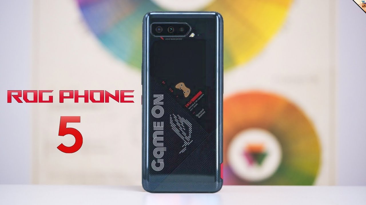
The upcoming ASUS ROG phone 5 was leaked about a week ago in the very first hands-on video which showed us a very lovely new design, but now we have a completely different design, suggesting that the phone in the hands on video might have been a discarded prototype, and this new design answers some of your problems with the previous version, but before we take a deep dive into that hello guys, how are you and if you are enjoying this video, then a sub to the channel would be breathtaking now. This is what the original leak of the ASUS rogue phone showed us. This design had the ASUS ROG logo on the bottom corner, some angular lines and a display at the back, which was able to display any sort of pictures or gives just like what you might find in some high-end graphics cards. However, the new design is completely different, and here it is. This was found antenna for certification now at front. We do keep the same design with some decently sized bezels for 2021, which contain the dual front, firing speakers and the selfie camera at the back side.
However, it is completely different from what we had before, instead of a small display in the middle. Now, it seems like the almost complete bottom half will have this dotted pattern, which works as a dot matrix display. The ASUS ROG logo is displayed on the dot matrix display, but it's likely going to be customizable. Remember guys. On the back of the ASUS zebra z14 laptop, we had the same type of dot metric display and even in the ROG phone 3, we had a case called lightning armor case, which featured this exact same dot, matrix design, covering almost all the back of the phone.
Now, what is not confirmed is that what is the size of this dot matrix display? The dotted area seems to be this big, but could be only this triangle, or it could actually be a small rectangle inside this big triangle, which works as the dot matrix display. I do hope that this full triangle has the dot matrix so that you can put on some crazy texts like game on winner chicken dinner, and I don't know what else there is, or you can just be. Like me, and have this GIF, we then have the Tencent logo over here, which is also present on the ASUS ROG phone 3. It says zero, five confirming that they will drop the name, ASUS ROG phone 4 and go straight to the ROG phone 5. Below that it says republic of gamers established 2006.
Then we have the triple camera system on the same spot, with some lines and angles to make it look more gamer. On the right hand, side we have the power button and the volume rockers and what looked like a giant red gaming button on the previous lick is now nothing more than just a red, accented, sim tray. So yeah guys things have changed quite significantly from a giant red button to a sim tray. This is it guys for the updated design of the ASUS ROG phone 5. Let me know which design? Do you like better this newer one with the dot matrix or the older one, with the real actual display? I like this newer one better subscribe for more videos on the ASUS ROG phone 5 hit that like button.
If you find this new design lovely, you can also say hi to me over on Twitter and with that guys thanks a lot for watching.
Source : The LEAKSTER
