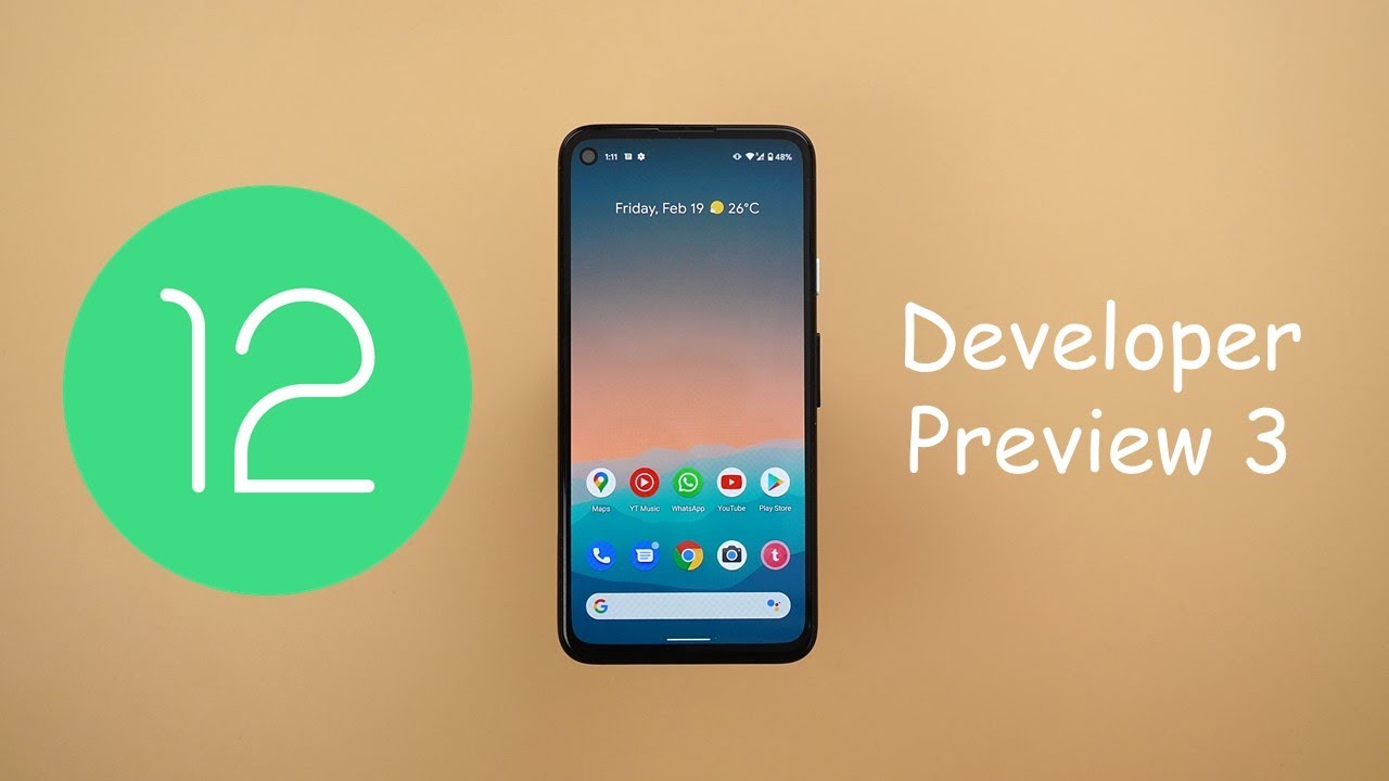
Android 12 Developer Preview 3 - Game Mode, Better Animations, Floating Accessibility Menu & More By In Depth Tech Reviews
Welcome back YouTube. We have Ahmed again from in-depth take reviews, and today google released android 12 developer previews 3. I have it here on my Pixel 4a, and I'm going to compare it side by side with developer preview.2 on my Pixel 4 XL. This build has a massive change lock. So let me show you: what's in you in android 12, developer preview 3, but before getting started, let's make sure to subscribe and hit the bell icon to get notified every time I post a new video. So let's jump in, let's start with the system-wide changes, and the first thing is the new bounce animation that you will see while scrolling almost everywhere in the OS on the left.
I have developer preview 3 and here on the right. I have developer preview too, and the first example I'm going to show you is the notifications shade. As you see here when I pull down the notification shade, I get this nice bounce animation which doesn't exist in developer preview.2. , that's exactly the case under settings. When we go to settings and scroll all the way down, you will see the same bounce animation, and it's also visible under native apps.
So, for example, when we go to styles and wallpapers, we will see the same behavior. You will also notice developer preview.3 is using rounded corners everywhere in the OS. As an example, here in the styles and wallpapers app, the thumbnails are using rounded corners versus the square corners in developer preview.2. , that's exactly the case in the recent apps screen and also when it comes to widgets. Here's the same widget and, as you see, the corners are more rounded in developer preview 3.
Another system, why? The change is the new splash screen for apps. As an example, when I open the camera in developer, preview 2, as you saw, the splash screen, is using a custom icon that doesn't match the one in the home screen, while here in developer preview 3. When I open the camera, let me try that again. You will see that splash screen icon is matching the one in the home screen button bigger size and that's exactly the case with other apps. Like play store, you will also see it in google, chrome and so on and so forth.
Next, the boot screen is now in dark theme. Regardless what theme you are using on your phone? So now I'm going to restart both of them to show you the difference, as you see in developer preview.3, it's in dark theme, while here it's in light theme, and I'm using light theme on both devices. Next, the home screen long press menu got redesigned first, the menu items are now partitioned, instead of showing in the same block. You will not see this small arrow in the bottom right corner in developer. Preview, 3 and the corners are more rounded, as expected.
Also, the quick app shortcuts got redesigned. So if we're going to take a look here on Google Chrome, you will see the same redesign. They are partitioned, and the top bar has more rounded corners compared to the one in developer, preview 2, and it's slightly separated from the rest of the menu items. And finally, the attack lens widget has a bolder font compared to the one in developer preview.2. next, the widget speaker got redesigned.
So if we take a look here at the top, you will see a new title called widgets, with a handle to give you a hint that you can swipe down to dismiss. After that, you will see the new search bar that will allow you to locate any app quickly without the need to scroll through the list, which is very convenient, and then there is a new section that will show you a couple of suggested widgets that you can drag and drop straight away to your home screen. I tried to play around with the system to get more suggested widgets in this area, but it seems like the maximum number is only two for now. I also found the counter to be slightly different in developer preview. Three.
So let's take WhatsApp as an example. Here it says one widget two shortcuts, while here it says only one widget, when you expand both, you will see the widget, which is here and the two shortcuts are separated and organized differently. But in developer preview, two, it doesn't take the shortcuts in consideration and when you expand an app with multiple widgets, you will see they are stacked on top of each other and instead of being organized horizontally and the name of the widget is listed under the preview instead of being listed on top. Let's take a look at a different app that has multiple widgets and shortcuts all together, for example, outlook. If you take a look here, you'll see the widgets are vertical and the shortcuts are horizontal.
While here everything is organized horizontally. I do prefer this more compact design, it's less confusing, and it saves space as well. So I hope google will return to the horizontal scrolling, but they can also still categorize the widgets and shortcuts in a way, without using this vertical scrolling. Let me show you one more change when I add a widget to the home screen. So let's say I added a widget and I want to change the size.
If you take a look at the handles, you will see they are in different color here in developer preview 3, it's matching the accent color of my phone. So if I change that under the styles and the wallpapers' app, let's say we're going to pick the green color the handles will match this accent color as well. Now I'm going to show you the new gaming mode of android 12, spotted by DA developers. Previously it seems to be broken for the time being, but it will give us an idea about how it works. The only way to access this new gaming mode is by going to settings, notifications and then scroll down to do not disturb then go to schedules, and you will see a new menu item here called game mode.
When you tap on the settings icon, you will see the same screen we saw before. First, you will see four toggles at the top and each one of them will give you quick access to a certain function that you can use, presumably while playing so, for example, when I activate the screenshot toggle, I got this floating button. When I tap on it. I can take a screenshot immediately. I can also dock it to the side, as you see here or place it anywhere on the screen.
So I can place it anywhere on the screen. However, it seems to be broken a little but anyways. Let's take a look at the other toggles as well. Here you can also activate the screen. Recording and the fps that do not disturb toggle doesn't add any buttons to the floating menu, but I assume it will activate they do not disturb automatically if you start it to game for the time being, it doesn't matter if I'm playing or not the floating menu will always show on the screen, and you can use it as a shortcut for certain functions.
After that you have something called game: optimizations with three options: performance which is going to give you the highest frame rate standard or battery saver with the lowest frame rate possible to save battery tapping on any of them will ask me to restart the game. I don't have any games running in the background and when I tap on restart it will take me back to settings and this loop doesn't end. Even if I opened any of the games, I have and then keep it in the background then go back to the game mode tap on performance, restart still, it will go back again to settings, so it seems to be broken for the time being, and the second option available is called YouTube live when you tap on it, it will take you straight away to the live stream, page of the YouTube app to start your live-streaming. So I'm not sure if this gaming mode is only for streaming, or it will be a full gaming mode in the future, and even when I try to start a live stream, I couldn't get anything different. It just works the same way as any normal live stream.
Next, the volume controls got a complete redesign in comparison with the previous versions of android. It's a lot thicker and easier to use due to the bigger space available for your finger. Also, when you move the slider up and down the music icon will move with it and when you push it all the way down to mute the sound, it will not go to the edge to give you more space to slide it back up easily. Also, the sound profile toggle looks totally different. Now, when you tap on it, it will show you the three sound profiles stacked on top of each other to easily switch between them with this nice animation.
Also, the more button has been replaced with three dots tapping on the three dots will show you the same sound and vibration card. And, finally, let me show you how it looks if you have multiple sliders at the same time, so I'm going to cast some music to my Chromecast and then try to raise the volume, and here is how it looks with the Chromecast slider. Next, the screenshots and the markup app. When you take a screenshot and then tap on edit, then go to the text editor, you will see a complete redesign here. First, you can choose between four different fonts, which is not possible in the previous build.
Also, the color palette and the fonts are showing, at the top of the screen, giving you more space in the center to see your text also, the colors not close to the keyboard, which going to minimize any accidental touches, while changing the color and the pin and the brush tools are now showing a floating color palette, instead of being close to the navigation bar, which is also looks nicer and matches the same design, language of android 12. Next, the notifications shade and the first change is in the messages counter. As you see here, it shows a pink color instead of using the blue color like the previous versions of android. Also, the drop-down arrow is a smaller and surrounded with gray circle. When you reply to any message from the notifications shade, you will see a rounded text field the send button and the text field are separated instead of having one big bar that fills the entire width.
Also, the accent color is no longer used, but unfortunately there is a bug that shows the snooze icon. On top of the send button. However, when you try to reply, it will work normally in developer preview 3. The quick settings will show you on and off labels under each toggle, which doesn't exist in the previous build and finally, the reduced brightness toggle has been renamed to extra dim due to dynamic change of the feature that will take us to the new floating accessibility shortcuts. As you see, I have two of them floating on the screen that I can dock anywhere.
There are two ways to dock the accessibility buttons either to dock it. That way and by this one tap will be enough to activate the feature, or you can push it even further, and by this it will require two taps, and this will minimize any accidental touches, while using your phone to add more floating shortcuts. All you need to do is to jump to settings and then accessibility go inside the feature you want to have a shortcut for, let's say, switch access for example, or let's try something else live transcribe turn this on, and you will get the extra button added to the list. You can also apply some visual tweaks to the floating menu by going to accessibility shortcuts, and here you will find a new menu item called accessibility button from here. You can choose between two different sizes, small or large.
After that, you will see a toggle called fade when not news. This will fade the floating menu to make it easier for you to see the screen, you can also adjust the transparency when not in use. There is one more option here called location, but it's a grayed out, and it says floating over other apps. It seems like you, can put this menu in a fixed location, but it's not currently available, and I couldn't find the way to do this. This new floating menu will also show on the lock screen.
So here I have my phone locked, and I still can use the magnifying glass, for example. It will also show on that always on display next, the styles and the wallpapers' app got some tweaks as well, and the first change is under the grid tap here you will see two 4x4 grid sizes, not only one like in the previous build. Both of them will give you the same four by four layout, but the major difference between the two is in the icon's size. This is how the icons look like in the old 4x4 grid, but when I switch to the new one you will see the icons are now smaller, and they have more spaces between them. And finally, when you try to create a new style, you will see.
Things are organized differently. That applies to the font, icon, colors and also the icon shapes, and when you compare the light theme of both versions, you will see developer preview.3 is back to the normal white color, instead of using the light gray color, while the dark theme remains exactly the same next, the power menu. When I tap on hold on any of the controls, it will quickly show me the Google home app splash screen, which is not the case with the previous build next. The split screen and one of the apps that doesn't support, split screen in android 11 is the YouTuber studio app. Here I have my pixel 5 running android 11, and I don't have the option to force this app to run in a split screen.
But here I can tap on the split screen, but you will see slightly different behavior. First, the app is showing in its full height, which is not the expected behavior of the split screen of android. But you will see this rounded arrow in the bottom right corner. Tapping on this arrow will show you the app in its normal split screen mode as expected from android, and every time you try to resize the window. You will see the same refresh button again to force the app to work with the new size.
Now let me show you what's new under settings and the first change is in the design. As you see the same design, we first saw with the one-handed mode of android.12 is now used as the default design, without the need to do any ADB, commands or activate the one-handed mode, but still it's not exactly the same as the previous build. The previous one-handed mode settings used to have the search bar and the profile picture side by side, but now the profile picture shifted towards the top, leaving more space for the search bar to fill the entire width next. The battery and the first change is the removal of the battery icon from the settings page. You will see this progress bar that will give you an idea about your battery life.
The apps are running, normally, menu item has been removed and the battery saver toggle no longer exist, and you can only activate it from the dedicated page. Next, the storage and here you will see the same bar we saw under battery, but it's used for the storage instead of using that circular design, there is a new menu with one item called internal shared storage. So I'm not sure if that will make any difference. If my phone supports SD card and finally, the manage storage button has been renamed to free up space and both will take you to the same files app next. The display and adaptive brightness got a quick toggle next to it.
Instead of activating the feature from the dedicated page. In contrast, the auto rotate screen feature lost its quick toggle next accessibility and beside reorganizing most of the menu items. The most important to change is to rename of to reduce brightness feature to be called extra dim. The feature works exactly the same as before, but now you can add a button for the feature in the floating accessibility menu to toggle it on or off, unfortunately, it's showing in white color. But when you tap on this area, you still can use the feature next.
Privacy and the notifications on lock, screen option got renamed to privacy, and it shows the same options as before. Next accounts have been renamed to passwords and accounts, and from here you can adjust the autofill service settings which doesn't exist in the previous build and finally under system gestures and then one-handed mode. You will see a new graphical representation that doesn't exist in the previous build. There is one more feature that I couldn't get on my Pixel 4a, which is the conversation widgets, so I'm going to do my best to activate the feature, and if I manage to do it, I will do a follow-up video with any new features I spotted in the developer preview 3. So that's pretty much it for today.
Those are all the changes I spotted in android 12, developer preview, 3! Please let me know in the comments. What do you think so? I hope you like my video and if you do, please hit the thumbs up and subscribe for more videos. Thank you for watching.
Source : In Depth Tech Reviews
Phones In This Article
Related Articles


Comments are disabled
Latest Articles