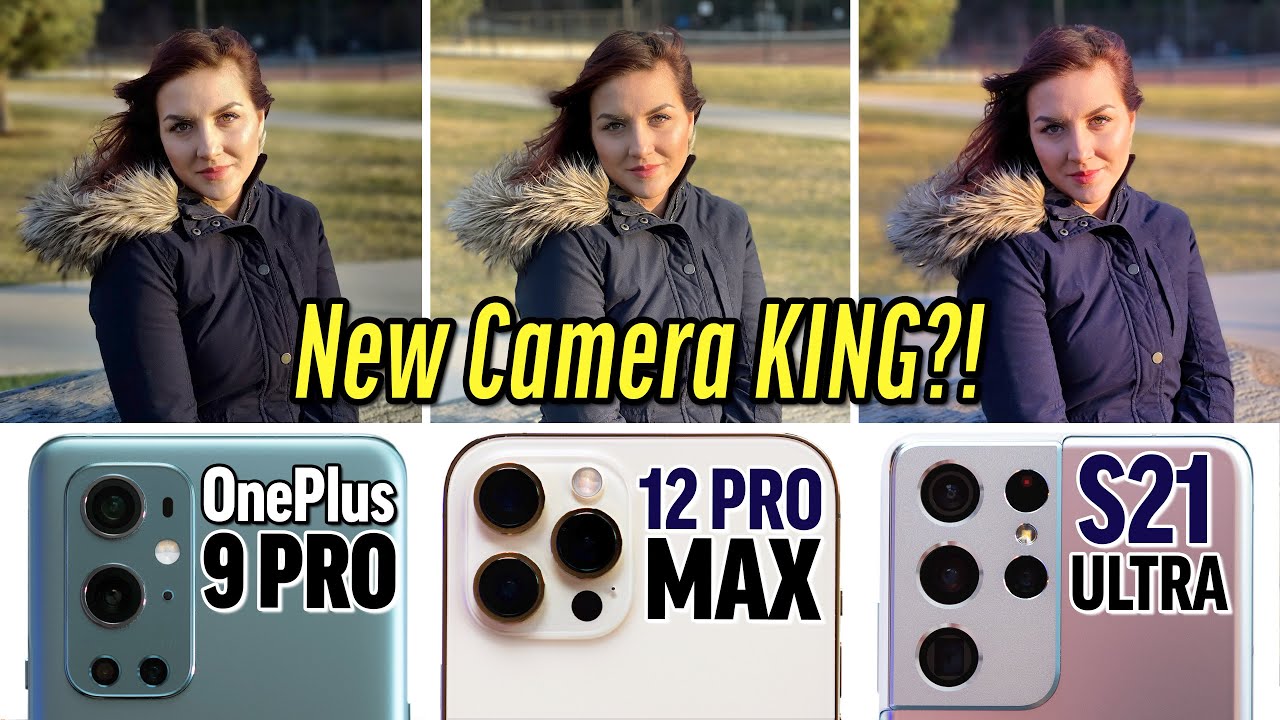
Unbiased OnePlus 9 Pro vs 12 Pro Max vs S21 Ultra Camera Test! By Max Tech
This is the last photo, so I guess that uh Hasselblad 150 million dollar investment, it's starting to work, hey guys, it's angelica max and Vadim, and today we are doing another blind camera comparison with the OnePlus 9 pro the iPhone 12 Pro max and the s21 ultra. I went out, and I took a bunch of images I have 30 of them lined up over here. Vadim and angelica have not seen these images, so we're going to be taking a look, and they're going to be choosing which one they think looks best without knowing uh, which brand shot at which phone anything like that. So go ahead and get out a piece of paper, or maybe your notes' app. We want you guys to vote along with us. It's a ton of fun uh because oftentimes we're surprised.
So let's go ahead and take a look at the first image right here. We have a nice bright day. I think I like the one in the center. It looks the sharpest and I like the white balance. The best too, the street looks a little warmer and I think the detail on the bricks is also good.
I think the right one looks the most detailed to me yeah. I don't think anybody can guess which one of these images is from which phone? Furthermore, I don't even remember: let's do it, okay, so here's the one plus nine and which one did you choose the twelve promise max all right next image. Here we have a portrait shot yeah the center. That's true, that's s21! Why is the iPhone so blurry? That's crazy! Come on apple all right, and here we have an ultra-wide and I have to say I'm excited about the OnePlus 9 pro, because it has a 50, megapixel ultrawide, and I've always been unhappy with ultra ride photos as far as sharpness. So what do you think? Well, I think I'm seeing more detail better image overall on the left.
I agree. I agree 12 pro max in 12 megapixels right there 12. All right and we have a portrait shot of the sign. I was beginning to like the one on the left because kind of like this both down here looks kind of nice, but I noticed that there's a big chunk right here that is not getting blurred. Where here you can see a little of blur on the outside and kind of the roll-off looks more natural.
With the background all right. Let's take a look. Oh all right, 12 pro max and here is a standard shot outside no fancy effects, but one of these photos is taken with a 108 megapixel sensor, another with a 48 and then one with a 12. To me. I think it's between the left and the right in terms of detail.
I think the one in the center either lacks contrast or lacks detail, and I think the one on the right is too cool in terms of the white balance. So I think I'm going with the left. I like it overall, the best uh to me. I think the one on the right has more detail and I don't mind the cooler white balance. Furthermore, I think it makes it look a lot prettier.
Okay, that's right bam. Interesting! Looking at you guys results, don't tell them anything yet, but all right, and we have our first selfie, which shot do. I look the best in center. Okay, the center first, I can't say anything yet, no biases for me. No, I, like it.
Okay, the detail on your face. The center one looks definitely the best all right. Let's go bam, okay, 12 pro max. What did it do? This 20 s21 looks killer all right, so this is an ultra-wide shot indoors cool coffee shop. Bakery thing: can you guys tell the difference as far as detail? At all I mean you guys still choose what you like the best, because two of these are 12 megapixel one is a cool sounding 50.
, the one on the right. If you look at these signs, I think the text is the most detailed and clear, but on top of that, if you look at these lights, it's the least blown out, because you actually see the texture in detail where these two are just literally just globes, this one's the worst yeah 12 pro max. How does it do what's it doing? Oh, is it uh? What's it called? What's that feature deficient deep fusion? That must be deep. This is stacking, multiple images. Okay, now we have a macro shot over here.
Okay, so I will say I'll add this in not all of these smartphones are able to get as close as the other ones. Some can get closer than others, but I wanted to match these up. So it's still fair if you're taking a macro shot, you want to get close to your subject. This is the best you can get with each phone. For me, it's got to be the center, because you have all that texture in the skin.
Look at that crazy detail and the uh the gem, the crystal whatever stands out like crazy. What would make you pay more for this necklace? What if this was the overages exactly you can can't really see much on the others so the center. It looks really nice and 12 pro max. So these are the original images. This is how close you can get, and Apple actually has made some updates recently with how they're doing things, so that was actually pretty surprising, looks good, and we have some macarons right.
I like the one on the right and the back. Everything else gets a little more blurry, I'm pretty sure Vadim might pick the center one, but I really like how this looks. No, I'm also going with the one on the right, for the same reason, the depth of field. You have this all sharp and focus, and over here you have some nice blur yeah. It kind of gets your attention over here, instead of having that image with the stuff perfect, one plus nine.
Finally, all right we have a portrait shot outside. This was a very difficult situation. Obviously it's very harsh lighting, I'm going with the right for a couple of different reasons. First off the highlight roll-off on her skin, very natural and in terms of the jacket, the detail looks perfect, especially if you look down to the jeans where you see the jean texture so right, I definitely like the right one as well. The only thing I don't like about it is sadly yeah the edge blurring on the hair got messed up.
It's really sad everything else. I really like iPhone, not bad all right, and here we are shooting into the sun. I mean this one kills it with the glare like there's no glare, that is impressive. Yeah, you still see sky. You still see contrast this one's, probably the worst, but obviously that's good one plus nine.
It's really okay, and we have a shot of the flag shot of the flag and the one on the right kills. It kills it much more detailed, oh yeah instantly, all right, s21 ultra, and we have a portrait shot. That is backlit. I think I like the one on the right the most, even though it's kind of like washed out in warmth, from the glare or whatever, but the all the others have glare too, and I don't know it kind of- has an almost DSLR feeling to me. I like it more than the others.
Furthermore, I was really gonna, go with the one on the right for the same reasons as angelica had, but there is that just a little of flaring there, and it's kind of like less contrast, so I think I'm going to go with the center, even though it's not perfect, it looks to be like the most clean in terms of not being as flat due to flaring in detail to one plus nine to me. There's a lot more to me, even though there's flaring there's a lot more detail like in their faces than the others, and it just looks more definitely a lot of differences like color, wise brightness of the faces white balance, a lot of differences here all right, and we have some buildings here to me. I think I see more detail on the one on the right. Yeah, the one on the right is definitely more detailed. That is the s21 ultra.
So, like I mentioned, you can shoot 108 megapixels, which is a mind-blowing number compared to 48 compared to 12. So it was clear that, with the iPhone, you definitely are missing out on detail. If you care for a shot like this, then we have another one here: yep by far the one in the center destroys the others once again, the one plus well not once again, I guess it lost last time. So this is ultra white, as you guys could see.50 megapixels. Is that a gimmick? Well, I guess it's not if we are getting more detail there outside compared to the other two all right, and we have a portrait shot here, uh just after sunset, I think I'm definitely going to go with the one in the center.
It looks the most natural to me, and I'm seeing more detail, I'm going with the one on the right. The middle one looks a bit too flat. In my opinion, all right, 12 pro max is average, and we have the androids got the points there all right, and then we have these little guys in four d'alone. So this is also a portrait shot. A wider portrait shot.
I like the one in the center, the most there's a lot more contrast and a lot more blurring with the portrait which makes it a lot sharper and easier to see. I'm also going with the center. It did a killer job with the blur edging, especially with it having more shallow depth of field. Can I add in its interesting how the antler is like a little blurred out here, not as much of the background, and this is in focus, so it has nice depth, whereas this is all in focus here so this looks more natural, perfect, yeah more realistic one plus nine man? So I guess that uh Hasselblad 150, 150 million dollar investment deal thing. They did it's starting to work, it's pretty good all right, so we have uh basically, sunset time we have a selfie here.
I just look mad yeah. I don't know if you're very happy. Furthermore, I think I definitely like the one on the right. The most I have to say I don't know what you're going to say, but that looks pretty dang good yeah. I definitely have to go with the right yeah.
The detail is crazy on the facial hair pores. Is it like blurred out here like it's not even focused? I don't even know what happened here. So much contrast like the edges on your hair, everything, and what about all this noise? Oh yeah, I also don't remember which one is which I mean. I think this might be a Samsung, because I remember it was great at selfies but yep s21 and what happened with the OnePlus just was there. I was looking at their advertisements, and they were like ignoring the selfie camera they kept focusing on the back here.
Is there a reason for that? Maybe all right and we have a shot over here. Oh definitely, the center banner destroys them wow that looks good center, so good yep s21 kills it perfect detail and then sun is basically down here. I like the one in the center. The most at first, I thought the right just because the white balance everything looked natural, but you can tweak it in post and there's so much more detail with the center and if you look at like the tassels and everything the others get like motion blurred or whatever, but everything in the center is kind of perfect yep. I'm also going with the center detail is much better than the other two and here on the left, you can kind of see some blown out detail in the tassels too, so I think the center 12 pro max good, all right, and we're into nighttime photos.
This is the ultra-wide here it's got to be the center yep. I mean that detail is killer, very good detail, and it looks like it, actually. Um less blown out lights way less blown out. You can tell, so it's doing everything great one, plus nine, plus that's good, very good- that ultra-wide lens is killer on there. Yeah, apple needs that all right- and this is a standard lens night mode as well.
Do you notice anything about this? I do. I know which one's the iPhone. It's this one um. It has a crazy reflection issue. Yeah, that's super annoying, so that just looks awful.
Does that mean you're going with the right? It says no reflections at all. I have an idea of what of which one this is. I don't remember from putting these together, but you see this has a little of reflection, but it's blurred out. This is flat and horrible. Looking this has none like how do they pull that off yeah? It's definitely got to be the right.
It looks so clean one plus. This looks like closer to a DSLR shot. These look like cell phone images right here, all right. We have a nighttime tower shot here I mean, even though the one on the right is all just very dark. I'm still going to go with it.
I think I see much more detail, especially if you look inside the building uh, where they, where the yellow is there's so much noise and artifacts, that's 20 s21. This is a portrait shot at night. It was very dark here. Very it doesn't look like it was very dark all right, I'm going to go with the right here. The one in the center, I think, is too flat and I, like how the both looks on the lights.
In the background, I like how everything's brought up a little all right, s21 ultra, and we have this crazy scene. There's lots of lights, lots of dark slots of colors. This is really tough, but I'm going to have to go with the right just because the other two I don't know if it's artifacts or something, but they just look really weird and unnatural yep, I'm also going with the right. It looks incredibly clean, very clean. The contrast is there the colors pop, and there is some kind of artifacts noise in the sky, whereas this one's incredibly clean- and it still looks like nighttime, where this kind of looks like it's trying to become day.
This has some color but very impressive. I agree 12 pro max. That was surprising, very good, and we have an ultra-wide shot here and the lights actually weren't changing at all. So this is their white balance and how they are thinking: okay, definitely, the right. Okay, so you're going for the right honestly, I'm going to go with the left, mainly because the sky is like pitch black, whereas the other two are kind of gray.
So I really like that extra level of contrast from the sky being just seen. I don't. I don't like that. A lot of everything over here is crushed because of that, even though this is brought up, and it's not as dark everything is so sharp and clean everything's, a good point, that's a good point.12 pro max and one plus nine wow, I have to say I think so far. That's pretty good that ultra-wide yeah in all ways is just killing it.
That is pretty good, got a portrait shot here, whoa which one's the worst the center yeah. I think in the center. Her skin is just underexposed. The left, the left one's pretty, pretty bad too. There's like not as much detail, everything's kind of like flat and what about detail in jeans like you look over here, I'm going to go with the right.
Even though, like I wish, the sky was a little more dark, but that level of detail and the exposure and detail of the face and skin is just yeah. It's very good to me the main subject: yeah. That is way more, and I guess, like you, can't get detail if it's not there, but you can always add some contrast. If you want to right, s21, ultra very good, an iPhone and um. Thankfully, Emily wanted to take a photo of me, and it actually turned out pretty good.
Definitely the one on the right. The other two are blurry, no detail really on your face. Yep, I'm also going with the right because um, the colors kind of stand out his skin color is kind of separate from like the lights color, whereas these two, this is very pink all of it, and this is also very kind of pink purplish, whereas that kind of has its looks natural yeah. The sky is very dark, but you can still see like the contrast, so basically much better and pretty much every way, 12 pro max. Oh, that's, crazy! Okay, all right we have this is.
I thought this was just crazy, tough with night mode. Super dark super bright. All these colors all right. So this one is pretty difficult, but I am going to go with the left because the other two kinds of take on the same general kind of flat color like across everything buildings, everything. But this one has like depth.
You know yeah, I don't know depth or, like the looks very clean. I think I'm actually going to go with the right. It seems like less blown out. You can see a lot more detail on the inside. I really don't like how the sky looks.
Everything looks kind of flat and bad, but I'm thinking, maybe afterwards in post you can edit. It adds some more contrast, add something to it all right and let's see what it is: OnePlus, one plus nine and this yeah whoa. What else this is the last photo uh the phones happen. I don't know very dark, and I made sure that's not a fluke. I actually took three photos with each one, and I chose uh the best one from each three.
Just for this situation, because it's so dark, and you have to hold it steady. This is really, really tough, but I think I'm going to go with the one on the left. I'm going to go with the one on the right, so the middle, just everybody wants to choose the middle one. The middle's terrible- and I feel like the one on the left is just having a little too much contrast, and it's a little too dark. It almost feels like there's two floating heads, whereas on the right make some good points, everything kind of like you still see the detail in the jackets, so you kind of see what's going on, I kind of like the contrast and dimension, because the right one looks pretty flat.
I feel, like you, get a little more detail, even though it's darker both look pretty, pretty good and close compared all right, one plus nine- and I have to look it up after this, but no it does not have uh night mode for the front-facing camera wow. It just doesn't happen really. I know we dealt with that with the iPhone 11. Oh, and now sometimes- but I guess OnePlus is still behind in that way, so there we have it guys. That is the end.
So go ahead and pause. This video count up what your scores were make sure to comment down below, because we want to hear your guy's opinion to see how you scored, because opinions are different, as you guys could see. I have been trying not to look at you guy's sheets, since it's been a while. So make sure you comment down below and let's see, let's have angelica go first. What did you get? I was tied between the s21 ultra and iPhone 12 Pro max, so the new OnePlus Hasselblad fancy camera system is in third place for you all right, but these two are close, all right and Vadim.
What did you get? My scores were very close to hers. I got nine for the OnePlus 9 pro 10 for the iPhone and 11 for the s21 ultra, very so almost the same. Just a couple off that is astounding, just one off so overall do we have a new king or no, let's see. Well, you get tied. You saw that's the new king, I mean it's just very good inside it does scenarios, and we try to make it.
I try to make it balance with a lot of different scenarios. Obviously the s21 is killer for the zoom. If you care about zoom like every time was DNA, that's probably what made it win. This thing was killer for the ultra-wide it yeah. It was awesome on those and the iPhone.
I think, all around well-balanced, very well-balanced all around. You could say that. So thank you guys for watching um. If you guys want to see our little side-by-side comparison between these two full comparison, we have it over. There we'll also be doing a gaming video, so click that little circle above to subscribe, and we will see you guys in the next video.
Source : Max Tech
