Top Tricks for XIAOMI Mi 10T Lite – Super Apps / Cool Features / Best Options By HardReset.Info
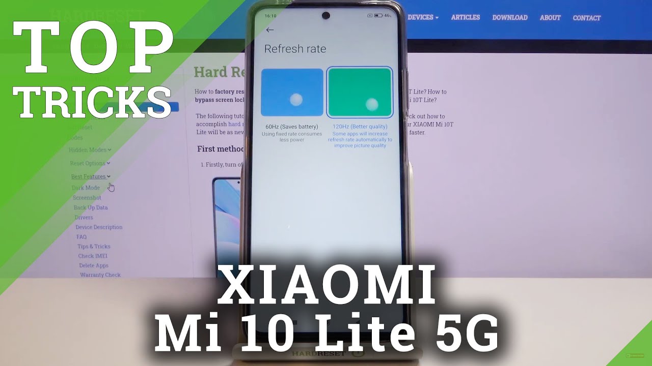
Welcome, I'm from the Xiaomi meet NT lite, and today I'll show you a couple tweaks and tricks you can do on this device and starting off we're going to begin with the refresh rate, and all you need to do is go into these settings from here, go down to display where you'll find the refresh rate. As you can see for me, it's already set to 120, but I believe for you. It will be at 60, and you can change it to a higher refresh rate and what it will do is it gives you a description of better quality, but I think the image right here or animation is perfect in terms of showing you how it will affect your uh display and overlay the image. So if you look at this ball right here, jumping up, it looks like it's kind of skipping right, while the 120 is moving super smooth and nicely, and that's basically, what high refresh rate does it show you more frames in between compared to the 60. So, in other words, if you imagine refresh rate as a really quick slideshow, so the 60 hertz, for instance, will give you 60 frames of or 60 images in a single second well, the 120 will give you twice as much so 120 images in a single second and that basically leaves a lot of room in between to add additional frames. So if you see an image, for instance, one right here and one right here with 120- will have one in the middle as well, making it look much smoother, so I recommend it.
But there is a drawback to this. It will consume a little more battery on your device. So if batteries uh something that you want to have or that you prioritize, then you might want to keep it at 60 and lose out on the additional quality that you get from this now moving on to the next one, it's going to be the dark mode, and it's also accessible in the display. So, as you see, I just went back, and we have dark mode right here and from here you can turn it on manually by just flipping on toggle, as I just did, and there we go we're in dark mode uh, but you also have the ability to check it as a schedule, so it will turn on at seven and uh or seven pm and turn off at seven am so in this way you will basically get best of both worlds. So when it's needed it's going to turn on during night, so you won't be blasting your irises with just this white background, but once it gets light outside again in the morning and throughout the day- and you know, the sun is out, you'll have the light mode, which is a little clearer to see and direct sunlight.
In my opinion, so, like I said, this is basically best of both worlds and schedule probably would be the best one and then moving on to the next option. It's going to be the home screen layout and, as you can see at the moment, we have the uh what I would call uh iPhone experience now, which isn't very good in my opinion here as well. So all icons are smack in the middle of your home screen and what you can do is combat that as not open a game. So what you can do to combat this is basically created folders to get rid of them. But if you prefer to have an actual android experience, you can go into these settings and from here we're going to go into the home screen.
Then home screen right here, and we have regular, which I would call irregular, actually because drawer mode was the regular android experience all the time um, and here we have the with app drawer. So that's basically what we're looking for. That is what I would call a regular android experience, and this is more of an apple experience here. So once you check it on, you can simply leave it and there we go as you can see, it did take a little of a second to adjust. So one of the dots disappeared and if we go into the second page, there is way less stuff here.
All the games that were here are completely gone, and there is no third page at all and overly the uh display is a little cleaner, less clutter and if you're wondering where all the apps that we had have gone, all you need to do now is pull up to access all of them and, as you can see, they're all here. So this is the all section right here where I'll basically have all the apps. But you also have the categories on here, which is really nice that they included this and basically, you can swipe out swipe from side to side to oops and basically access different categories. If you want games boom top games and all your games are in this category, and it removes everything else, so you have quick access to everything shopping. As you can see news tools, photograph entertainment.
So you can see everything is categorized, and you can quickly find it, and even if you can't, you can tap on the search and simply type in the name of the app that you're looking for to quickly find it, and also, I believe in here, the very top in this section will usually be populated with well the most uh used apps. So at the moment it's kind of all over the place. So, as you can see, we have settings cameras, gallery phone themes, security, eBay and Facebook, which is kind of a weird wacky uh recommended list of apps that are primarily used, but once you start using the phone and the phone realizes what your applications are, that you use most often it will start switching them up here, um but yeah. This is basically, in my opinion, a little of a better experience uh for android. That is also a bit cleaner and then moving on to the next one.
It's going to be the icon size, so we can shrink the icons if you want to, and again it's in the same place where the home screen style was so again. Let's go on the home screen and then, where was it icon size over here, and I believe default is medium um, but, as you can see, you can make it bigger or smaller, depending on what you need now, the spacing um, how many icons are in a row and then the column doesn't change here. It only changes the size of them. If you want to change the amount of icons you have, all you would need to do is go into the home screen layout and in here you can change it from 4x6 to 5x6, and this will add, as you can see, additional icon, making them a little more compact. Now, personally, I'm not a fan of how this looks like it makes it look a little crammed, but to each own.
If you like, it, then good for you and then moving on to the next one. It's going to be the floating windows which can be accessed. Let's see, um either. I believe through here, but I might be wrong. It looks like let's see, okay, so let's go to the settings.
Maybe it's not enabled, and from here you want to scroll down to special features. Now there we go and from here floating windows all right. I know I couldn't open it, because this is only for notifications, so this works uh when you get notification from any kind of application and what we'll do is, as you can see right here, we'll bring up this banner. As you normally see, when you get a notification and from there you can grab it slide it down, and we'll open it up in this pop-up view, which can be resized minimized in this way, and this is a good indication of how you can use it, so it will allow you to have an overlay. So if right now we'll get a notification, I will get this popup right here, and I can slide it down, and it will create this kind of small window on top of the settings that are open right now and from here I can interact with that tiny little window, write messages and then basically tap on the side and to minimize to this small one like this, and I can either disregard it and move it out of the way and just completely close it or leave it there till the moment that I want to interact with it once more.
But as you can see it's already by default, it's turned on. So you don't need to actually do anything here. Then, moving on to the last option, it's going to be the second space, and this will allow you to virtually set additional uh part of your display or not display the device. So, as you can see, right now we're what I would call the first space- and oh the only one at this moment, because there is no other one, but you can set a second space which will be completely independent of what is right here. So if we go into something like, for instance, photos right now, as you can see, there's a bunch of photos here, they're all primarily the same: nothing really special, but yeah.
You can see that there they are and if we now go and create the second space which is again and special features, oops, not what I want to correct there. We go special features, we'll have second space and simply turn it on give it a moment now, when you're going to be setting it up for the first time, I believe we do need to go through a little of a setup here which should be presented in a second okay. So, let's continue switch, retain spaces, use a password or a shortcut. So we have two choices. I can select if you wanna, launch second space through a basically an app like shortcut on your home screen on the main space or, if you just wanna, use a for instance, a pattern pin password whatever it's set, to which I'm going to go with the passcode right here.
So let's continue, and we have set a password. So this is a second space password. So start now confirm first space password so because I already have one set for the main space that I have used uh the primary one. I will need to confirm it. So this is the confirming it, and now it tells us to set one for the second space, so I'm gonna basically mirror it and create one a little differently.
So that's one repeat it to confirm it, and there we go and from here it's a fingerprint now you could sort of fingerprint to it as well, and what this will allow you to do is instead of writing the pen pattern password or whatever it is. You can just use a fingerprint now you could have, for instance, your right thumb to be the main space, and then your left thumb to be the second space, and you can quickly switch between them, depending on which finger you used to unlock the device, but I'm going to skip it um and just show you the bear kind of minimum here. So right now we're on the second space which you can guess by the wallpaper, which is the blue one, and on this space everything is completely independent. Uh the apps. The settings are completely different.
As you can see, there is basically no apps, as I did have some games installed, they're not on here they're only on the first space. Also, if we go into the gallery and not the weather, the gallery, which is below um, you will see that there are no photos here quickly go back, but so, as you can see, there is literally not a single photo here, which I did show you right before we started this, that I did have a bunch of photos and the gallery they're not here so same thing. If you capture photos here, they will be only on this space and not on the first one. So you could basically create almost like two different phones, and you could use one as an example for a work and solely for work and have everything work associated on that device. While on your second space, you could have your personal stuff and basically contacts and all that stuff that are associated with your personal life and just to show off uh the lacking and unlocking.
So, as you can see, the home screen looks normal, and if you swipe up, you will have the passcode right. So if I use this one, which was the first space, it will take me to well the first space and literally where I left off right. As you can see there, we go and now, if I lock it again and unlock it using the second space code, we're now back in the second space, and it just allows you to quickly switch between them. So this will now conclude all the tweaks and tricks that I wanted to show and if you found this video helpful don't forget to hit like subscribe, and thanks for watching you.
Source : HardReset.Info
