Sony Ericsson Xperia mini pro Review By PhoneArena
It is not very often that we see a device that is truly different from most of the handsets out there on the market, who are Sony, Ericsson's Xperia Mini devices are just one of those rare occasions. This is Ray with phone arena, and you're watching our video review of the Sony Ericsson Xperia Mini Pro. What makes the Xperia Mini Pro so different is its ultra-compact design. It is so small that it can be easily fit even in the smallest purse. However, due to its excessive thickness, it won't go unnoticed in your pocket. Another aspect of the Xperia Mini Pro, which further differentiates it is its stylish appearance which is not something very common among Android devices.
Thankfully Sony Ericsson has increased the screen size from 2.5 in the original x10 mini to 3 inches here, which makes the handset a lot more usable. In addition, the screen resolution has also been increased from avg to HVG, which is not something groundbreaking, but it works fairly well, with the strange screen size managing to deliver some relatively crisp details, the keys around the handset left us with some mixed feelings. For example, the two stop camera shutter is very good. You can definitely sense the two stops of it, but the volume rocker, for example, is relatively stuffed and such is the honky here. The power and lock key is relatively usable, but its small size makes it a bit uncomfortable.
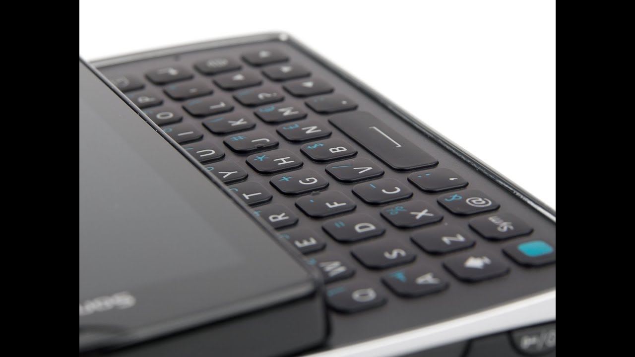
The sliding mechanism of the Sony Ericsson Xperia Mini Pro, is very solid. The upper part of the handset snaps firmly into place without any wobbling effect here, and it reveals the four awkward keyboard it does not have some premium feel to it, but the East, but the keys are nicely spaced from one another, and they have nice travel to them and a very click feel so. The experiment pro presents us with some very decent typing experience. The Sony, Ericsson Xperia Mini Pro, is loaded with the custom interface over android 2.3 Gingerbread. This is the custom interface that we first saw about a year ago with the original Xperia x10 mini, but thankfully the company has worked to improve it in a number of ways.
First, you can now have multiple home screen widgets and in the four corners of the screen before you could have just one shortcut, but now you can have up to four there's also this widget overview mode, which is very interesting because of this floating widget, and when you shake the phone, the widgets get shaped as well. There is no practical use to that. You just cool, and indeed the interface is full of these little touches and animations, which make it seem very playful and very, very pleasant to use a notable example here is the lock screen animation, a major piece of custom software on the Xperia Mini Pro is the times cape app, which allows you to keep track of all sorts of Twitter, Facebook updates as well as messages and calls, but the service has also been improved to allow you to add other services that you can follow here. If you happen to enjoy this interface like Gmail, for example, we personally are not very big fans of it, because once you choose a certain update, and you want to see more of it- you're just sent to the mobile site of the respective service, the portrait on-screen keyboard of the Xperia Mini Pro- is not the most comfortable one out there because of the small size of the case. You know the display is only three inches big, but at least the landscape option is usable.
It gets the job done if you just want to input something quickly without having to go for the physical keyboard. Thanks to his 1 gigahertz processor, the Xperia Mini Pro has a very decent web browsing experience with full flash support, as you can see, page scrolling, Keys relatively smooth, and so is pinch-to-zoom. What we like about this browser is that about the way Sony, Ericsson, his tweet, this browser is that you can pan the page, while you're executing the pinch to zoom gesture, which makes overall navigation with this browser much easier. We also like the interface of the music player here, which is in line with the rest of the UI throughout Xperia Mini Pro. It has this big buttons which make its operation easy, and it also has a number of other cool features like equalizer presets and also some other settings such as X loud setting, which makes the loudspeaker sound much better than it usually in DES.
The interface of the camera is also very pleasant to use, especially with these drawers here, which expand your options. It is also customizable, so you can change the places of your settings and this keep the ones that you need the most. It's your fingertips here. Unfortunately, the 5 megapixel images of the handset are more like checkbox feature as the Xperia Mini Pro shoots photos which are more like 3 megapixels. The colors are overall realistic, but also a bit dull and the same observations go for the 720p HD video voice, quality in the earpiece of the Sony Ericsson Xperia Mini Pro is average at best, while loudness is okay, voices sound, quite sharp and unnatural.
The same goes for the microphone of the handset, which manages to transmit some equally average sounds, although we can conclude that Sony Ericsson Opera, Mini Pro, it's a very capable and ultra-compact smartphone for those of you who are not into giant 4-inch screens. In addition, it is very cute and 20 factors in its usable QWERTY keyboard and playful interface. It seems like the Sony Ericsson Xperia mini pro. Is a dream come true for those users that are into compact handsets, if only it's camera could be a bit better, but one can never give it all. You know this was three with phone arena for more details, check us out at phone Ring, calm.
Source : PhoneArena
