iPad vs Chromebook: Which is better for productivity? (Is iPad Air 2020 worth it?) By iTablet
Welcome back to the channel, so for those of you who've been following the channel. You probably know that I've been quite obsessed with turning the iPad into my main computer and the reason for that is simple. It's that the MacBook is so bad these days that I wish that I could do all my work on just the iPad because it has so much potential, and it's just such a better computer in so many ways than the MacBook is just because you've got a touchscreen. You've got the Apple Pencil. You've got a great keyboard and mouse, and it's just one of those things where you want to use it, because it's so much more fun to use than the MacBook, and I think that over the years the problems that have been plaguing the MacBook and apple's lack of focus with the MacBook is now starting to kind of creep into the iPad. And I'm a little worried about that.
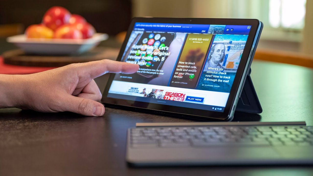
I'm also quite worried about the. How apple is talking about iPadOS and how they're over promising what iPadOS can do and when you actually try to use the iPad to replace your MacBook, it's quite far from reality, so in today's video I wanted to do something a little fun and slightly different to what we usually do on this channel. I want to compare how iPadOS compares with something like chrome OS on the Chromebook. So to do that, I bought a Chromebook. I bought google's latest Chromebook, which is called the Chromebook go, and I know what everyone's going to say in the comments they're going to say that this is a tablet, and this is a laptop, and you're right.
They definitely are two different devices with two different target audiences. But when you start to look at them, you start to compare what they actually are. They are so similar that I don't think that doing this comparison is actually that unfair. Both of them have touch screens. You can see both of them have mouse support.
Both of them have fantastic keyboards. I would say that the Pixelbook goes. Keyboard is one of the best keyboards I've actually used in a very, very long time. They both have you two USB ports. Obviously the iPad has one on this side and one on the magic keyboard down here now and they both run mobile apps.
So obviously, the iPad runs iPad, OS apps, but you can also run phone apps on the iPad and with the Pixelbook you can run android apps on there. So it's very similar when you start looking at it, so they're both kind of laptops that both kind of trying to replace a traditional MacBook or a traditional computer, but they're doing it in two very, very different ways. So what is it that you need to do on a modern computer these days? Well, when you think about it, the list is actually really long. You obviously need to be able to run apps. So on both of these platforms, you can do that.
Like I said on the Chromebook, you can run android apps, so you can see that things like slack and Gmail and confluence JIRA. All those things are available on the Chromebook as well through the play store. So there's not that much difference there. The next thing you need to do is you need to be able to organize files and be able to quickly share them with others and also quickly rearrange them. So let's try that first on the iPad, and then we'll try it on the Google Pixel book go so here we have files open on the iPad.
I've already set it up so that I have two different folders uh one left and one on the right- and I have one JPEG in here that I want to be able to drag over from here into that folder. So to do that, it's obviously very easy with a touchscreen. You just do that, and you drag it, but because this is a touchscreen on the iPad, you can't just pick it up and pull it. You have to push hold wait for it to pick up, and then you can drag it. If you use the mouse, it's a lot easier because the mouse is obviously more precise than your fingers.
So you can just do that a lot quicker, but when it comes to multiple files, you can't select them all with your cursor, because the cursor on the iPad is trying to emulate your finger so that when you try and select things it's actually scrolling up and down instead of creating a bounding box that allows you to grab more than one file. So it's a slightly worse experience on the iPad here you can see we have multiple items in this folder. So if I want to drag all four of these into folder two, I can't do that with the cursor. I have to go up here and say, select and then type them one by one, or maybe I can go and hold down shift yeah. So I can hold down shift and then click on the first one and click on the last one, and then I can drag it that way, but here's a problem when you try and drag them now you can see that that doesn't work, because you can't pick them all up at the same time and drag them because again the iPad has a touch layer and is a touch first device and now the interface of needing to be able to scroll up and down with your finger and because the cursor is not a real cursor.
It's just emulating your finger. That is just simulating what your finger would do on the screen, instead of allowing you to grab those files and pull them over. If I try that with my finger now, I can do that like that, but if I want to be really productive and do this very quickly with my mouse and select a bunch of different things like that, I just can't do it. I have to go like this tap on that one reach up and do it you see it do it this way. So again, you can't be as fast as you can on a regular computer, because the system slows you down.
Something else is a little annoying is that when you try and move uh files around, sometimes it's very difficult for you to be precise with your fingers. So if we do that pick this one up, and you go up here- you can see it tries to put the file into slide over instead of going into the folder. So you really have to be so precise and know exactly how to work with the iPad, because it's just not like a regular PC, and it's yeah. You see it's so easy for you to make mistakes because Apple doesn't believe in showing you any window chrome. So when you look at this, there's no hint for you on what to do on the display.
You have these two little stripes at the top of the screen and there's no indication of what they do. It's if you look at it this way, and you drag them, you can see. Oh okay, cool they're, actually there to move the window around, but that they have more features than that. You know you can use it to drag things around and put them into a slide over, or you can use them to put them back into multitasking mode, but there's just no indication from apple on what those are, and you basically have to learn how to use it because again, apple hides everything in the interface away from the user. It gets even worse when you use things like the music app in slide over.
So here you can see. We have two of those little lines at the top of the window, but it's quite unclear on what they do and also. Why is the one lighter than the other one? It's just so confusing, and when you look at the way google does it's. They show you well not surprisingly, quite a lot of window chrome because they want to make it easy for the user to understand what to do and how to minimize things and move things around, but because Apple has not brought any of the traditional mac interface paradigms over to the iPad. It leaves you to guess quite a lot on what those lines mean and also, if you drag the wrong one, you can do things that you didn't really expect here.
We are on the Chromebook go, and you can see that we have a traditional mouse cursor on the Chromebook instead of something that simulates your finger, which means that if I click and go up and down it doesn't scroll the interface, it actually creates a bounding box which I can use to select different files. So if I want to move this image into the folder one up here, I can do that really quickly and just drag like that. So it's a lot more like a traditional computer than the iPad is also a big difference with the Chromebook versus the iPad is that you can open up imagery or files straight from the files app, and it will show in a window. So that's obviously something that we don't have on the iPad, because Apple doesn't allow windowed apps at this point, unless it's in slide over so with this one, you can enlarge it by using the built-in window management. So it's really clever how it works.
When you drag something to the right hand, side, it automatically gives you a large view that way or if you drag something to this side. It gives you a larger view on the left hand, side and again, if you drag it to the top, it shows the image as large as it can go. Another great feature I like about the Chromebook is that you can use the keyboard to resize things and to also going to multitasking mode. So if you tap the enlarge button, it takes the full screen. If you type it again, it shows up in the window, which makes a lot of sense.
And, of course, if you want to see all your apps, you can just tap one button, and it shows you everything in a multitasking mode, very similar to what the iPad can do at this point. But it's just done in a slightly more elegant way, and maybe it's a way that well, at least for me, it's easier to use, because it's windowed, and I know exactly what I'm doing, and I know exactly what I'm looking at, because I can quickly switch between windows and see exactly what I want to see and find things a lot quicker than I can on the iPad. At this point when it comes to creating and producing content on the iPad or the Chromebook. There are certainly quite a lot of apps that are available on the Chromebook that you can use at the moment, and some of them are okay. I guess I mean you have Photoshop on here which, as you know from my past videos, I'm not really such a big fan of photoshop on mobile devices, because it's not real to photoshop you've got Canva and a bunch of other things, but you can just tell from looking at the app store that there is just nowhere near as many apps as there are in iPadOS.
I mean when you look at the same category, so they call it art and design and apple course of graphics and design. The types of apps and the caliber of apps you have for the iPad is just so much better than what you get on the Chromebook and that's not really the Chromebook's fault. That's just the because the iPad is so powerful. It can run slightly better apps than the Chromebook can. The only problem is that the iPad as powerful, as it is, still can't, run real versions of desktop apps, so things like photoshop things like Lightroom, adobe, illustrator, all those things, those are still kind of baby apps that you can use to sometimes work on.
It's not the kind of app that you would want to work on the entire day, because it's just very, very difficult to get real work done on a smaller app like this and, of course, the main difference between the iPad and the Chromebook is that the iPad works with a stylus and the Apple Pencil is by far one of the best creative tools that I've used in a very, very long time, and I can use it to draw and markup documents and a bunch of other things like that. But it's not really the kind of thing that I can use to do my day job. So I can't really use it for UX design like um, so to create websites and do things where I need to be very, very precise, because a mouse and a mouse, cursor and also a keyboard allows me to be a lot more precise with where I place things on the canvas than the Apple Pencil can. At this point there is no Apple Pencil or equivalent stylus available for the Pixelbook go, but some other Chromebooks do support pencil input or some kind of stylus input. So, if you're interested in drawing- and if you want to try it out with something that's more like a traditional computer, which is obviously the Chromebook, then you can get a version like that which flips over and allows you to draw on the screen.
And of course, another big thing about being productive with a modern computer is that you need to be able to add accessories to your computer in order to augment what you can do with it. With a MacBook or a traditional desktop PC. You can add a monitor, and you can extend the workspace to the external monitor and if you want to be able to do that, you should definitely consider the Chromebook, because when you attach the external monitor to the Chromebook with the USB cable, you can see that it extends the workspace. So, instead of showing two black bars like on the iPad, you can actually use it like a traditional computer and have certain apps on the screen down here and run other apps on the Excel monitor, which means it's a lot more like a traditional PC in that regard. So, let's try that with the iPad now, so, if we close the Chromebook you can see, you can still run the Chromebook in clamshell mode, which means, if you attach an external, monitor, a keyboard and a mouse.
You can use the Chromebook without showing the main display. Unfortunately, that's not the case when you try and use it with the iPad. So here we have the iPad and if we connect that you'll see that instead of filling the external display, it mirrors what's happening on the iPad. At this point, the only way to really extend the desktop on the iPad is to run the app called shift screen which allows you to run a second app on the iPad screen and then also use the external monitor up there. But this is a bit of a hack, and it's not as elegant as the Chromebook when it comes to doing real work.
You obviously also need to be able to work on large files and something like the Chromebook, which has about eight gigs of ram handles large files really well. So you can see that here I've got a Figma file open. I've picked my project and there's quite a lot of pages in here and lots of vectors, graphics and if I try and open that same file on the iPad, you'll see that it reloads, and it doesn't load because the iPad is unfortunately not powerful enough to be able to hold this entire project in memory. So that's a bit of a downside for me, seeing as though my entire workflow, my entire life is in Figma, and I wish I was able to use it on the iPad, but unfortunately, at this stage with iPadOS being the way it is also the iPad not being powerful enough and having enough ram. I can't work on large projects, so what does that mean for the upcoming iPad Air? Well, what should you do at this point? Should you wait for the iPad Air? Should you get a Chromebook? Should you get an older iPad Pro? Should you work for the new iPad Pro? Should you wait for the silicon max like there's just so many things to consider when you think about getting a new computer or getting something that is an alternative to your existing MacBook or your existing laptop? At this point, it's very difficult for me to give you advice, because the iPad is in such an in-between phase, and these are the frustrating years when apple is still working out, how they're going to merge or create an iPad which is more capable and more mac-like.
And obviously, when you look at what we have at the moment, it's such a great device, and it can do so much, but it still has a long way to go before you can think about this thing as being able to do exactly what a Chromebook can do or exactly what a MacBook can do and a lot of people like that. A lot of people like the fact that the iPad is a simpler version of a Chromebook. So I like that, it's just this sheet of glass with a keyboard that you can use to draw on or do anything with, and they don't want. The complexity of a Chromebook or the complexity of the MacBook, but just because its simple doesn't mean it's better, because there are times when you're using the iPad, and it just feels like a nightmare, because there are small things that you run into all the time when the iPad is not good enough as a MacBook replacement and, unfortunately, if you're planning on buying the iPad Air to replace your MacBook or replace your Windows PC, you may need to think about that twice before you buy it. The main reason why you run into roadblocks on the iPad.
All the time is because the iPad is a touch first device. That's now trying to be a laptop, and that causes a lot of issues when you're trying to be productive and that all comes down to this cursor. You can see that a traditional mouse cursor, you know you can make selections. You can do a bunch of things. Furthermore, you can click and drag, whereas if you click and drag on here, it doesn't always work the way you think it's going to work.
So sometimes you click and drag, and on websites you can actually select things but on the home screen. If you click and drag it, acts like your finger. So there are quite a lot of places on the in the OS where the interface and the paradigm of trying to merge touch with mouse input has not been refined, and it still clashes a lot with what you're trying to do, and I think the example of what we looked at with the files' app is the clearest way for me to illustrate that is that simple things like just being able to move files from one place to another is just not as easy as it is on a MacBook or a windows laptop or anything else like that, and as always thank you very much for watching and don't forget, you can win an iPad Mini when the channel reaches 10 000 subscribers. So if you want to enter just subscribe to the channel and comment hashtag, I tablet on future videos, and you could win so good luck, and I'll see you in the next one. You.
Source : iTablet

![[HOT NEWS]The Best BlackBerry KEYone - Deals and Prices in 2018 !!](https://img.youtube.com/vi/qwWPXbDDja8/maxresdefault.jpg )
