Android 12 preview: here's Google's radical new design By The Verge
(rubs hands) - Android 12, it is here or it's being announced. The new beta where Google actually tells us what the biggest new user facing features will be, has been announced. And, I have seen a demo and I've played around with the beta here on my phone, and I have some thoughts. Do you wanna hear my thoughts or would you rather just see what's new in Android 12? Oh, why not both... This is Android 12. (upbeat music) Android 12 looks different from what you're used to on Android, actually very different.
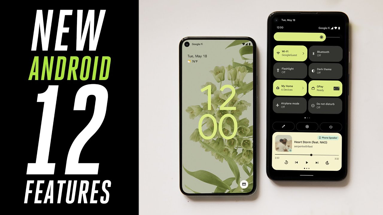
Google says that this is the biggest visual overhaul since 2014, or maybe ever, depending on who you're asking. And yeah, a lot of the pieces of this operating system here do look very different, but it all basically still works the same. You've got a home screen, you swipe up for apps, you swipe on for quick settings and for your notifications, etcetera, etcetera. What you're really looking at here with these big buttons and the really big bubbly sliders and so on is how the Android team has decided to implement a new design system that Google is calling Material U. Now, Material UX or material UI just Material U like Y O U, whatever.
Now, when you're looking at the B roll and the screen recordings and the screenshots on this phone, you should know that it is how Google is implementing Material U on the Pixel. Whether and how Samsung or Xiaomi or OnePlus decide to implement it is going to be different. And also, you know, much later because their updates always come later than the Pixel. Anyway, I don't have the full details on Material U and how it works and so on. But, I do know that it's supposed to apply to everything from the web to Android, to apps, to even hardware.
What that means is I'm just, I'm not going to get any of the HETI UI versus UX versus you. You stuff here. I'm just going to talk about what I am seeing here on this phone. And what I am seeing is good. For the Android team the U part of material you hear is an automatic theming system.
So, when you set a new wallpaper you're gonna to be given the option to have Android pull up some colors from your photo and then, apply that theme with those colors to the system. So you can see here that the buttons have turned green, and there's also an algorithm for pulling out complementary colors from the photo. It's kind of neat, but I don't know that I would have picked this particular green if I were beaming at myself. And the good news is is you can pick whatever colors you really want to. So that's neat, but really I can tell you the whole story of this visual redesign just by looking at a couple of screen recording.
So, here's Android 11 and here is Andrew 12. So first there's a bunch of new like lighting effects when you unlock the phone, you can kinda see colors and shadows and light kinda sweep around. And, in general there's just more animations all over the operating system. And we're gonna come back to why that is, but look, they're even taking advantage of these animations on the lock screen buttons, and you can see the little color from the material U theming as well. Now, when we pull down the quick settings and notification shade you see that they are just very big, easy to recognize easy to understand buttons.
Google's just not afraid of taking up more space with all of their UI and they're not trying to cram everything into the most information dense thing possible. I actually think it's like a nice direction. There is another subtle difference in the notification shade, you can see that it's just covering the entire screen instead of sort of being a translucent layer over. It makes it into an entirely new space. And if you look at the notifications themselves you'll see that they're groups together and signified by a bunch of bubbles for each individual group.
So there's conversations and silent notifications and whatever. But if you slide an individual notification away there's this really subtle effect where the hard corner turns into a bubble for just that notification to indicate that is its own separate thing. Now on the home screen, let's just pause a moment to look at these widgets. They are brand new and they're based on an entirely new system for making widgets that is based on these principles from the material U design system. So, Google is gonna update a bunch of their own widgets, but they're also hoping that they can get a bunch of developers on board to update their old widgets to the new system.
And, I really hope it works because the widget ecosystem on Android has gotten really crufty and messy over time and it is due for a refresh. Now, next stop are quick settings and Google changes quick settings every single year. And this year is no different. The new thing this year is that the buttons are huge! I mean, just look at them, but I don't know. I kinda like it.
Google also puts smart home controls and Google wallet into quick settings finally, which means that now holding down the power button brings up the assistant just like it does on the iPhone and on Galaxy phones. And all of that means "adiós weird power button menu from Android 11!". You tried... Finally in quick settings there are toggles for camera and mic access and we're going to get to those in a minute. Oh you know what, one more thing I just have to talk about that's not in the screen recordings, the new lock screen when you don't have any notifications you have this giant clock on it and it's dope and it matches your color theme.
We do have notifications. It's still pretty big. It just gets a little bit smaller. It's a good lock screen! Now the version of the Android beta that Google is releasing this month, doesn't have all of the gewgaws and bells and whistles that you just saw but, there's enough here that you can see where Google is going with it. Like, even if you just look at the settings I have all of the icons and the text is bigger and they've got this new over scroll animation that kinda squeezes things together.
It's a big redesign but it's not a complete overhaul of how everything works. Every design gets crufty over time. And Android was definitely starting to show a lot of inconsistencies as new features piled on and old ones were kind of half forgotten. I see this design as a general cleanup. All the buttons are big and bubbly and I see a sense that things are going to be a little bit more coherent now, and, I dig that.
So that is the new design system, but I wanna come back to a thing I mentioned at the top to the smoothness thing. Android has a, a reputation that the only way to make it smooth and good-looking is to throw more powerful hardware at it with faster refresh screens or more RAM or whatever. With Android 12, Google's promising that they're going to make the animation smoother for everybody through software improvements. So, we sat down with Sameer Samat, the VP of product management for Android and Google play. And here's how he explains it.
- So we've done a few things to make things to make the system feel smooth. We've reduced lock contention and key services, activity window and package manager. What that really means is, there are multiple different parts of the system trying to talk to the operating system at the same time. And that's when you see things jitter or genic, by smoothing a lot of that out and by reducing, for example, the amount of time that Android system server uses by 22%, actually. We've been able to make all the motion and animation feel super smooth.
- All right, there are a few other interesting features that are being announced today. So, there is a proper remote control app for Android TV. They're going to have car unlock that works with NFC or UWB if your phone has it and that'll work with a few different partners. And later this year, if you have a Chromebook it's going to be able to directly access the photo library on your Android phone. So next up is privacy updates.
Google is putting privacy updates in every version of Android. That is great. And this year there really are a bunch. The main thing that Google is trying to do this year is tamp down on unfettered access to your location, your camera and your microphone. So there are new indicators in the upper right-hand corner when they're being accessed.
And there are those new buttons and quick settings that just fully turns off your camera or your microphone. So, when you toggle them off, an app that looks your camera just gets a black, nothing. It thinks the camera's there, but really it's just getting nothing. There is also a new privacy dashboard that will show you how often those sensors have been accessed and by which apps. So you can view your data from the past 24 hours in a pie chart or in a timeline, and then turn off all the different access stuff from there.
Now for location, there is a new kind of permission that you can grant to an app that's approximate location instead of just precise location. So, say you've got something like a weather app and you don't want it to know your precise GPS pin but you want to know what neighborhood you're in, you can give it an approximate location. So let's all the privacy stuff for sensors, but there's also this new part of the operating system called the Android private compute core. Now you might think it's a chip because core but it's not, instead it's, it's like a sandbox part of the operating system for machine learning things. It doesn't store data.
It runs processes. - A good way to think about it is, when you have these advanced technologies, like for example speech recognition or natural language processing, and they need access to certain information. Another favorite example of mine is smart reply. Awesome feature, looks at your notifications your chat notifications, and suggests replies based on a speech and language model. All of that runs on device in private compute core.
- From my perspective, basically what all that means is that if Google wants Android to be able to do something with AI that you might think is creepy, now they can put all of those processes in a box and limit all communication into and out of that box and everything in the box can't access the network and it's only accessible via limited API. So, that all seems great but is it more secure? We'll see. So that's all the privacy stuff that Google wants to talk about but, there is another kind of privacy that Google really isn't keen on discussing that much. And that is app tracking for ads. Now, there have been rumors that Google would follow Apple and limit some kind of app tracking for things like ads but, Google also makes all of its money on ads.
So - Taking a step back on this one, there's obviously a lot changing in the, in the ecosystem. One thing about Google is that, it is a platform company. It's also a company that is deep in the advertising space. So we're thinking, very deeply about how we should evolve the advertising ecosystem. You've seen what we're doing on Chrome.
From our standpoint on Android, we don't have anything to announce at the moment but we are taking a position that privacy and advertising don't need to be directly opposed with each other, that we don't believe is healthy for the overall ecosystem as a company. So we're thinking about that working with our developer partners and we'll be sharing more later this year. - All right, well, stay tuned for news from Google on that later. And speaking of later, when are you gonna be able to get Android 12 on your Android phone? Well, do you have a Pixel? Because then the answer is easy. You're going to get it this fall.
Do you not have a Pixel? Well, then the answer is later. Google says that the speed by which companies are updating their phones to the latest version of Android has improved by 30% but still, other manufacturers besides Google just take awhile to get the latest version of Android on their phones. That's just how Android works. Alright. That's Android 12, a huge redesign that adds some consistency and coherency with big buttons, big sliders, big everything! There's more theming options.
There's a bunch of privacy indicators. There's a bunch of stuff that they put in the developer betas that I haven't even covered here and a TV remote. This isn't the most massive release ever but you know what, it's enough. (transition sound) Hey everybody, thanks so much for watching, right now it is the middle of Google IO, which means that there is a lot going on and we're going to have a lot more coverage of everything Google has announced, and, you know, in general it's just a big tech week. So I think there's gonna be a couple more videos on the verge you're gonna wanna check out...
Source : The Verge
