Meizu M1 Note Review By Mobilegeeks.de
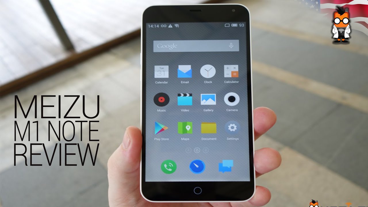
Nichole's got here for mobile geeks and today, I'm going to be doing a review of the Mizzou and OneNote. That's got a 5.5 inch. It goes OH display and has absolutely no business being on 175 dollar smartphone. Now there is a catch, and it's not the camera, let's get into the review. So, let's start with a quick overview of the device. It's got a 5.5 inch, EX LCD with a resolution of 1920 by 1080. It's got a PPI of 403 and this is Gorilla Glass now I've been using this for a week and I haven't had any protection on it at all.
So the fact that there are no scratches on it is pretty good the same for the back. We have a poly carbonate kind of just white finish here. It's gotten a few scuffs on it, but I've been able to just kind of clean them off really easily, which is nice. It's got a thickness of 8.9 millimeters. Furthermore, it weighs in at 145 grams and has a battery size of 3,140, which is great for a 5.5 inch display. Now under the hood, it's got a media tech I.
Think it's the mt6752 at 1.7 gigahertz. Now that is an outscore processor. This isn't something new in the mid-range smartphone we've tested quite a few phones with this processor in it and overall I've been very happy with the performance and the battery life. It's got: 2 gigs of RAM, a 16 and 32 gigabyte options for storage, a dual micro sim, which is great you just pop that out here. So one thing that has been problematic in the design for me is that this hasn't been flush, so you can see that it's kind of sticking out there, and it's kind of getting black with dirt and I have a really hard time getting my SIM card in and out of this device.
So this it took like five minutes to put it in I, don't know what it is about this, but it doesn't seem to be perfectly aligned or kind of made. So that's one thing that I'm kind of disappointed about you know and just it should be annoying I think it's the power button actually sometimes I forget it's on top and because I can feel it in it sticking out. Think I'll, what a crappy power button so design! Why is that they kind of made a mistake there? It should be a lot more flush, it shouldn't stick out, and it shouldn't be exactly where a power button might be. If this didn't have a power button on the top. So you can see that there's a power button on the top taking a look around the device while I'm spinning it around.
We have a 13 megapixel shooter on the back two-tone flash here for you there's a there's, our headphone jack right there around. Here we have the volume buttons they are separated, which is kind of nice to see here on the bottom. We have the speakers and that's our microUSB and then around this side. We only have that it's a important thing that I was complaining about. So overall I do like the design.
The weighting is quite nice. It feels comfortable in your hand the plastic it feels plastic, but it doesn't, it doesn't offend it. It actually feels the curves of the phone. This is kind of classic maze style, they've gone for this rounded, and it does feel perfect when it, when you're holding it right now, I wanted to take a closer look at the display, because this is an ink so display, and it does go a little white on the angles, but it's definitely usable outside overall I've been really happy with the crispness of this and for a hundred and seventy-five dollar device. I.
Don't really feel that this display should be on here. So this is one thing that if you are somebody who really values a good display, this is usually the thing that separates the mid-range devices from the high-end, but overall, this device is really knocking it out of the park. Now let me talk about the software, so this is running. Fly me for point. No now I have been a maze mx4pro user, but I don't recall it being this crap in UI, and the reason behind that is they've gone to a single capacitive touch button here now the style of fly me is no app drawer.
If you like the app drawer, then you just need to get over it. There are two styles of OS after or no app drawer. Personally, you need to be a lot more organized if you don't have an app drawer just because if you start to put things into folders, you can forget where you've put stuff, and then you can't find an app. But the reason why I'm a little annoyed is that they've had this smart touch icon here, so I can move it around the screen and I can use it to pull down the notification bar I can move it. I can use it to switch between apps.
These are all the apps that I've had open, so I'm just going back and forth between them. Now what this means is that there's actually no way for you to pull up all the open apps. You can't see what's open and then just decide to close something or choose which happen is you have to physically scroll through this, which is pretty annoying and I, really think that they should have like left us with a way to kind of manage our open applications? If you hold down it, just shuts the device off. So that is a real annoyance and the other thing that I've never really liked about fly me is that they don't put settings in the notification bar there's even an open spot right here. So I have no idea why they wouldn't just include the settings now the settings has to be one of these buttons.
So one thing that I have done in the past is sometimes I put the settings here. Just so I can have constant access to them, but in your quick launch, bar is sittings really something that you want so front and forward anyways. Clearly, I am using this phone anyways yeah, that's my little pet peeve about that. But I am going to move on so back to this button. The long hold kind of moves it around, and you can see that here there are a bunch of different features within the phone, so you can turn multitasking on or off.
Turning it on will enable well, let's right, eat up more a lot more battery life, the home light. You can turn that on and on gesture to wake up. That's about sliding I should really turn my Facebook chat off during this time. Sorry about that guys, you can see that I am actually living in this phone, so this is one of my biggest pet peeves. Is that sometimes you can't figure out if you're using the back, so let them? Let me just go to Facebook and show you so now.
One thing here right so, let's just say: I click on here now I have to use this to go back right but, let's just say, I click on this photo no I still use hold on, say: I click on this person now I have the arrow right, so I mean there's like, depending on the application. The way that you interact with the UI can can change right. So sometimes it gives you an arrow. Sometimes it doesn't so like visually. Sometimes I would get confused as to if I'm, using the error, if I'm using the button, because sometimes the button won't just move you around in the app the button will take you right out of the application.
So there 's, there are some UI struggles when you're dealing with this. My I introduced some friends for a have a fire-spinning friend and then her friend who's trying to hire her. So that's what those Facebook messages are about yeah, so they mean that that has been my one pet peeve behind it, but overall the UI does run smoothly. No real issues with it like I, said I, always kind of like that. You can pull this down like really like relatively quickly.
Maze has done a perfect job. With the camera like on the mx4pro there's software before processing the photos is totally on points. We have a 13, megapixel, shooter and I. Definitely like the UI that they've given their camera. It's very Cyanogen, so you just switch across manual, so you have ISO focal length.
So you can do depth of field stuff, which is kind of nice, see if you're kind of like doing a video you can manually set the focus as well. So let's just keep going beautify all this glad. This guy can't get any more beautiful panorama light field, so that's tapping to focus right and changing the brightness scanning for QR code. So I think is great. That they've included that, but it felt slo-mo quite good.
Well, actually, the slow mode function is so-so on this, and what was that? One? That's right and we're back to auto. So now some settings include photo size, video size. You can have HDR on and off I kind of wish that they had HDR in a function, but their HDR actually here is pretty good. So, let's just go back now. Let's just show you how quick the autofocus is on this.
That's again, all right now, let's take a look at this photo I think that that is great for 175 dollar phone I. Think that's perfect! Now, let's take a look at the real thing now the Reds maybe are a little deeper, but look at the detail on that really phenomenal. So, let's take a look at some other photos. Here's some food photos, so you can see that even when you pull it in to look at things like the numbers, you can read that and the lines are still quite sharp. This.
This camera doesn't really belong on such a budget phone. To be honest with you, so here's a here's a little camera sample. This is over at the National Taiwan University see the colors are nice and bright. It handles light to dark fairly well, so all in all Mays, you have knocked it out of the park. They've built a great device.
It checks all the boxes that I need for something that would be my daily driver, good, build quality well, except for this SIM card slot not being flush and me thinking. It's the power button. Great display TO display great viewing angles: nice and bright outdoors, solid camera and all-day battery life if using it lightly, I can definitely go into a second day charging it in the morning now the things that really bug me about this phone like I, mentioned this needs to be flush. The fact that the SIM card slot is not flesh ya, little, irritating if I did I put the power button on the top, the phone's a little long for a power button on the top, and it's the software. The software is actually the thing that makes me the craziest now I wasn't mx4pro user.
So it's not as if I'm unfamiliar with fly me, but they've gone with a single capacitive touch button and removed the back and the menu functionality, and so, when you're navigating the phone, it's not entirely clear what the best or best practices are so like we saw with the Facebook app, sometimes there's the arrow to go back, and sometimes you're, just using the button, even with somebody who's really familiar with Android you'll find yourself kind of stumbling to go. Where do I? How do I go back, because, if you hit back to me times, you actually exit the app. So it's like back inside the app and back for searching around the UI. It's too much functionality for just one button, so I think that they should have given you the option to have the soft, the Android software Keys, on-screen. I.
Think that was a huge mistake and the other thing that find me has never done is included the settings in the vacation boy. You actually need an icon for that, and that just makes me absolutely crazy and don't know why, in all their iterations they haven't just put the Settings button in the notification bar. Please leave a comment if you are a fly me user and want them to do this, I have no idea why they won't do that. So of all the things that really piss me off about the phone. If you really hate fly me, you can always download another launcher so because it's Android everything's always fixable.
So it hits all the high points that I need for something to become my daily driver $175, depending on where you're at I've noticed on Amazon. It may be around 200. Now the question is gonna, be: if you're going to be paying 200, then should you pay to be paying to 25 for the Arena phone -? Well, that might be a topic for another video. Let me know in the comments if you'd like to see me shoot that one. Like always please subscribe to our channel.
If you haven't already, it doesn't mean anything dude. It means the world to me and if you aren't following me on Twitter, it's Nichole underscore scooter hope to see you guys again soon.
Source : Mobilegeeks.de
Phones In This Article
Related Articles


Comments are disabled
Latest Articles